Freelancers using Trellus
Sign Up
Post a job
Sign Up
Log In
Filters
1
Projects
People
Klym Yevtushenko
pro
Warsaw, Poland
SaaS Product Designer | UI/UX, Webflow & B2B Websites
$1k+
Earned
3x
Hired
5.0
Rating
293
Followers
Follow
Message
SaaS Product Designer | UI/UX, Webflow & B2B Websites
22
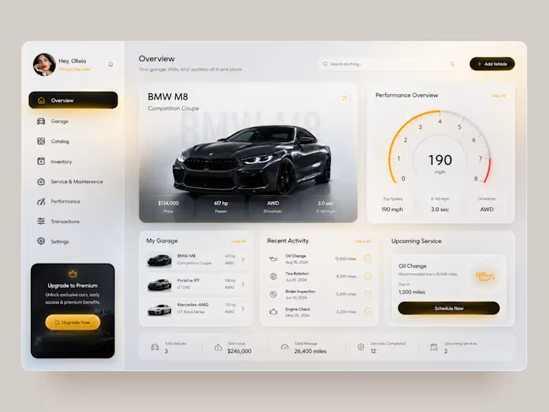
Premium Garage — Automotive Management Dashboard 🚘 A premium automotive dashboard concept designed to bring vehicle management, performance data, maintenance, and garage activity into one connected digital experience. The goal was to combine a luxury automotive aesthetic with a data-rich interface that still feels clean and easy to navigate. The concept explores both light and dark modes, using warm gold accents, spacious layouts, and strong vehicle imagery to create a premium feel. Special attention was given to: • a clear dashboard hierarchy that keeps the vehicle and its key data at the center; • performance insights including top speed, acceleration, drivetrain, and power 📊; • a structured garage experience for managing multiple vehicles; • maintenance tracking with recent activity and upcoming service information 🔧; • quick access to Garage, Catalog, Inventory, Performance, Transactions, and Settings; • premium membership and upgrade touchpoints integrated naturally into the interface; • light and dark themes that maintain the same visual hierarchy and premium character 🌗; • mobile layouts redesigned around vehicle cards rather than simply shrinking the desktop dashboard; • compact filters and bottom navigation for faster mobile interaction 📱; • a consistent gold accent system used for active states, CTAs, performance indicators, and key actions. The result is a polished automotive product experience that turns complex vehicle information into a structured, premium, and easy-to-navigate interface. Looking to create an automotive platform, management dashboard, or data-heavy digital product? Let’s turn complex functionality into an experience users actually enjoy using 🚀
8
22
765
11
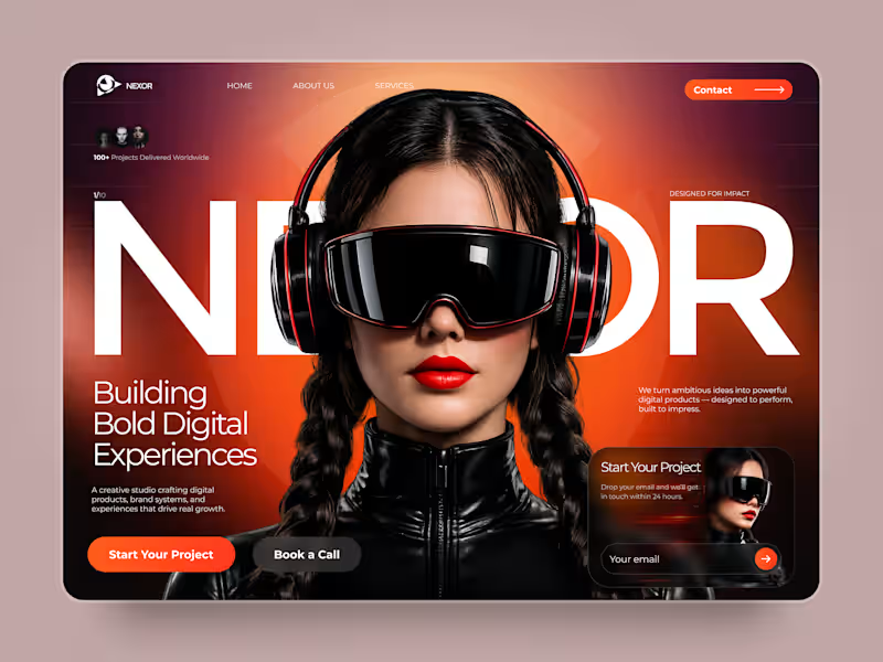
NEXOR — Creative Digital Agency Website 🔥 NEXOR is a futuristic website concept for a creative digital studio focused on digital products, brand systems, and bold digital experiences. The goal was to create a memorable first impression while keeping the agency’s services and next steps clear. Special attention was given to: • a bold hero composition with oversized typography and futuristic imagery; • a vibrant orange and black palette that creates a distinctive visual identity 🟠; • a strong visual hierarchy that balances creative expression with usability; • clear CTAs for starting a project or booking a call; • a contact form integrated directly into the hero section; • responsive mobile layouts that preserve the visual impact 📱; • a full-screen mobile menu with intuitive navigation and prominent contact options. The result is an expressive digital experience that combines bold visual storytelling with a clear path to conversion. Looking to create a distinctive website for your creative agency, digital studio, or technology brand? Let’s build something extraordinary together ⚡
6
11
161
14
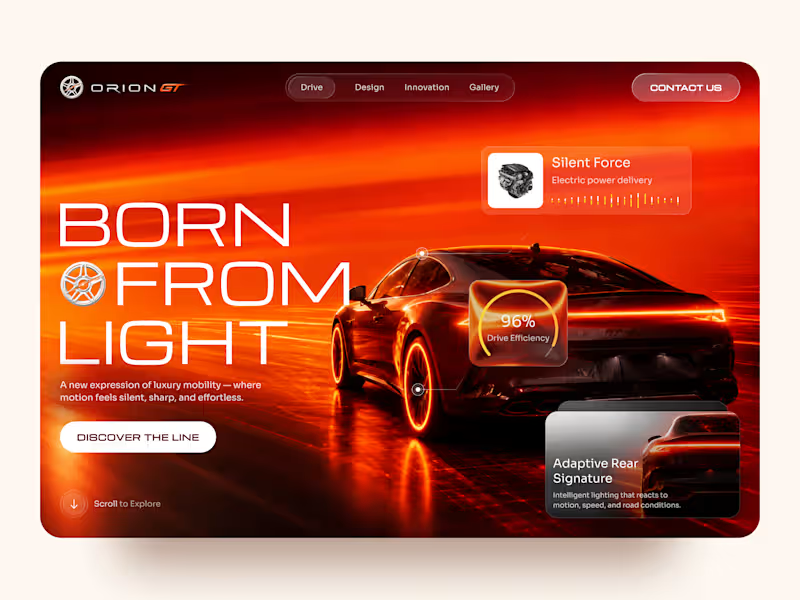
Orion GT — Luxury Automotive Landing Page 🏎️🔥 Orion GT is a landing page concept for a premium performance car brand, built around speed, innovation, and a cinematic digital experience. The goal was to make the vehicle feel like more than a product — creating an immersive introduction where lighting, motion, typography, and interface details reinforce the feeling of performance and exclusivity. Special attention was given to: • a cinematic hero composition that makes the vehicle the main visual focus; • a high-energy red and orange palette inspired by speed, heat, and light 🔥; • oversized typography that strengthens the premium, futuristic character; • floating performance UI elements that communicate features without interrupting the visual experience; • glass-style interface cards for drive efficiency, electric power delivery, and adaptive lighting; • a clear “Discover the Line” CTA integrated into the storytelling; • responsive mobile layouts that preserve the atmosphere while simplifying the composition 📱; • a minimal mobile navigation designed to keep the experience focused and immersive. The result is a bold automotive experience that combines luxury presentation with a technology-driven interface — turning the landing page into part of the product experience itself. Looking to create a premium website for your automotive, mobility, or technology brand? Let’s build something that feels as powerful as the product. ⚡
9
14
306
14
ENDURX — Smartwatch & Fitness Tech Landing Page ⌚🔥 ENDURX is a landing page concept for a performance-focused smartwatch built around endurance, health tracking, and active everyday lifestyles. The goal was to make the product feel powerful and energetic from the first screen while keeping the experience premium and product-focused. A bold orange palette, oversized typography, and a large smartwatch visual create a strong sense of movement and performance. Special attention was given to: • a product-first hero composition that makes the smartwatch the main visual focus ⌚; • oversized “ENDURANCE” typography to communicate strength and performance; • an intense orange gradient that gives the brand a distinctive, energetic identity 🟠; • supporting product details around health metrics, activity tracking, battery life, and comfort; • a clear “Get Started” CTA positioned close to the main product; • additional product imagery that highlights the strap and all-day comfort; • clean navigation around Features, Health, Reviews, and Contact; • responsive mobile layouts that preserve the visual impact while simplifying the information hierarchy 📱; • a compact mobile menu with social touchpoints and easy access to key sections. The result is a bold digital experience that positions ENDURX as a modern wearable for people who want technology that keeps up with an active lifestyle. Looking to launch a wearable, fitness product, or consumer tech brand? Let’s create a product experience built to perform 🚀
7
14
246
Trellus
(1)
Follow
Message
Rasik Kanzariya
max
Ahmedabad, India
Product Designer from india
Follow
Message
Product Designer from india
2
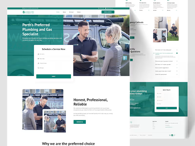
Sureflow — Plumbing & Gas Specialist Landing Page Plumbing is an emergency-adjacent industry — half the people landing on this site have water actively going somewhere it shouldn't. So Sureflow's design had to do two things at once: feel calm and professional for someone comparing quotes, and get someone in a genuine emergency to the phone number in under five seconds. The hero photo does a lot of the "professional" work on its own — two real people, a branded van, a tablet mid-conversation — while the "Schedule a Service Now" form sits as a clean white card cut directly into the teal hero, immediately actionable without needing a scroll. Google star ratings appear early too, right below the fold, four separate short reviews rather than one long testimonial, because for a trade business, volume of proof reads more convincing than a single polished quote. The water-drop shape from the logo becomes a running visual motif — it wraps around team photos as a soft background shape, sits behind the "Contact us for upfront pricing" banner, reappears at the free-safety-check section — small thing, but it ties a fairly text-heavy, section-heavy page back to the brand every time the eye lands on a new block. The six-service grid (Safety Checks, Taps & Sink Installation, Hot Water & Gas Servicing, Appliance Installs) uses real on-the-job photos instead of icons, because a homeowner deciding whether to book wants to see the actual work, not an abstract pictogram. Two small sections do real conversion work: a 3-step "Locate → Identify → Remove" breakdown that turns "we fix blocked drains" into something that sounds like an actual method, not a vague promise, and an "Emergency Callouts" block that's deliberately more urgent in tone — burst pipes, blocked toilets, gas leaks — set apart from the calmer sections around it. Thanks for scrolling through this one 🙌
2
58
1
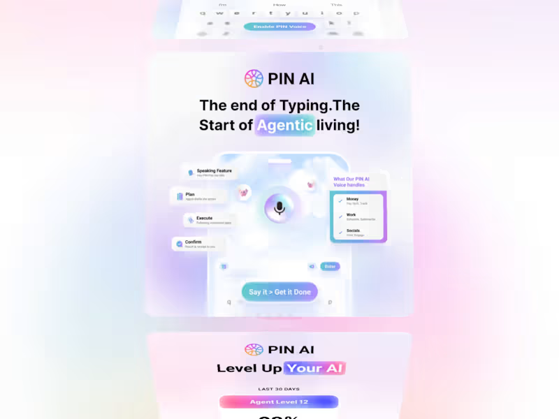
PIN AI — Social Media Creatives for a Web3 AI App
1
5
1
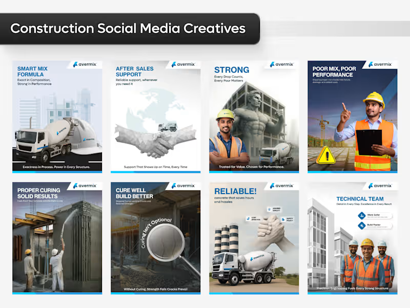
Designing Strength for 🚀
1
256
1
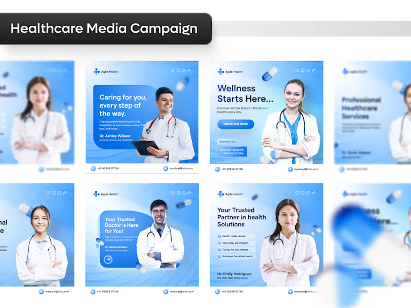
Healthcare Social Media Campaign Design
1
161
Trellus
(1)
Follow
Message
514 Digital
Houston, USA
Brand & Digital Studio
29
Followers
Follow
Message
Brand & Digital Studio
5
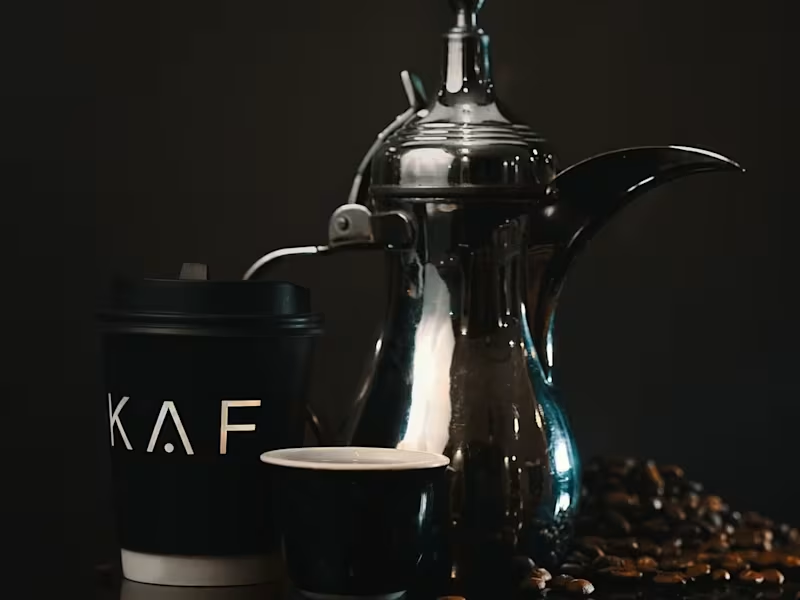
KAF COFFEE Branding! Thoughts? For reference KAF Coffee is a luxury middle eastern coffee place present in UAE, Saudi Arabia, Pakistan etc.
4
5
611
19
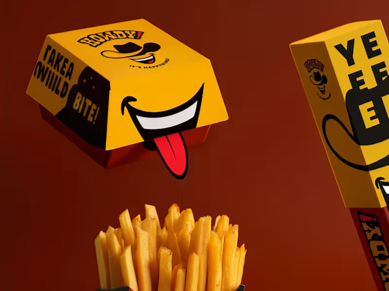
Excited to reveal complete rebranding for Howdy. This included redesigning the logo, all packaging, the menu, uniforms and outlets.
12
19
2.2K
6
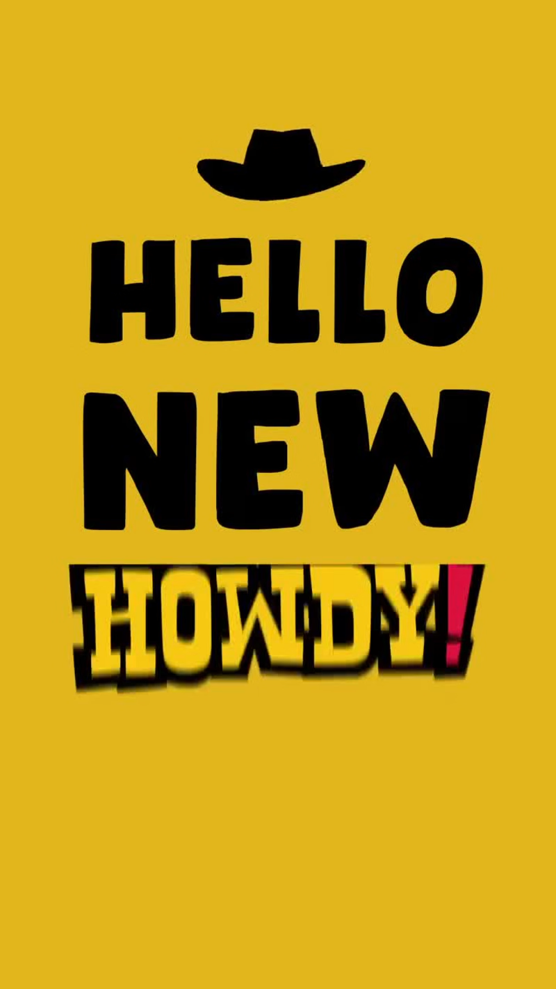
514 Digital's Brand video Production for Howdy, What do you guys think?
2
6
2.2K
0
Our Merch Design for Howdy! This included menu's, uniforms and complete brand package.
0
1.7K
Trellus
(1)
Follow
Message
Enisa Dzafic
Zenica, Bosnia and Herzegovina
Graphic & Brand Designer | Logos, Packaging & Marketing
New to Contra
Follow
Message
Graphic & Brand Designer | Logos, Packaging & Marketing
1
I turn ideas into visually engaging digital art. Each video combines creativity, design, and attention to detail to create something unique and memorable. My goal is to transform simple concepts into visuals that tell a story.
1
59
0
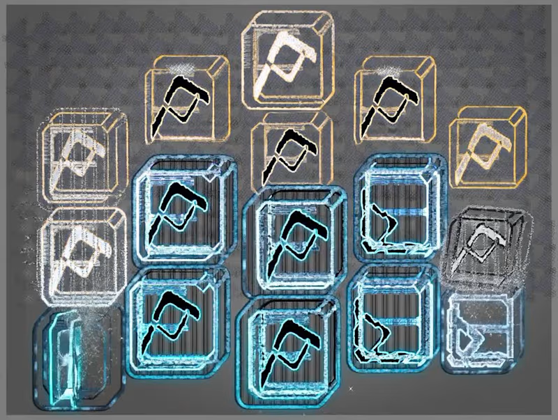
✨ Turning an idea into a new visual concept with AI. I took the original cube design and reimagined it using Grok, experimenting with shapes, details, colors, and visual composition to create a completely different look. What I love about AI in creative work is that it doesn’t replace the designer’s imagination — it gives us another way to explore it. The final result comes from combining an initial idea, creative direction, experimentation, and AI-assisted design. This project was a fun exploration of how a simple geometric concept can be transformed into something fresh and visually engaging. 🎨 Created and creatively directed by me, with AI assistance using Grok. #AIArt #AIDesign #CreativeDesign #DigitalArt #GrokAI #AIArtistry #VisualDesign #CreativeProcess
0
27
1
Flyer & Brochure Design A collection of modern flyer and brochure designs created to communicate information with clarity while maintaining a strong visual identity. This project focuses on clean layouts, balanced typography, and thoughtful composition, ensuring that every page is both engaging and easy to navigate.
1
171
0
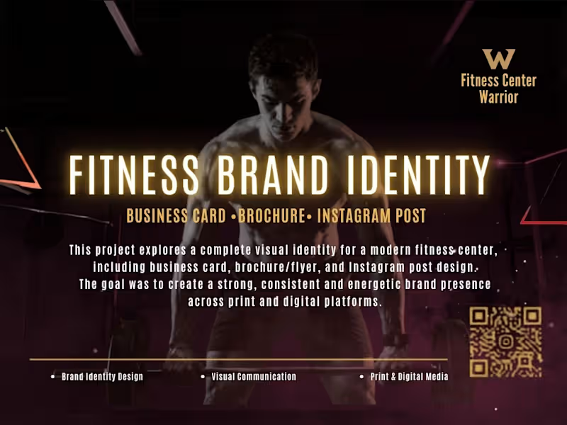
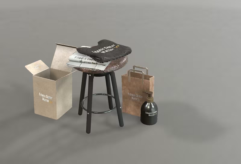
Warrior Fitness – Merchandise & Packaging Design A premium merchandise and packaging collection created for the Warrior Fitness brand, designed to deliver a consistent and recognizable brand experience across physical touchpoints. This project includes branded fitness towels, retail packaging, shopping bags, and promotional products, all developed with a clean, modern, and performance-driven aesthetic. The focus was on creating a cohesive visual identity that reflects the brand's strength, professionalism, and attention to detail. Realistic 3D mockups were used to demonstrate how the branding translates into real-world applications, ensuring a polished and engaging presentation. Adobe Illustrator, Adobe Photoshop, Blender, Adobe Dimension
0
236
Trellus
(1)
Follow
Message
Miss Chatz
Miami, USA
🎖Creative Illustrator 💋Storyboard Artist ✨Envato Author
9
Followers
Follow
Message
🎖Creative Illustrator 💋Storyboard Artist ✨Envato Author
1
Book Cover Designs for Zero1 Education
1
6
2
Best digital painting and image editing tools — with AI picks https://elements.envato.com/learn/best-digital-painting-and-image-editing-tools
2
49
3
🚀 Just published on Envato: Tips for replacing images with Photoshop and AI tools (2026 guide) (https://elements.envato.com/learn/replacing-images-with-photoshop-and-ai-tools)! Learn how to master Generative Fill, write prompts that actually work, and fix lighting or seam issues like a pro—whether you're working in Photoshop or using fast browser-based tools. 👉 Read the full guide here (https://elements.envato.com/learn/replacing-images-with-photoshop-and-ai-tools) to level up your image editing workflow!
3
80
4
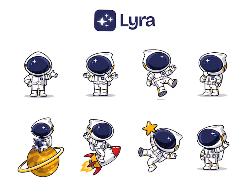
Lyra Character Design & Logo
1
4
143
Trellus
(1)
Follow
Message
Explore people