The network for creativity
Join 1.25M professional creatives like you
Connect with clients, get discovered, and run your business 100% commission-free
Creatives on Contra have earned over $150M and we are just getting started
Back to feedPost

✨ Turning an idea into a new visual concept with AI.
I took the original cube design and reimagined it using Grok, experimenting with shapes, details, colors, and visual composition to create a completely different look.
What I love about AI in creative work is that it doesn’t replace the designer’s imagination — it gives us another way to explore it. The final result comes from combining an initial idea, creative direction, experimentation, and AI-assisted design.
This project was a fun exploration of how a simple geometric concept can be transformed into something fresh and visually engaging.
🎨 Created and creatively directed by me, with AI assistance using Grok.
#AIArt #AIDesign #CreativeDesign #DigitalArt #GrokAI #AIArtistry #VisualDesign #CreativeProcess

The network for creativity
Join 1.25M professional creatives like you
Connect with clients, get discovered, and run your business 100% commission-free
Creatives on Contra have earned over $150M and we are just getting started




Related posts

Brand Identity delivered by paper.


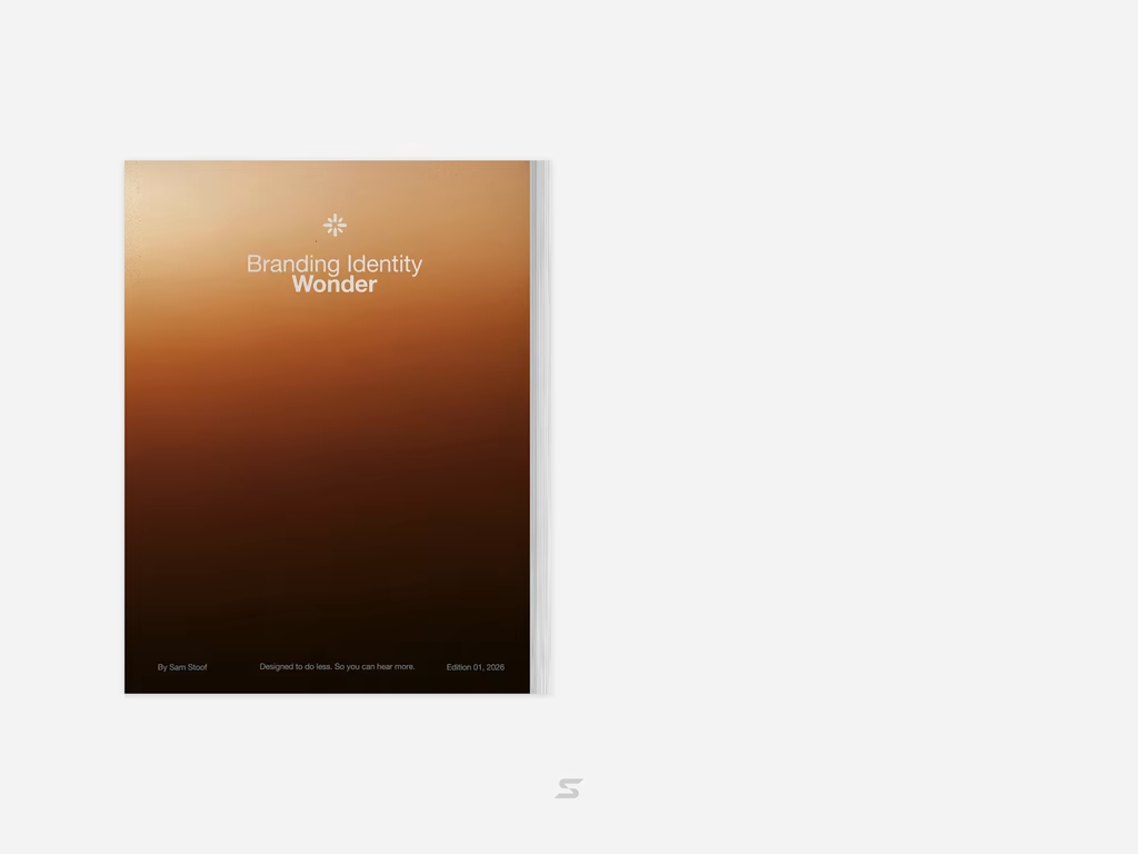

Love it🙌

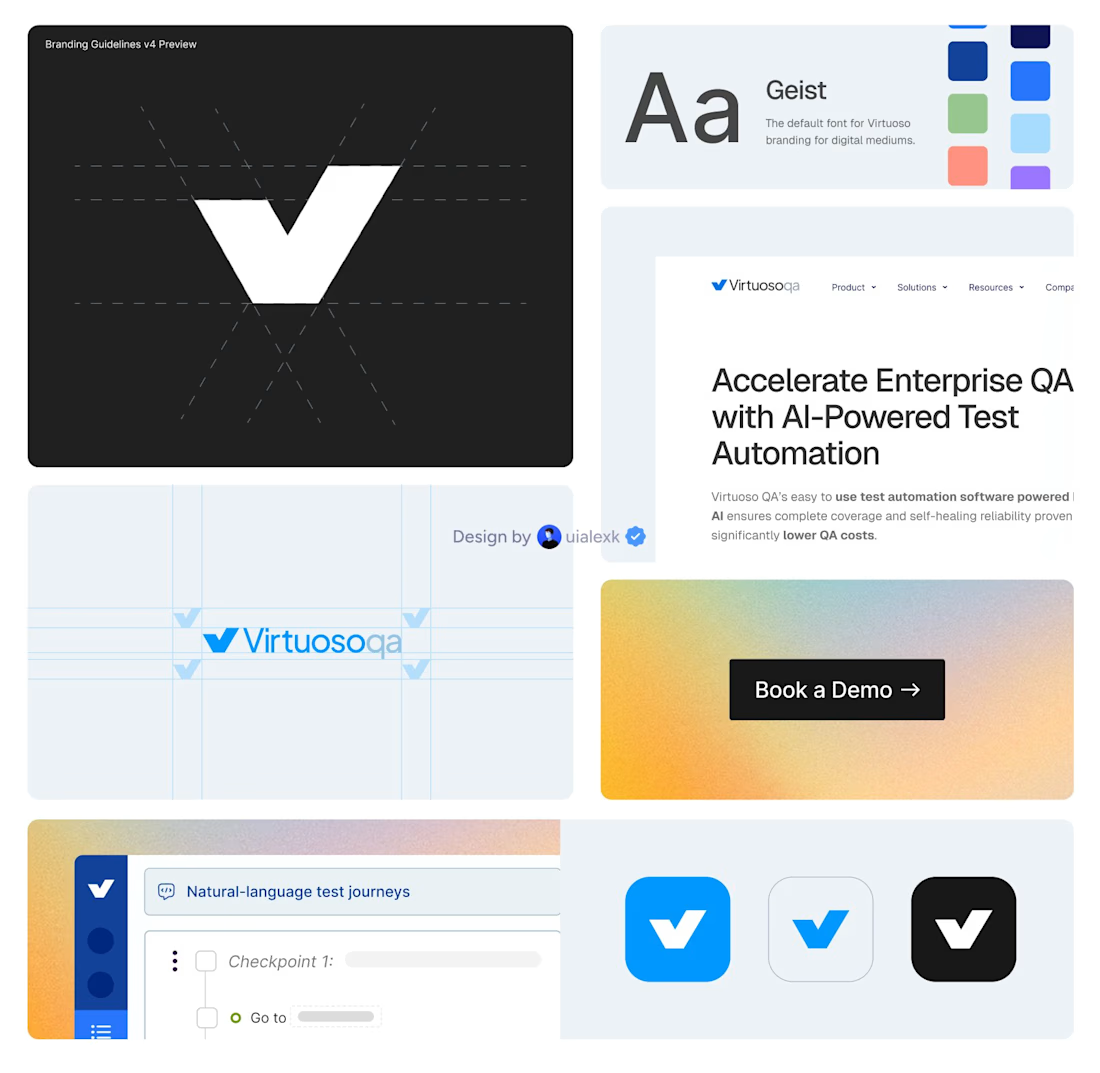
I just finalised a brand evolution and website migration for Virtuoso.
500+ CMS items and 150+ static pages moved from Webflow to Framer.
Alongside that, I helped shape the brand across web, campaigns, product and motion.
The impact:
• Helped shift 80% outbound to 80% inbound
• Built a clearer and more consistent brand presence
• Made a complex AI product easier to understand, trust and buy
I’ve been working with Virtuoso as their design partner on a monthly retainer, helping the brand evolve as the company grows.


500+ CMS items is not a small migration, that's the kind of project that eats weeks just in QA. What almost went wrong during the Webflow to Framer move?

For Sienna Rhodes, I designed the homepage around one idea: the portfolio should come first.
Photography clients usually want to know one thing before they read about your process, your packages, or even who you are: Do I connect with your work?
So instead of opening with a traditional introduction, the homepage leads directly into the portfolio and lets the imagery make the first impression. The supporting copy and details come later, once the work has already created that initial connection.
I’m curious where other designers and photographers land on this. Do you prefer a portfolio-first homepage, or do you think the photographer’s story should come first?


Portfolio first, every time for photography. Nobody hires off a process paragraph, they hire because one image stopped them scrolling. The story matters, but it lands harder after the work has already made the case. That start here slider does the pitch by itself.