The network for creativity
Join 1.25M professional creatives like you
Connect with clients, get discovered, and run your business 100% commission-free
Creatives on Contra have earned over $150M and we are just getting started
Back to feedPost


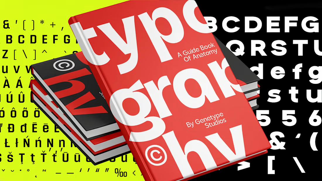
Tired of the same generic logo fonts? 🥱
I’ve just rounded up the 13 best sans-serif fonts for branding in 2027 over on Envato, broken down by geometric precision, grotesque authority, and humanist warmth (plus licensing and pairing tips!).
👉 Check out the full guide to find the right typographic fit for your next brand identity project! https://elements.envato.com/learn/best-sans-serif-fonts-for-branding

The network for creativity
Join 1.25M professional creatives like you
Connect with clients, get discovered, and run your business 100% commission-free
Creatives on Contra have earned over $150M and we are just getting started



Related posts

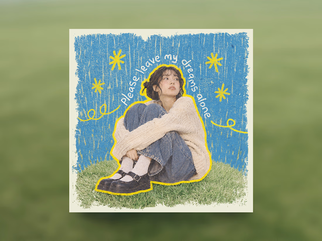
Some people think having text on an album cover is tacky.
But I think it really comes down to how the typography is incorporated.
There's a difference between simply placing text on an image and making it an integral part of the artwork.
So I decided to explore this idea by designing a fictional album cover of my own.
For this concept, I used playful colors, handwritten text and hand-drawn elements to capture the album's imaginative and whimsical personality.
Rather than treating the title as a separate element, I wanted it to feel like a natural part of the overall design.
What do you think?

Treating the handwritten title as part of the artwork rather than a label on top is the right call. Email designers fight the same battle with hero images: text baked into the picture looks great until an inbox blocks images. Which came first for you, the lettering or the collage?

🚀 Just completed the UX/UI design and website redesign for Spartan SEM!
The goal was to bring their refreshed brand identity to life with a modern, conversion-focused website and a better user experience.
Really enjoyed working with the team and seeing the design go live!


This is amazing

The variable font setting in the newly released Geist Serif VF is something else!
● ▲ 🖤 ◼️

So the ● ▲ 🖤 ◼️ is the dot on the i changing with the Element Shape axis. Clever. Have you tried animating that axis on hover in Framer? A dot turning into a heart on a like button would be a nice use of it.