
Khubaeb Chaudhary
AI, design & strategy for premium digital products
New to Contra
Khubaeb is ready for their next project!

A quick look at a pitch deck design I recently wrapped up.
For this one, the focus was all about creating a premium, tech-forward vibe. I used deep gradients and bold typography to give it a modern edge while keeping the layout clean and easy to read.
You can check out the cover style below.
If you have a presentation that needs a visual refresh, let’s connect!
1
27
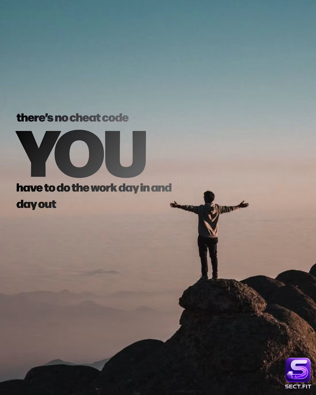
This carousel focuses on personal responsibility and the idea that real change can’t be outsourced. The concept was to break down different aspects of fitness training, nutrition, and discipline. Into simple, relatable visuals that reinforce the message. I kept the layouts minimal with strong typography so the message stays front and center, while the imagery adds emotion and context. The overall direction is calm, clear, and intentional, making the message feel more personal and grounded.
0
30
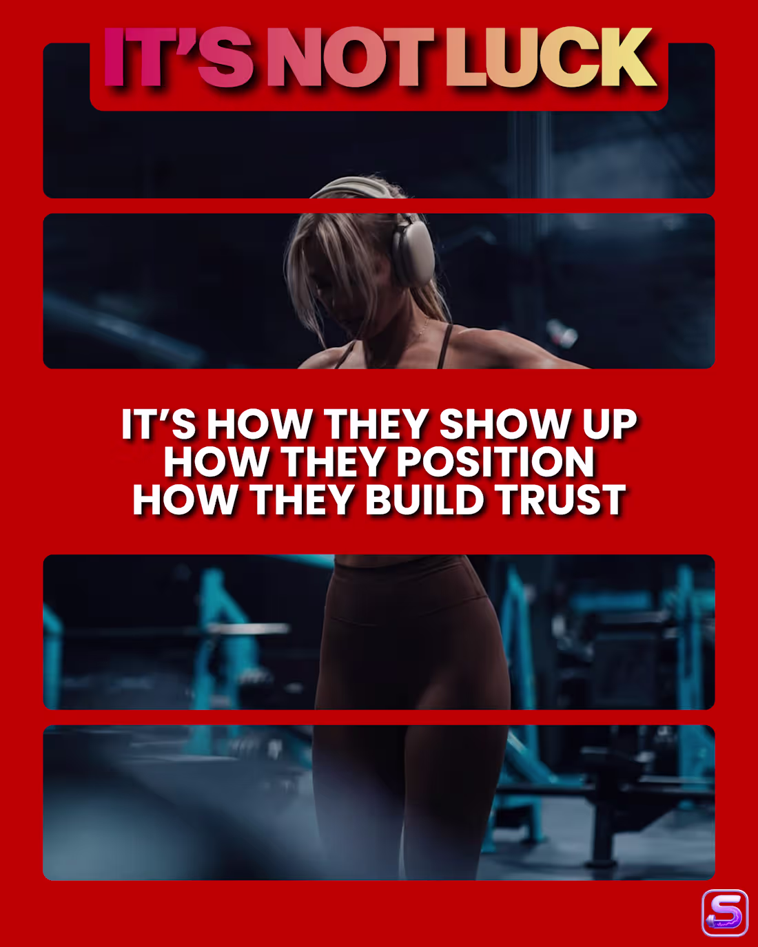
This carousel was designed to challenge the idea that consistency alone is enough. The goal was to highlight the gap between effort and actual growth, and shift the focus toward strategy and positioning. I used bold typography, strong color contrast, and segmented visuals to keep each slide engaging while maintaining a clear narrative flow. The overall direction keeps it sharp, direct, and easy to follow-ending with a strong, conversion-focused message.
0
35
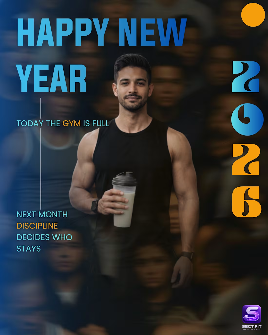
This post plays on the contrast between short-term motivation and long-term discipline. The idea was to capture a relatable New Year moment and turn it into a strong, thought-provoking message. I used motion blur in the background to represent the crowd and hype, while keeping the subject sharp to symbolize focus and consistency. The layout and color contrast help guide the viewer through the message while keeping the overall look bold and modern.
0
52
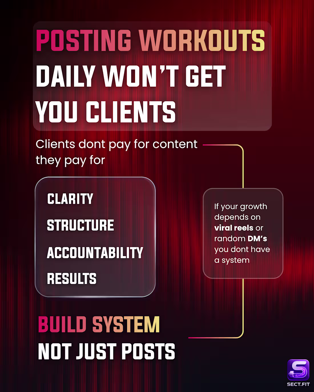
This post was designed to shift the mindset from just posting content to building a system that actually converts. The goal was to make a bold, scroll-stopping statement while keeping the message clear and actionable. I used strong typography, high contrast, and a structured layout to guide the viewer from problem → insight → solution. The overall visual style keeps it modern and premium while making the message easy to absorb at a glance.
0
57