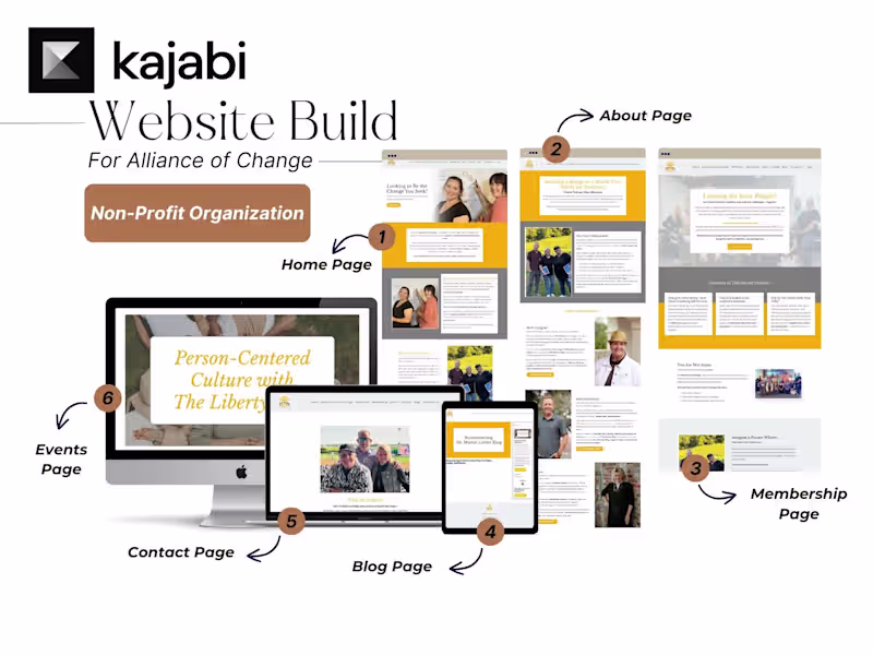
Strategic Kajabi Builds That Sell, Not Just Look Good.
Strategic Kajabi Builds That Sell, Not Just Look Good.
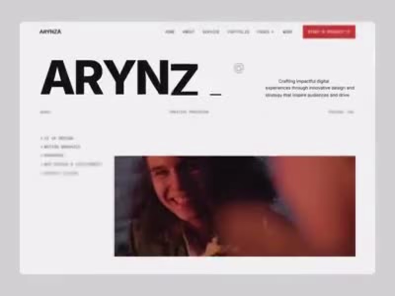
UX-led product design & dev agency for b2b saas and AI
UX-led product design & dev agency for b2b saas and AI

Graphic Designer | Social Media Designer | LinkedIn Branding
- 1x
- Hired
- 5.0
- Rating
- 66
- Followers
Graphic Designer | Social Media Designer | LinkedIn Branding

FullStack Expert WordPress| Shopify Webflow| HubSpot| Framer
- $25k+
- Earned
- 13x
- Hired
- 5.0
- Rating
- 38
- Followers
FullStack Expert WordPress| Shopify Webflow| HubSpot| Framer

Conversion-Focused Website Design. Built to Scale.
- 1x
- Hired
- 5.0
- Rating
- 9
- Followers
Conversion-Focused Website Design. Built to Scale.
E-commerce Designer | Klaviyo & Replo Specialist | Framer
- 5.0
- Rating
- 22
- Followers
E-commerce Designer | Klaviyo & Replo Specialist | Framer
Full-Stack Dev Team: React, Django, Node & More
Graphic Designer | Logo Designer | Creative Designer