Built with Kajabi
Kajabi Membership Sales Page Design for Coaches
Sneha Hiremath
Verified
Kajabi Membership Sales Page Design for Coaches
The Brief
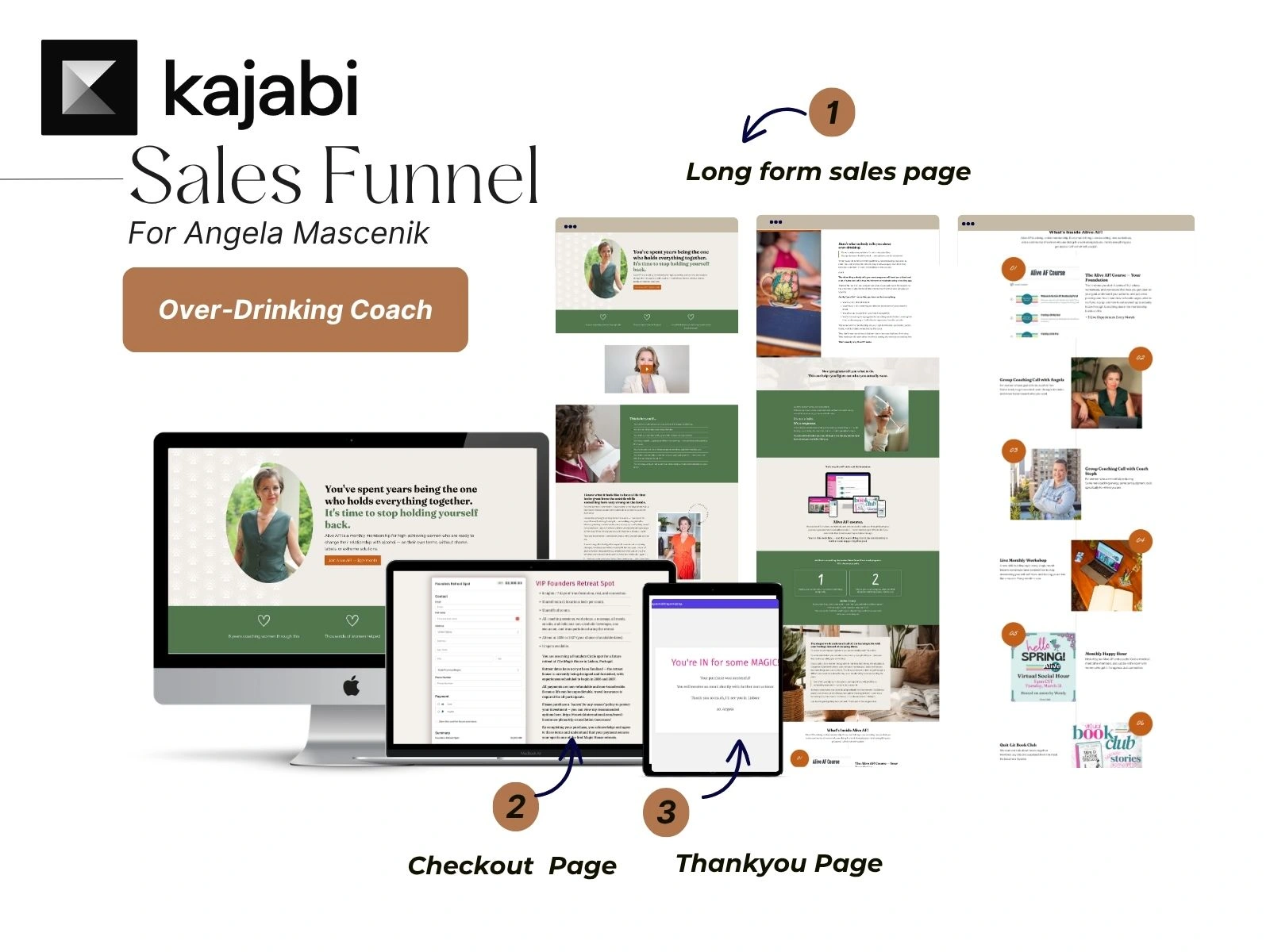
Angela is a certified alcohol-free life coach. She has spent eight years helping women change their relationship with alcohol — without shame, rules, or the all-or-nothing pressure most programmes put on you.
Her membership, Alive AF!, is for high-achieving women who want out of the cycle but don't relate to traditional recovery programmes. It's a specific audience. And it needed a page that understood that.
Angela had already worked with me before. This was her second project. She came back knowing what to expect — and this time she also brought a fresh brand identity she wanted the page to reflect.
My job: understand exactly what she was going for, and build it.
How I Approach Every Kajabi Sales Page Project
Before I open Kajabi, I need to understand two things.
Who you're talking to — and who you are.
That means understanding your audience beyond the surface. Not just who they are, but where they are in their decision. What they've already tried. What made them hesitant before. What needs to be true on the page for them to say yes.
And it means understanding you. Your brand, your tone, your goals for this page. If you have an existing page, I look at that too — what's working, what isn't, what the page is doing that it shouldn't be.
Only then does the design begin.
That's why Angela had zero revisions. By the time I opened Kajabi, I already knew exactly what the page needed to do.
How I Designed and Built
Full Kajabi sales page — designed, built, and published
New brand identity translated into the page — typography, colour, visual tone
Section order built around how the reader moves through the decision, not a features list
Social proof placed at the moments in the scroll where it does the most work
Multiple CTAs — each positioned based on where the reader is emotionally on the page
Mobile layout reviewed and adjusted across breakpoints
Want to understand the thinking behind how a membership sales page is structured? I've written about it here:
6 Must-Have Sections for a High-Converting Membership Sales Page — the framework behind every membership page I build.
Course Sales Pages vs. Membership Sales Pages: Key Differences — why a membership page needs its own design logic.
Questions Coaches Ask About Kajabi Sales Page Design
What does a Kajabi membership sales page designer actually do?
I design and build the full page inside your Kajabi account. That includes the layout, the section structure, the visual design, where the CTAs go, and how it looks on mobile. The goal is a page that feels like your brand and is set up to convert.
Do I need copy ready before we start?
Ideally, yes. Copy should come before design — not the other way around. If you don't have copy yet, I have a membership sales page framework that shows you exactly what to write in each section. You use the framework to write your copy, and if you need additional support beyond that I am happy to help.
What kind of coaches do you design Kajabi sales pages for?
I work with coaches, consultants, and course creators globally who are selling memberships and programmes on Kajabi. I have particular experience designing pages for US-based coaching brands where the audience is specific and the messaging needs to do careful work.
How long does a Kajabi sales page project take?
Usually 1–3 weeks, depending on how complex the page is and how quickly assets and feedback come through.
What actually makes a membership sales page convert?
The section order matters more than most people think. A page that leads with features before the reader feels understood will underperform — every time. The pages that convert are the ones that mirror the reader's situation first, explain why what they've tried hasn't worked, and then introduce the offer. I've been building this structure into membership pages for nearly a decade.
If you have a Kajabi membership or programme you're ready to launch — or a page that's not converting the way it should — let's talk.
I'll look at what you have, understand what you're building, and tell you honestly what the page needs.
Like this project
Posted Mar 25, 2026
Kajabi membership sales page design for coaches. See how a high-converting Kajabi sales page is designed and built for a women's wellness coaching programme.