3D web designer


AI Video Producer for Brands, Social Media & Filmmakers

AI Video Producer for Brands, Social Media & Filmmakers



Award Winning - No-Code Dev + Web Design: Framer Expert

Award Winning - No-Code Dev + Web Design: Framer Expert

My submission for this challenge is a real product that I am going to drop in my Etsy Store. I love designing Merch, specifically Streetwear so i was so stoked to design this and fully commit to creating a social reel.
I wanted to make it feel real and practical and not feel like AI so I created some mocks and visuals along with keeping the green hues. My goal is to keep it luxury streetwear, old money, editorial film aesthetic. Also Pickleball has been one of my favorite hobbies this past year!
View Project
(https://app.kittl.com/project/cmmpch1qa40630i8dnkn338gv)Kittl is, and has been, my go-to tool for awhile now. It was my secret for Web Design and T-shirt Design for awhile lol but now im glad it's starting to pop off because I feel like it is one of the best all-in-one tools out there.
5
18
681
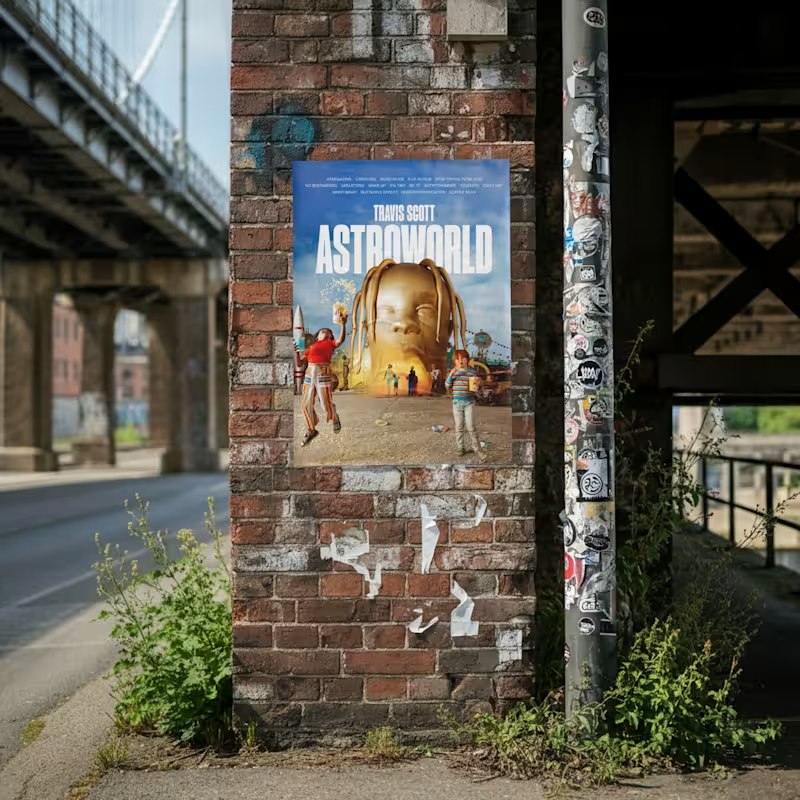
Dropping another product that I am proud of.
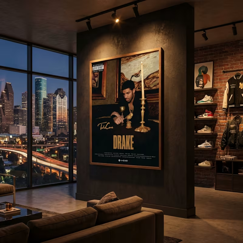
One of my all time favorite albums, top to bottom. Astroworld full art music poster.
https://contra.com/products/4jioA1Jh-astroworld-album-poster-digital-art-print
3
609

So stoked to be invited to this challenge! I couldn't decide if I wanted to submit my favorite Framer Template or T-shirt designs but i decided to craft something cool that I use on a project basis that helps my workflow depending on the need.
If you’ve ever built a project from scratch, you know the real challenge isn’t tools but the direction to go.
✨ I built Astro Mode for the assist and speed up that workflow.
Astro Mode is a digital system that shows how to turn one idea into a full, web-ready brand using AI and Kittl — from logos to patterns to lifestyle imagery — without starting from zero every time.
It’s a clean blend of a prompt pack and repeatable workflow.
Product Link (https://contra.com/products/GKFiLpSY-astro-mode-the-brand-prompt-kit-for-web-design)
2
516

Top-Rated Independent Design. Develop. Deliver Results
Top-Rated Independent Design. Develop. Deliver Results


Strategic Brand Designer for Ambitious Founders
Strategic Brand Designer for Ambitious Founders

Cronuts are my obsession. What do you mean you get to eat a donut AND a croissant at the same time?
For the Kittl x Contra challenge I designed Good & Gone Cronuts, a bold bakery that doesn't do guilt. Just cronuts.
For the product commercial, I focused on what makes cronuts so irresistible: the ooze, the crunch, the layers, that moment when everything spills out.
Sound on, and enjoy.
https://app.kittl.com/project/cmms8ml7jk47t0i90g1ug1daf
7
27
1.9K


Ad Creatives Designer and CAPI specialist

Ad Creatives Designer and CAPI specialist
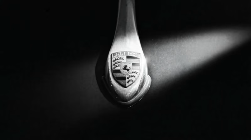
First @Kittl Challenge submission and I was NOT playing it safe. I've worked on a lot of creative projects but this one genuinely got me excited, pairing a 1957 black Porsche 356 Speedster with Jailhouse Rock felt like the most natural thing in the world once I saw it.
Kittl was a huge part of making this look the way it does. The text work, the split panels, the end card, things that would've taken me forever to get right just came together fast.
Genuinely one of the better tools I've used for this kind of cinematic content work.
This is just the beginning.
View Only Link (https://app.kittl.com/project/cmmengichgfp20ib5417whkho)
26
93
3.3K


Brands built from idea to launch, with brains & personality.

Brands built from idea to launch, with brains & personality.

First passion project of 2026, meet LOAFFA;
Your newest obsession when it comes to sleepwear and bedding.
Worth coming home to, and hard to leave in the morning...
4
24
917

Small look at Cinnapop, a gingerbread cookie brand I made for fun... Just in time for the holidays!
5
34
847
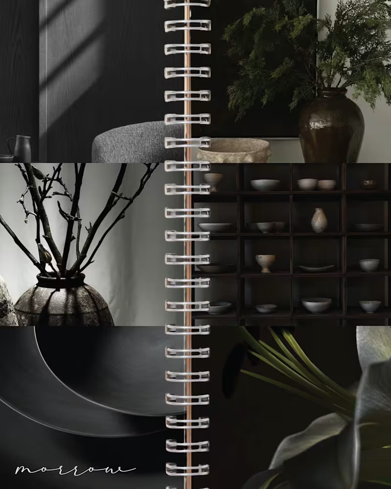
MORROW | Brand Identity & Art Direction
MORROW is a self-directed homeware brand concept built around a slower approach to living. Thoughtful objects, natural materials and a sense of permanence, brought together through a brand designed to feel as considered as the pieces it represents.
The visual direction combines deep greens, warm browns and soft ivory, balancing rustic character with understated luxury. The goal was to create an identity that feels collected rather than overly polished, with a quiet sense of permanence running through every detail.
From the visual identity to the overall art direction, I developed the branding from start to finish, building a cohesive visual world around the idea of slow-made living.
MORROW. Design made to stay.
47
109
4.3K
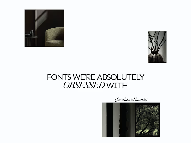
A few editorial typefaces we’re absolutely obsessed with right now.
These are some of the fonts we keep coming back to at Studio Mayze when we want a brand to feel considered, distinctive and a little more editorial without pushing the design too far.
Good type can do a lot of the heavy lifting. The right one can completely change how a brand feels before you’ve even added anything else.
Each slide shows the typeface in use at the top, with the font name underneath, so you can see how it could look in context rather than just as a specimen.
These are three of our favourites at the moment. Want to see the full selection? We’ve shared all of our favourites over on Instagram (https://www.instagram.com/p/Dewd73IkcWw/?img_index=1).
Which one would you pick? 👀
6
21
790


Visual design for authors, coaches & bold creatives
Visual design for authors, coaches & bold creatives

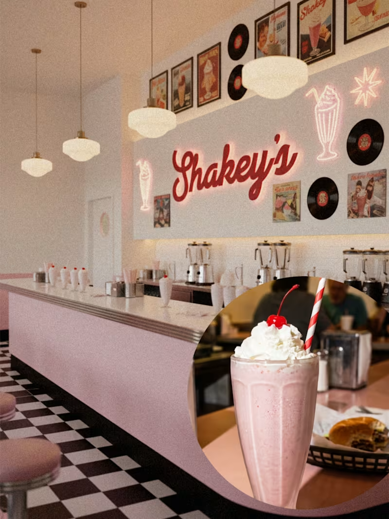
🥤💗 SHAKEY'S
An 80s milkshake bar where the music's too loud, the shakes are stupidly thick, and "extra" isn't optional.
For Brief 147 by @designerbriefs × @kittldesign, I designed the whole brand world for Shakey's—a retro milkshake bar that mixes old-school diner vibes with modern design that actually works.
The vibe:
🍓 Real fruit (not the fake stuff)
🎶 Vinyl records and cassette tape energy
🪩 Bold pinks, cherry reds, creamy neutrals
🥛 Thick shakes with personality
I wanted it to feel playful but not gimmicky. Not costume-y retro. Not trying too hard to be cute. Just the kind of place you walk into for one shake and leave with three photos and zero regrets.
@designerbriefs @kittldesign
2
299