Built with Ideogram
Linéa di Luce — Building a Fashion Brand
Nitin Upadhyay
Linéa di Luce — A Fashion Brand Made From Light
Linéa di Luce started as a small idea, what if a fashion brand could feel like a poem?
something that spoke through light instead of noise.
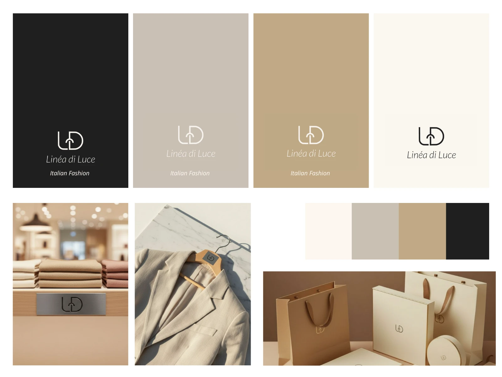
I began with the brand itself. The name means “Line of Light” in Italian and that became our guide for everything we created next. The logo, the colors, the typeface, all were designed to feel calm, timeless, and feminine.
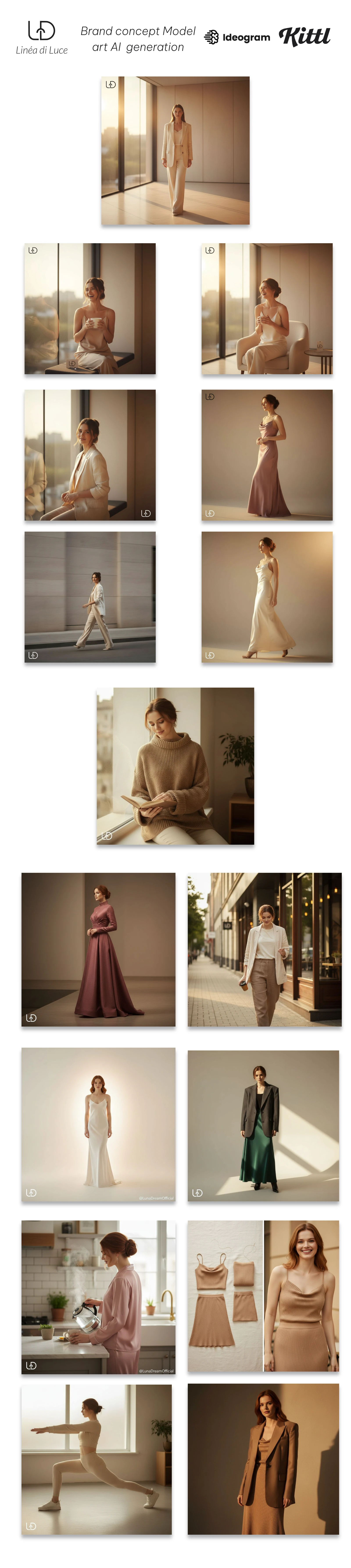
Then came the people behind the clothes. I used Nano Bana style prompts to create model visuals, women who looked real, graceful, and full of quiet strength.
It was important that the images felt honest, not staged.
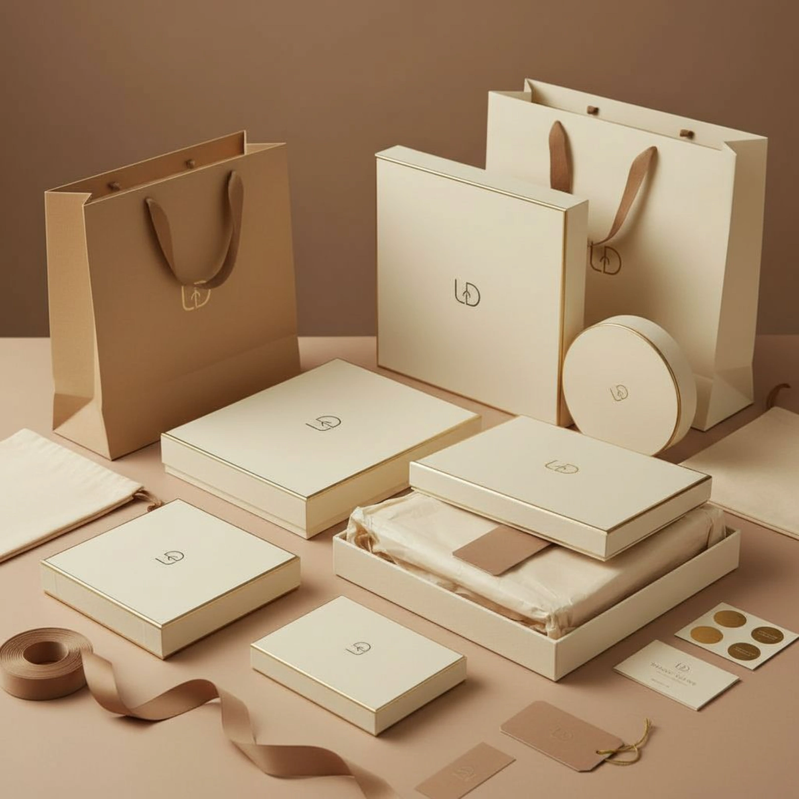
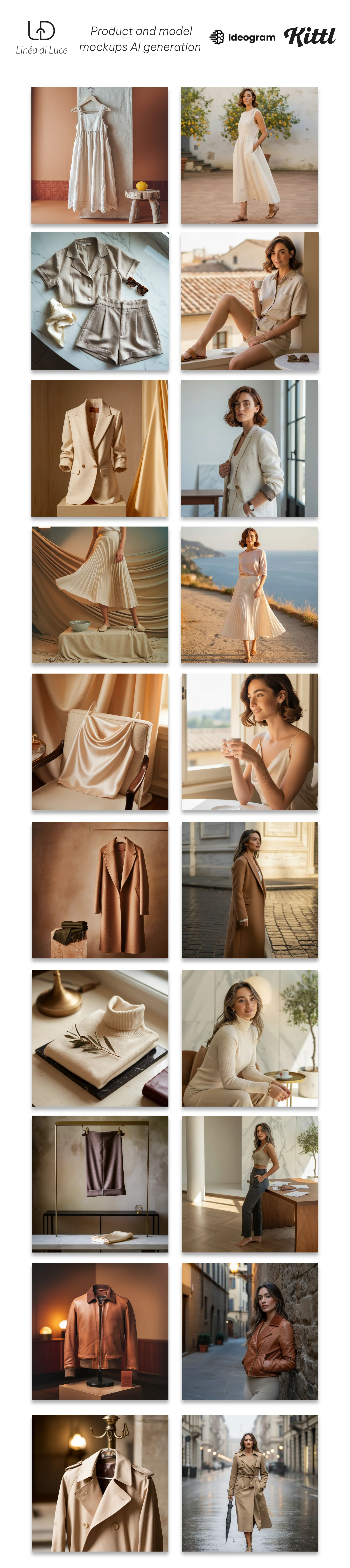
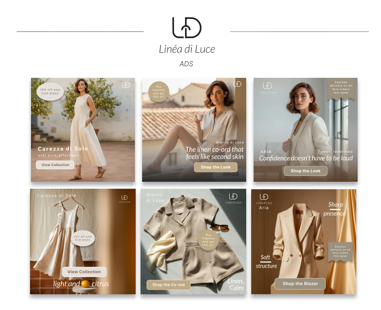
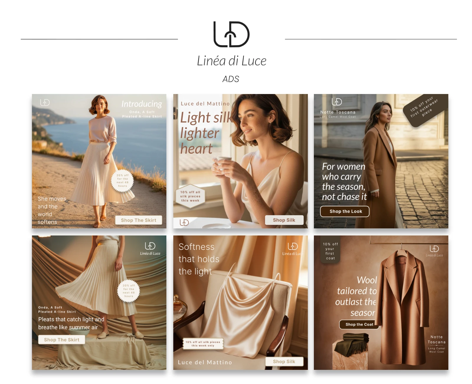
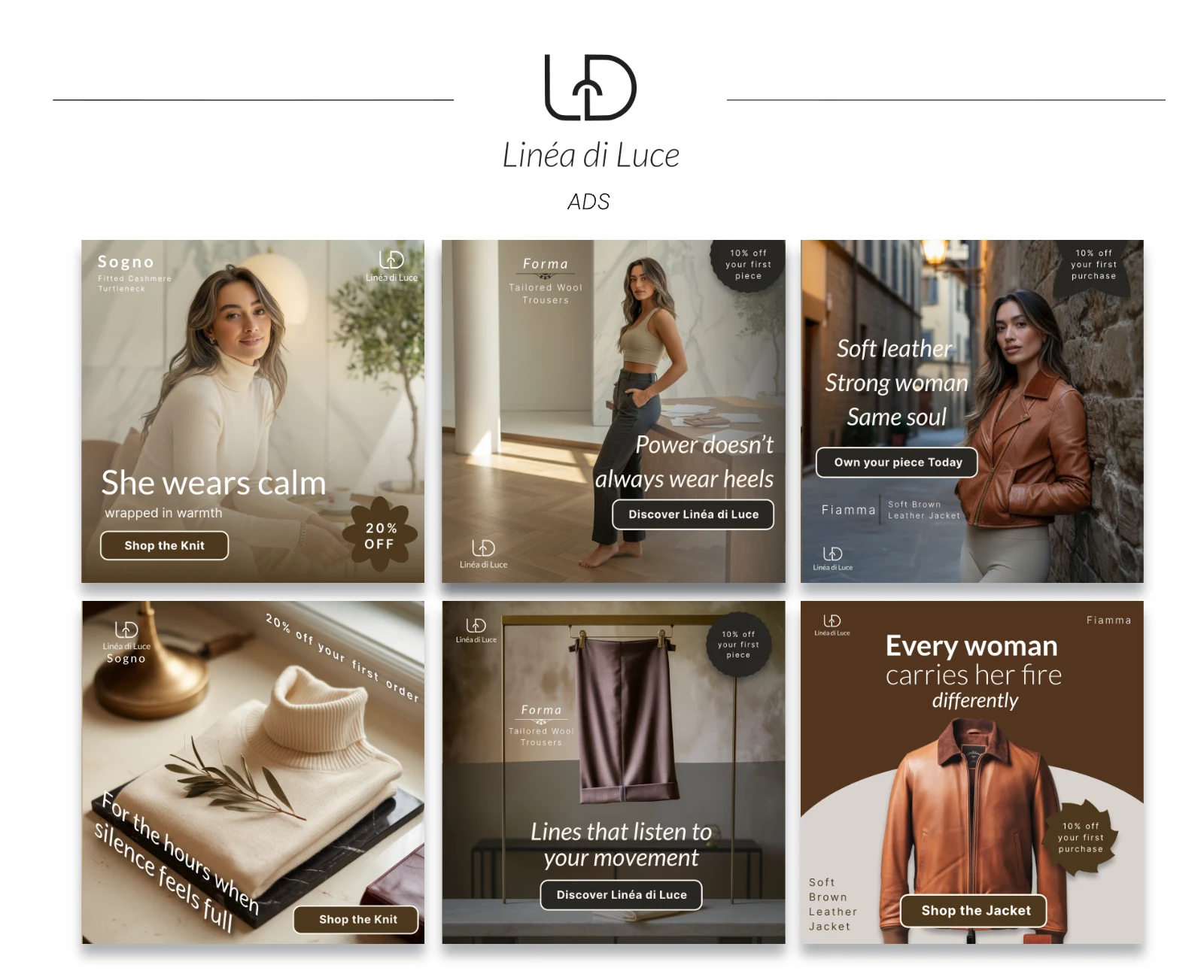
Once the foundation was set, I moved to the products. Using Ideogram, I generated product images that looked like they belonged in a real Italian studio. Coats, jackets, and accessories, all created with care and a consistent mood.
After that, I took everything into Kittl, where I designed the ads. Each ad used the same visuals from Ideogram, simple compositions, soft colors, short emotional lines. Every design was made to feel like a moment, not an advertisement.
Finally, I created a short video ad a soft introduction to the brand and its first collection, using Ideogram for visuals and Veo3 for movement. It captured the feeling I wanted people to experience, light, elegance, and a sense of calm.
Like this project
Posted Oct 28, 2025
Brand built through design, AI, and storytelling. Logo to product and model mockups to ads and video.