Built with Kittl
Iron Tide Brewing Co. — Coffee on Tap Branding
Gureesha Singh
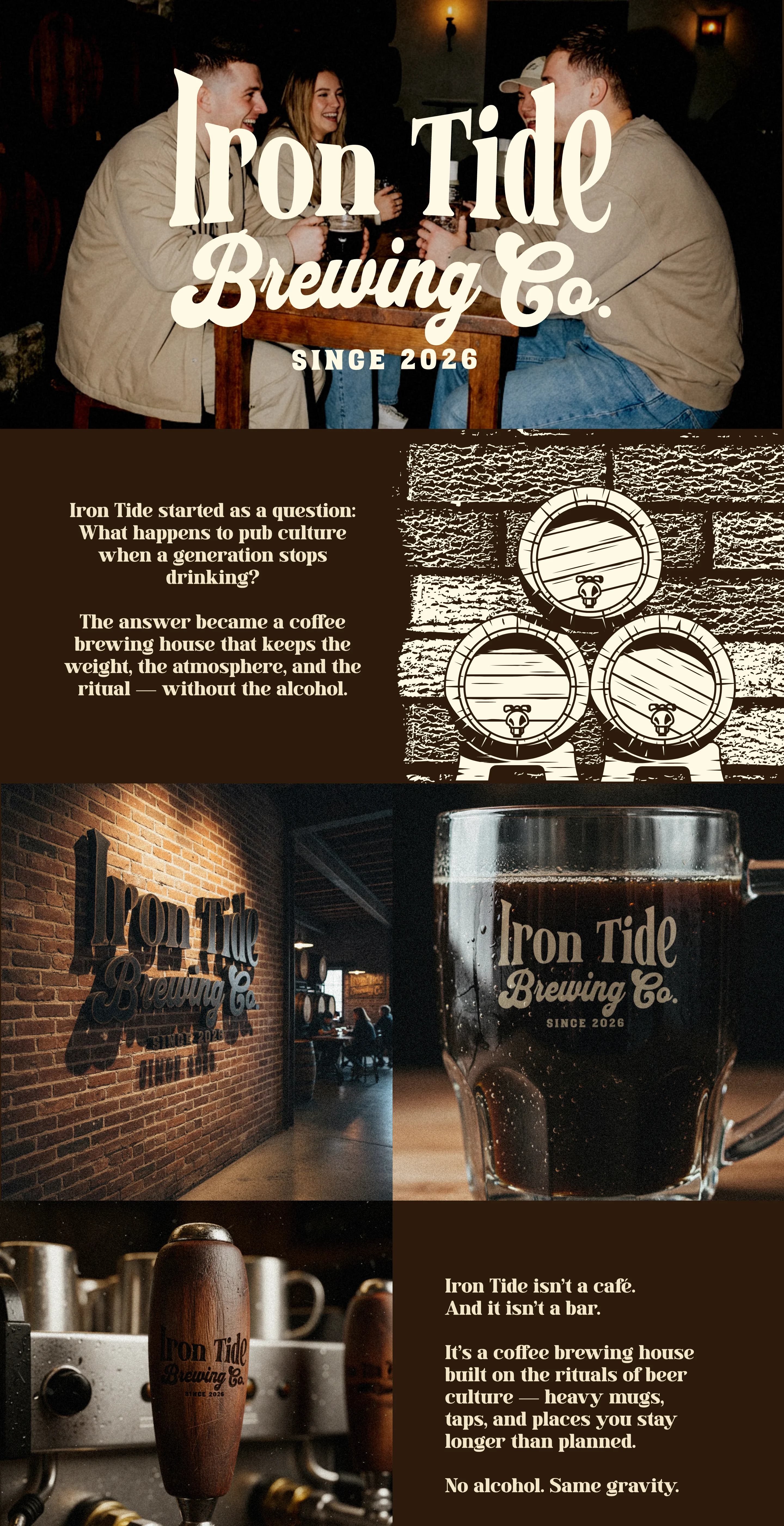
Iron Tide Brewing Co. — Coffee on Tap
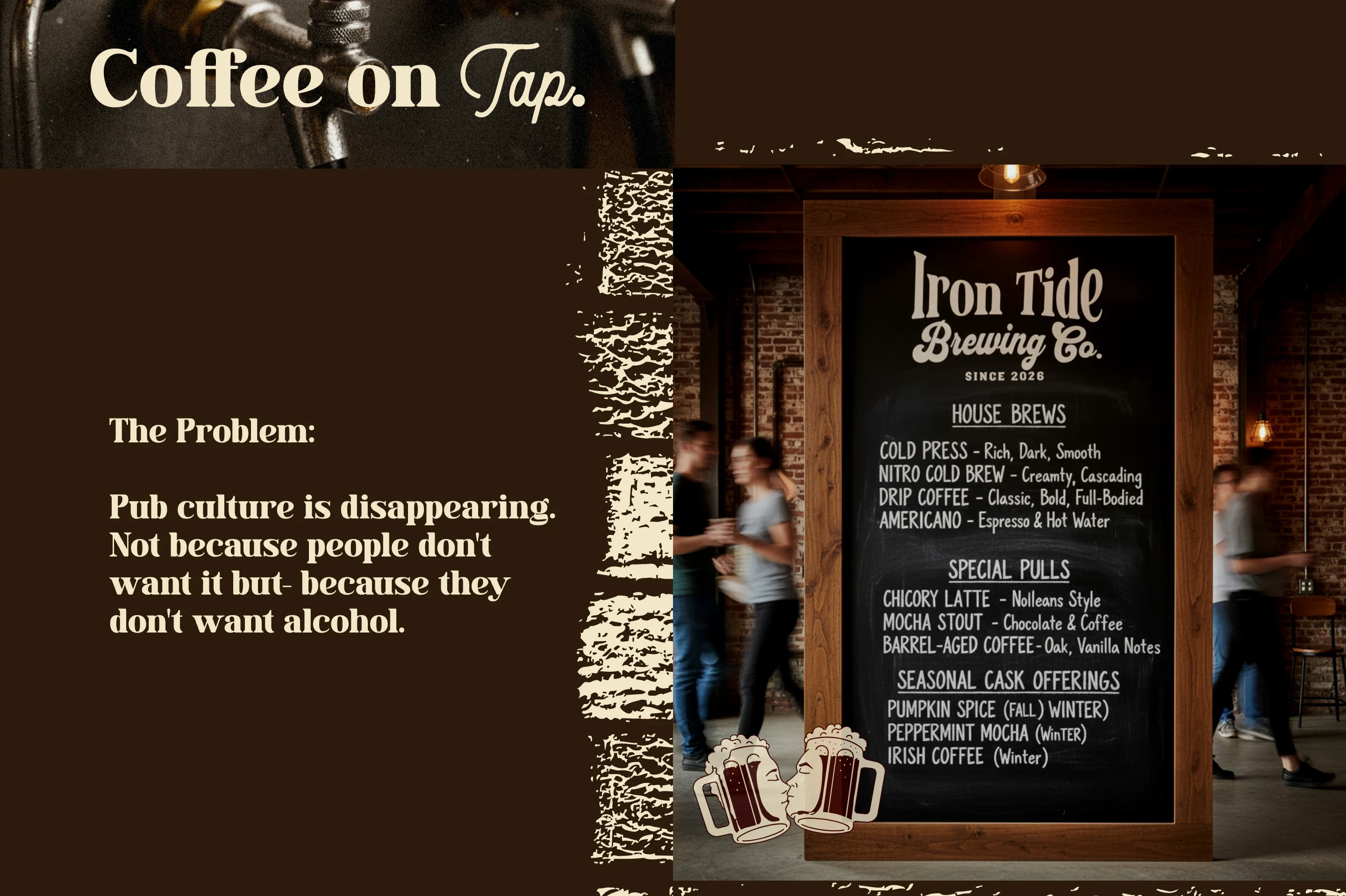
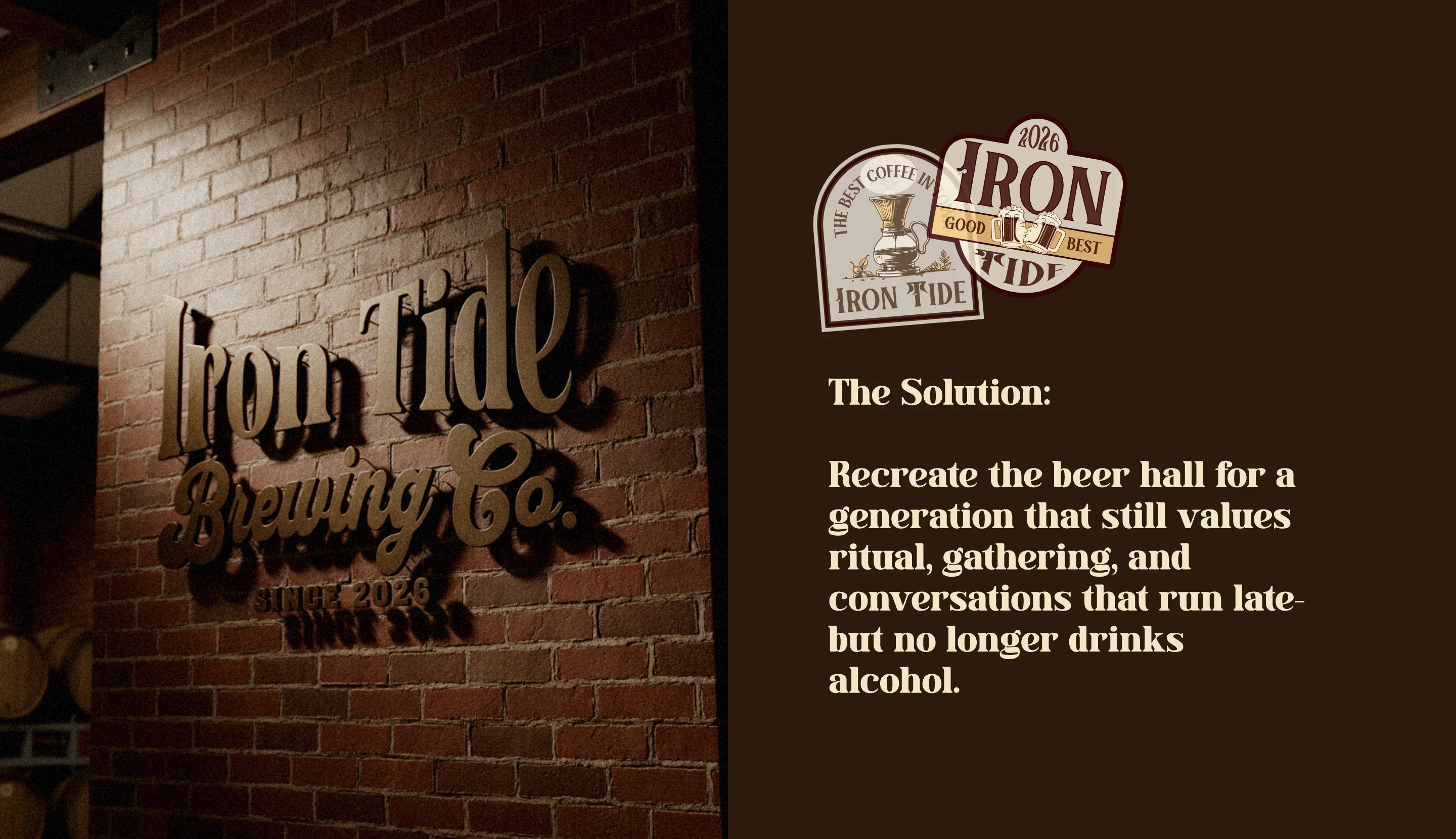
Iron Tide Brewing Co. is a conceptual brand identity built around a cultural shift: a generation stepping away from alcohol without stepping away from ritual, atmosphere, or places to gather.
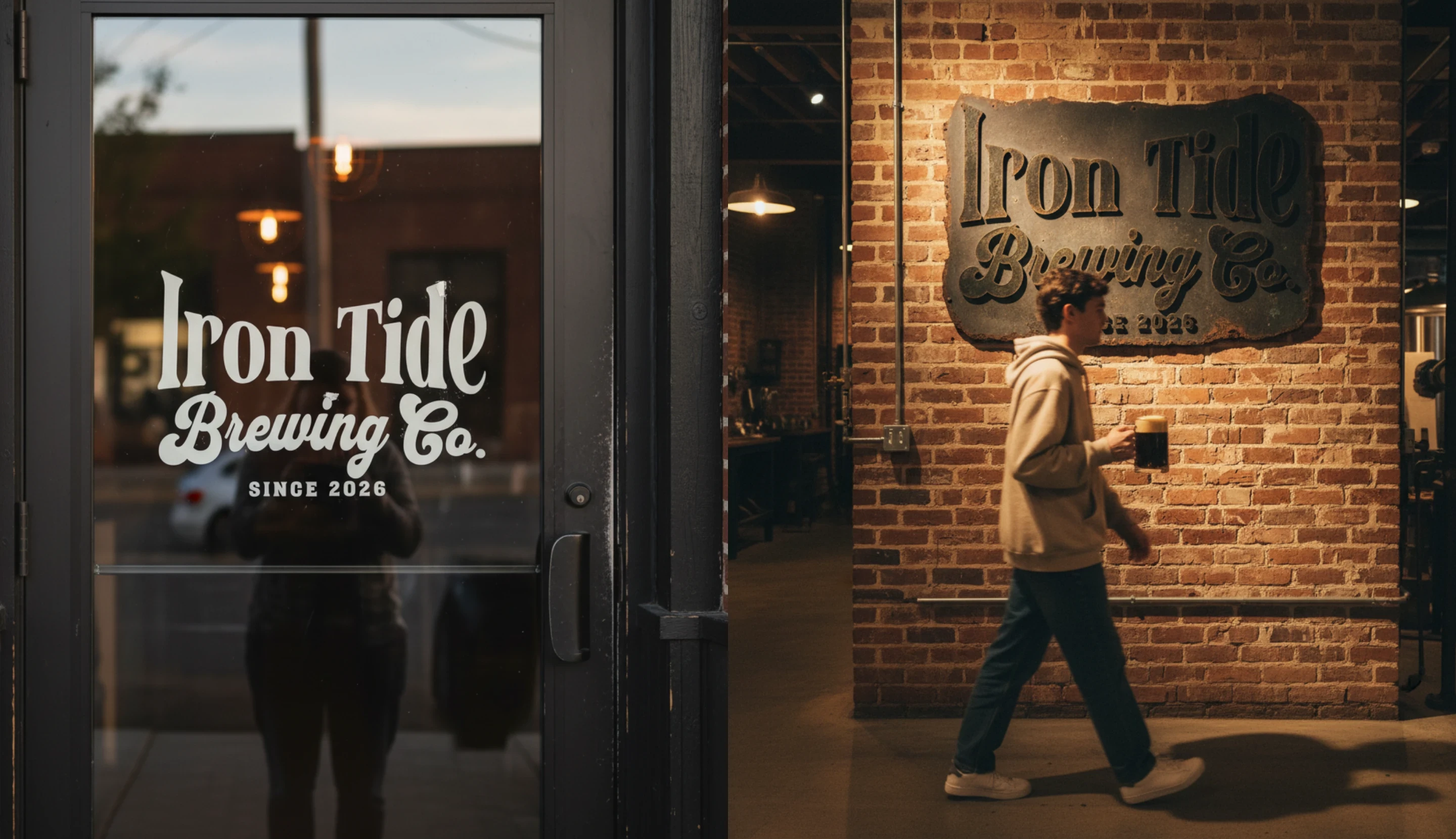
Instead of rebranding coffee as a lifestyle product, Iron Tide borrows the language and structure of pub culture. The result is a coffee brewing house that looks and operates like a beer hall — taps, barrels, heavy glass mugs, and long communal tables — but serves only coffee.
The brand is designed to feel grounded and established rather than trendy. Visual decisions are rooted in industrial materials, vintage brewing references, and tactile imperfection. Typography is restrained and authoritative. Surfaces show wear. The space prioritizes presence over productivity.
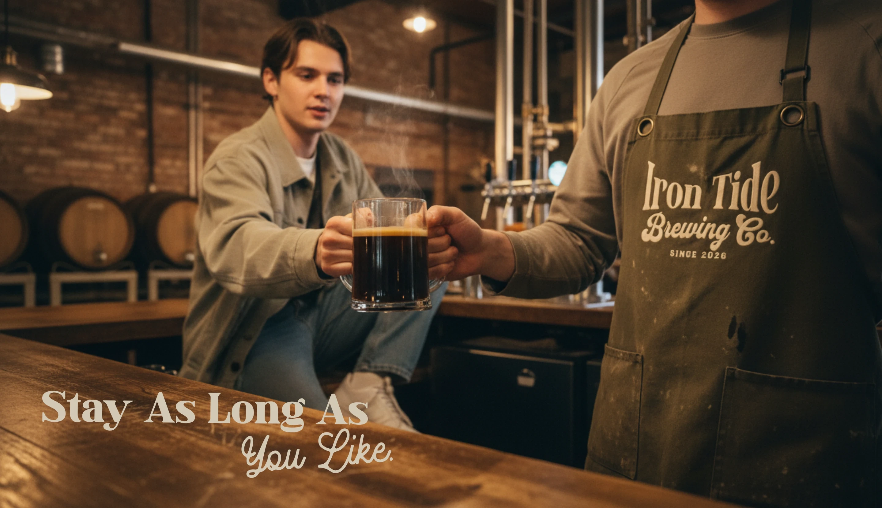
Coffee is served on tap, ordered by the mug or the pull, and consumed slowly. There are no takeaway cups, no latte art, and no overt wellness messaging. The experience is familiar, but intentionally recontextualized.
Iron Tide is not positioned as a café or a sober brand. It is a drinking house — one that preserves the gravity, community, and ritual of pubs for a generation that values clarity.
This project explores brand strategy, visual identity, environmental design, and cultural storytelling through a cohesive, realistic brand world.
Like this project
Posted Jan 22, 2026
Created a brand identity for a coffee house styled like a beer hall.