Contra - A professional network for the jobs and skills of the future
Discover
Sign Up
Post a job
Sign Up
Log In
Filters
Projects
People
Filters
Featured
Web developers
Content creators
Graphic designers
Product designers
AI developers
Motion designers
Social media marketers
Animators
Video editors
Projects we love
Projects we love
Standout projects making waves around the web
View more
Message
28
Maxim Zvarici
pro
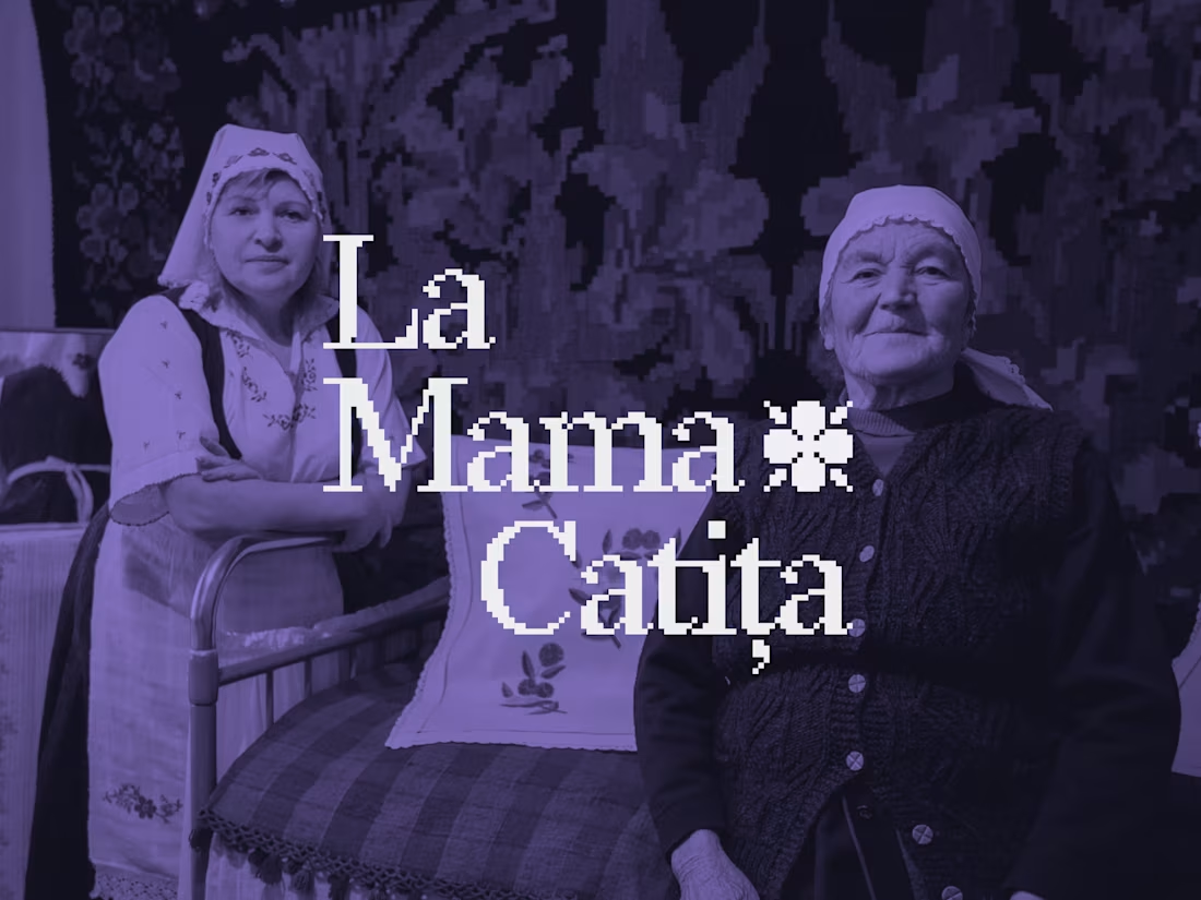
La Mama Catița Visual Identity Design
1
28
622
Message
13
Sasha Beglova
pro
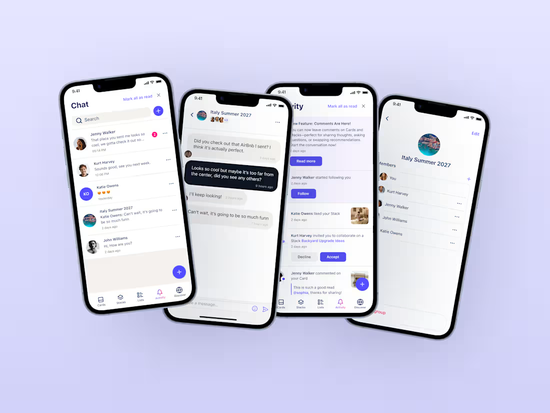
Stacklist | UI/UX & Graphic Design
13
397
Message
20
Flávia Jackeline
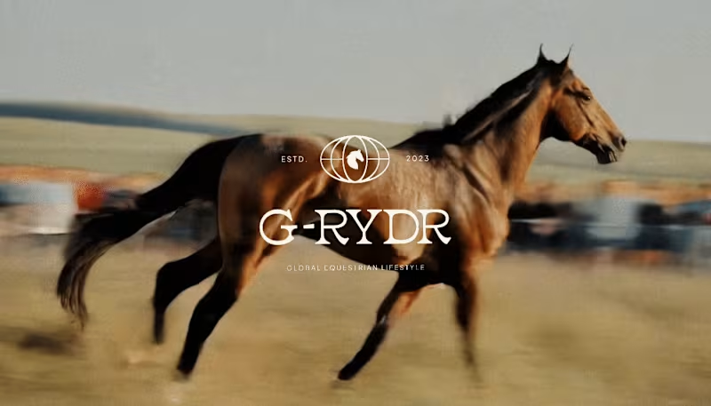
Visual Identity Design for G-RYDR — Equestrian Lifestyle
1
20
314
Message
20
Kris Anfalova
pro
Cadvel Brand Identity Design
20
262
Web design projects using Framer
Framer
The best modern websites built on the leading web design tool, Framer
View more
Message
8
Kyle Panilan
max
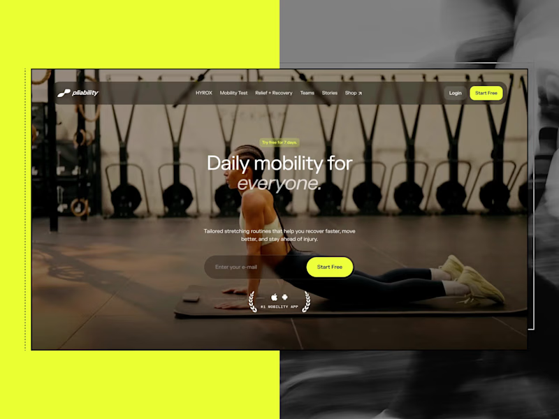
Framer Website for pliability: the #1 Mobility App in the World
1
8
624
Message
4
Domenico Griffo
pro
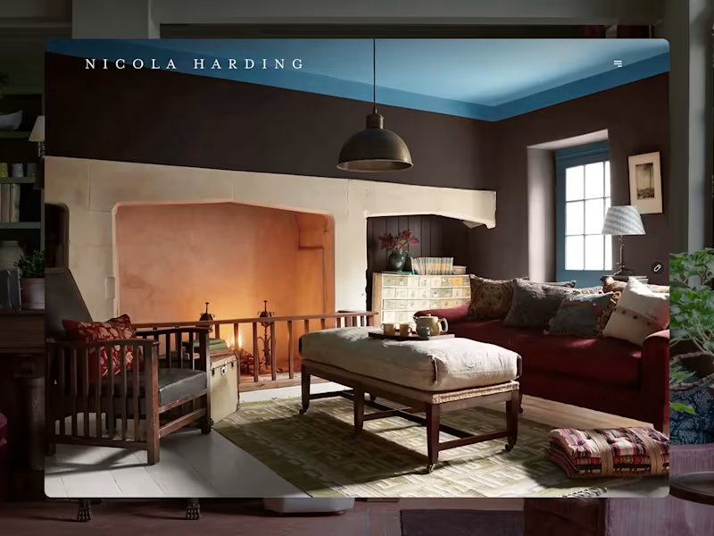
Nicola Harding & Co
4
107
Message
2
Rachel Cohen
pro
Starfish Studios Website Redesign
2
79
Message
14
Studio Ilker
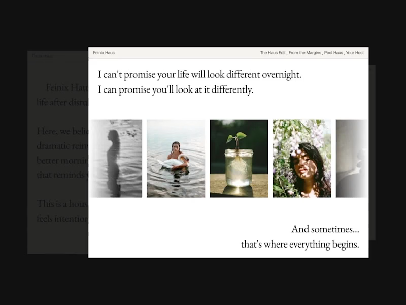
Feinix Haus Website
14
675
AI projects
AI
New projects from the best AI creators
View more
Message
7
Lisa Demchenko
max
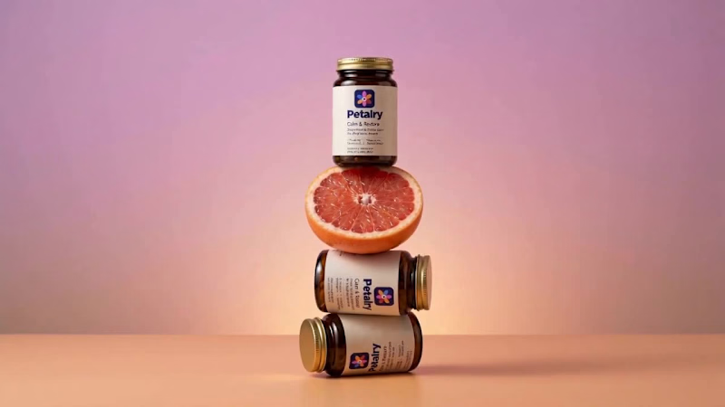
Petalry Brand Identity Development - Kittl exploration
7
303
Message
2
Alexandru Köllo
max
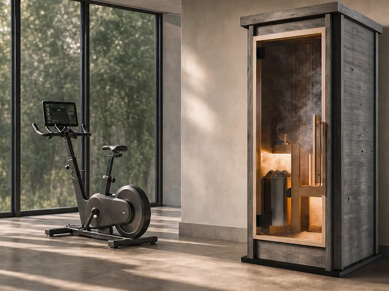
AI Product Visuals: Luxury Sauna Collection
2
112
Message
8
Darya Batyr ✦
max
Kotoba: Giving Voice AI a Human Visual Identity
8
250
Message
0
Viktor Gavrilovic
pro
MatchPro: Building soccer tournament schedules in seconds
0
84
Brand design projects
Brand design
Bold visual identities and branding systems created by top independent designers
View more
Message
6
Chantal Jemmott
pro
Label Redesign
6
153
Message
10
Olga & Joyd Branding ✦ Web Design
pro
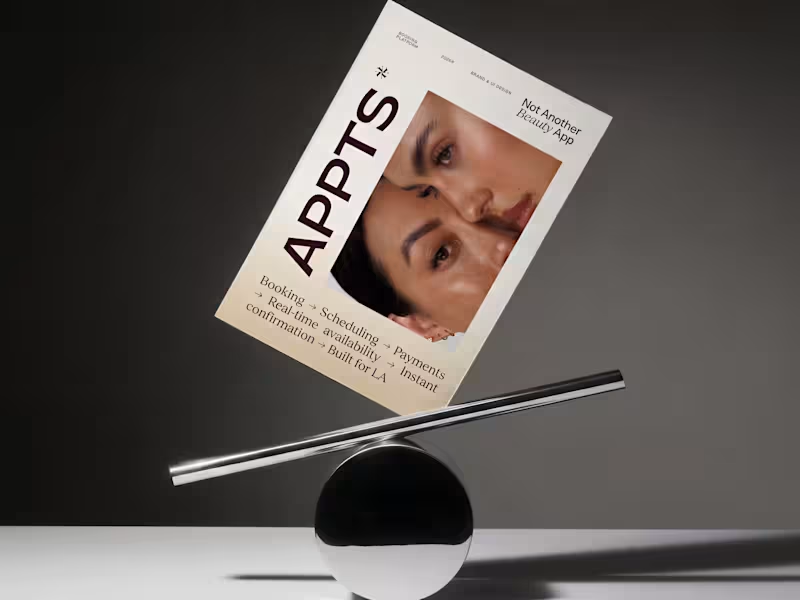
APPTS — Brand Identity & Mobile App Design
10
111
Message
8
Dane Kowachek
pro
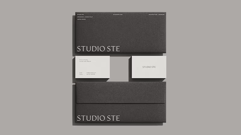
Brand Identity Development for Studio STE
8
68
Message
21
Daniel G Bright
max
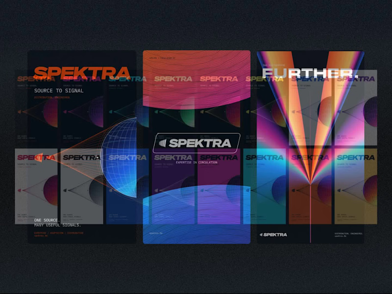
Spektra Visual Identity Development
21
374
Video editor projects
Video editing
Creative video edits made using today’s best editing tools
View more
Message
11
Jen Lai
pro
Gritzy | Social Media + OOH Animations
11
197
Message
11
Mykola Malyhin
pro
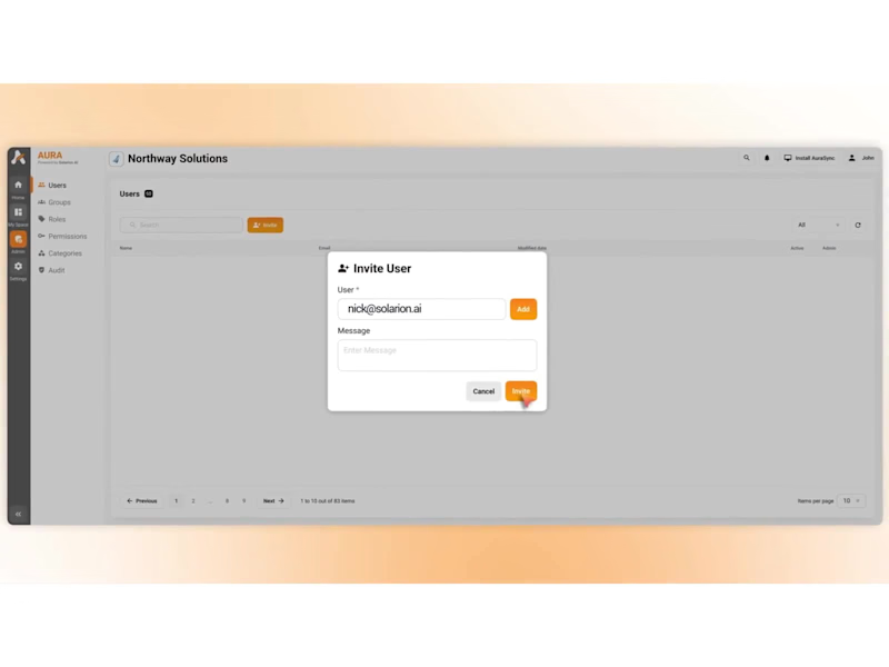
Aura | AI SaaS Explainer Video & Real UI Product Demo
11
79
Message
7
Bohdan Serdiuk
pro
Bolt New Slides V2 launch video
7
86
Message
9
Blahomyr Popok
max
Explainer video for PerformancePay - a motion design explainer
9
146
Standout projects
Standout projects
More projects we love that are making waves across the web
Message
12
Avinash NV
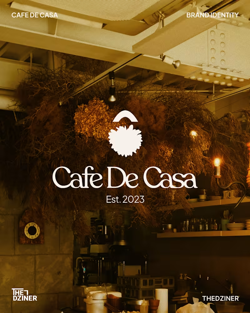
Cafe De Casa — Visual Identity System The Problem: Beautiful physical café spaces often lose their premium feel online when their digital grid and generic brand marks don't match the in-store hospitality experience. The Solution: A cohesive, custom word mark and unified visual system that bridges the gap between their physical storefront and digital presence. The goal was to build a mark that feels welcoming, premium, and instantly recognisable at a glance. Deliverables: • Custom word mark & responsive brand icon • Unified typographic and colour system • Digital touchpoint strategy (Instagram grid) • Physical brand applications (Menu, signage, and apparel) (Concept redesign for Cafe De Casa — Unsolicited / Not affiliated) Available for new brand identity projects
5
12
300
Message
1
Lara van der Sluijs
Summum is a boutique agency working across three pillars: athlete management, sports partnerships and professional performance coaching. Each pillar speaks to its own audience, from elite athletes to corporate decision-makers, and each one stands strong on its own. Summum asked me for the full picture: a brand strategy, a visual identity, and a website to launch it with. The challenge was to bring these three directions together under one coherent, premium identity. It had to feel exclusive and boutique, never broad or generic, without flattening what makes each pillar distinct. An identity that leans too far toward one pillar loses the other two. One that tries to please all three ends up saying nothing. Summum needed a single brand strong enough to hold all of them. I proposed a dark, sophisticated identity carried by a single mint accent, a nod to winter sports and the mountains at the heart of the brand's story. Large, outspoken imagery gives the brand its edge. Each pillar gets its own icon and photography style, so it stays recognisable within one system. A technical yet modern typeface adds speed and dynamism, and contour lines return throughout as the most literal expression of the summit idea. The identity carried straight into a compact landing page, the brand's first real touchpoint: a hero slider, a services overview, team introductions and a contact form. Interactions and animation are tuned to amplify the bold, sporty feel. Result: a sophisticated, fitting brand identity including new logo, typography and AI generated imagery. Alongside a landing page created in Webflow, a full brand guide and marketing materials for the client to work with.
2
1
23
Message
15
Rufana Zade
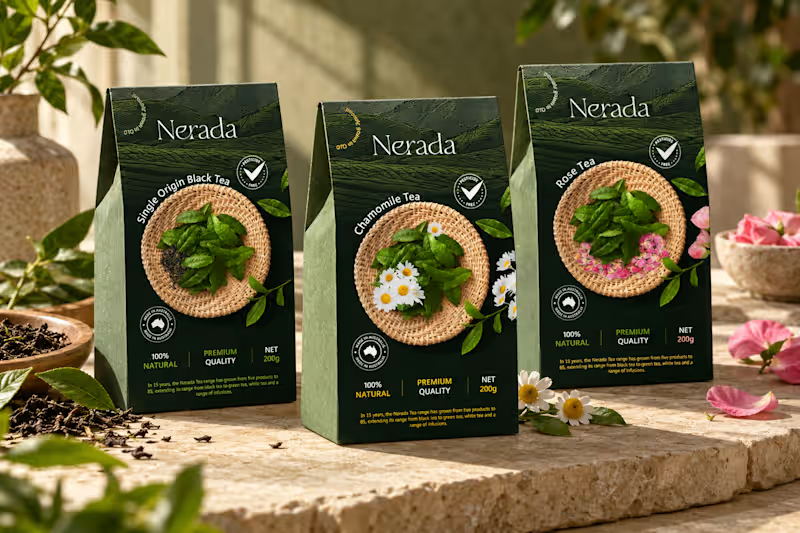
Created the complete brand identity for Nerada, a natural tea brand — developing the visual direction and design elements that shape how the brand looks and feels across every touchpoint. The goal was a clean, organic aesthetic that reflects the brand's natural positioning and builds a consistent, recognizable identity.
21
15
340
Message
23
Arek Dvornechuck
pro
Banner design for a Real Estate Broker in NYC
4
23
368
Message
11
Omoniyi Daniel
pro
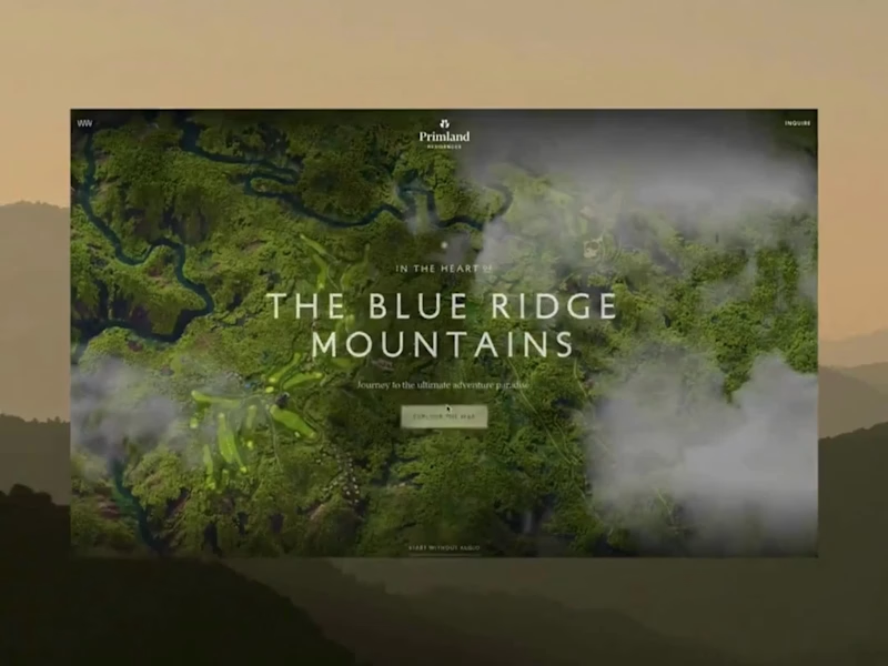
Primland puts a whole mountain resort on one interactive 3D map. You start high above the Blue Ridge Mountains with clouds drifting through the valley, then pick a pin and fly down to the lodge, the pool, or the mountaintop restaurant. The terrain, the trees, and the smooth camera moves make you want to book a trip. Big shout-out to Robert Borghesi (https://x.com/dghez_) for building this. The scale and the attention to detail are impressive.
7
11
195
Message
54
Klym Yevtushenko
pro
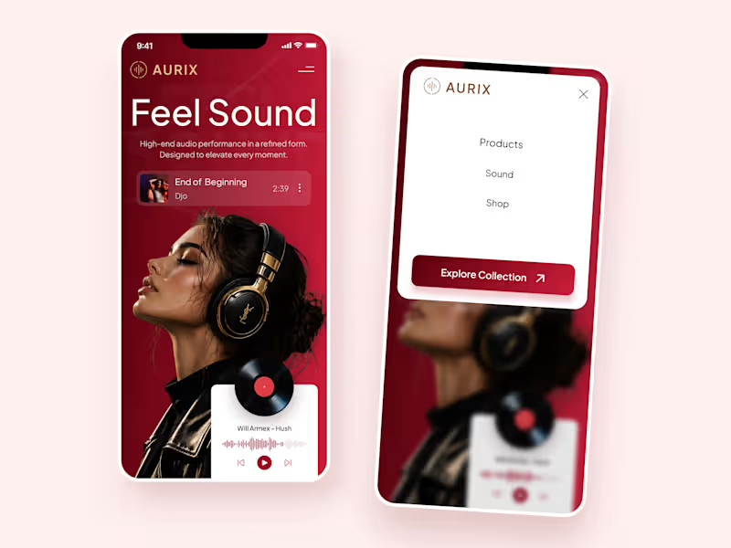
AURIX — Premium Headphones Landing Page 🎧❤️ A bold landing page concept for a premium audio brand, combining luxury headphones, music, and a strong lifestyle aesthetic The design brings together deep red tones, elegant black and gold details, oversized typography, and immersive lifestyle imagery to create a modern, fashion-inspired experience Special attention was given to: • Bold lifestyle-focused hero composition • Rich red and gold color palette • Clean, oversized typography • Music player and suggested tracks • Premium product presentation • Responsive mobile experience • Minimal navigation and clear CTA The result is a stylish, immersive landing page that connects premium audio with fashion, music, and everyday lifestyle ✨
24
54
1.6K
Message
28
Yaroslav Demidov
pro
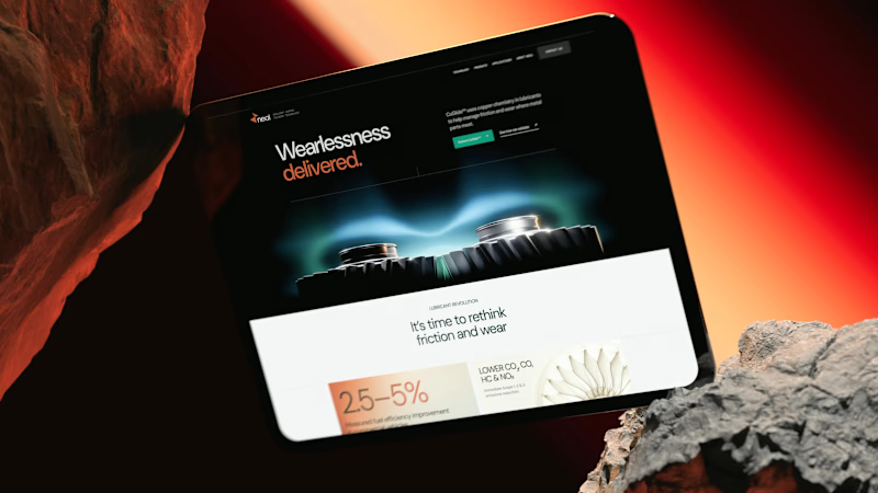
NEOL. Making of the Hero NEOL develops CuGlide™, a copper-based lubricant technology that reduces wear between metal parts. I recently designed their website. The hero was the hardest part: two gears in contact, with a thin copper film where they meet. That's why I built it in 3D instead of generating it: AI video can't give that level of control and precision. From the first draft to the live site.
19
28
567
Message
8
Anna Selkova
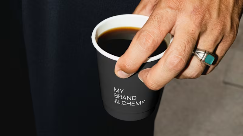
My Brand Alchemy – Visual Identity How do you brand a branding agency without hiding behind someone else’s product? The real question with My Brand Alchemy, a studio that helps entrepreneurs reimagine and transform their businesses, was this: Its identity had to stand on its own, not borrow from anyone else's. We built the system around one metaphor: the laboratory. Strategy as an experiment and clarity as the result of patient work. → A monochrome palette, stripped of anything decorative → Precise, concept-driven typography with a custom symbol woven into the wordmark → Atmospheric glass photography against clean geometric forms The whole system is meant to feel like a workshop, not a showroom. Transformation as something slow and carefully made, not performed. Would you trust a branding studio more if its own brand looked like a lab, or like a gallery? 👇
2
8
169
Message
20
Braulio Cardenas
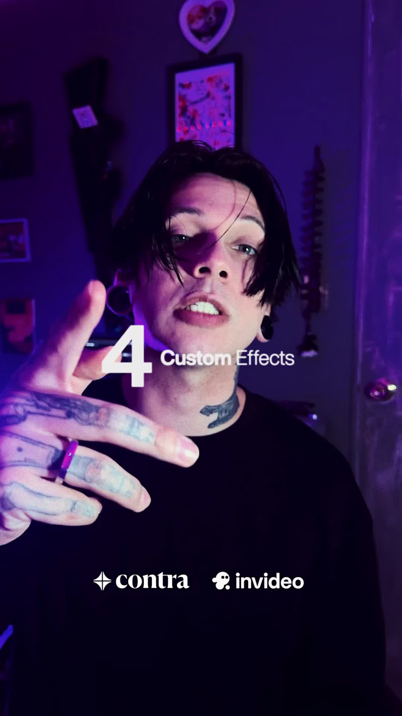
URBAN DIGITAL PACK — 4 Agent-Built FX for Urban Music Videos by Brauxelion® URBAN DIGITAL PACK is a four-effect toolkit built entirely in invideo Editor using AI editing agents. It includes Frame Kick (Shaker), Analog Burn (CRT), Hologrid, and Scan ID, designed for contemporary urban music videos. Process: I started with my own urban music video footage, asked the invideo agent to build four custom effects for the pack, and then refined the timing, intensity, motion, distortion, and visual controls directly on the editable timeline (https://invideo.io/share/Urban-Digital-Pack-F3xVkYErG61). The goal was to create a cohesive FX pack that turns complex manual editing techniques into customizable agent-built tools. Enjoy. @Invideo | @Contra HQ
2
20
743
Message
38
Hy Nguyen
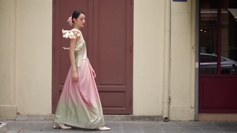
Happy to share submission for the invideo Editor Challenge! 🚀✨ For this video, I created an effect I call "Ao Dai Flicker" - blocks of light that flicker across the frame and flip the colours underneath every time the outfit changes. AO DAI FLICKER Nobody saw her go through the door. But every time the light flickered, she stepped back out as someone new. Seven flashes. Seven looks. One quiet street. Where does she change? No one knows - and honestly, that's the fun part. ✨ Why fashion? Because fashion lives in the moment of change, and it never slows down. Trends turn over in a week, and every look deserves its own big reveal, not a copy-paste cut. So I made every cut a flash: pink and blue halftone bursts that feel like a printed magazine, a stream of binary code for the screen era, and Difference-blended shapes that turn each reveal into a little flashbulb moment. It's the kind of edit fashion creators want on every post but rarely have the hours to build by hand. That's exactly what I wanted invideo Editor to take off our plate: the same impact on every single cut, built from a description instead of hours of keyframing, while every creative call (the colours, the rhythm, which look gets the loudest flash) stays ours. Behind the scenes: Primary effect: Shape Flicker — Mixed-Media Outfit Transitions Large squares and rectangles flash across each outfit change, creating bold colour inversions through Difference blending. Blue and pink halftone flashes, black-and-white print textures, and small data-style digits add a mixed-media finish. Each burst clears quickly to reveal the next outfit, with a clean final shot. Process note: I started with my own fashion footage, filmed from a fixed camera position with outfit changes at matching poses. I asked invideo Editor’s timeline agent to build the transitions using editable shape layers and Difference blending, without rotoscoping or object tracking. My refinements focused on the shapes’ size, placement, drift, and flicker timing, then adding halftone and data textures while keeping each outfit clearly visible. Which look is yours? Drop the number 1–7 below 👇 LINKS invideo timeline: https://invideo.io/share/Ao-dai-Flicker-v1BryMJao80 Instagram post: invideo Editor is free to try. @invideo.io (http://invideo.io) @invideo.creators #invideocontrachallenge #invideoeditor
28
38
1.4K
Message
2
Quzmo Studios
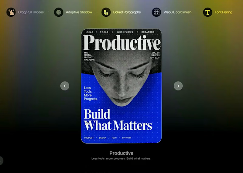
✦ Introducing Mollis The WebGL Carousel that feels like fabric. Digital cards are usually rigid rectangles. Mollis treats them as flexible surfaces. Built with a custom WebGL mesh, each card bends and warps with your drag, bringing a tactile, organic weight to your Framer carousel. WHAT’S INSIDE ✦ Fluid Deformation: A responsive mesh that ripples and settles naturally. ✦ Dynamic Shadows: Adaptive depth that follows every pull and fold. ✦ Typographic Precision: Baked paragraphs and font pairing for crisp, editorial-grade captions. PERFECT FOR ✦ Editorial layouts and high-end portfolios. ✦ Product showcases that deserve a physical touch. I’D LOVE YOUR TAKE Does the deformation feel natural, or should it be toned down? Where would you deploy this on your next project? Mollis. Every interaction, felt.
4
2
120
Message
12
Vibhansh Alok
Little late to announce but, Construct Computer ranked 1st on Product Hunt as the Product of the Day, Thank you everyone for your support. Welp here's the launch video I made, hope you have a good day!
13
12
322
Message
6
Khiz | Business Wifey Agency
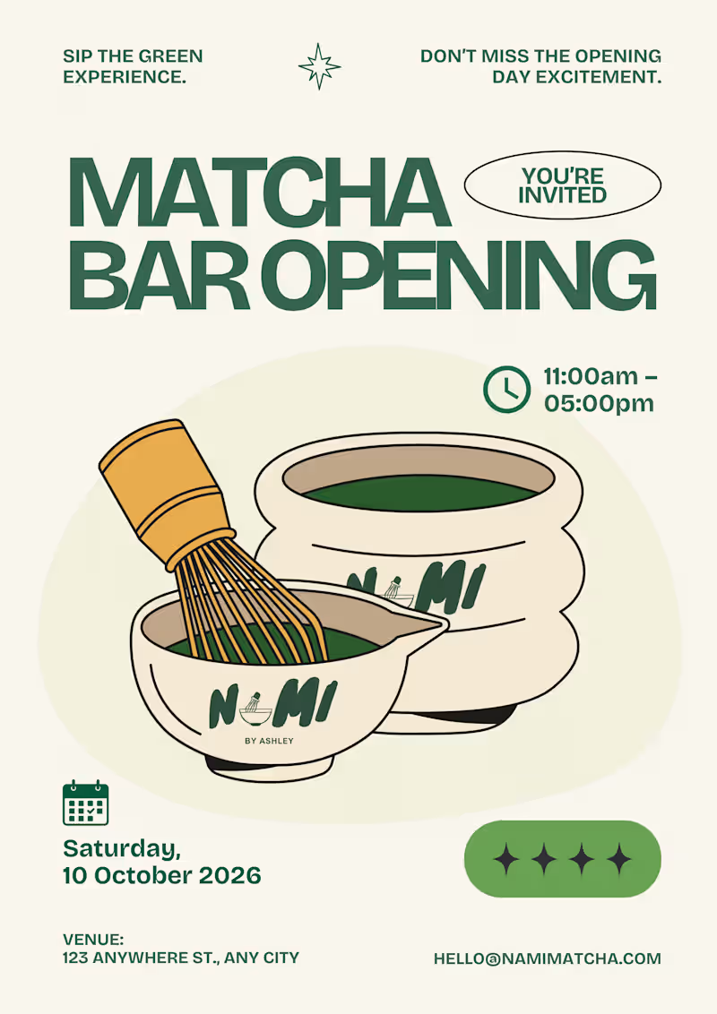
A concept feed designed by Business Wifey Agency The Project Nami Matcha is a matcha bar brand we fell in love with and couldn't resist designing for. This is not their official branding. This is BWA doing what we do best: taking a vibe, a product, and a personality, and turning it into a full visual identity that makes people stop and stare. Because honestly - who doesn't love matcha? What We Created A complete social media design system built around Nami Matcha's playful yet premium aesthetic. Every post was designed to feel like the brand already existed, already had a loyal audience, and already knew exactly who it was talking to. The feed covers every content pillar a beverage brand actually needs: Product Content → Editorial-style drink photography posts with bold typography and on-brand copy that makes you want to order immediately. Event & Launch Design → A full matcha bar opening poster and pop-up event flyer - the kind of content that makes people save the date and show up. Engagement & Viral Content → "Born to / Forced to," "Take What You Need," "Matcha Mode: ON" - the kind of posts that get shared, saved, and commented on because they feel real, not promotional. Promotional Posts → Buy 1 Get 1 offers and product deals designed to convert, not just perform. Brand Storytelling → From the fuel gauge concept to the receipt mockup, every piece tells the Nami Matcha story in a way that feels completely native to the platform. The Result A 10-post feed that looks like a fully launched brand - cohesive, confident, and completely scroll-stopping. This is what BWA brings to every client: the ability to make a brand feel real before it even launches. Note This is a concept project created independently by Business Wifey Agency to showcase our design capabilities. Nami Matcha is not an official BWA client and this is not their confirmed brand identity - we simply loved the concept and built it out because great design doesn't wait for a brief. Skills & Tools Used Brand Design · Social Media Design · Content Strategy · Feed Curation · Typography · Visual Storytelling
5
6
781
Message
8
Suraj Chhabra
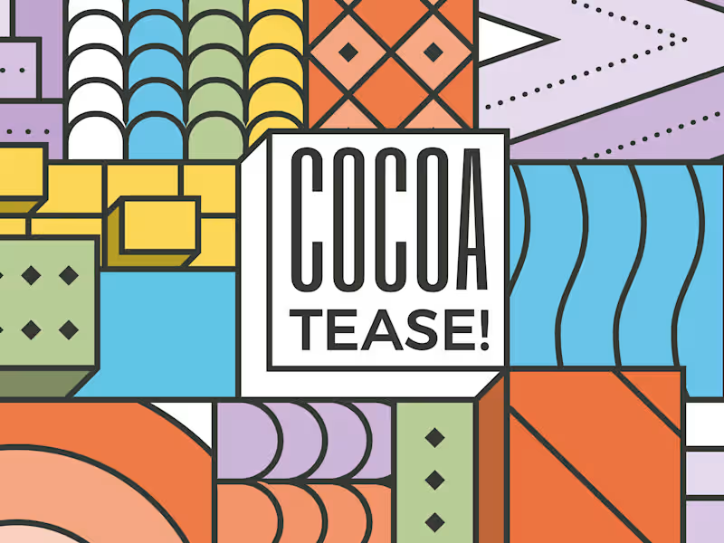
Brand & packaging design for Cocoatease! 🍫 • A chocolate company at heart, Cocoatease! is a dessert brand that aims to “tease your palette”. This unofficial tagline prompted the idea of a button for the logo…a visual way of saying “push for a treat”. • While a logo is usually designed first, the packaging was conceptualised first to meet growing demand. That pushed us (wink wink) to create a bunch of colour variations to match it. • Logo design, logo symbol, branding, brand design, visual identity design, packaging, packaging design, colour palette, typography
6
8
253
Message
19
Juice Lab
pro
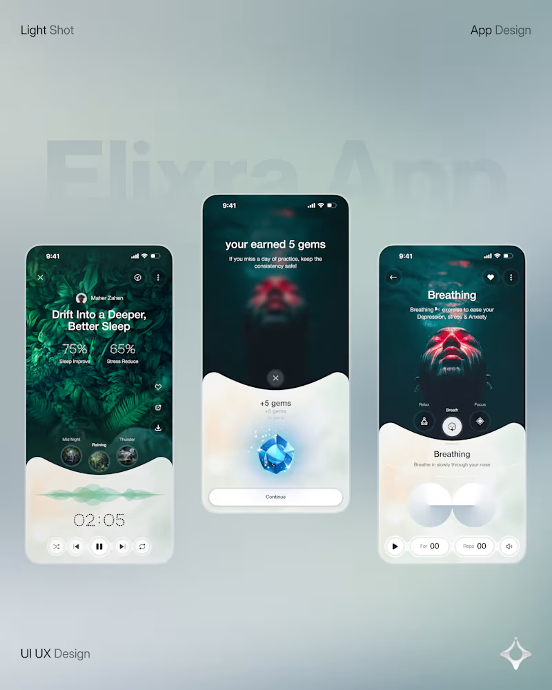
Wellness shouldn’t feel like another task on your to do list. Elixra turns breathing, sleep, and mindful routines into an immersive digital experience through cinematic visuals, soft interactions, and rewarding micro moments. What if wellness felt like this?
15
19
2.1K
Message
5
Josh Bendall
pro
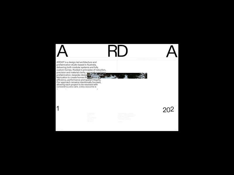
First look at ARDA® — new website layouts for an Australian architecture and building studio. Starting with the preloader, cycling through a selection of projects after transitioning into the homepage. More from this one soon!
4
5
123