Talga Cosmetics Packaging Design System

Nina Maar
Verified


Packaging design system for Talga Cosmetics
From brand identity to a packaging system
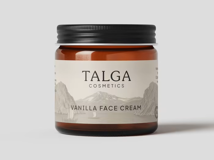
Packaging design was the natural next step after Talga’s rebrand. The challenge was to translate the new identity into a flexible system that could accommodate the existing product range and grow with the brand as new products were introduced.
Talga is a family-run skincare brand from Northern Norway, built around grass-fed tallow, botanical oils and a hands-on approach to making things with care. The packaging needed to reflect that character while giving each product its own identity on the shelf.
A system built to grow
Rather than designing each package as a separate piece, I developed a visual system that could be applied across different product sizes and packaging formats. The structure stays consistent, while colour creates distinction between individual products.
The goal was to give every product its own presence without losing the feeling of a cohesive family.
02 — Colour as product identity
Colour with a purpose
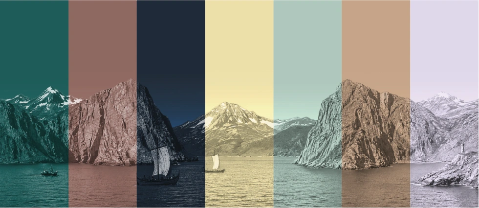
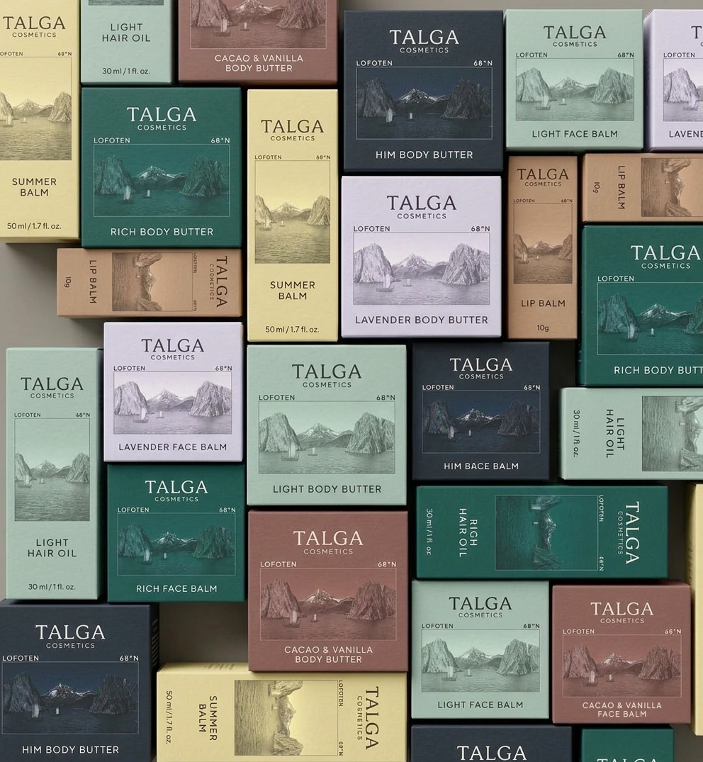
Talga’s colour palette is built around muted, earthy tones drawn from the brand identity. They reflect the character of a heritage-inspired, family-run business and feel closer to the natural materials behind the products than to the bright, high-contrast colours often found in skincare packaging.
Each shade was chosen in relation to the product itself, particularly the richer and lighter tallow creams. When a vanilla and cacao variant was introduced, we selected a muted reddish-brown tone (
#8F6961) to distinguish it from the rest of the range.The colour doesn't need to reproduce the ingredient literally. It needs to communicate a feeling that makes sense for the product and the brand.
03 — The postcard decision
A postcard from the Arctic
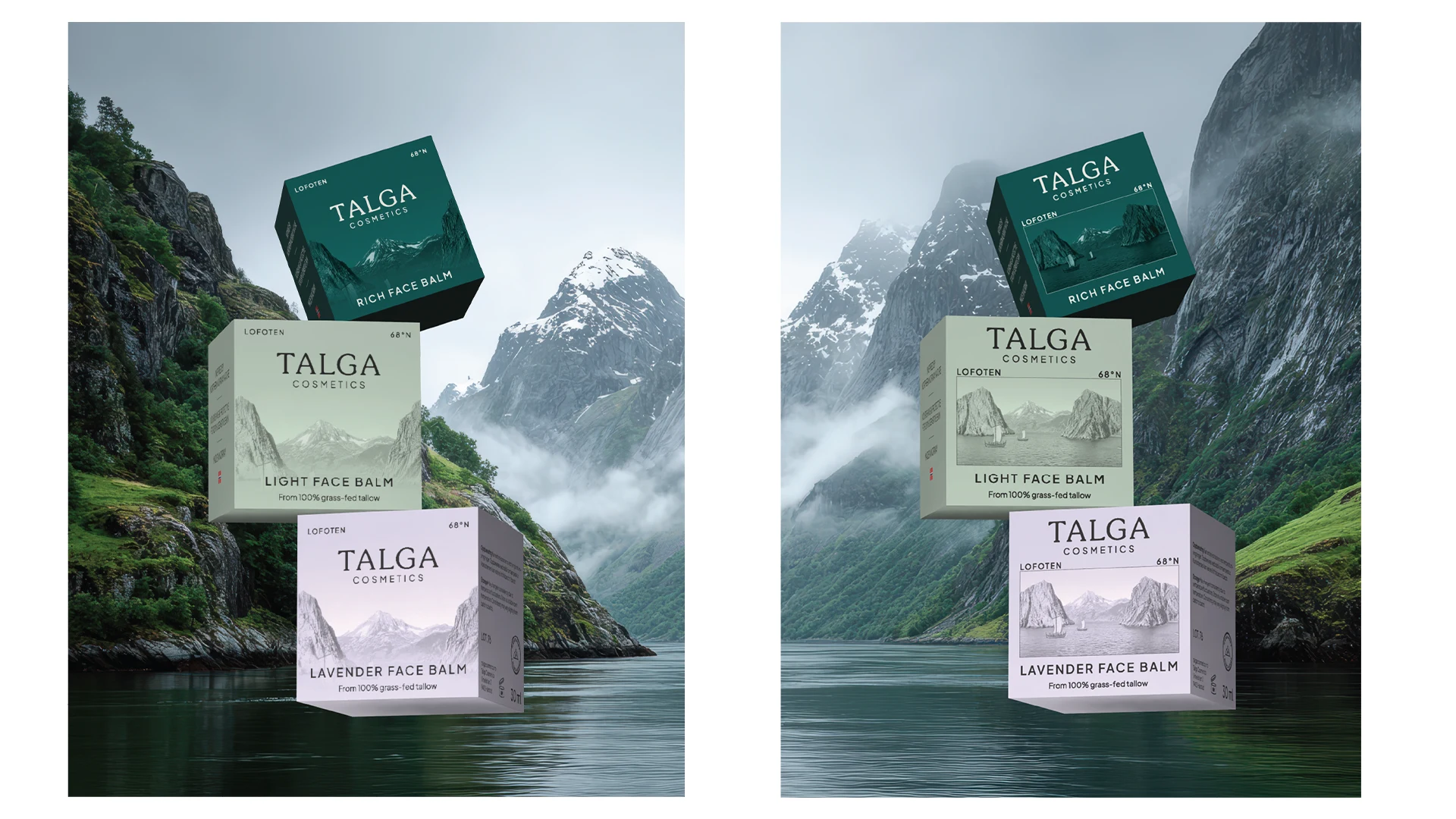
One of the main design decisions was how to incorporate the Norwegian landscape. We explored two directions: a fjord photograph used as a full background, with typography placed over it, and a framed postcard-style image on the front label.
The full-bleed photograph offered more depth and negative space around the text. But the postcard felt more distinctive and more closely connected to Talga’s brand story.
It gives the packaging a sense of place. The image becomes a small window into the Arctic Circle, connecting the product to the landscape and the origin of its ingredients.
The postcards were also adjusted individually to work with each packaging colour. Dark fjord imagery against a dark label, for example, could easily lose definition. I refined the images manually to maintain enough contrast and separation without losing the atmosphere of the original photographs.
I tested both directions through Contra’s Taste Test. Although the full-bleed background received more votes, we ultimately chose the postcard format because it felt more distinctive and aligned more closely with Talga’s brand strategy.
04 — The taste test
Making room for what matters
The original layouts included a descriptor line beneath each product name on packages larger than 30 ml. During refinement, I removed it to give the product name and postcard more room to breathe.
The freed-up space made the front labels feel less crowded and established a clearer hierarchy between the product name, landscape and supporting information.
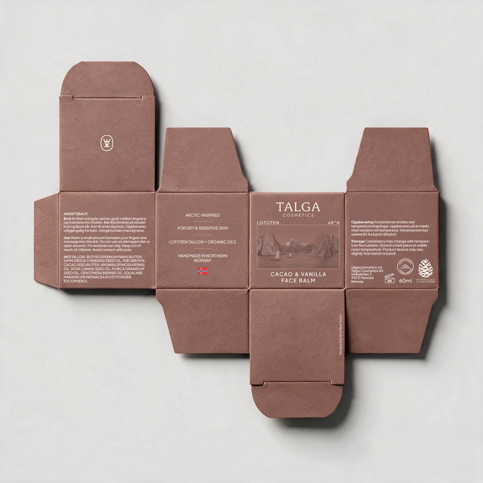
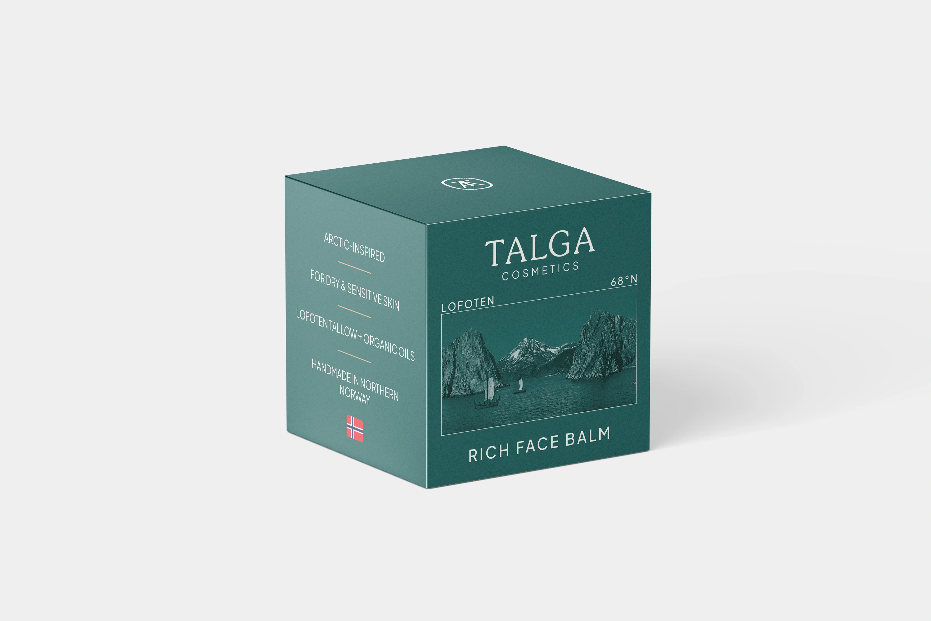
On one side of the packaging, I developed a concise set of four uppercase statements communicating Talga’s key selling points: grass-fed tallow from Lofoten, certified organic botanical oils, and production within the Arctic Circle, alongside the brand’s core product promise.
The information is easy to scan, giving customers a quick understanding of what distinguishes Talga without turning the packaging into a wall of text.
05 — Refinement and print testing
Designed for print, not just the screen
The fjord imagery required particular attention during production. Dark photographs combined with darker label colours can lose detail once printed, especially when the amount of ink and the underlying colour begin to compete.
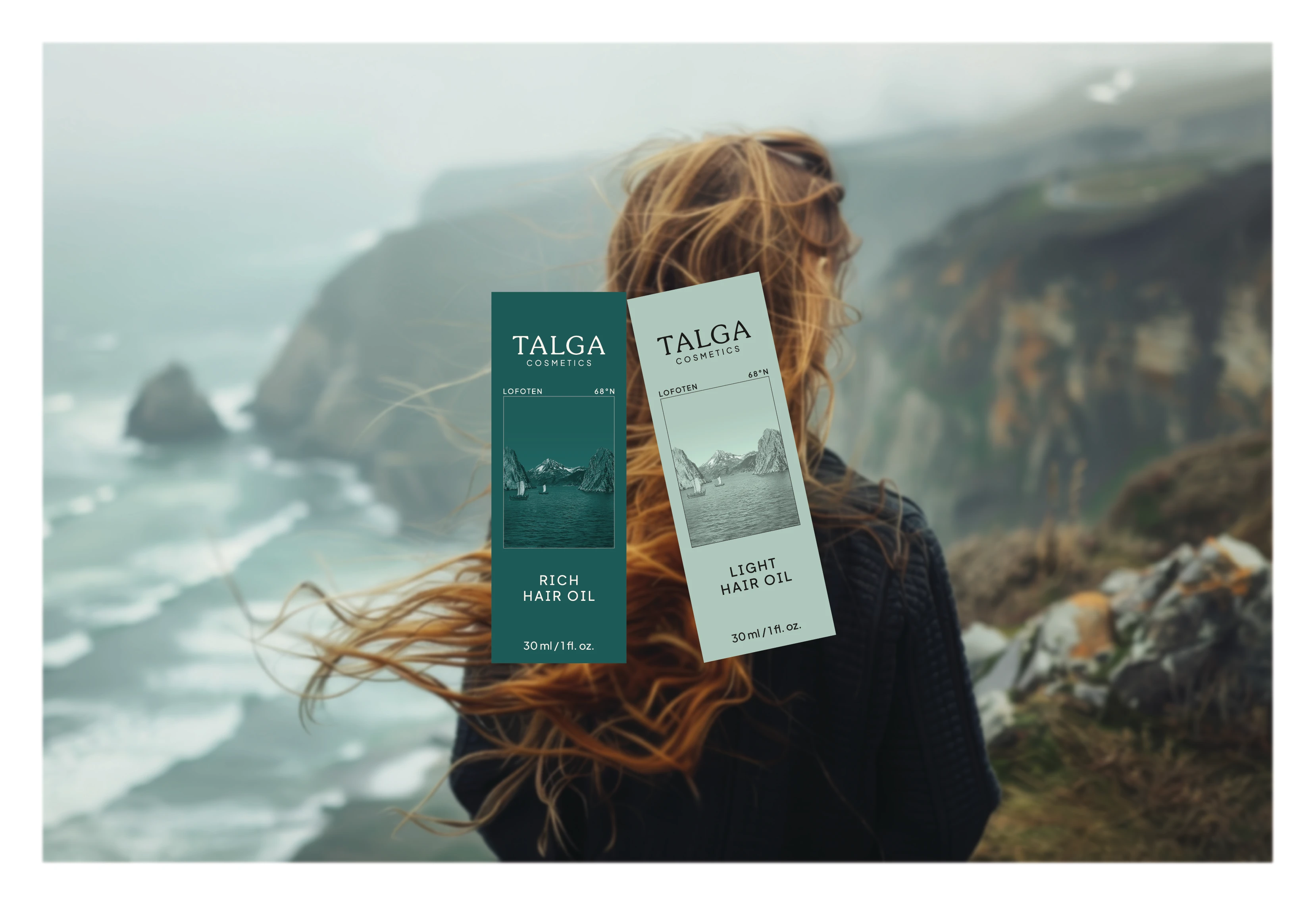
I used Photoshop to assess the images against their intended background colours and check ink coverage, making manual adjustments to each postcard rather than applying one treatment across the entire range. The aim was to preserve the image’s depth and atmosphere while keeping the printed result legible.
I also printed the packaging designs and assembled physical prototypes to evaluate the details that are difficult to judge on screen: how the colours translated to print, the readability of small type, the proportions of the cartons, text alignment and the overall balance of each panel.
This allowed me to refine the designs as physical objects, not just flat layouts.
06 — Packaging dielines and structural layout
07 — Balancing tactile appeal and everyday use
The right finish for everyday use
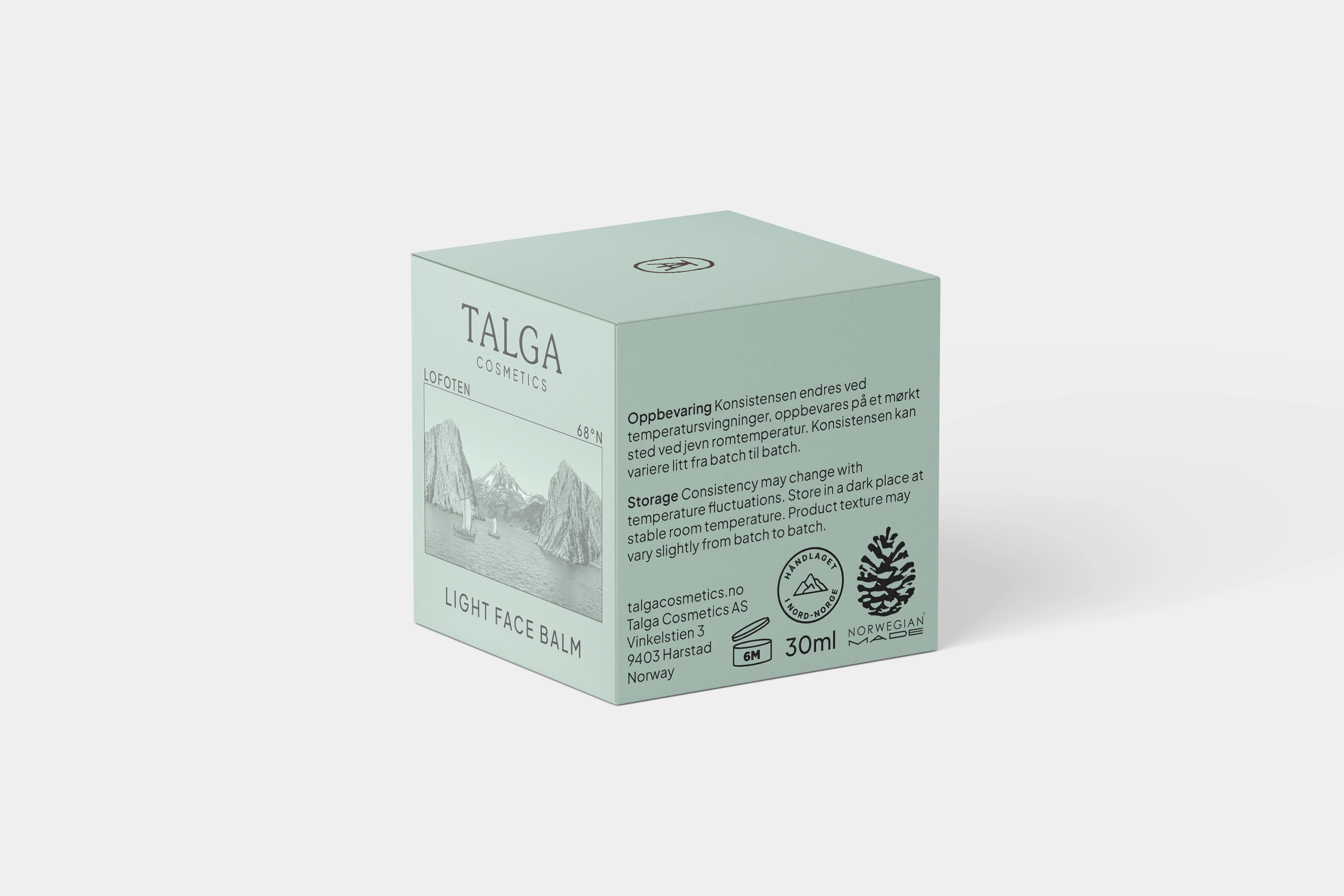
Although an uncoated finish initially felt closer to Talga’s tactile, heritage-inspired character, we opted for coated stock for practical reasons.
Skincare packaging needs to withstand everyday handling, including use around sinks and bathrooms, where hands may be damp. A coated surface offers better resistance to moisture and helps protect the printed packaging during use.
The final choice balanced the tactile character of the brand with the functional demands of the product.
08 — Product information and storage symbols
09 — The finished range
A consistent family, with room for more
The result is a packaging system that brings together product differentiation, a recognisable sense of place and a consistent visual identity. Muted colours distinguish the range, postcard imagery anchors it to Northern Norway, and a shared layout keeps the products connected.
Most importantly, the system is designed to extend beyond the current collection, giving Talga a clear visual framework for future products without having to start from scratch each time.
Like this project
What the client had to say
Reliable, trustworthy and has great attention for details. She goes the extra mile to make sure the customer is satisfied, which in addition to her professional capabilities makes her an excellent choice for everyone. Warm recommendation!


Sara Jakobsen, Talga Cosmetics
Sep 30, 2026, Client
Posted Oct 12, 2026
Arctic landscapes, muted colours and thoughtful details shape Talga’s packaging system, bringing the brand’s northern roots to life across every product.
Likes
5
Views
10
Timeline
Jul 20, 2026 - Sep 30, 2026
Clients
Talga Cosmetics