
Fuel your day with goodness. 🥣
Introducing CERRO, a granola cereal brand we designed to make everyday breakfast more delicious, nutritious, and fun.
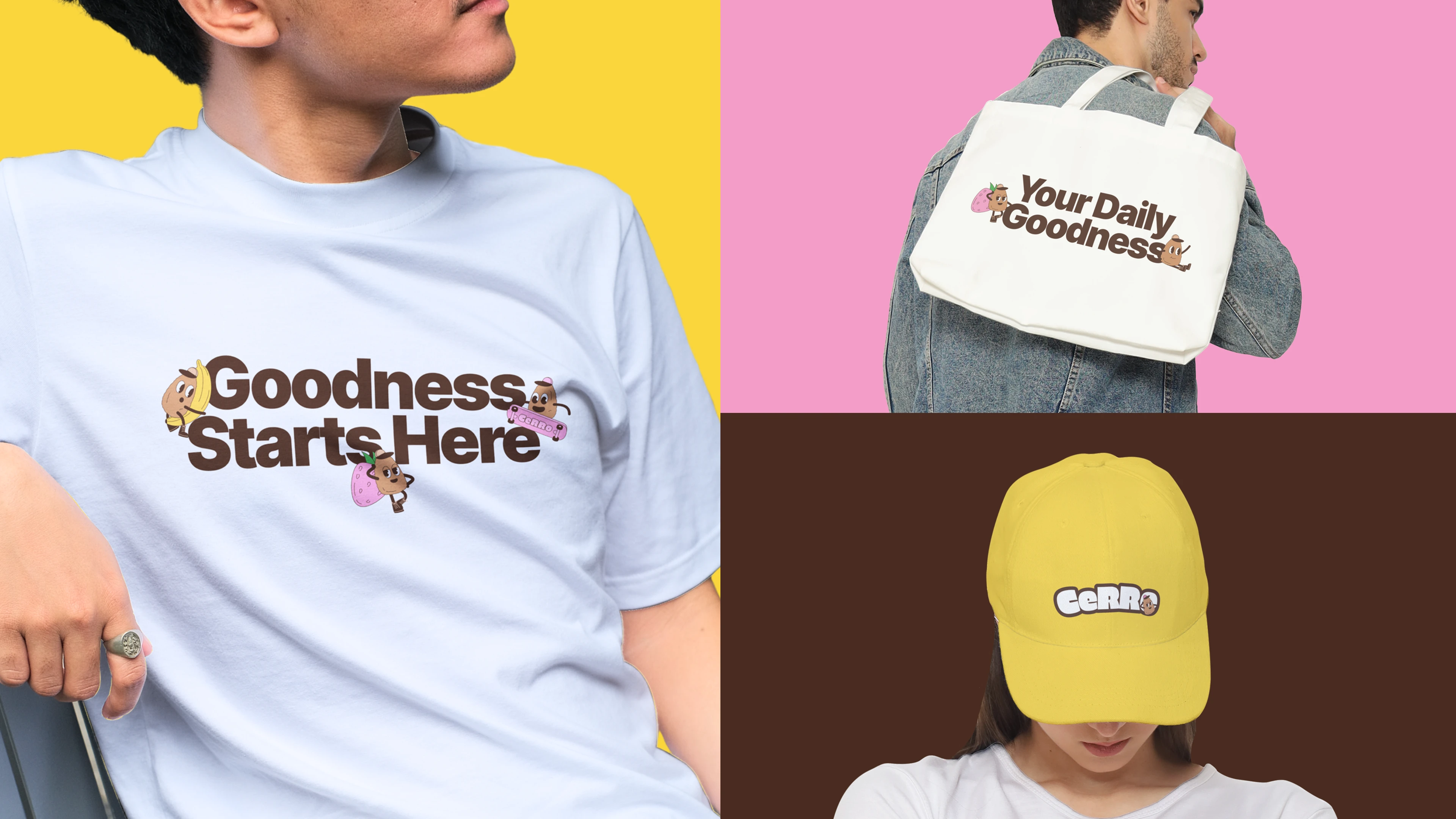
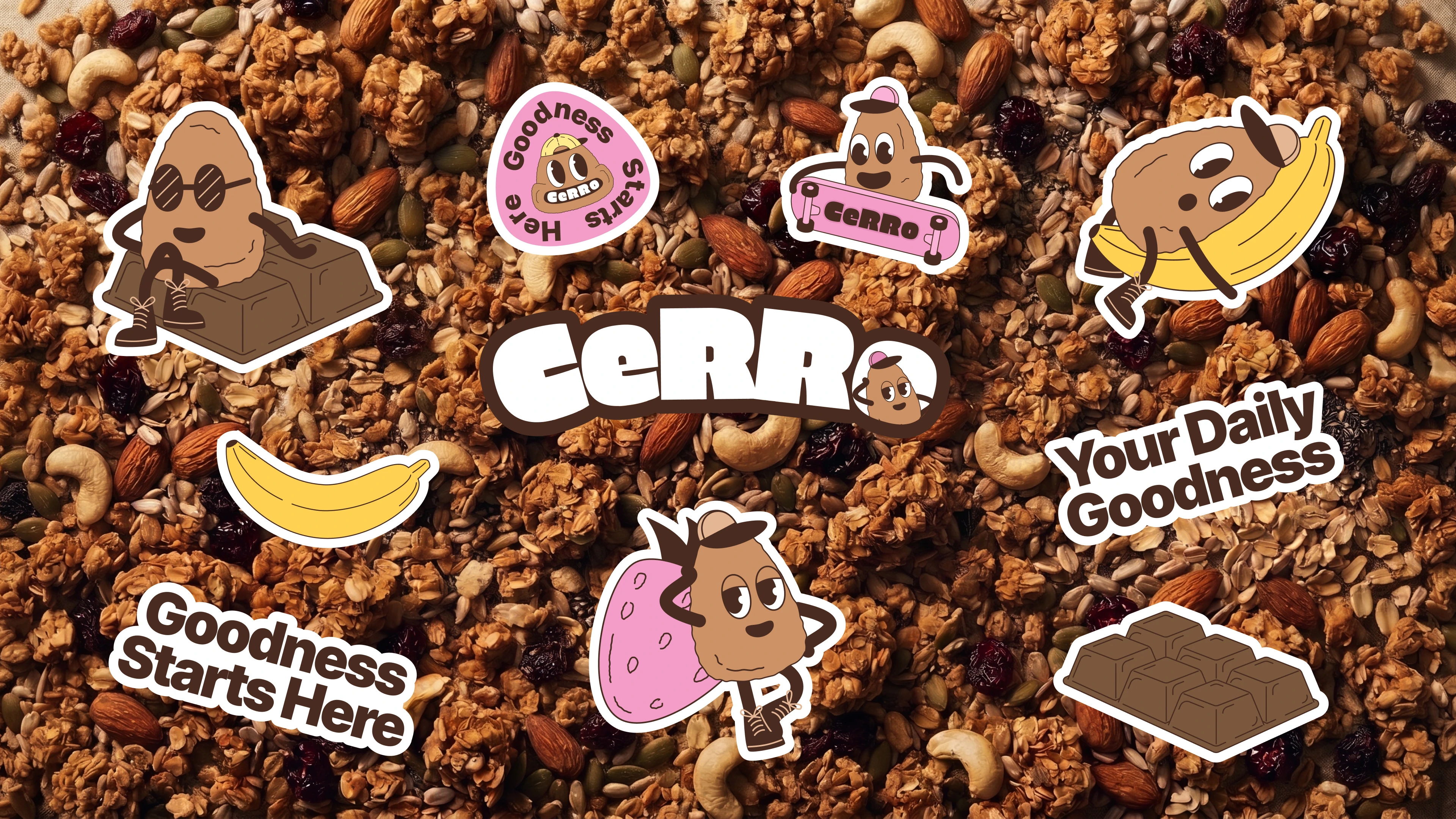
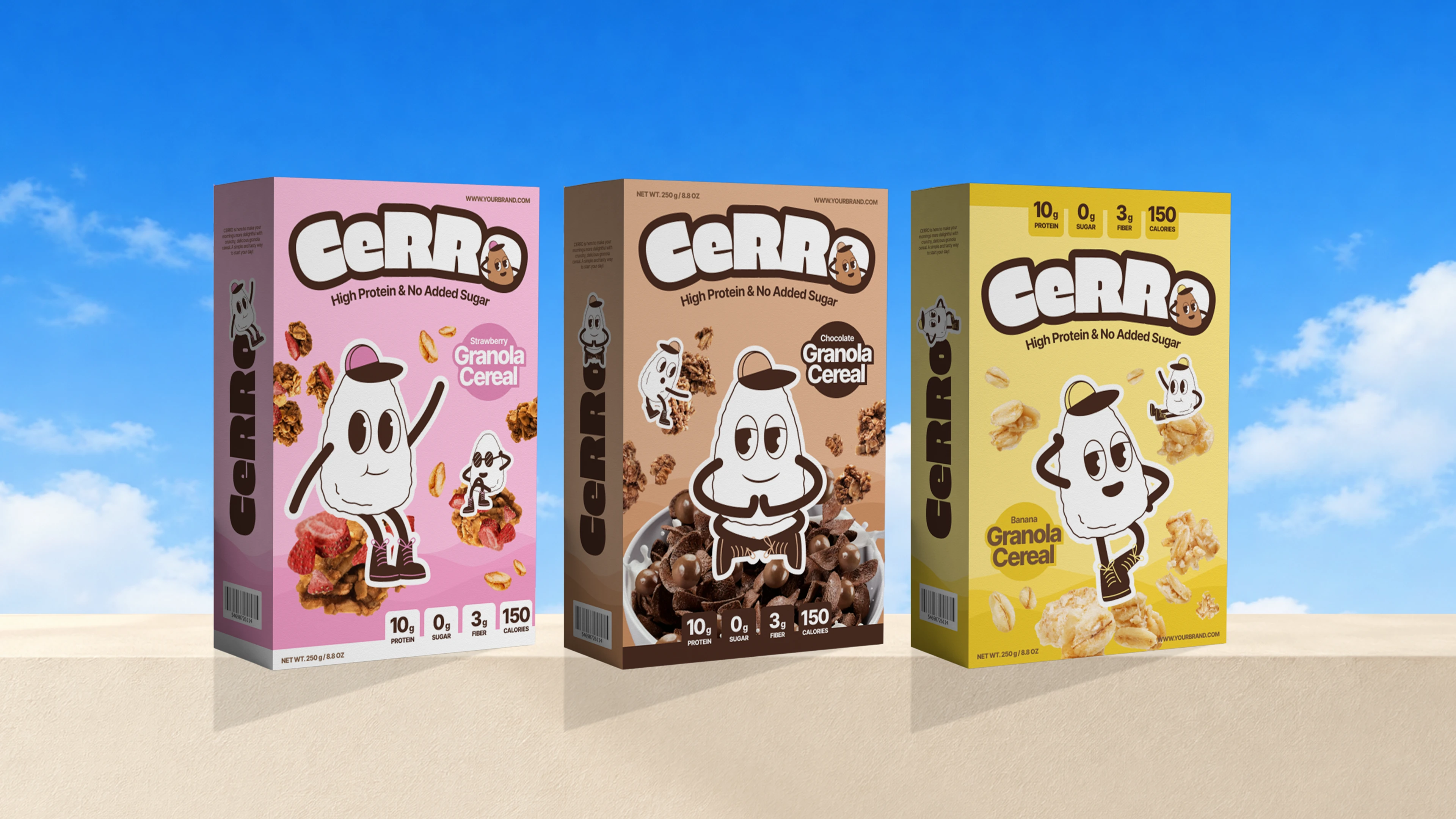
CERRO pairs wholesome oats, nuts, and seeds with high-protein nutrition and no added sugar. We built the identity around that same energy: a chunky rounded "CeRRo" wordmark, a playful retro-cartoon mascot that replaces the "o", and a bold yellow hero color.
Each flavor gets its own color code, with pink for Strawberry, brown for Chocolate, and yellow for Banana. That keeps the range easy to read on the shelf while staying consistent as a system. The work covers the logo, packaging, posters, merchandise, and a billboard campaign.
See the full project on Behance:
www.behance.net/gallery/Cerro-Granola-Branding-Packaging-Design
What's your go-to breakfast? 👇
#BrandIdentity #PackagingDesign #Branding #FoodPackaging #VisualIdentity #GraphicDesign #Illustration
0 likes · 0 views · Nov 19, 2026
Fuel your day with goodness. 🥣 Introducing CERRO, a granola cereal brand we designed to make everyday breakfast more delicious, nutritious, and fun. CERRO p...


