Contra - A professional network for the jobs and skills of the future
Discover
Sign Up
Post a job
Sign Up
Log In
Filters
Projects
People
Filters
Featured
Web developers
Content creators
Graphic designers
Product designers
AI developers
Motion designers
Social media marketers
Animators
Video editors
Projects we love
Projects we love
Standout projects making waves around the web
View more
Message
6
Maia Anderson Rembert
pro
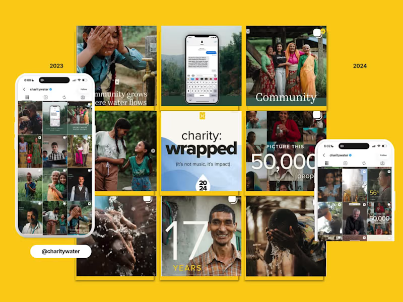
charity: water EOYG Organic Campaign Social Strategy
6
116
Message
18
Oleksandra Marchenko
pro
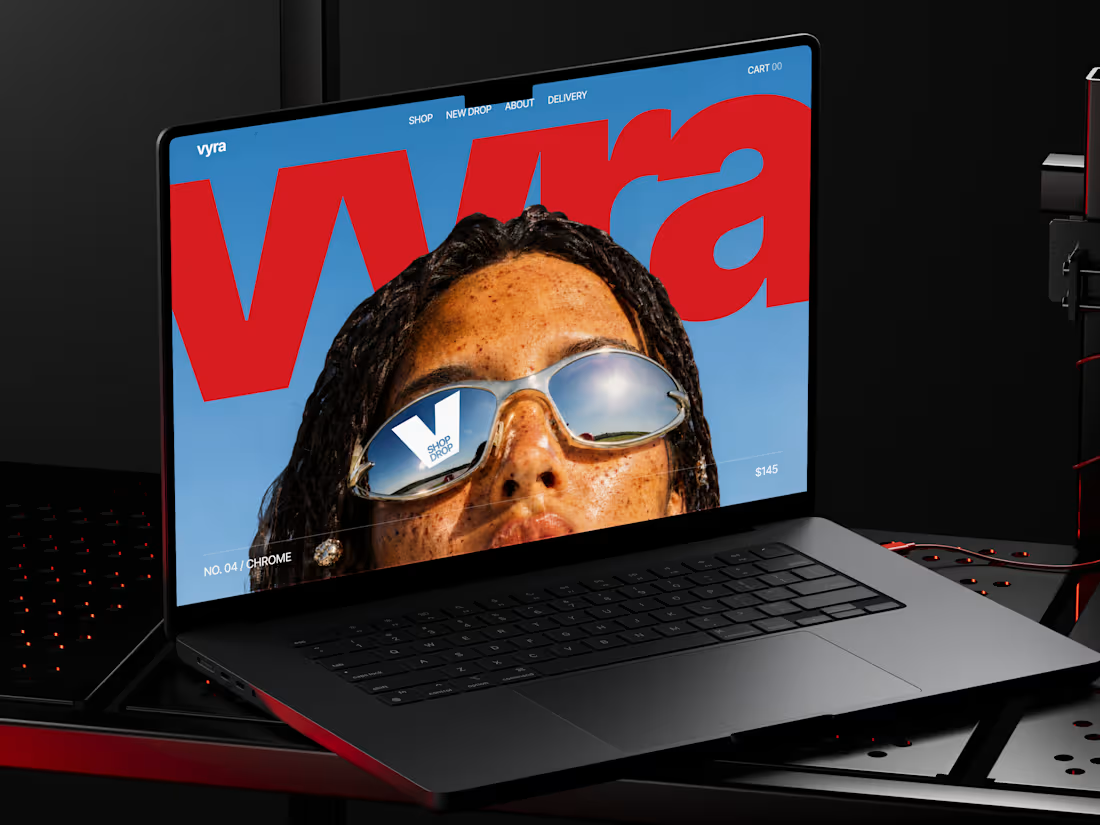
🕶️ Web design for eyewear e-commerce website | Hyperactive
18
208
Message
9
Val Guerra
pro
Explainer video for Paper
1
9
140
Message
12
Robin Holesinsky
pro
Atom.money: Brand Identity for a Regulated Fintech Platform
12
73
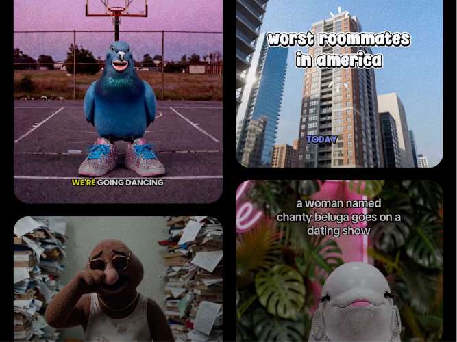
Join the $50k Cantina Challenge
Share your Cantina creation for a chance to win!
Learn more.
Enter the challenge
Enter the challenge
Enter the challenge
Enter the challenge
Web design projects using Framer
Framer
The best modern websites built on the leading web design tool, Framer
View more
Message
6
Studio Ilker
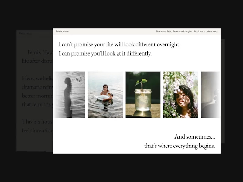
Feinix Haus Website
6
48
Framer is the leading tool for building websites, fast
Hire experts
Message
6
Creative Capital
pro
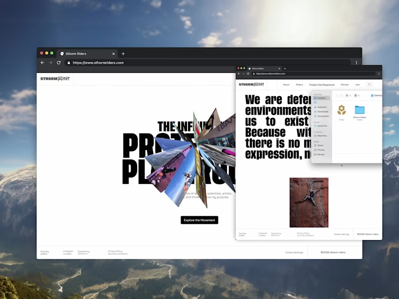
Sthorm Riders Framer Website Design
3
6
49
Message
10
Diego Colino - Vítrea Studio
max
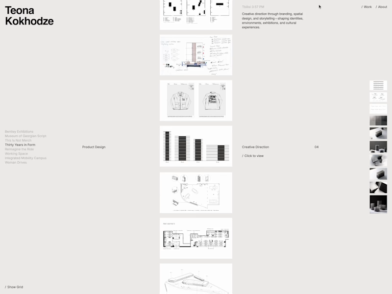
Teona Kokhodze — Framer Website Creative Director Portfolio
10
66
AI projects
AI
New projects from the best AI creators
View more
Message
13
Filip Panov
max
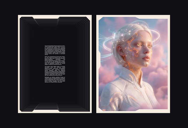
Brand Identity for Propane
13
110
Message
16
Anna asol_design
pro
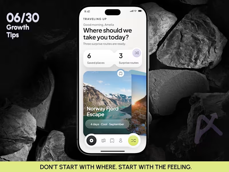
Mobile App Design | AI Trip Randomizer Planner Mobile IOS App
16
39
Message
5
Darya Batyr ✦
max
From AI-Generated to Premium: Spartan SEM Brand Identity
5
39
Message
9
Razvan Badea
pro
Alkera - Logo Design & Brand Identity
1
9
177
Brand design projects
Brand design
Bold visual identities and branding systems created by top independent designers
View more
Message
6
Virginia Roson
pro
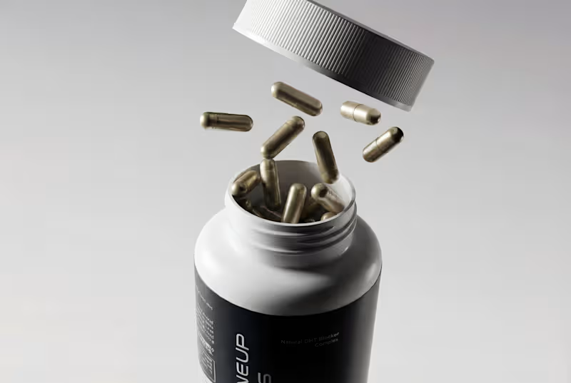
Maneup Labs Brand Identity and Packaging Design
6
66
Message
5
Révolté
pro
Vetti Brand Identity Design
5
42
Message
7
Mateus Scopel
pro
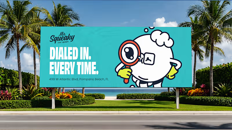
Mr. Squeaky | Brand Design
7
28
Message
4
Flávia Jackeline
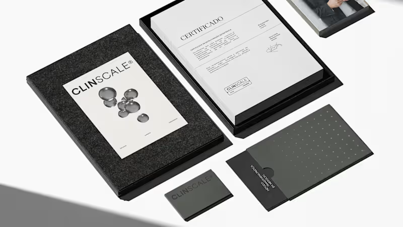
ClinScale — Brand Identity & Logo Design for Clinical Research
1
4
39
Video editor projects
Video editing
Creative video edits made using today’s best editing tools
View more
Message
3
Kayla Elorza
pro
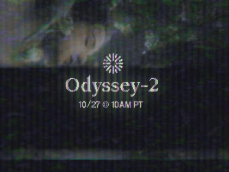
Odyssey-2 Launch Video Teasers
3
90
Message
6
Alejandra Tello
max
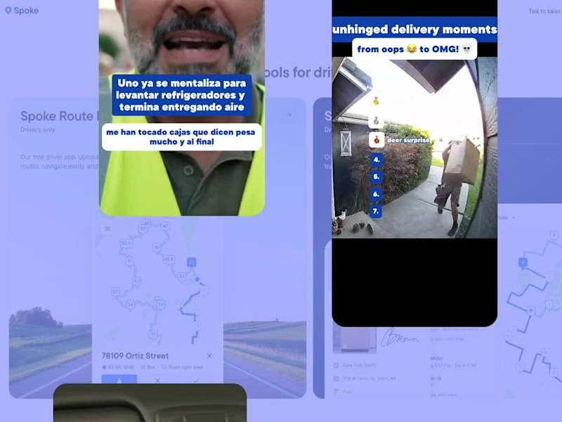
Meme-Driven Video Editing for a Delivery Driver App
1
6
132
Message
1
George Alexander-Pike
pro
Born To Sweat Video Editing/Motion Graphics
1
1
50
Message
6
Jesse Calis
pro
Halate Showreel
1
6
55
Standout projects
Standout projects
More projects we love that are making waves across the web
Message
4
Mateo Lucero
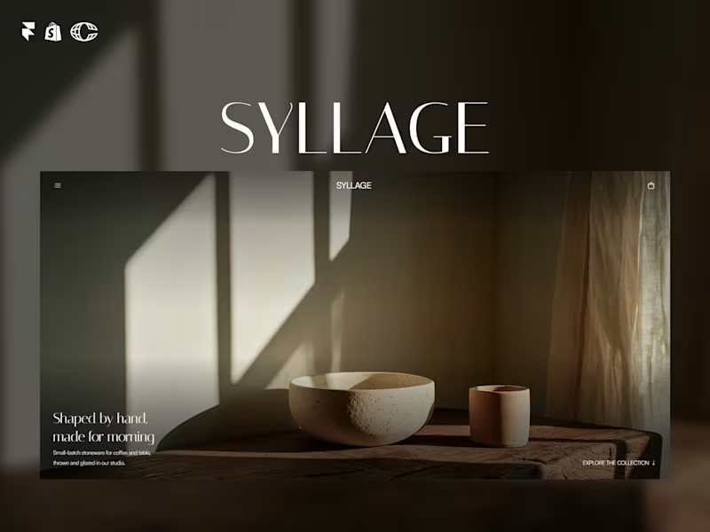
SYLLAGE is live. A complete ecommerce template for ceramic and small-batch product brands, built in Framer with full Shopify integration. 15 pages. 4 CMS collections. Journal, collections, product categories, legal pages, all done. Minimal, editorial, built to sell, not just look good. Check it out and let me know what you think ↓ https://contra.com/products/Rzd5vtXw-syllage-ceramic-ecommerce
3
4
112
Message
22
Aleksandar Coric
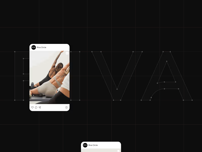
How do you turn movement into a visual identity without literally showing movement? That was one of the questions behind the branding for Riva Circle, a Pilates studio based in St. Gallen, Switzerland. Riva Circle came to us as a completely new brand. The task was to build the brand from the ground up and create a visual language that could define how Riva Circle would be perceived from the very beginning. The goal was to create something modern and dynamic, but without being loud or overly expressive. We wanted the brand to feel refined and contemporary, while still capturing something essential to Pilates: movement, control, balance, and the connection with the body. That became the starting point for the wordmark. We explored how we could translate the expression of the body and the movement of Pilates into typography. Rather than illustrating movement directly, we looked for a way to make it part of the letterforms themselves. This led us to a custom typographic treatment where a simple continuous line becomes part of the letters. Most importantly, that line appears within the letter A, creating a subtle but distinctive gesture. From that detail, we developed the visual language of the brand. The result is intentionally simple, clean typography, a restrained visual system, and a recognizable symbol built from the same idea of movement. For me, that balance was really important. The brand needed to have enough character to be recognizable, but not so much visual noise that it would compete with the experience Riva Circle is offering. And I think the brand has proven that direction quite well. Just one year after launching, Riva Circle has grown, established a recognizable presence, and, most importantly, built a strong community around the studio. So, this project was ultimately about taking something as expressive as movement and finding a very simple visual expression for it. One that can stay relevant as the brand continues to grow.
10
22
360
Message
16
Reda Oumomen
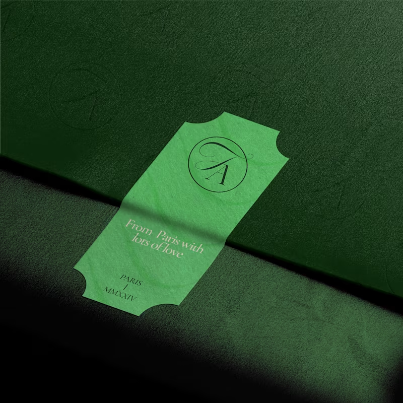
🌸 Fleur d'amour part 1. Fleur d'amour is a beautiful flower shop in Paris, making sure the beauty and magic of their flowers reaches people lives to make them better, happier, and serene. The brand direction is elegant, a bit premium, and somewhat minimal, communicated through a mix of curvy typography and a thin elegant serif. I developed a scalable logo suite to make sure each application can have an option that fits. What do you think? (This is a fictional project aimed for exploration)
3
16
172
Message
21
Olawale Opadisi
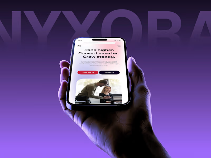
Everyone wants their brand to look "premium" but almost nobody can define what that actually means. In crowded industries like digital marketing, premium is the absence of noise. Every unnecessary element is removed until what's left earns trust on sight and can be immediately recognized. Designing Nyxora meant understanding that trade-off and building for legacy. The identity needed to feel current enough to compete with the top agencies out there, but grounded enough that a client would hand over a real budget without hesitation. The result is an identity built on purpose, one designed to earn trust before it earns attention. Case study: https://rb.gy/hy6hs1
8
21
173
Message
9
Raazi Rauf
pro
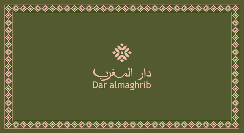
Dar Almaghrib Moroccan Café Brand Identity & Logo DesignA complete brand identity for Dar Almaghrib, a Moroccan-inspired café bringing the warmth of Marrakech to the Pacific Northwest. The identity centers on a custom logo lockup pairing fluid Arabic calligraphy for "دار المغرب" with a clean, modern English wordmark, supported by an original geometric icon inspired by traditional zellige tilework sharp-edged and fully custom, not a stock motif. The palette blends deep olive green, warm terracotta, cream beige, and a soft brass-gold accent colors drawn from Moroccan earth tones and the calm forests of the PNW, built for a premium, welcoming feel across cups, signage, packaging, and menus.
9
550
Message
7
Sujon Hossain
pro
Designed a modern Executive Business Dashboard. Clean and data-driven UI with key metrics (Sales, Revenue, Profit, Retention), performance charts, product insights, and clear analytics for smarter business decisions.
4
7
794
Message
3
DARTYX BLACKWALL
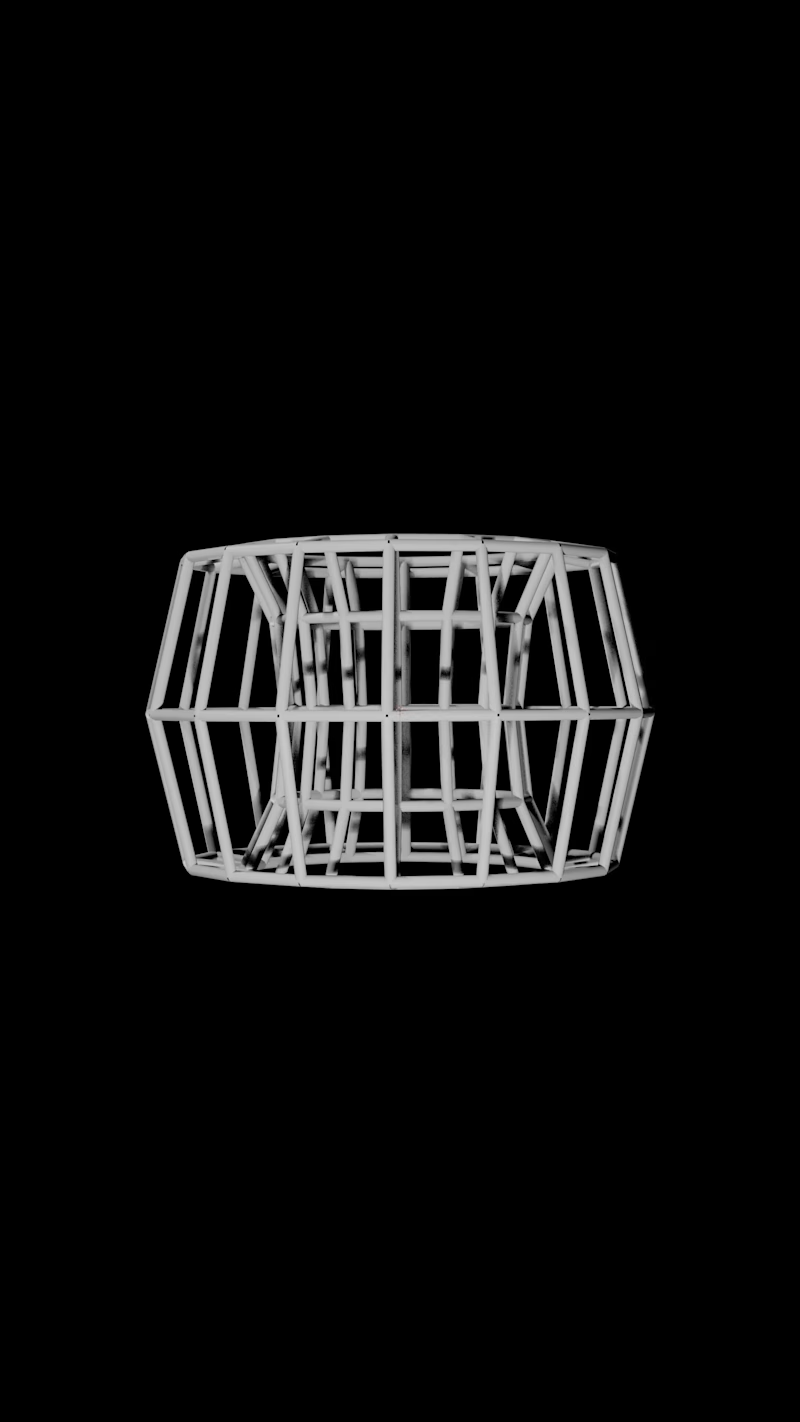
Exploring geometry beyond familiar dimensions. Procedural motion, transformation and structure.
1
3
111
Message
8
Gm Design studio
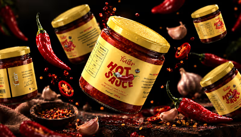
Yousr — Hot Sauce Brand Identity & Packaging Design Turning bold flavor into a bold visual identity. Yusr Hot Sauce is a food packaging project created to translate the intensity, heat, and character of the product into a striking visual experience. The packaging combines a warm, distinctive color palette with bold typography and expressive graphic elements, creating an identity that immediately communicates the product's spicy and authentic character. The visual direction was developed around the contrast between the rich red tones of the chili sauce and the warm cream of the label, creating a strong and recognizable presence across the product range. From the label design to the final product presentation, every element was carefully considered to enhance the product's personality while maintaining clarity and brand consistency. The final art direction brings the packaging to life through a dramatic food-focused environment, using rich textures, controlled lighting, and carefully composed ingredients to create an appetizing and memorable product experience. A packaging identity designed to capture attention, communicate flavor, and give Yusr Hot Sauce a distinctive presence. View the full project : https://www.behance.net/gallery/255675391/Yousr-Hot-Sauce-Brand-Identity-Packaging-Design #PackagingDesign #FoodPackaging #HotSauce #LabelDesign #FoodBranding #ProductDesign #ArtDirection
4
8
127
Message
9
Jéssica T. ✦
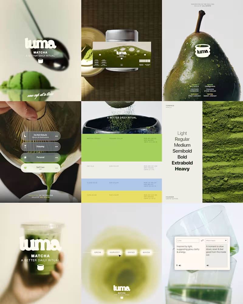
Sharing this amazing project I had the pleasure to work on ⚡️ LUMA is a matcha brand built around the ritual of taking a moment for yourself. The identity combines a fresh, playful color palette with a clean and contemporary visual language, creating a brand that feels vibrant without losing its sense of calm. The result is a modern matcha identity that brings together natural qualities with a bright, lifestyle-driven aesthetic. Check the full project on https://www.behance.net/gallery/255763939/LUMA-Matcha-Branding Tell me your thoughts! 🔥🍵
6
9
78
Message
11
Tanvir Ahmed
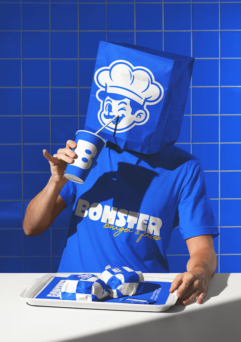
BONSTER — A Burger Brand Built With Big Flavor & Bigger Personality. Designed to bring energy, fun, and boldness into every bite, BONSTER combines a playful chef mascot, chunky visual language, and a memorable identity system that feels as exciting as the burgers themselves. From the logo to packaging elements and brand patterns, every detail is crafted to create a fun, unforgettable burger experience. BONSTER — Big Bites. Bigger Attitude. 🔥 mockups - @creatsyofficial (https://www.instagram.com/creatsyofficial/)#BrandIdentity (https://www.instagram.com/explore/tags/brandidentity/) #BurgerBrand (https://www.instagram.com/explore/tags/burgerbrand/)
7
11
231
Message
7
Mauricio Pontual
pro
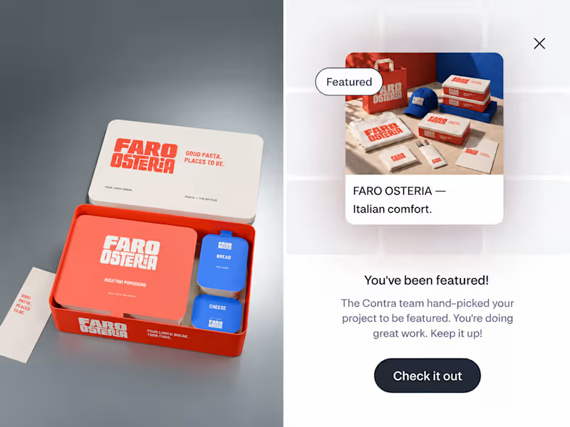
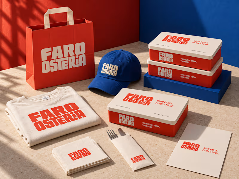
FARO OSTERIA just got featured on Contra! ✨ Really happy to see this one selected by the Contra team. I loved building the world around it, from the red pasta boxes and blue caps to the menu and street campaign. Thank you, Contra, and everyone who has taken a look and supported the work. Explore the project: https://contra.com/community/eVKgBdEl-faro-osteria-italian-comfort-street Independent concept. Creative direction, branding, packaging and AI assisted imagery by Mauricio Pontual / MP House Studio.
1
7
113
Message
12
Yonatan Efrem
pro
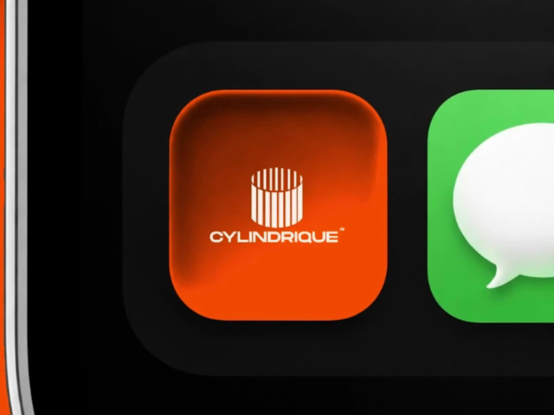
Not every project ends with a launch. Sometimes, the work is good. The direction is clear. The conversation is productive. And then the timeline doesn't quite line up. That was the case with Cylindrique. The project ended before we could take this concept all the way through, largely because we couldn't find alignment on the timeline. That's part of working in design. A good creative process still needs a practical agreement around time, feedback, and decision making. But I didn't want the concept to disappear with the project. The idea started with something deliberately simple: a cylinder. From there, I explored how that form could become a modern industrial mark for an AI company, using geometry, segmentation, negative space, and perspective to create a sense of structure and depth. No generic AI symbols. No unnecessary complexity. Just a system built from one strong form. I would have liked to see where the identity could have gone with the full process. Still, some concepts are worth showing even when they don't become the final answer. Not every design has to become a brand to be worth making. #Cylindrique #LogoDesign #BrandIdentity #AI #TechBranding #IndustrialDesign #LogoConcept #DesignProcess
4
12
328
Message
14
Swati Awasthi
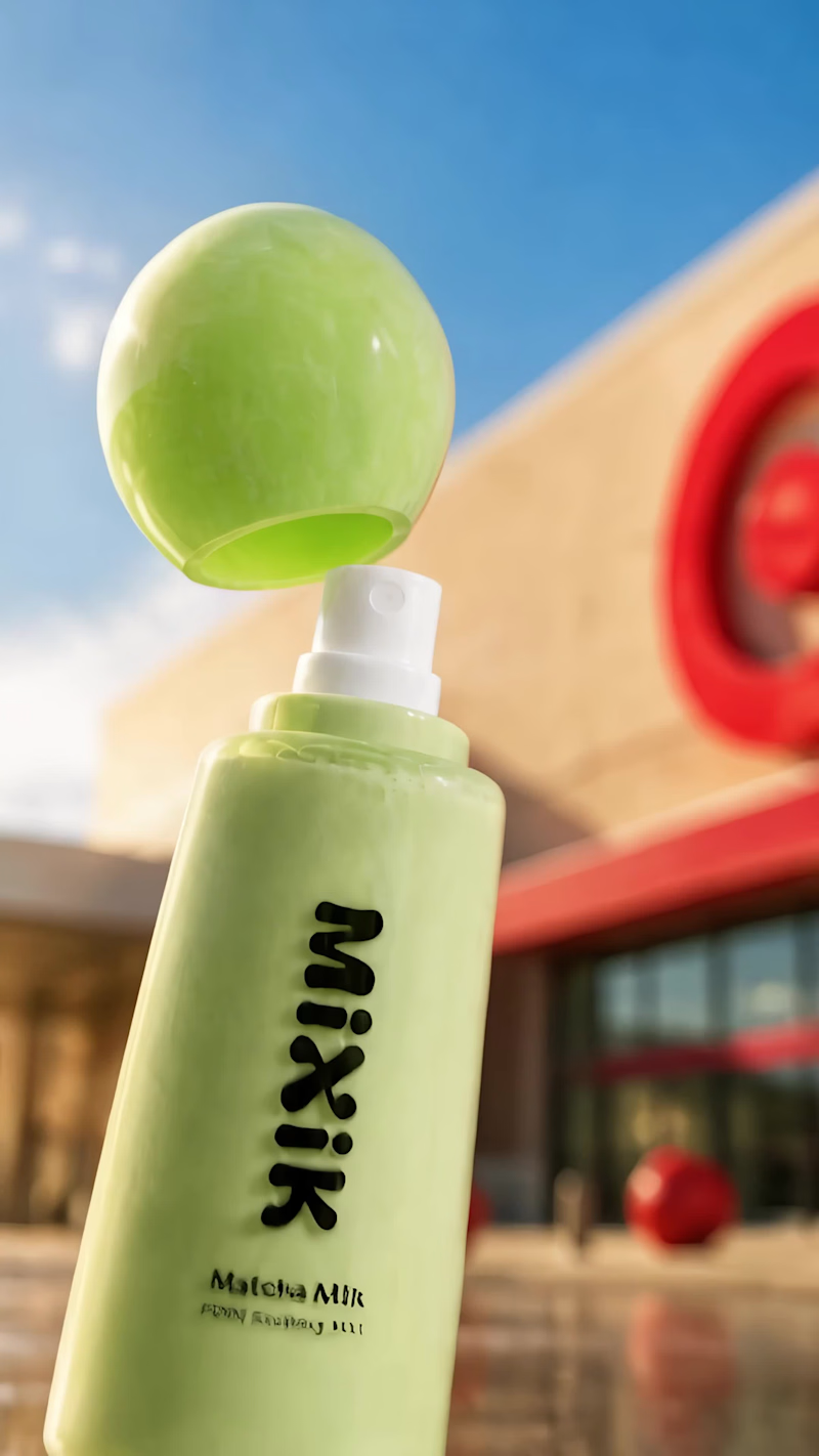
Launch film created for @mixikskin (https://www.instagram.com/mixikskin/) ⚡️ Loved bringing this collaboration to life. 🥤
4
14
539
Message
16
David Charles
pro
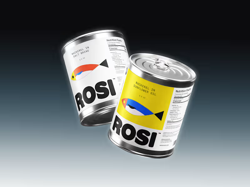
So, what is ROSI? A few cans. Five colours. One very simple fish. A ridiculously large wordmark. And hopefully proof that everyday products don’t have to look everyday.
8
16
182
Message
10
Ciaran Moore
pro
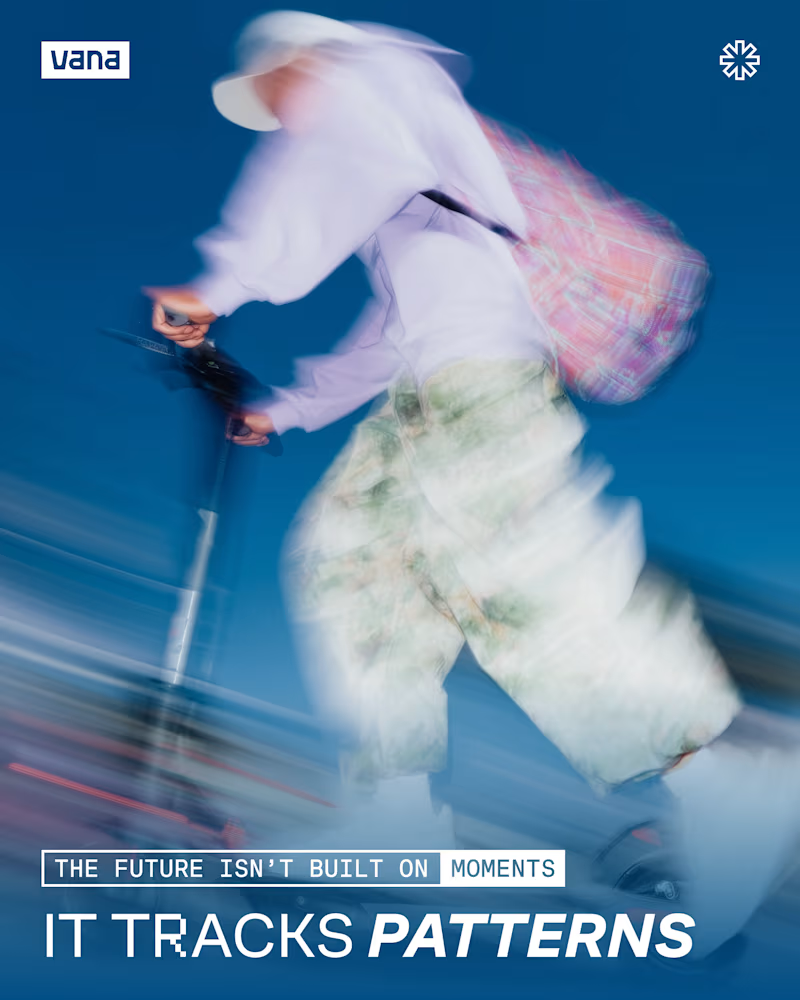
VANA Data Moments campaign. Strategy, creative direction & design for a social media + ad campaign. With this we set out to highlight moments of data creation in everyday life, connecting the audience with Vana's data-ownership mission.
4
10
150
Message
13
Mauricio Pontual
pro
FARO OSTERIA — Italian comfort. Street energy. A brand and takeaway concept built around the entire meal: bold packaging, a clear digital menu and a street presence that carries the same identity from counter to customer. The packaging study uses one carrier with separate pasta, bread and cheese modules. The visual system extends through a $5–$7 pasta menu, uniforms, bags and editorial campaign imagery. Creative Direction — Mauricio Pontual. Concept study. Packaging modelled in Blender; campaign imagery developed with AI-assisted tools and art direction. Explore the complete project: https://www.behance.net/gallery/255879863/Faro-Osteria-Food-Branding-Packaging-Design
6
13
228
Explore projects