Contra - A professional network for the jobs and skills of the future
Discover
Sign Up
Post a job
Sign Up
Log In
Filters
Projects
People
Filters
Featured
Web developers
Content creators
Graphic designers
Product designers
AI developers
Motion designers
Social media marketers
Animators
Video editors
Projects we love
Projects we love
Standout projects making waves around the web
View more
Message
11
Paula Gibert
pro
AxiDerm: clinical decision-support app for vets
1
11
103
Message
4
Lauri Lännenmäki
pro
no-code.supply — A Store for Very Good Websites
4
84
Message
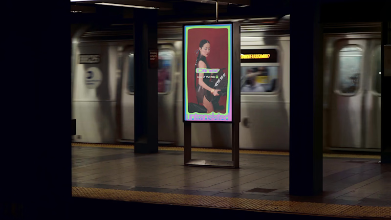
6
Yutong Hu
Untranslated
6
48
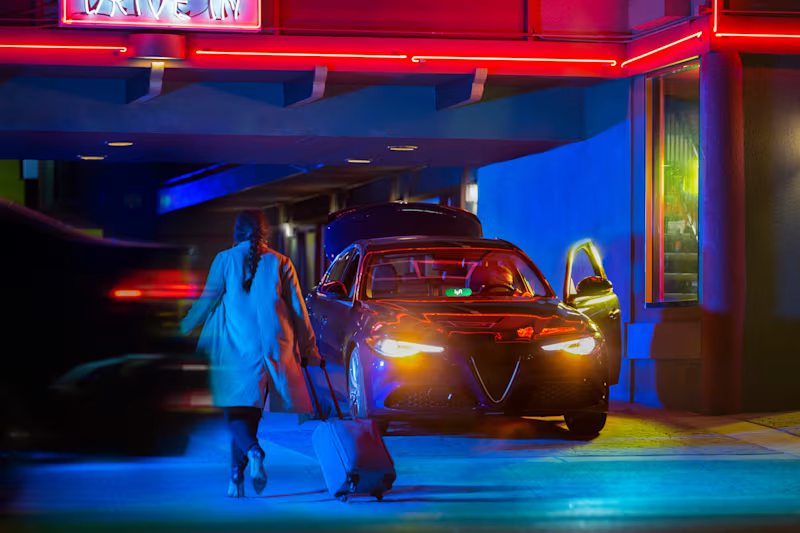
Message
38
Jon Howell
Lyft Pink
38
1K
Web design projects using Framer
Framer
The best modern websites built on the leading web design tool, Framer
View more
Message
15
Julia Ibri
pro
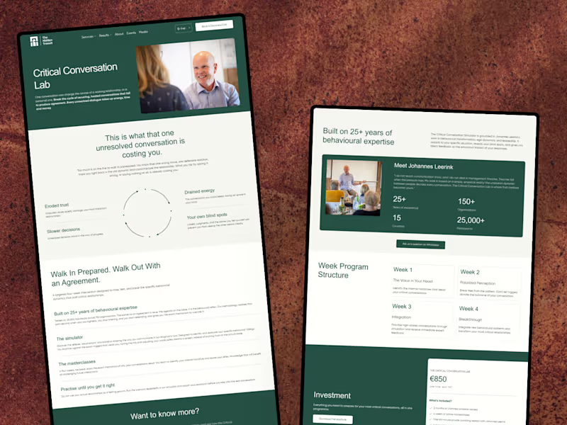
The Hidden Transit — Conversion-Focused Landing Page
15
73
Framer is the leading tool for building websites, fast
Hire experts
Message
5
Kyle Panilan
max
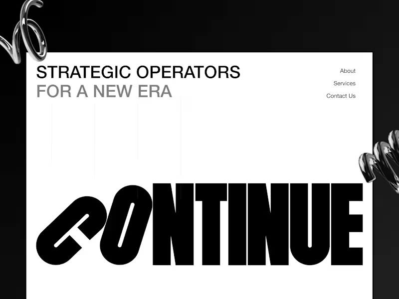
Continue Landing Page: Framer Website Development
5
82
Message
1
Tanish Mittal
pro
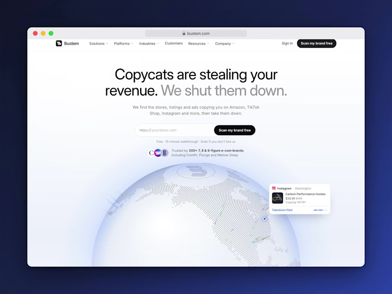
Bustem // A 51-Page Brand Protection Website in Framer
1
26
AI projects
AI
New projects from the best AI creators
View more
Message
5
Jeannie Kho
pro
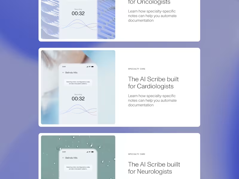
Brand Refresh for DeepScribe AI
5
71
Message
12
Karina Bondarenko
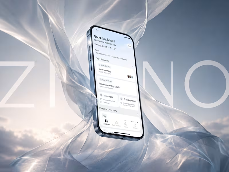
Zino: AI-Powered Productivity Platform for Focused Workflows
12
74
Message
13
Stacy · Heed Collective
pro
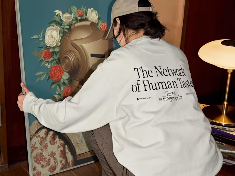
Brand Identity & Web Design · Contra Labs
1
13
105
Message
1
Ralph Jones
max
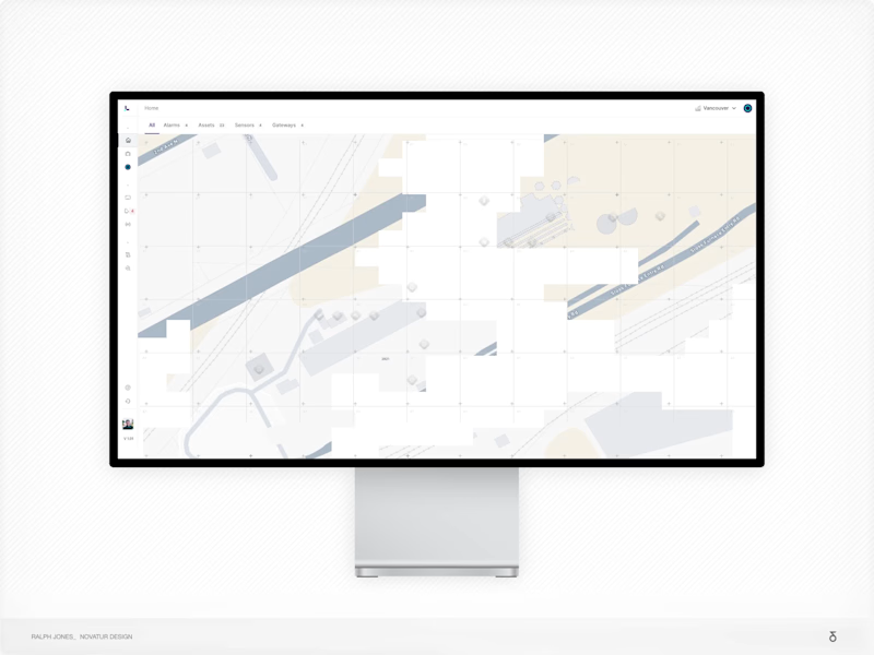
Strategy-Led Redesign for Industrial IoT Platform with AI
1
29
Brand design projects
Brand design
Bold visual identities and branding systems created by top independent designers
View more
Message
3
Paula Gibert
pro
The Pedagogy Coach: brand and product design
1
3
49
Message
2
Lindsey Morgan
pro
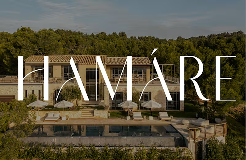
HAMÁRE Brand and Digital Ecosystem Development
2
38
Message
3
Serena Tyrrell
max
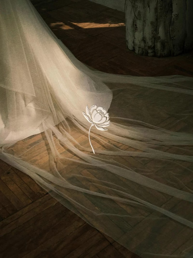
Poetic Brand Identity Design for Little Poppy June
3
24
Message
1
Kris Anfalova
pro
Cobalt Brand Identity Design
1
21
Video editor projects
Video editing
Creative video edits made using today’s best editing tools
View more
Message
3
Krystyna Zeljukina
pro
Motion Graphics for Brand Identity Video | Optyo
3
35
Message
4
Alexandru Köllo
max
The Courier: VFX-Driven AI Sci-Fi Short Film
4
54
Message
16
Jen Lai
pro
Gritzy | Social Media + OOH Animations
16
308
Message
15
Mykola Malyhin
pro
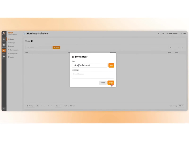
Aura | AI SaaS Explainer Video & Real UI Product Demo
15
153
Standout projects
Standout projects
More projects we love that are making waves across the web
Message
0
mademo studio
pro
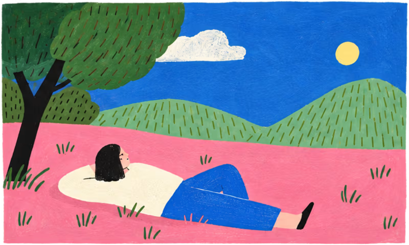
An illustrated story about a small gesture that makes a big difference. Through four colorful scenes, a discarded battery finds its way to the right recycling bin, transforming an everyday action into a playful environmental message. Inspired by contemporary editorial illustration, this series combines bold colors, organic shapes, subtle textures, and minimalist characters to explore the relationship between people and nature. A visual narrative about environmental awareness, collective responsibility, and the beauty of simple actions. Illustration · Visual Storytelling · Editorial Design · Sustainability #Illustration #EditorialIllustration #EnvironmentalAwareness #VisualStorytelling #DigitalIllustration #Sustainability #CharacterDesign
0
10
Message
13
Arek Dvornechuck
pro
The brand is coming together 😊
7
13
182
Message
3
Summer Chang
pro
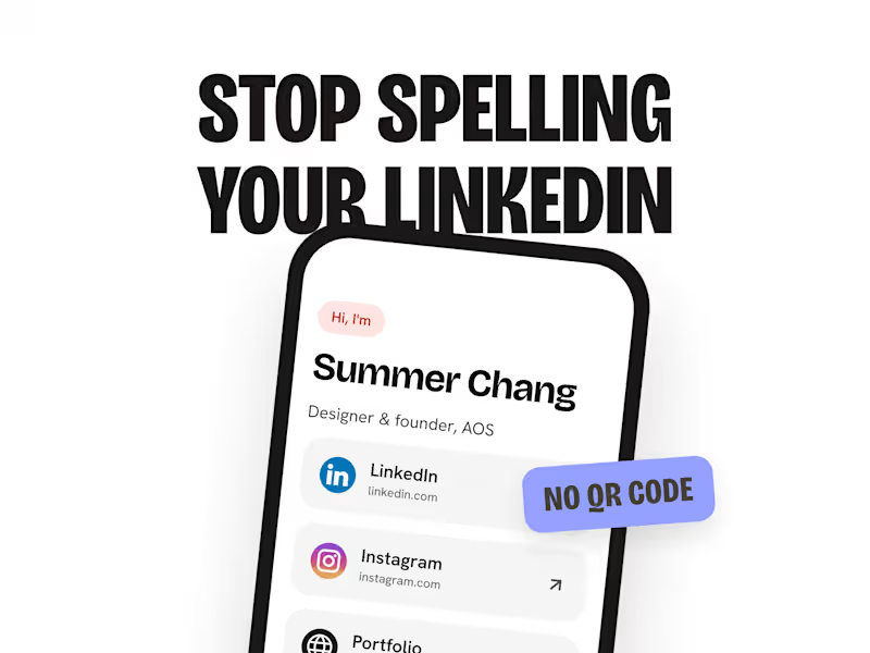
I rebuilt the NFCtree website to match the new app. Same colors, same fonts, same textures, from one design system. ⠀ I explored layouts in Paper first. Looked at how Anchor, ugly.cash (http://ugly.cash) and Klarna handle scrolling. Picked one. ⠀ Then I designed it in Figma. Claude Code turned it into code. Pushed to GitHub. Vercel published it. ⠀ The scroll motion is CSS only. It turns off when reduced motion is on. ⠀ Does your website look like your product?
1
3
79
Message
11
Anna Syniavska
pro
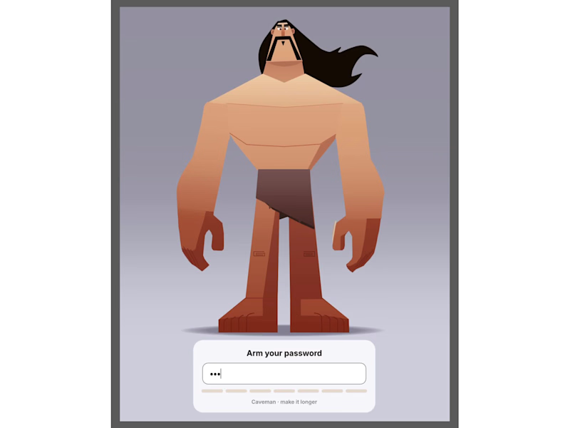
Login page idea design A playful visual concept where the character literally “arms” himself depending on the strength of the password. As the user creates a stronger password, the character progressively equips himself with more powerful protection and armor. The stronger the password, the better prepared and more protected he becomes. The idea turns password security into a simple and engaging visual metaphor , instead of showing abstract security levels, the user can immediately see how their password makes the character stronger and safer.
8
11
293
Message
21
Kris Anfalova
pro
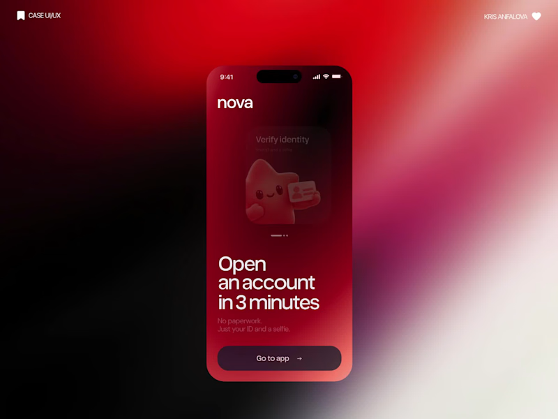
What if sending money felt a little more like giving a gift? For Nova, I explored a banking app that brings payments, cards, and a bit of personality together. You can check your balance, browse recent transactions, send or request money, top up, and pay bills. My favorite part is the digital postcard feature. Before sending a transfer, you can add a little illustrated card—a heart, a birthday greeting, or a playful character. A simple way to make birthday money or a thank-you feel more personal. I carried that same 3D character into onboarding, pairing it with bold red gradients and large, clear payment details. There’s room for play, while the recipient and amount stay easy to check. Would you add a postcard to a transfer? I’d love to know what occasion you’d use it for.
11
21
331
Message
0
Abron Studio
pro
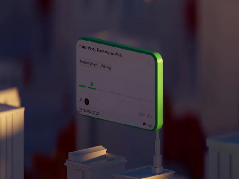
Kept is SaaS providing location tracking task management services. We created a 3D animation featuring the main services.
0
19
Message
7
Andrés Mesa
pro
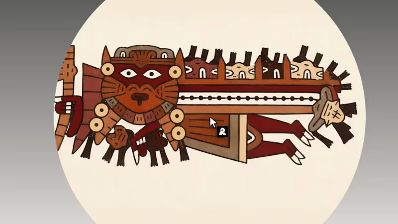
Nazca Terra Pop is a vector style, built from a single Nasca bottle painted on the south coast of Peru 1,500 years ago . I unwrapped its flying figure, vectorized it, and grew a small world of people, animals and objects around it to train the style, keeping the original earth palette of terracotta, maroon and bone. Then I gave it real jobs: an in-flight safety guide for a made-up airline, a ten-piece collection called Everyday Problems that tells modern annoyances the way the Nasca told their myths, and a microsite (https://andresmesa.com/nazca) where the art becomes a painted tablet again like it would be 1500 years ago.
7
238
Message
0
Michael Bellout
pro
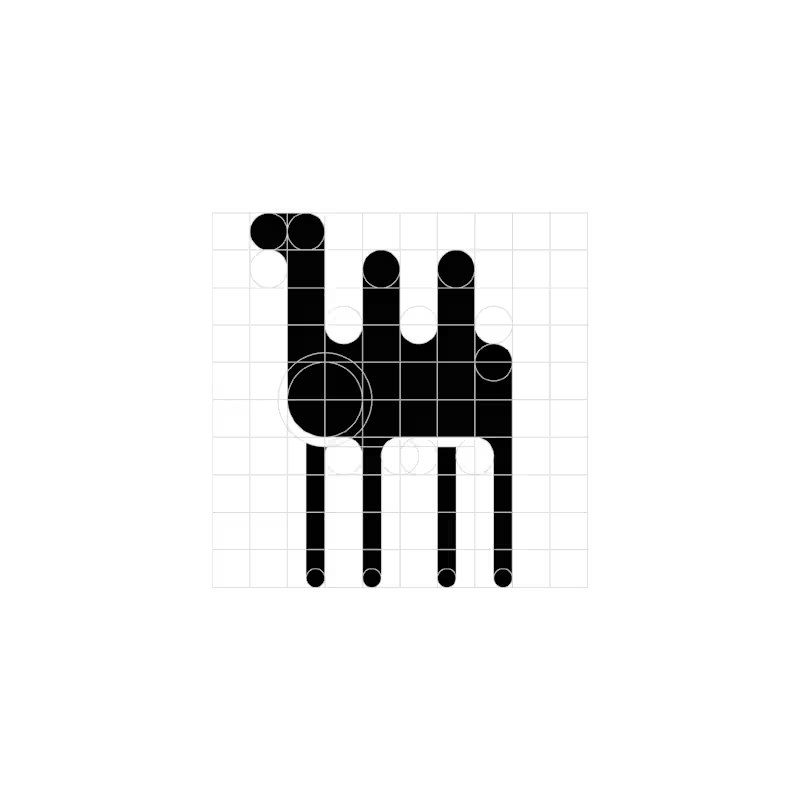
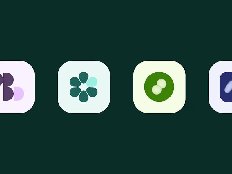
One Logo a Day | Exploring Geometric Expression For one month, I challenged myself to design a logo every day. These four favourites share a distinct visual language: bold monochrome shapes, precise geometric construction, and playful use of negative space. Circles, semicircles, and elongated verticals become the building blocks for expressive symbols. Rounded forms soften the heavy black silhouettes, while repetition creates rhythm and movement. Elsewhere, sharp diagonals and dramatic shifts in thickness introduce a more angular, architectural character. The series explores the boundary between abstraction and recognition, suggesting familiar objects and gestures through a small number of carefully arranged shapes. Visible construction grids reveal the relationships behind each mark, showing how proportions, alignments, and curves hold the compositions together. Working entirely in black and white places the focus on form. Each design becomes an exercise in creating personality and visual impact through silhouette, contrast, and space.
0
24
Message
0
Michael Bellout
pro
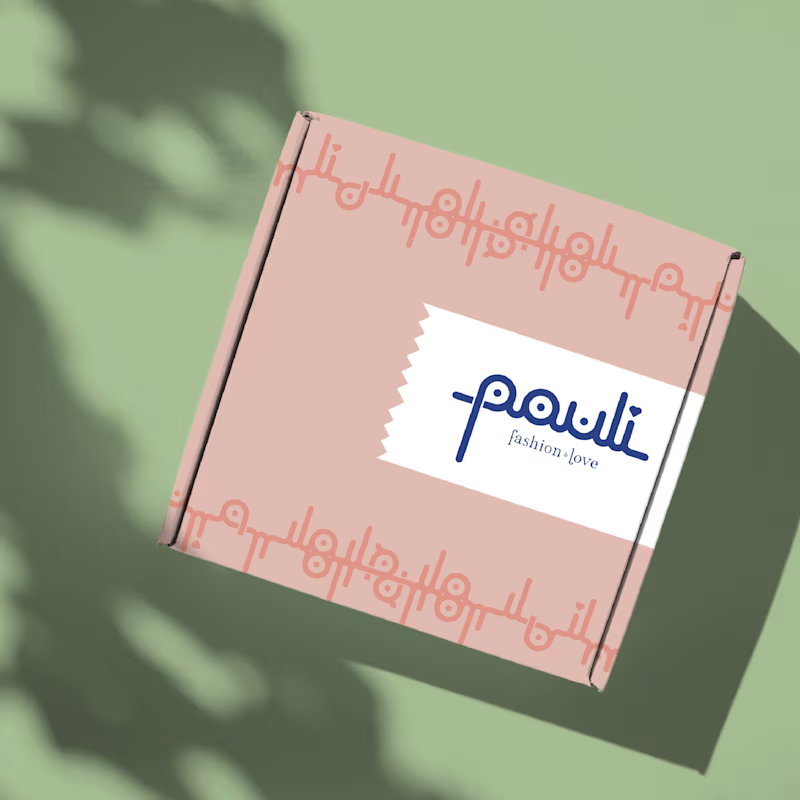
Pauli | Fashion with a Personal Touch For Pauli, a fashion boutique with a warm, caring personality, I designed a logo that brings its “fashion & love” philosophy to life through playful, distinctive lettering. The connected lowercase wordmark combines rounded strokes, circular details, and flowing curves. Its consistent line weight creates visual harmony, while the elongated “p” and tall “l” give the silhouette rhythm and individuality. A small heart replaces the dot above the “i,” weaving the boutique’s affectionate character directly into its name. A delicate serif tagline adds elegance beneath the expressive lettering. Deep blue anchors the identity, balanced by soft blush pink and fresh pastel green for a welcoming, uplifting palette. The letterforms also become a flexible graphic toolkit: separated, mirrored, and repeated, they create decorative motifs and packaging patterns. This extends the logo into a cohesive identity, giving every detail the same personal, lovingly considered feel.
0
26
Message
0
Michael Bellout
pro
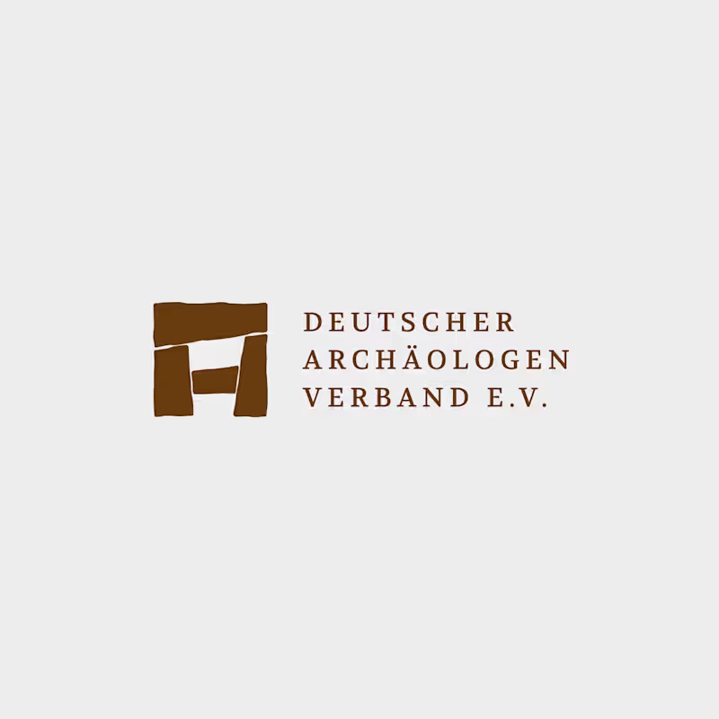
German Archaeologists Association | Connecting Heritage and Identity For the German Archaeologists Association, I redesigned the logo to translate the physical character of archaeology into a clear, contemporary visual identity. The symbol combines a Stonehenge-inspired structure with an abstract “A” for archaeology. Four stone-like shapes form a compact emblem, with subtly irregular edges that evoke weathered surfaces and ancient construction. Balanced proportions bring structure to these organic contours, connecting historical references with precise graphic design. Uppercase serif typography adds a scholarly, authoritative character. Generous letter spacing and a structured three-line arrangement give the association’s name clarity and presence. The palette draws on earth, stone, and excavation: warm ochre, deep brown, and cool mineral grey. The emblem also retains its distinctive character in simple black-and-white applications. The result is an identity rooted in the material traces of the past, giving the association a confident contemporary presence.
0
31
Message
28
Sveta K
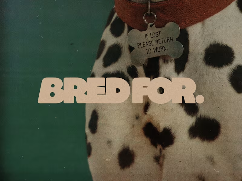
BRED FOR. is a fictional dog brand built on one idea: every breed was bred for a job, and the instinct never left. Collies herded sheep, poodles retrieved ducks, Yorkies hunted rats, Dalmatians ran beside fire carriages, so each product turns a breed's original work into an everyday object. Style 01 is built from Japanese and Korean folk art found at the Cleveland Museum of Art, The Met, LACMA and the Rijksmuseum, and designs the products as soft, deadpan designer objects. Style 02 is built from early colour autochromes and a 1914 lithographic poster from the Rijksmuseum and the Albertina, and turns every scene into a modern fashion campaign with an archival feel. The two Styles were chained with Edit image: Style 01 products placed into Style 02 scenes, every headline rewritten in the brand's dry, deadpan voice. The strongest images were selected, upscaled and finished with a logo made in Recraft Logo Maker. Style 01 (products): https://www.recraft.ai/styles/b8e1a6b6-ae61-49db-907d-74229530b596 Style 02 (campaign): https://www.recraft.ai/styles/7f2a89de-d69a-4fad-aa0d-ba6302c9a2f3
28
28
2K
Message
21
JAVIER @DSpot
max
Rive Games Live at the 2026 EuroLeague Final Four
1
21
482
Message
49
Studio Cesare
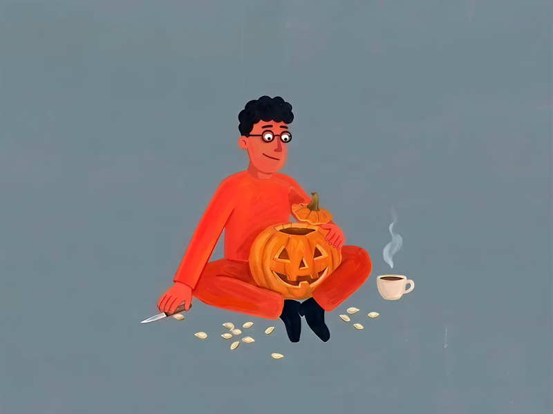
Did y'all already carve your pumpkins? Cesare is definitely into it 😊
24
49
906
Message
74
Kris Anfalova
pro
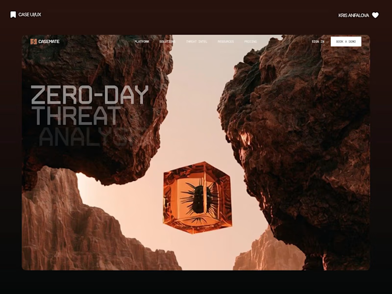
Casemate: making malware analysis feel calm instead of scary Cybersecurity websites usually look the same: black background, green code, a hooded guy. I wanted to try the opposite for Casemate, a concept for a malware analysis tool. The idea is simple: the product keeps a suspicious file in a sealed chamber and watches what it does. So I put a bug frozen in amber in the middle of a canyon. It’s dangerous and under control at the same time, and you get it without reading a word. Then I made sure the page still works for a security lead who wants facts. The stats sit right next to the headline: threats isolated, latency, endpoints covered. The hardest part was keeping it warm without losing trust. I stayed with one terracotta colour, wide capitals and mono labels, so it reads like a serious tool and not a poster. I’m taking on new projects for SaaS and tech teams. If you have a product that’s hard to explain in one glance, send me a message. What do you think, would you trust a security product with a canyon on the homepage?
31
74
1.8K
Message
115
Kris Anfalova
pro
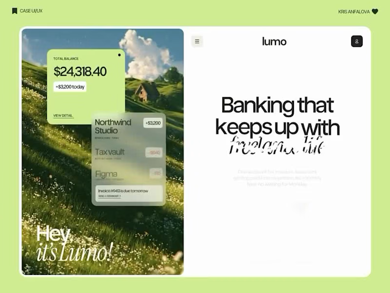
Landing page design for Lumo — banking for freelance life Banks sell control — dashboards, charts, a card floating at fifteen degrees. Freelancers don't want control over their money. They want to stop thinking about it in the gap between sending an invoice and the money landing. That gap is what the page is built on. The product sits in a meadow instead of on a dark grid, because the promise isn't "manage your finances better" — it's "we handle the part that keeps you up." And the strongest line on the page isn't a feature: no waiting for Monday. Freelancers don't lose weekends to fees. They lose them to timing. The proof follows the same rule. One freelancer, one number — 4% lost on every international payment. A percentage someone can check against their own account beats any adjective.
50
115
2.4K
Message
28
Sulman Cheema
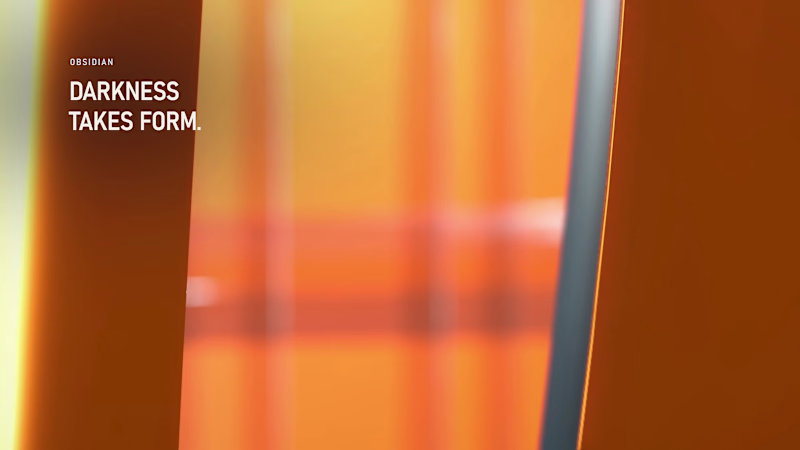
Dark luxury, Halloween edition. 🖤 Obsidian textures, spectral glass, liquid-orange lighting and kinetic typography—fully in their element. Around 6.5 GB of production data shaped into one 20-second reel, built with Antigravity, Blender and FFmpeg.
8
28
845
Explore projects