Web design projects using Framer
Framer
The best modern websites built on the leading web design tool, Framer
Framer is the leading tool for building websites, fast

Brand design projects
Brand design
Bold visual identities and branding systems created by top independent designers
Standout projects
Standout projects
More projects we love that are making waves across the web
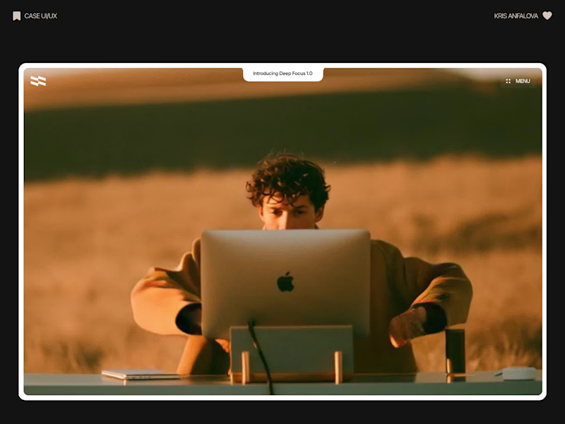
Deep Focus is a fictional macOS app that silences notifications so people can do deep work. The catch is the audience: people who need a productivity app are already tired of apps. Every competitor promises more features, so this page had to promise relief and turn it into a download within seconds.
What I did
I started from the pain, not the product. The second screen lists what a normal day looks like: push notifications, endless pings, 142 unread emails, context switching. I styled those chips like the four benefit chips in the hero, only white instead of frosted, so the visitor reads before and after without a line of explanation.
The hero section design shows no interface on purpose. This product is about absence, and a screenshot would add noise, so a person alone in a field does the proving. The headline “Deep focus. Anywhere.” is a high-contrast serif because every tool in this category speaks in a grotesque, and a serif sounds calm and human.
I kept one action, Download for macOS, with no pricing and no form. The first job of this landing page design is a download, and everything else can wait until after it.
Would you keep the serif for the headline, or switch to a grotesque so it feels more like software?
16
35
649
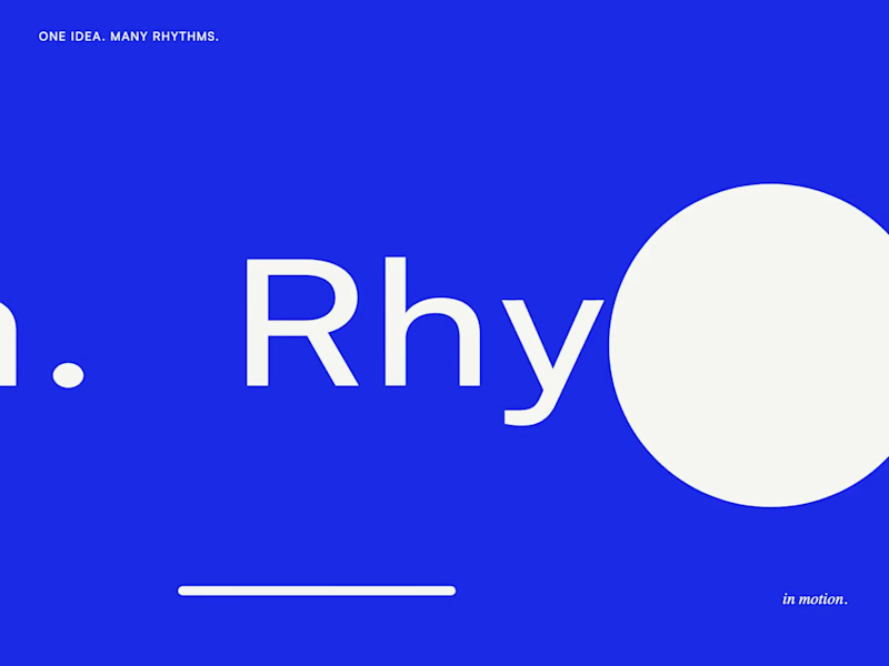
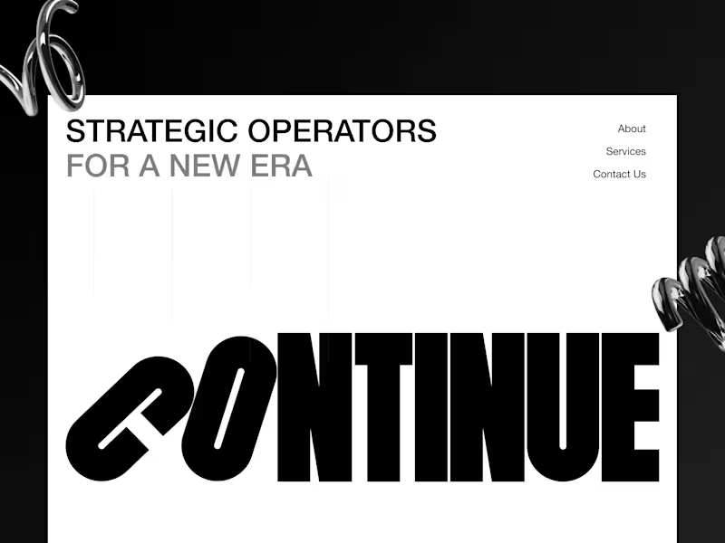
Motion Design & Art Direction
I design motion from the first composition to the final frame, combining typography, graphic design and animation.
This self-initiated series shows how I work with timing, weight and visual hierarchy. Letters stretch and rebound, geometric forms trigger chain reactions, and transitions carry one composition into the next. Each movement follows the same graphic language while giving each film a distinct pace.
My focus is on how a design behaves over time: where the eye goes, how an element arrives, and when a transition needs to hold or accelerate.
6
17
249
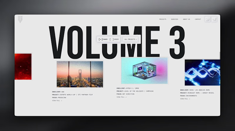
Here’s a little piece from my current project. As I watch the Swiss design concept become a part of my creative DNA, I find myself constantly gravitating towards this direction in web design.
What’s really interesting is that Volume 3 studio and I are experimenting here, mixing things that seem completely unmixable at first glance.
Since Volume 3 is a CGI and VFX studio, it was crucial to incorporate a 3D dimension into their brand communication. On top of that, a Terminal UI is exactly what keeps that technical vibe going.
So, the final mix is International (Swiss) style, a Terminal UI, and a 3D feel brought to life by neumorphism. Crazy, right???
It looks simple and clean, but behind the scenes, there’s a massive amount of work on the details. We focused on all those little things that push the UX/UI into the premium segment — the things you don't necessarily see right away, but you definitely feel when you're on the page.
The work is still ongoing, so I can't dive into reflecting on the whole process just yet, but I'm gonna keep revealing small parts here.
12
28
363
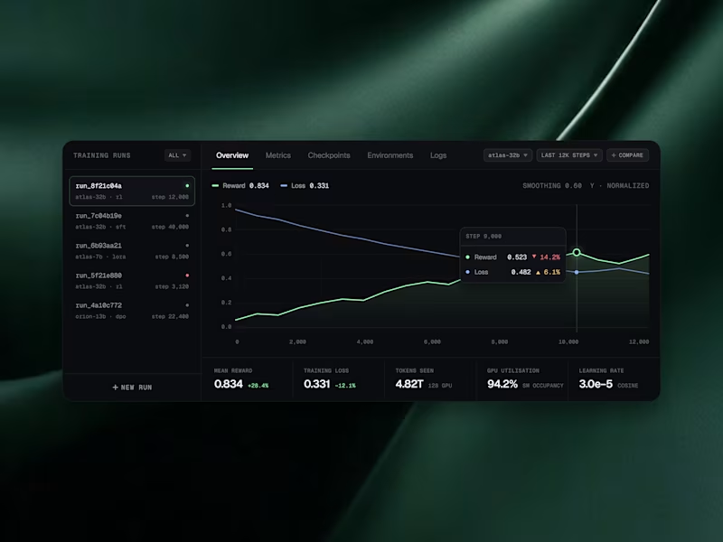
AI Telemetry & Evaluation Widgets 🟢
What if AI infrastructure data felt calm instead of overwhelming? 🌿
We designed a set of widgets for tracking models, GPUs, and training runs, where every score, price, and metric is easy to scan. Sleek dark cards with soft green highlights float over a rich emerald silk backdrop, turning dense telemetry into something you actually want to look at.
Swipe through the 4 frames to see the model leaderboard, GPU pricing cards, training and inference flows, and live training run charts. 👀
Which widget would you want on your dashboard first? Tell us in the comments! 💬👇
#UIDesign #UXDesign #DashboardDesign #DataVisualization #AIDesign #SaaSDesign #DarkModeUI #DeveloperTools
15
33
939
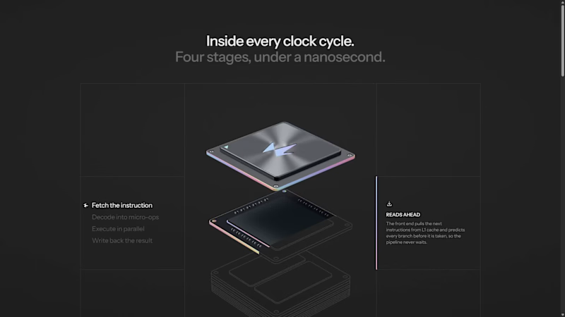
A CPU runs four stages in under a nanosecond. Fetch, decode, execute, write back.
Try explaining that in a paragraph.
So I made a 3D exploration where every scroll is one stage. A piece turns from a technical drawing into 3D and locks into place, until the chip is complete.
When people can see what your product does, they don't need a paragraph to believe it.
4
10
285
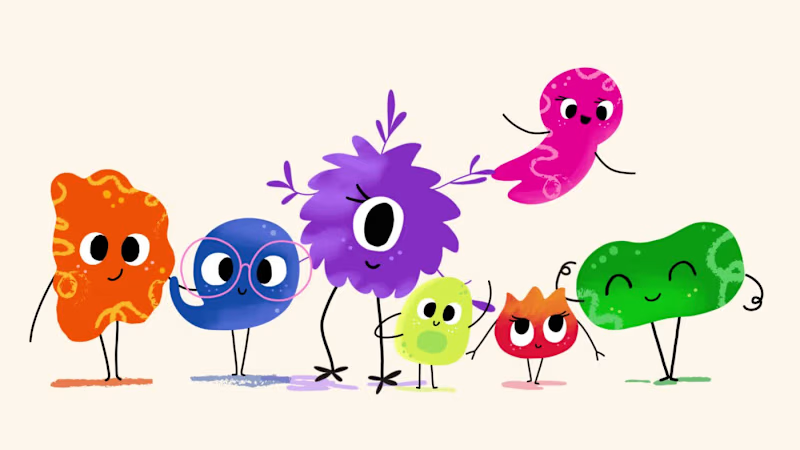
Meet the Mental Reps squad!
We got a chance to bring these seven characters to life, including building a fully custom Shopify store for Mental Reps Co., a performance-psychology brand that teaches kids the mental game.
Each one lives in mentalrepsco.com (http://mentalrepsco.com)
Big feelings, tiny monsters.
20
50
941
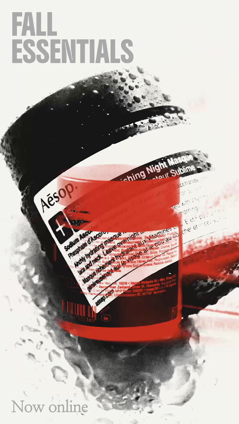
An exploration of art, creativity, and creative direction through the lens of AI 🌸
This is an independent, experimental concept project, created entirely with AI to explore new possibilities in visual storytelling, artistic expression, and creative direction.
The work incorporates AESOP brand assets and identity, which remain the property of their respective owners. This is a personal creative exploration, not an official AESOP campaign or commissioned work.
Created with AI. Directed by me.
A concept. A creative experiment. A vision brought to life through AI.
9
15
442
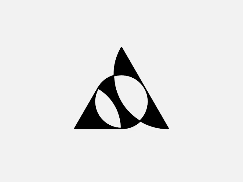
Exclusive premade abstract triangle A logo.
One buyer, full copyright transfer.
A triangle, a circle, and one sweeping curve forming a stylized letter A with two leaf-like shapes in negative space. Built for AI companies, tech startups, fintech platforms, and architecture studios.
Available now: https://brandforma.com/work/abstract-triangle-a-logo-for-sale
(https://brandforma.com/work/abstract-triangle-a-logo-for-sale)Design by Bohdan Harbaruk // Brandforma Studio
5
15
248
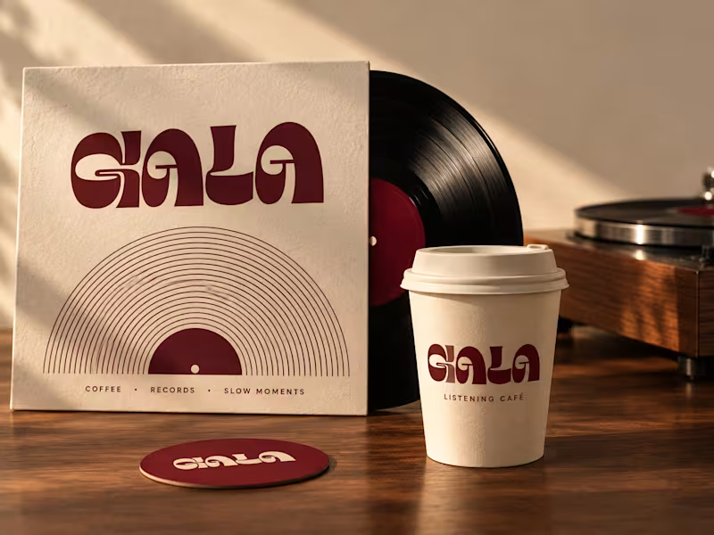
GALA, Listening Café_ Brand Identity
GALA — Listening Café Coffee. Records. Slow moments. GALA brings together the warmth of coffee and the pleasure of listening—a space to pause, settle in, and enjoy the moment. The wordmark’s bold, sculptural letterforms and flowing curves create a visual rhythm with a nostalgic spirit. Generous shapes and expressive negative spaces balance movement with a sense of ease. Deep burgundy and warm cream give the identity a rich, welcoming character. Vinyl-inspired arcs carry the listening concept across packaging and printed materials, while slender, elongated supporting typography contrasts with the weight of the logo. From coffee cups to listening-session cards, every detail shares one invitation: sip slowly, listen closely, and stay for another track. Take a pause. Press play.
4
7
188
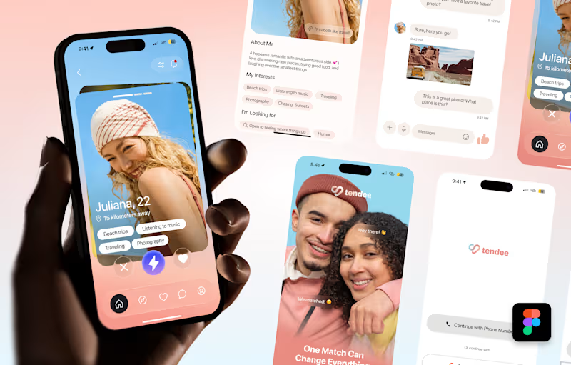
Tendee - Dating App UI UX Design
A mobile app UI design showcase focused on discovery, profiles, matching and conversation.
The visual challenge was to bring profile content, interest tags, primary actions and messaging into a consistent mobile experience. The design uses a soft lavender and coral palette, clear typography, rounded cards and recognizable navigation.
The selected mockup presents a profile discovery screen, detailed profile information, chat, onboarding and sign-in views. These screens demonstrate visual hierarchy, consistent interface styling and attention to mobile interactions.
Personal portfolio showcase. Project cost is an illustrative quote for comparable design work, not a past client payment. The date marks this showcase's preparation in October 2026; duration is an estimated production timeframe.
4
21
2.2K
Proud to share one of my collaborations with Leni AI, creating engaging video content for a real estate technology SaaS platform.
From concept development and motion design to UI animations, and data visualization, I help bring complex SaaS products and ideas to life through compelling visual storytelling.
Looking for creative video solutions for your SaaS or tech product? Let's talk!
2
12
276
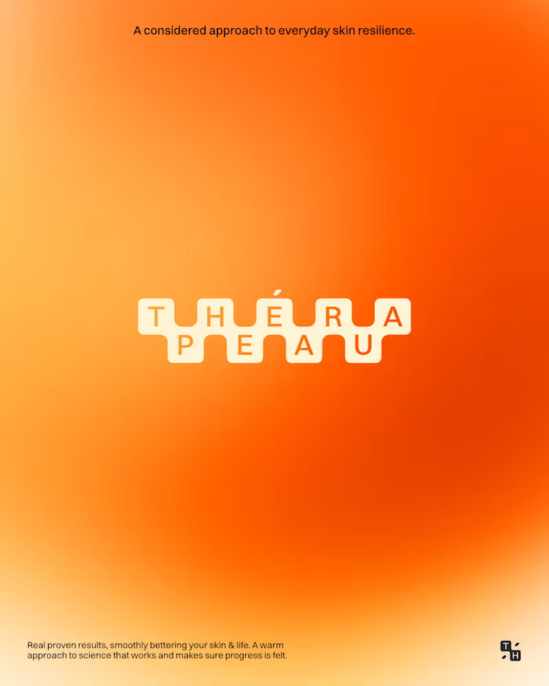
Thérapeau is a science-led brand making sure skincare delivers results through its barrier-repairing approach.
The goal here was to create a warm identity that represents the scientific approach the brand adopts, without being cold or boring.
A vibrant and warm visual identity that expresses a sense of calm, healing, and growth.
Follow if you wanna see more branding.
4
7
142