Contra - A professional network for the jobs and skills of the future
Discover
Sign Up
Post a job
Sign Up
Log In
Filters
Projects
People
Filters
Featured
Web developers
Content creators
Graphic designers
Product designers
AI developers
Motion designers
Social media marketers
Animators
Video editors
Projects we love
Projects we love
Standout projects making waves around the web
View more
Message
18
Anna Peredelskaia
pro
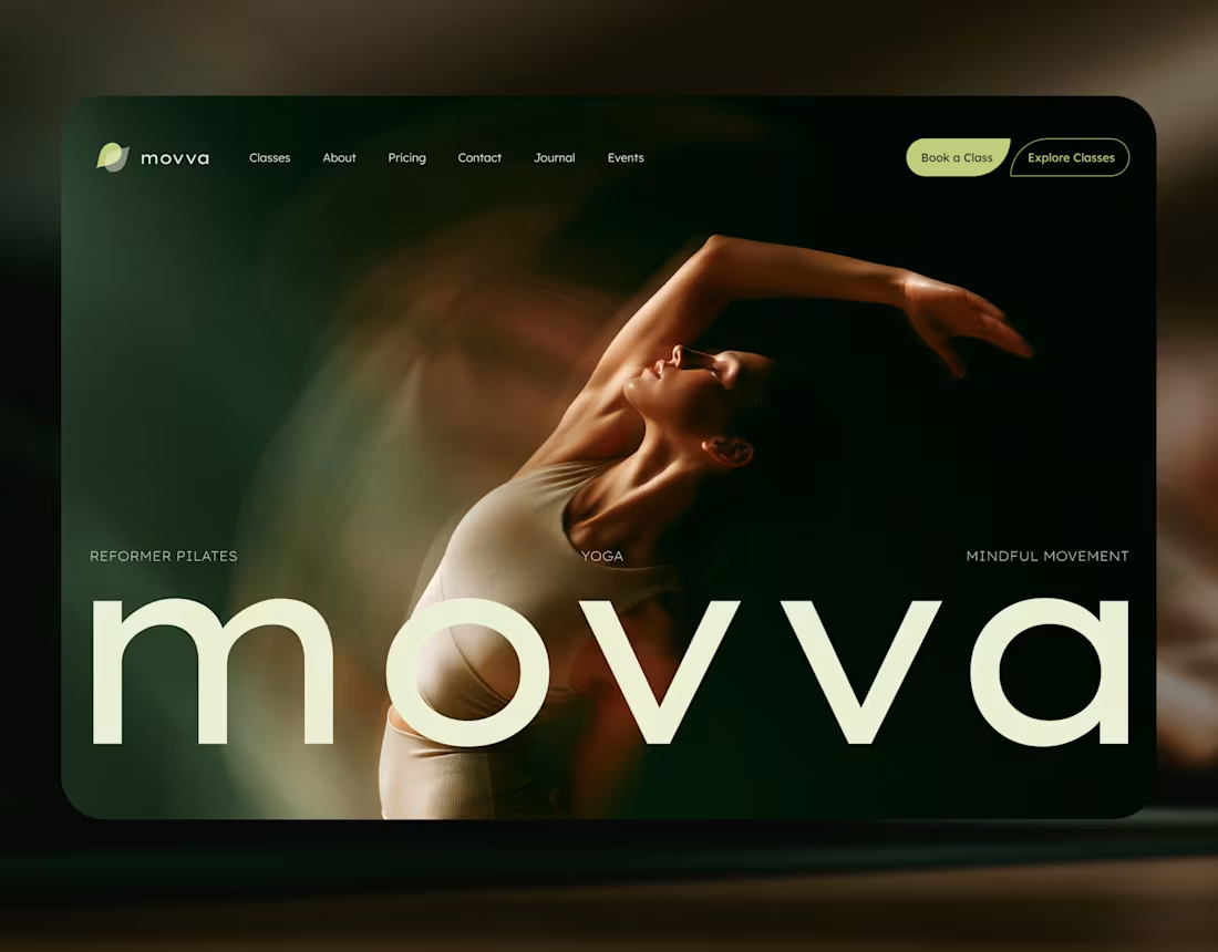
MOVVA — Yoga & Pilates Website Design and Webflow Development
1
18
221
Message
36
Maxim Zvarici
pro
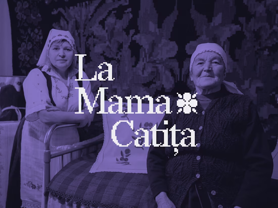
La Mama Catița Visual Identity Design
1
36
733
Message
21
Sasha Beglova
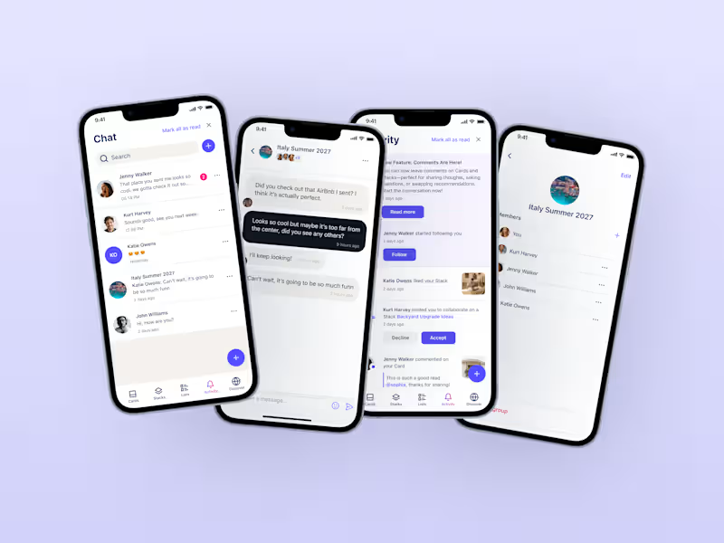
Stacklist | UI/UX & Graphic Design
21
496
Message
30
Flávia Jackeline
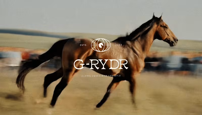
Visual Identity Design for G-RYDR — Equestrian Lifestyle
1
30
363
Web design projects using Framer
Framer
The best modern websites built on the leading web design tool, Framer
View more
Message
19
Kyle Panilan
max
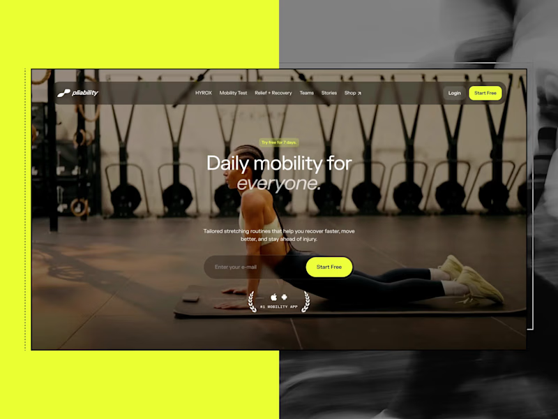
Framer Website for pliability: the #1 Mobility App in the World
1
19
696
Message
6
Domenico Griffo
pro
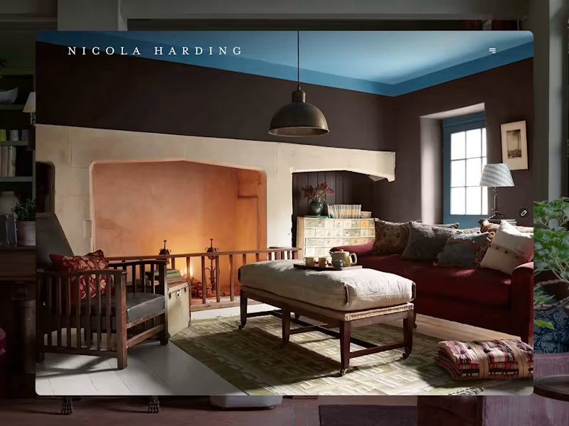
Nicola Harding & Co
6
137
Message
4
Rachel Cohen
pro
Starfish Studios Website Redesign
4
112
Message
14
Studio Ilker
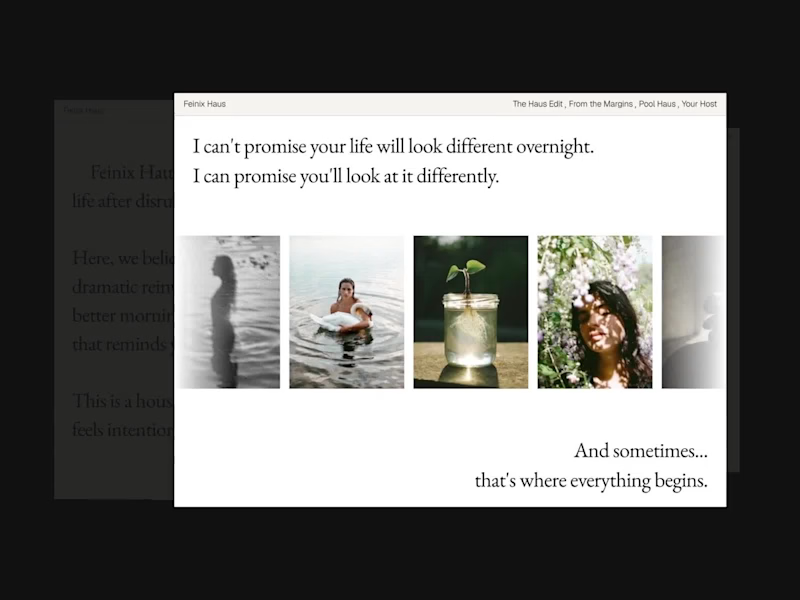
Feinix Haus Website
14
686
AI projects
AI
New projects from the best AI creators
View more
Message
12
Lisa Demchenko
max
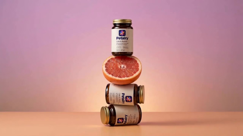
Petalry Brand Identity Development - Kittl exploration
12
360
Message
9
Alexandru Köllo
max
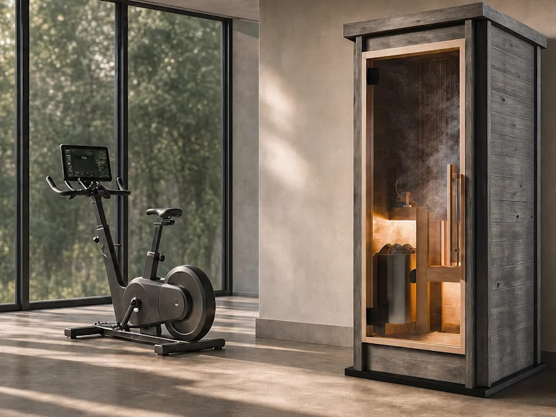
AI Product Visuals: Luxury Sauna Collection
9
149
Message
20
Darya Batyr ✦
max
Kotoba: Giving Voice AI a Human Visual Identity
20
317
Message
3
Viktor Gavrilovic
pro
MatchPro: Building soccer tournament schedules in seconds
3
110
Brand design projects
Brand design
Bold visual identities and branding systems created by top independent designers
View more
Message
9
Chantal Jemmott
pro
Label Redesign
9
192
Message
10
Olga & Joyd Branding ✦ Web Design
pro
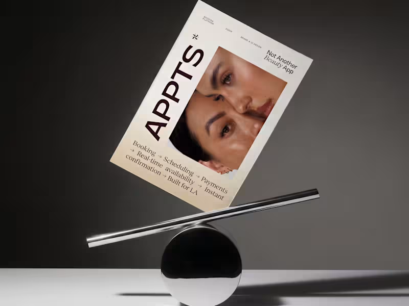
APPTS — Brand Identity & Mobile App Design
10
138
Message
8
Dane Kowachek
pro
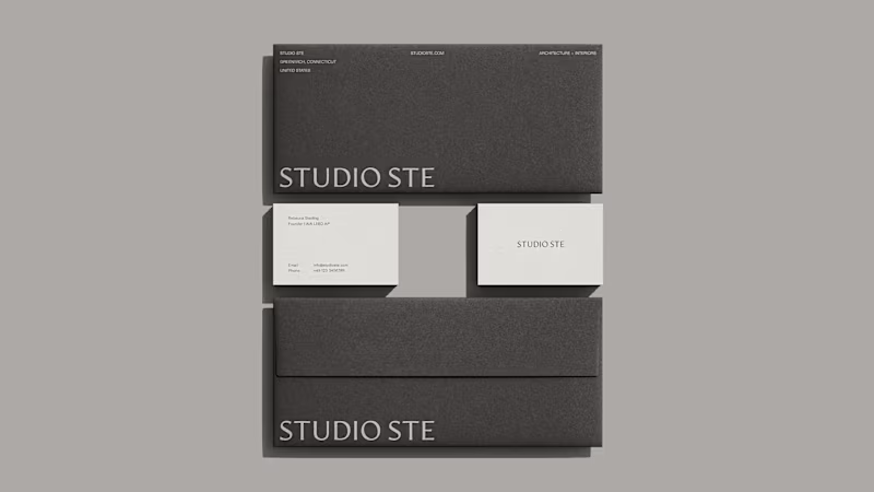
Brand Identity Development for Studio STE
8
89
Message
26
Daniel G Bright
max
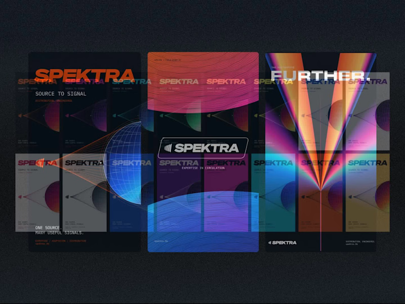
Spektra Visual Identity Development
26
448
Video editor projects
Video editing
Creative video edits made using today’s best editing tools
View more
Message
14
Jen Lai
pro
Gritzy | Social Media + OOH Animations
14
245
Message
12
Mykola Malyhin
pro
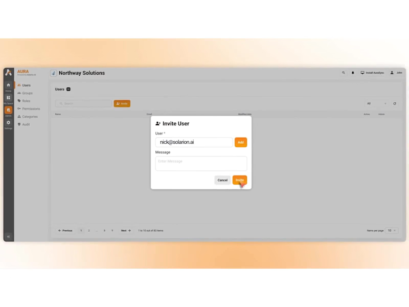
Aura | AI SaaS Explainer Video & Real UI Product Demo
12
111
Message
10
Bohdan Serdiuk
pro
Bolt New Slides V2 launch video
10
125
Message
11
Blahomyr Popok
max
Explainer video for PerformancePay - a motion design explainer
11
180
Standout projects
Standout projects
More projects we love that are making waves across the web
Message
19
Kreativa Studio
pro
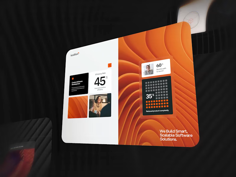
A few pieces of the website we recently created for Kodilion. Com check the complete website at https://kodilion.hr/
8
19
1K
Message
21
Zakaria MAMOUMI
pro
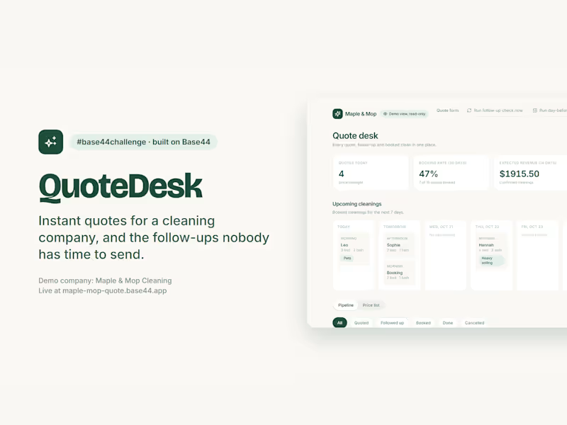
QuoteDesk: instant quotes for a cleaning company, and the follow-ups nobody has time to send. A home cleaning business loses jobs in two places: quotes that take a day to come back, and open quotes nobody chases. QuoteDesk handles both for Maple & Mop, a demo company. What runs on its own: • Priced on the server. The client sees a live, itemized price; the saved total is recomputed from the owner's price list, never trusted from the browser, in integer cents. • The quote is emailed the second it is saved, with a link to book or pick another slot. • One follow-up, never two: an hourly job nudges quotes still open after 24 hours, stamps them so it can't fire twice, and skips anyone who booked. • A day-before reminder for every booked cleaning, also sent once. • AI reads the client's notes: "two cats, fourth-floor walk-up" becomes Pets and Stairs flags plus 30 extra minutes for the crew. • Owner dashboard: quotes today, booking rate, expected revenue, bookings after a follow-up, a 7-day schedule and an email timeline per quote. Owner actions require the Base44 admin login, checked on the server. Judges get a read-only demo view with masked emails: Owner login, then View the demo dashboard.
8
21
1.3K
Message
21
Charles Ogada
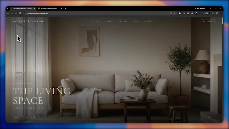
I Built "My Perfect Interior" an Interior Design company website. This website combines a premium, editorial design experience with AI-powered room visualization. Visitors upload a photo of their empty room, describe their vision, and receive a generated design concept. Each submission is automatically saved to a studio dashboard with the client's email, original photo, generated concept, and design brief. This addresses a key challenge in interior design: translating a client's imagination into something a designer can understand and act on. By automating early-stage visualization and enquiry collection, the platform helps interior design businesses understand client needs faster, reduce repetitive consultations, and turn ideas into actionable project leads—all within a beautifully designed, responsive experience. X post link: https://x.com/Charles_ogada1/status/2112390727351075027
12
21
1.5K
Message
6
Andreu Martínez
pro
Scott, founder of Glenwood Primary Care and Geriatrics, came to me looking for stock photos for his new website. I proposed building an image library for his brand instead, guided by a clear visual guide based on his patients, his logo and the local landscape. The result was 20 images made with AI, art direction and hand retouching, plus home page mockups on desktop and phone to help him choose the hero. If you were Scott, would you have gone with stock photos or a custom image library?
3
6
180
Message
36
Lubos Belak
pro
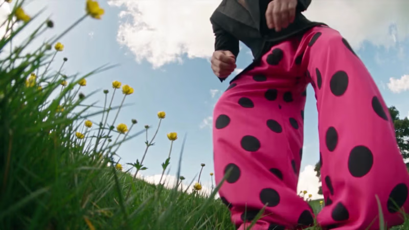
Who needs an invitation when you have a little imagination and a lot of fantasy? That's how I got to the CapCut World LA event at the Audrey Irmas Pavilion. The trip was... intense! 🦄 This is my entry for the new Contra × CapCut challenge. My workflow: ① I created the character sheet and the prop sheet for the mushroom, as well as the location sheets for a nature landscape and the Audrey Irmas Pavilion. ② I created still shots using my internal AI image generation tool. ③ I created trippy 2D/3D animated images to use as the opening frames of the videos. ④ I imported all the images into the CapCut Video Studio and used the CapCut AI to animate them. ⑤ I created the music in ElevenLabs/ElevenMusic. ⑥ I edited the videos using DaVinci Resolve.
32
36
1.7K
Message
2
Alona Yakovlieva 📱
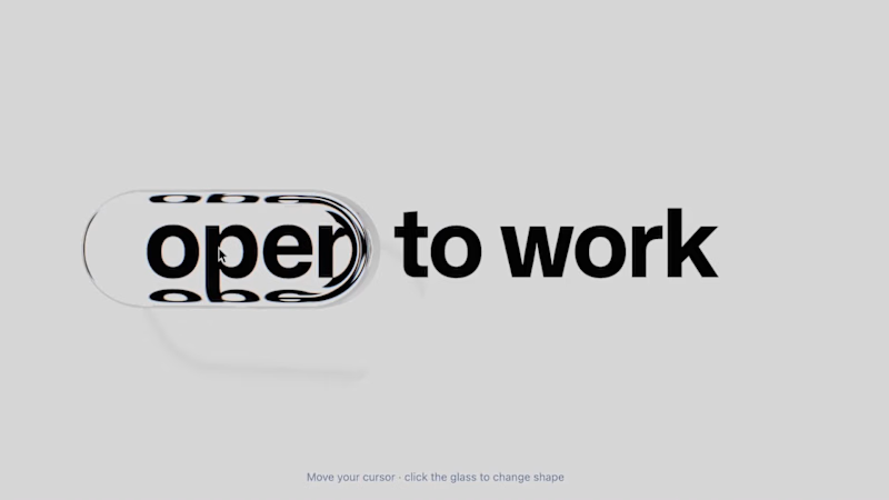
React Bits & Lovable. Just try this cool stuff! 👍 #prototyping #uiux #nocode
3
2
96
Message
16
Ziva Valentincic
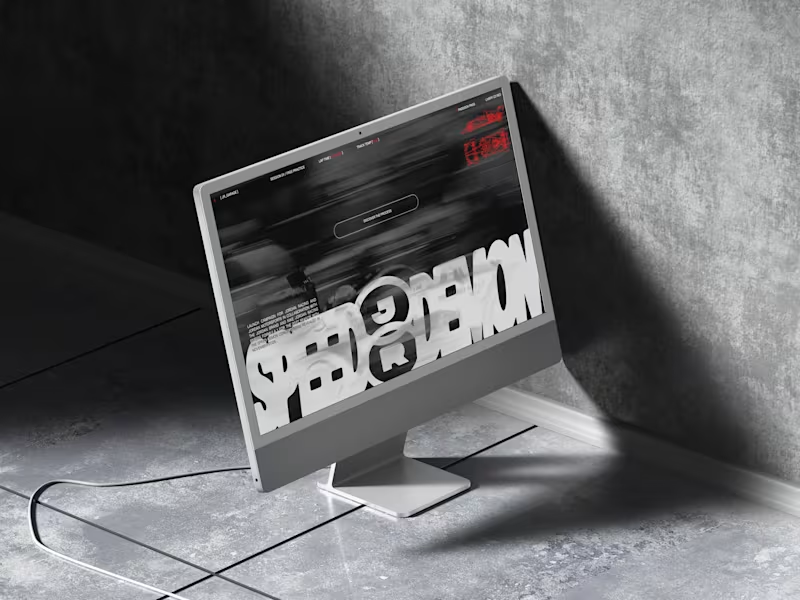
Jordan Racing concept. What if Jordan Brand launched its own racing team? We imagined the full launch, from the Speed Demon campaign and posters to a telemetry inspired website, racing streetwear and a flagship research facility. Basketball heritage meets Formula 1 speed. Designed by Studio /03 Concept project, not affiliated with Nike or Jordan Brand. Art Direction, Brand Identity, Campaign Design, Web Design, Poster Design, Apparel Graphics, Motorsport, Concept
8
16
289
Message
6
Izumo Kobu
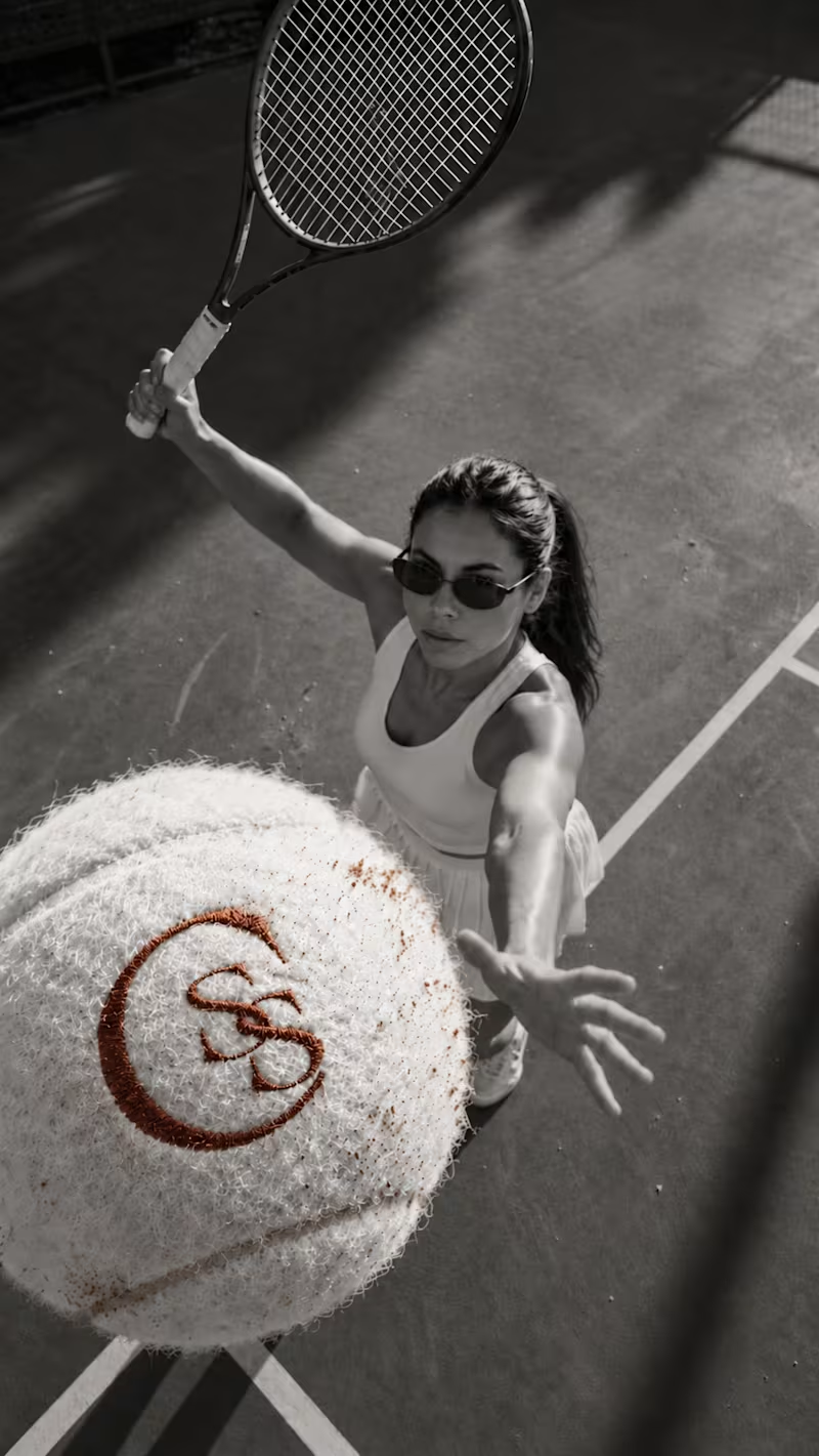
Second Serve Club — Exploring Visual Identity Through AI & Design. For this branding challenge, I created a series of original logo marks in Adobe Illustrator, inspired by vintage tennis culture. I then explored how these designs could come to life by combining my own typography, monograms and colour identity with AI-generated visuals using ChatGPT. From the texture of a clay court to embroidered details on tennis balls, the goal was to bring the brand identity into a more tangible, realistic setting. An exploration of how traditional graphic design and AI can work together to create a cohesive visual world. Designed by me. Visualised with AI. 🎾 Full brand identity case study coming soon. #BrandIdentity #VisualIdentity #GraphicDesign #AIDesign #ChatGPT
6
6
111
Message
28
NexUX Lab
Interactive AI Analytics Dashboard | SaaS Product Design A modern, animated AI-powered eCommerce analytics dashboard designed to help businesses track sales performance, monitor revenue, understand customer behavior, and make data-driven decisions. The design combines a clean SaaS interface, intuitive data visualization, interactive dashboard elements, and smooth animations to create a more engaging user experience. Every section is designed to make complex analytics easier to understand while maintaining a professional, scalable, and user-friendly layout.
16
28
2K
Message
8
Josh Bendall
pro
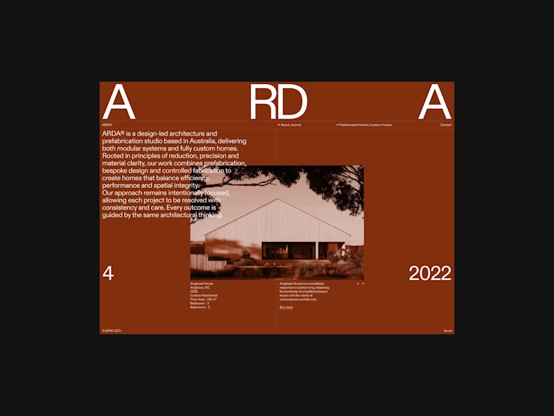
A few colour explorations from ARDA®. I spent a bit of time experimenting with different colour combinations to see how they would change the overall feel of the site. There were a few I really liked and considered taking further, but in the end I kept coming back to black and white. I felt it worked best with the imagery and typography, and ultimately suited the direction I wanted to take the project.
7
8
109
Message
33
Mateo Szymkowicz
max
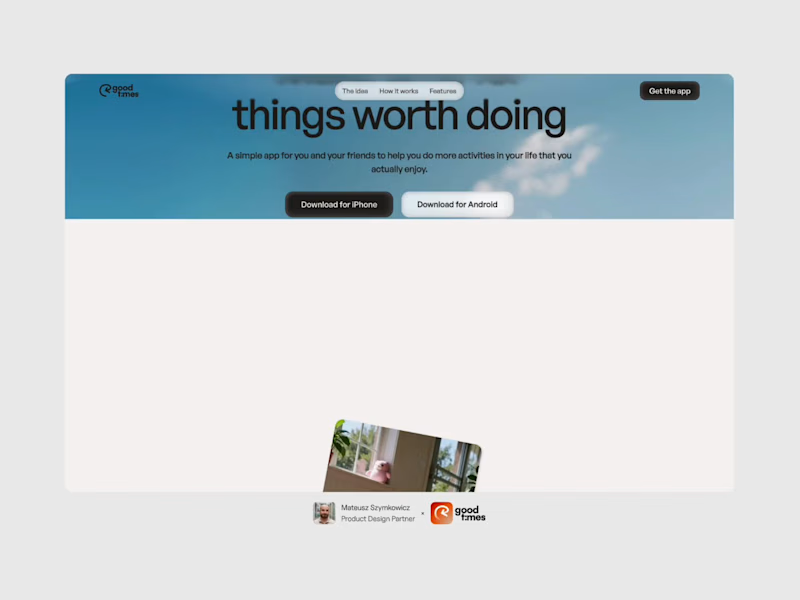
The Good Times website is live 👀 Most app sites start with a phone mockup and a list of features. This one starts with the problem, so you can see yourself in it first. The app shows up after that, as the answer. https://goodtimestimer.com/ (https://goodtimestimer.com/)Built with Astro.
19
33
526
Message
3
Abron Studio
pro
RepeatMD is a company that builds software for the aesthetic and wellness practices. We created a sizzle video introducing the product and features.
4
3
119
Message
22
Milan Bundalo
pro
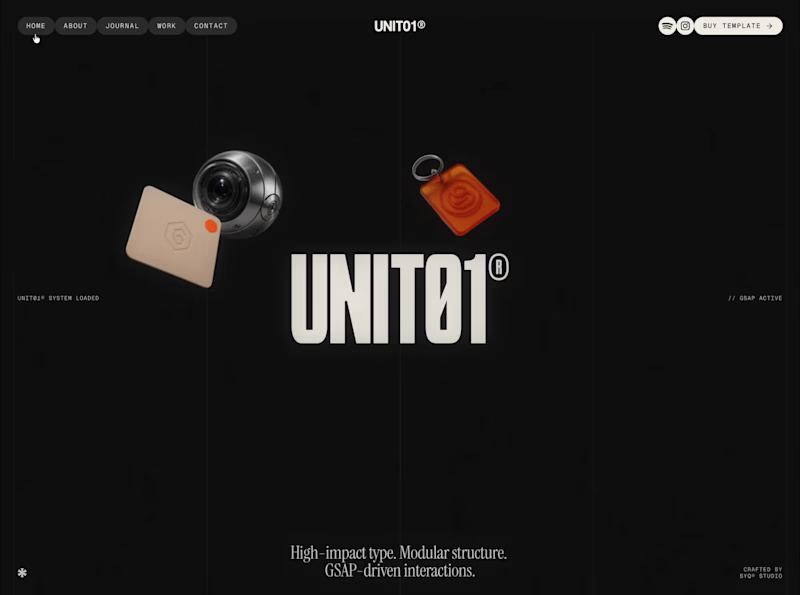
This is the kind of work I want to do more of. A strong visual direction and plenty of room to get creative with the development. Built in Webflow, animated with GSAP. Here’s a look around.
9
22
287
Message
53
Klym Yevtushenko
pro
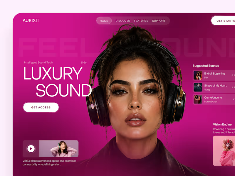
AURIXIT — Luxury Headphones Landing Page 🎧💗 A vibrant landing page concept for a premium audio brand, combining luxury sound, fashion-inspired visuals, and a bold digital experience The design brings together bright magenta tones, oversized typography, lifestyle photography, and clean UI elements to create a modern, eye-catching aesthetic Special attention was given to: • Bold lifestyle-focused hero composition • Vibrant pink and magenta color palette • Clean, oversized typography • Music playlist and suggested tracks • Premium headphone presentation • Clear CTA and minimal navigation • Responsive mobile experience The result is a fresh, stylish landing page that connects premium audio technology with fashion, music, and personal expression ✨
29
53
1.5K
Message
25
Naim Islam
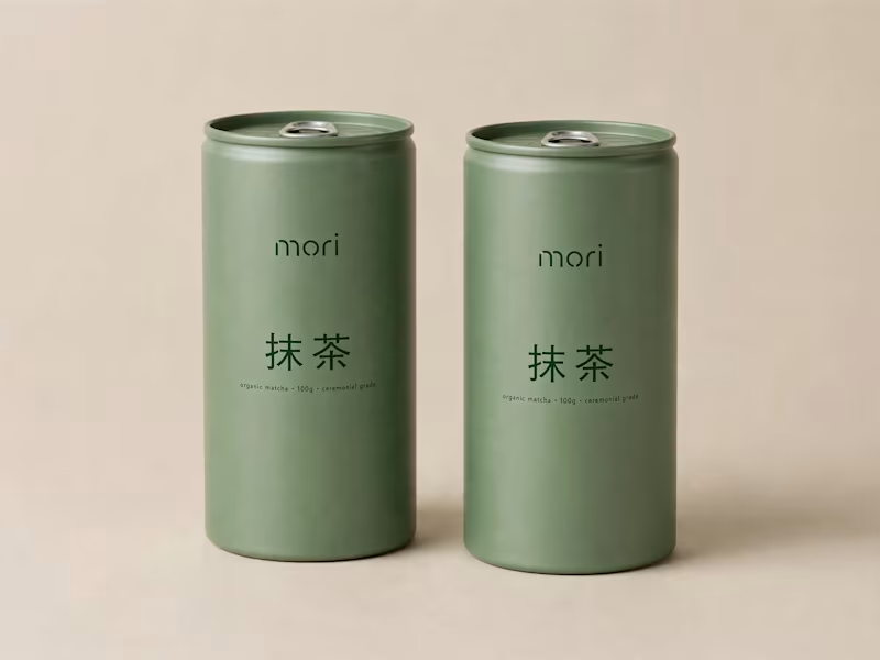
more visuals from my latest project — mori matcha 🍵 explored minimal Japanese packaging with earthy greens and calm typography. focusing on premium ceramic cups and clean can design. #branddesign #packagingdesign #visualidentity #brandstrategy #matcha #minimaldesign #japanesedesign #figma #mockup #branding
21
25
590
Message
4
Jander Hoffmann
AION — Logo Reveal & Animated End Card A 5-second logo reveal derived from the studio's showreel, reusable as an end card on any video. Challenge: it had to work on a solid background and over other footage, in horizontal and vertical formats, without redrawing the official logo. Solution: the animation is built from the logo's real vector outlines. An ultramarine beam locks onto the crossbar of the "A", the letter grows out of it, and the beam writes the rest of the wordmark. Delivered in 16:9 and 9:16, on solid colour and with transparency (ProRes 4444, WebM alpha and PNG sequence), with and without a services line, plus original sound design. Credits Motion design & direction: Jander Hoffmann Studio: AION Creative Studio Method: AION Creative Studio OS
3
4
124