Freelancers using Adobe Illustrator in Western Cape
Sign Up
Post a job
Sign Up
Log In
Filters
2
Projects
People
Richard Bolland
Cape Town, South Africa
I'm an interactive animator and explainer video expert.
$10k+
Earned
5x
Hired
5.0
Rating
35
Followers
expert
Follow
Message
I'm an interactive animator and explainer video expert.

0
Interactive Explainer Videos
0
2
1
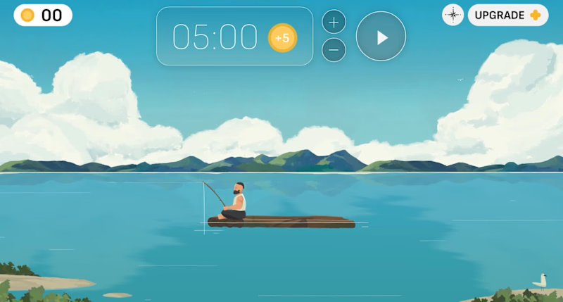
I designed this focus app interface called 'Sea of Focus' for a client last year which sadly never saw the light of day. All made in @Rive, using Photoshop files, with the final export planned for a web app. The idea was that when a user completes a focus session, they are rewarded with in-app currency to upgrade their virtual raft with pets, flags, and music players. All in all, it was great fun to work on despite it not getting out there!
1
1
267
1
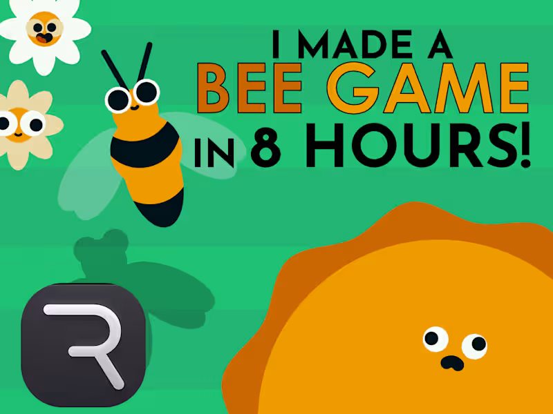
A bee mini-game in 8 hours using Rive.
1
75
5
Character Animation for your brand
5
63
Adobe Illustrator
(6)
Follow
Message
Nadia Ariefdien
Cape Town, South Africa
Brand & Web Designer
1x
Hired
5.0
Rating
10
Followers
Follow
Message
Brand & Web Designer
2
Aurelia Haircare – Brand Identity and Packaging Design
2
10
2
Maison Élan – Branding & Packaging Design
2
5
2
Step-by-Step Running Club – Branding & Merch Design
2
3
3
VÉRA Botanicals – Visual Identity & Packaging Design
3
2
Adobe Illustrator
(6)
Follow
Message
Gideon Phillip
Cape Town, South Africa
Building premium brands with strategy at the core.™
5.0
Rating
17
Followers
Follow
Message
Building premium brands with strategy at the core.™
0
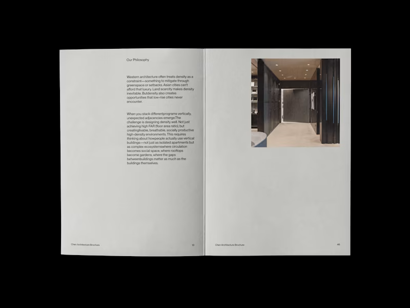
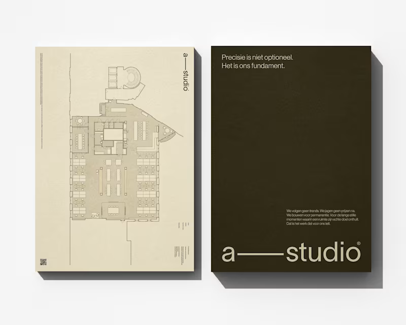
Chen Architecture is a Singapore-based architecture firm specializing in high-density design for the rapidly evolving cities of Southeast and East Asia. Founded by Eleanor Chen in 2019, the studio operates at the intersection of Asian spatial intelligence and contemporary architectural practice—rejecting both Western mimicry and nostalgic traditionalism.
0
75
0
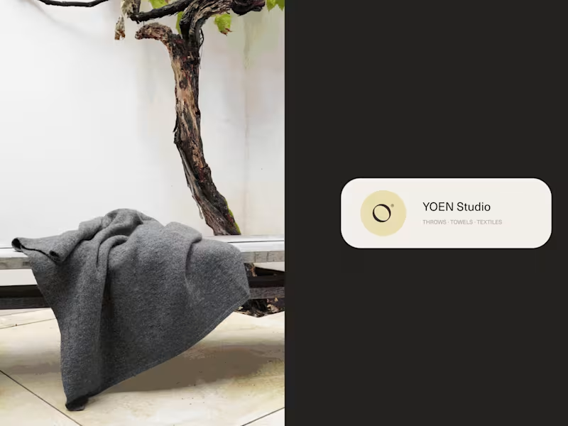
YOEN® is a luxury textile house dedicated to the art of considered making. Founded on the belief that the objects closest to our bodies deserve the same rigour applied to architecture — every thread chosen, every weight calibrated, every texture a dialogue between material and maker. We work in cashmere, merino, alpaca and their rarest blends. Our throws, towels and textiles are not decorative objects — they are tactile experiences, designed to hold warmth, absorb light and endure. YOEN® pieces belong to rooms that breathe: minimalist interiors, thoughtful homes, places where stillness is a form of luxury. Yoen's mission remains the same: To create textiles of genuine permanence — pieces that are felt before they are seen, that outlast trends, and that reward daily use with deepening softness and quiet beauty. Such a wonderful experience to finally see this work done!
0
88
0
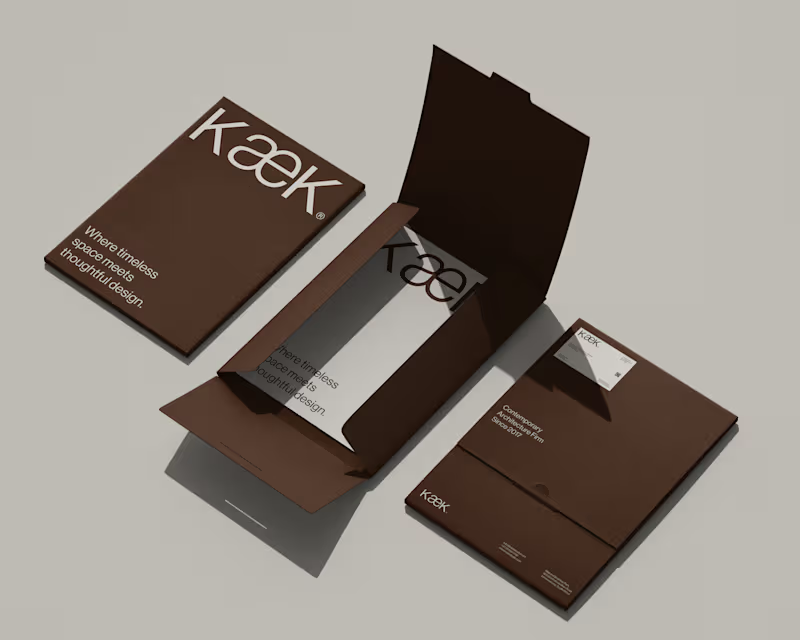
KæK / Brand Identity
0
6
0
Alima Studio® / Brand Identity
0
3
Adobe Illustrator
(9)
Follow
Message
Nimi Pretorius
pro
Cape Town, South Africa
Building brands people feel something for
New to Contra
Follow
Message
Building brands people feel something for
0
SOUTH AFRICAN AIRWAYS A catalyst for African growth: the SAA corporate identity guide Strategic planning, creative direction and copywriting for the corporate identity guide of a national airline and a national symbol. THE STORY There are brands that carry weight in the literal sense. And then there are brands that carry weight in every other sense. South African Airways is both. As the national carrier of South Africa and one of the continent's longest-running airlines, SAA represents something beyond its routes and its fleet. It represents a country, a continent, an idea of what Africa is becoming and what it deserves to be. When I took this brief I understood that the stakes were not just creative. They were cultural. The CI guide I developed for SAA had to hold all of that without buckling under it. It needed to give every person who touched the brand, from cabin crew to marketing managers to external agencies across the world, a clear and inspiring sense of what SAA stood for and how that should show up in everything they did. The platform we built was "A Catalyst for African Growth." Vibrant, cosmopolitan, contemporary. A carrier that didn't just fly people to destinations but believed in the destinations themselves. The guide covered brand assets, tone of voice, photographic style, colour, typography and the full brand narrative. Every word was written to inspire as much as to instruct. The simplest line in the whole document took the longest to write. It always does. WHAT IT TAUGHT ME That the most important reader of a brand guide is not the designer. It's the person who has never thought about brand before and needs to understand, in plain and beautiful language, why any of this matters at all.
0
75
0
CALIBRE LIFE SCIENCE Creating immunity for Africa, from Africa: brand strategy, creative direction and copywriting for a life science engineering firm Brand strategy, manifesto, creative direction, content strategy and ongoing copywriting for a pharmaceutical and biotech facility engineering company. THE STORY There are industries where the stakes are abstract. And then there are industries where the stakes are people's lives. Calibre Life Science designs, builds and validates the facilities where medicine is made. Sterile pharmaceutical environments, biosafety laboratories, large-scale production facilities across the continent. The work is technical, precise, and unforgiving in ways most people never see. The challenge wasn't understanding what they did. It was finding language that could carry the weight of it without collapsing under the gravity. The platform I built centres on a single idea: the line. Every facility begins with a line of intention. A line that has to hold through design, through build, through validation, all the way to the moment production comes online and the system either proves itself or it doesn't. Design. Build. Validate. Not three separate phases. One continuous commitment. The manifesto came first and set the temperature for everything that followed. The content strategy extended the voice across thirteen LinkedIn posts in the first calendar, each anchored to a pillar and written to sound like people who knew exactly what they were doing and felt no need to shout about it. Precise. Direct. Quietly certain. Writing for this industry taught me something I didn't expect. The engineers building these facilities will never meet the patients whose medicine is made inside them. But they think about them anyway. That's what the writing had to hold. WHAT IT TAUGHT ME That gravity is a gift. When the work genuinely matters, you don't have to manufacture meaning. You just have to get out of the way and let it speak.
0
94
0
AMBER ROSE NOBLE A name worth remembering: naming and creative direction for a feminist graphic novelist Naming and creative direction for the personal brand of a graphic novelist and feminist voice. THE STORY A writer's name is their first piece of writing. It sets a tone before a single word of the work has been read. When this graphic novelist came to me, she needed something that could carry the weight of her voice and the breadth of her work. Something that felt like a person and a position at the same time. Amber Rose Noble. The name arrived with its own quiet authority. Warm but grounded. Feminine without being soft. The kind of name that looks right on a book cover and sounds right when someone says it out loud for the first time. The creative direction followed from the name's personality. A diamond mark in blush and red, sitting at the intersection of femininity and precision. Typography that is elegant without being delicate. A colour palette that feels intimate and bold in equal measure. The identity needed to work across everything from a notebook to a silk scarf, and it does, because it was built around a single clear idea of who this person is and what she stands for. When your work is about giving women a voice, your brand needs to have one too. WHAT IT TAUGHT ME That naming a person is different from naming a product. A product can be anything you decide it is. A person already knows who they are. Your job is just to help them say it.
0
100
0
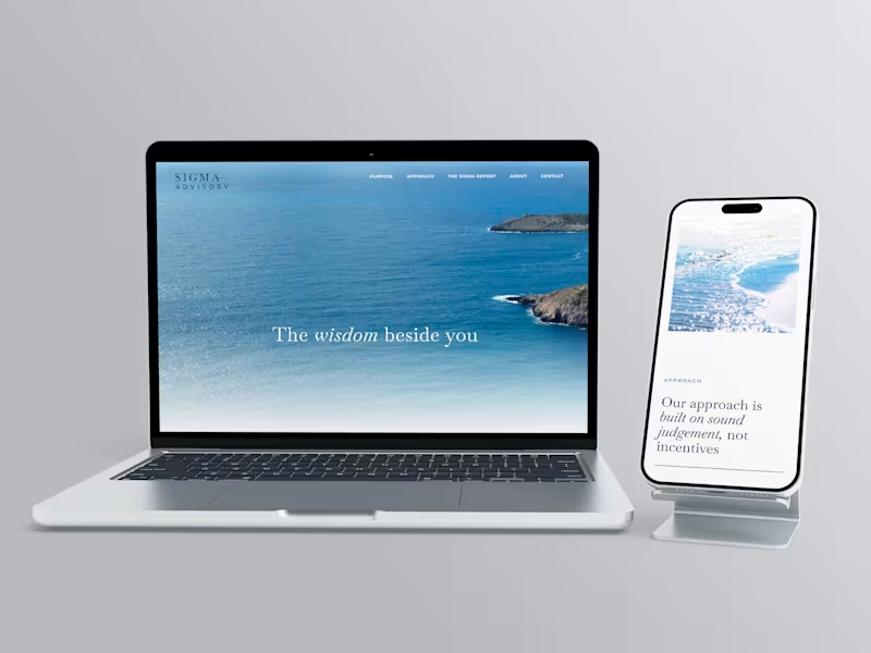
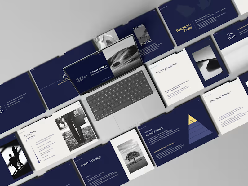
When less is the whole point: brand development for Sigma Advisory Brand direction, visual identity and creative positioning for a private wealth advisory firm. THE STORY Financial advisory is a category where everyone says the same things. Trust. Expertise. Partnership. The words have been borrowed so many times they've stopped meaning anything. Sigma Advisory is a firm that helps growth-minded businesses replace operational chaos with clear systems and capable leadership. The work is serious and the clients are serious. What they needed wasn't a louder way to say the usual things. They needed a brand that could hold the same quiet authority they hold in a room. Deep navy. Clean serif. A horizontal rule that separates the name into two parts without breaking it. Nothing decorative. Nothing that reaches. The identity doesn't announce itself. It assumes its own credibility, which is exactly how the firm operates. The voice followed the same logic. Clarity as confidence, not performance. WHAT IT TAUGHT ME Restraint is a decision that has to be made repeatedly. Every element you leave out is a choice. The discipline is in knowing what the brand can carry without being said.
0
83
Adobe Illustrator
(11)
Follow
Message
Rebecca Hayter
Cape Town, South Africa
Creative Director/Creative All-Rounder
5.0
Rating
4
Followers
Follow
Message
Creative Director/Creative All-Rounder
0
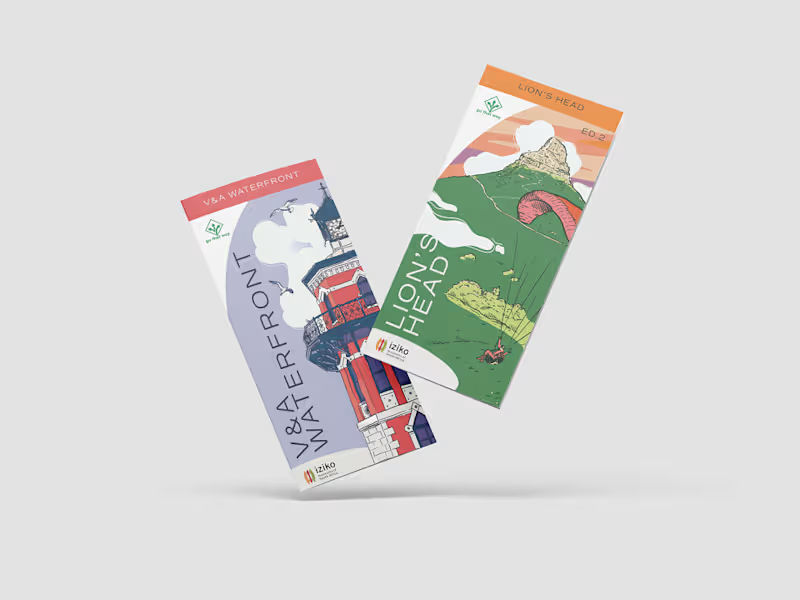
Go That Way Brochures
0
22
0
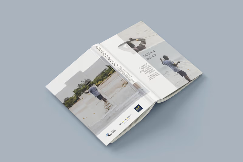
Ocean Beings
0
14
0
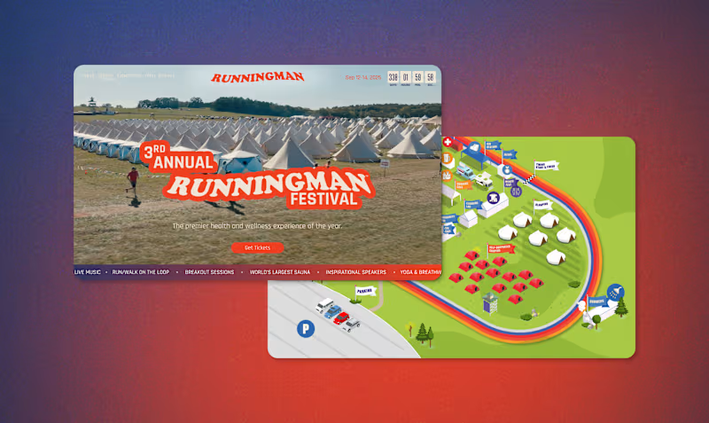
Runningman Festival
0
14
1
PS 150 NYC Public School Rebrand and Web Design
1
10
Adobe Illustrator
(6)
Follow
Message
Jordan Talbot
Cape Town, South Africa
Branding Specialist | Bold Identities That Connect
5.0
Rating
3
Followers
Follow
Message
Branding Specialist | Bold Identities That Connect
1
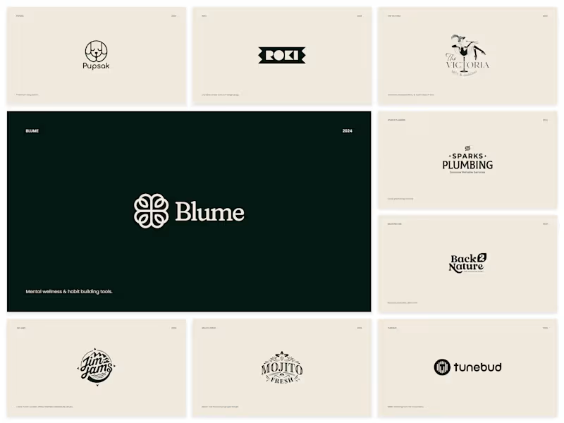
2024 Logofolio
1
14
0
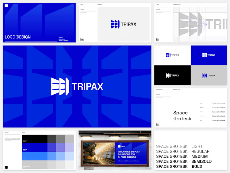
Tripax Display (Light Brand Design)
0
9
1
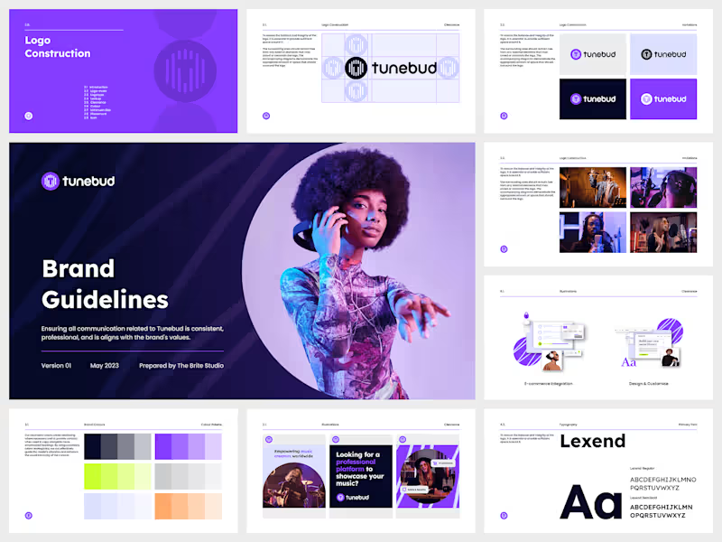
Tunebud (Medium Brand Design)
1
13
1
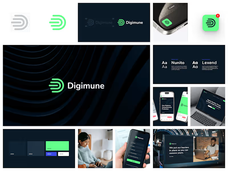
Digimune (Light Brand Design)
1
12
Adobe Illustrator
(5)
Follow
Message
Belinda Broszeit
Cape Town, South Africa
Professional Reports, Brochures, White Papers and More
5.0
Rating
1
Followers
Follow
Message
Professional Reports, Brochures, White Papers and More
0
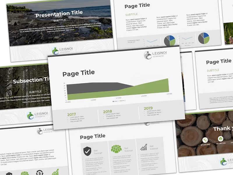
Engaging Corporate Presentation Template
0
1
0
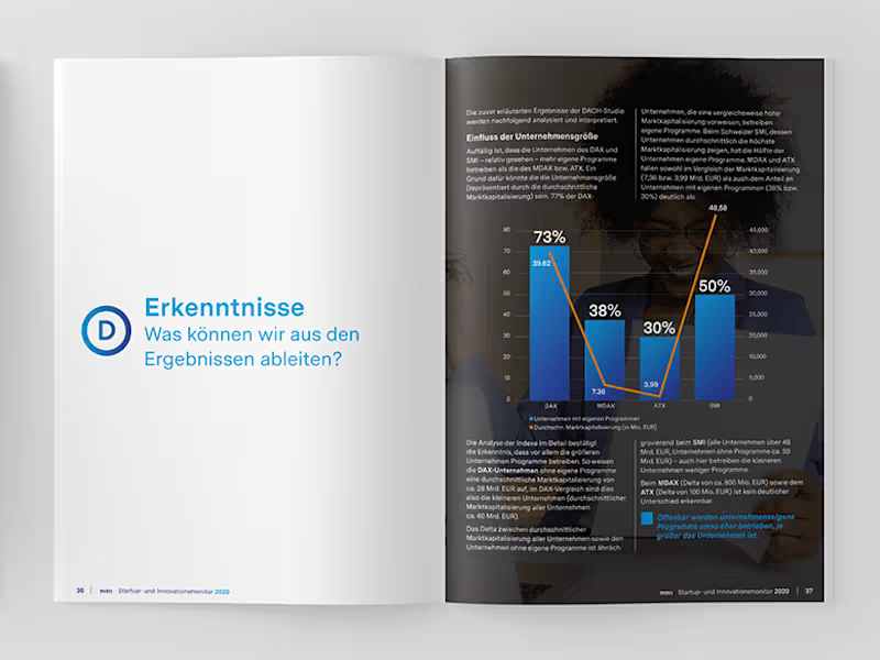
White Paper
0
8
0
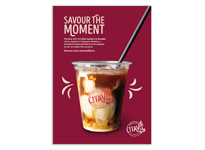
"Savour the Moment" Launch
0
4
0
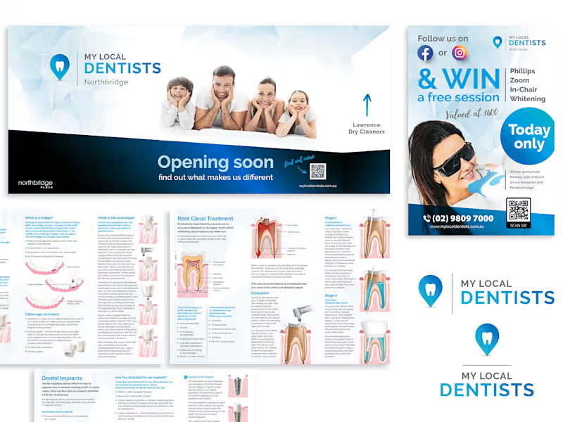
Logo, brand guides, signage, flyers and social media
0
7
Adobe Illustrator
(8)
Follow
Message
Lerato Studios
Cape Town, South Africa
Minimal Logo & Brand Design that Makes an Impact ✨
Follow
Message
Minimal Logo & Brand Design that Makes an Impact ✨
0
Yoake Skincare Design
0
16
0
Sanctuary Living Brand Guidelines
0
8
0
Fashion Brand Identity
0
8
View more →
Adobe Illustrator
(3)
Follow
Message
Explore people