
Innovative IT solutions for modern businesses.
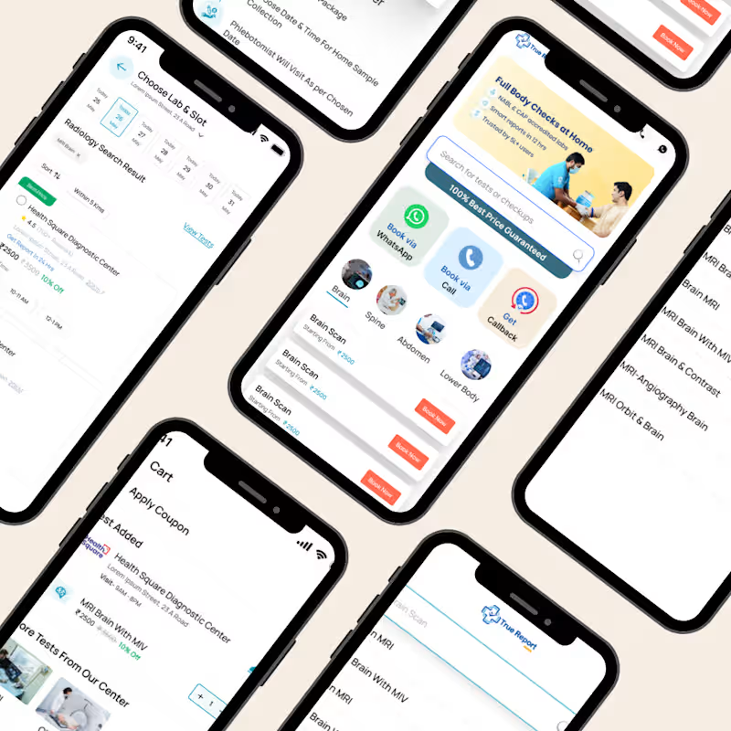
True Report is a smart diagnostic booking platform that helps users search and book medical tests such as MRI, CT Scan, blood tests, and full body checkups at the best guaranteed prices. The platform connects patients with top diagnostic centres, offering easy booking via call, WhatsApp, or callback support. With home sample collection and real-time scheduling, True Report makes healthcare testing simple, affordable, and completely hassle-free.
0
40
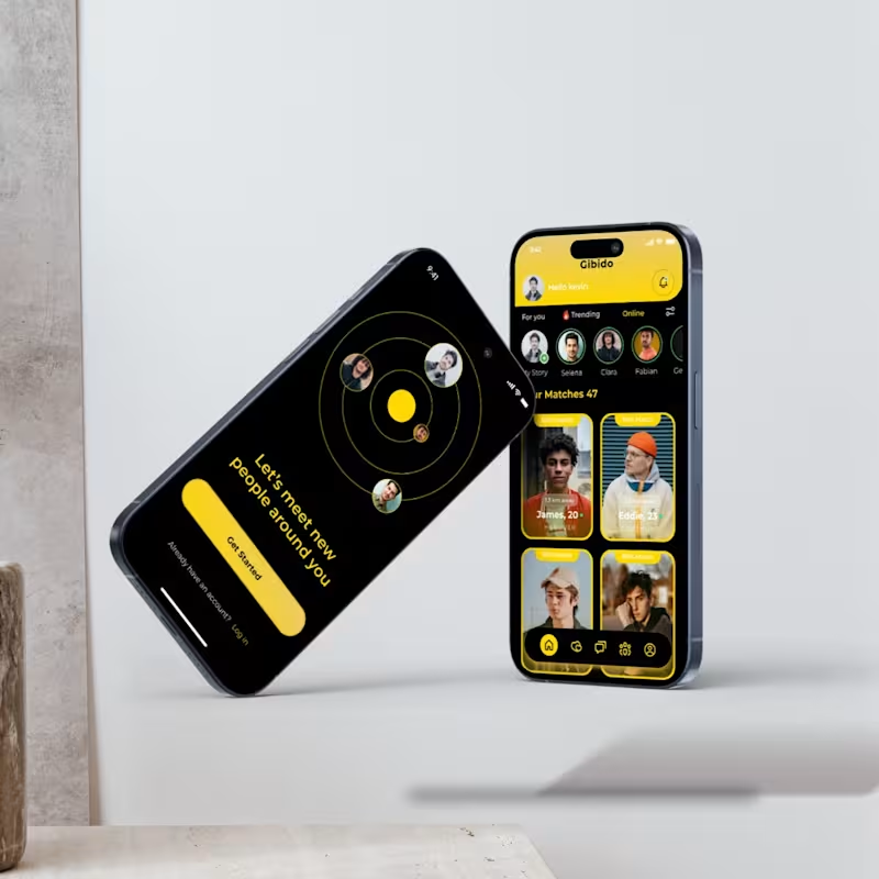
Gibido is a user-friendly dating application that helps individuals find like-minded partners with ease. Built with a clean interface and advanced matchmaking algorithms, it ensures personalized suggestions based on interests and preferences. Users can chat, share moments, and build connections in a safe and secure environment. With interactive features like profile customization, instant messaging, and location-based matches, Gibido enhances the overall dating experience. The app focuses on building authentic relationships rather than just swipes.
0
69
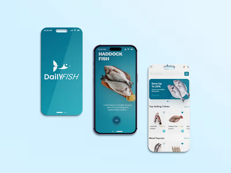
Daily Fish App is a user-friendly mobile platform built to simplify seafood shopping. It allows customers to browse a wide range of fresh fish and seafood, place quick orders, and get them delivered on time. The app ensures freshness through verified suppliers and provides an easy-to-navigate interface for a smooth user experience. Integrated with secure payment options and real-time order tracking, it brings convenience right to the customer’s table.
0
70
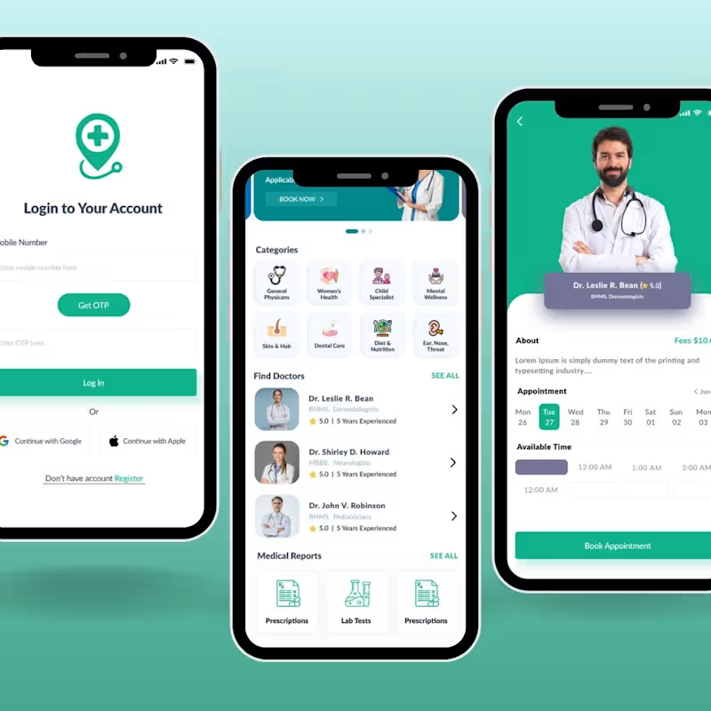
The Health Care App is an innovative medical platform that bridges the gap between patients and healthcare providers. With features like online doctor consultations, appointment booking, digital prescriptions, and health record tracking, it ensures convenience and accessibility. The app is built with a secure system to maintain patient confidentiality while providing real-time updates on medications and reports. Designed with an intuitive interface, it caters to all age groups and makes healthcare services more efficient. By integrating technology with medicine, it helps users take better control of their health.
0
56

Product Designer | SaaS, Mobile & Web | UI/UX| Figma| Framer
Product Designer | SaaS, Mobile & Web | UI/UX| Figma| Framer


UI/UX Design · Web Design · Framer Development
UI/UX Design · Web Design · Framer Development


View more →

I design things that look good & work better. ✦




Next-gen web design for today’s modern user.
Next-gen web design for today’s modern user.

Submitting my Config Makeathon entry — Simplify 🌿
An AI document translator and simplifier built for elderly users. Inspired by my grandmother struggling to understand her bank notices and medicine labels.
The app automatically detects your document type and simplifies it instantly — no login, no data saved, no prompting needed. Just scan and understand.
Built using Figma Make, Figma Weave.
🔗 Live project: https://glad-sweat-80927657.figma.site/
📁 Figma Community file: https://www.figma.com/community/file/1649550081362020764/simplify-because-no-one-should-struggle-with-a-document-alone
📱 Social post: https://www.linkedin.com/posts/sandipdas-_configmakeathon-ugcPost-7473618571177340928-tSgu/?utm_source=share&utm_medium=member_desktop&rcm=ACoAAEx45LMB_gnvWqiyWfMwUXSk5ACP8ZaUvpQ
3
202
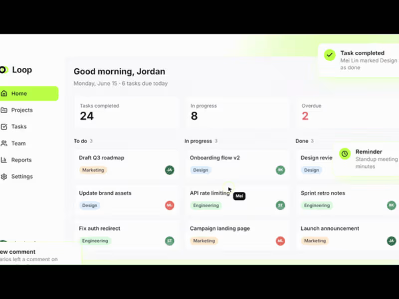
Loop — SaaS Workflow & Task Management Landing Page
A clean, conversion-focused landing page for a workflow SaaS product, pairing a bold headline with credibility stats and a live product preview to build trust fast.
2
2
177

Ashworth & Cole is a self-directed concept project designed to explore how premium professional-services brands, law firms, private wealth advisors, boutique consultancies can use web design to signal trust before a single word is read.
The goal was to build something that feels closer to a private bank or a design agency's own site.
2
138

Pulse — SaaS Analytics Dashboard UI designed for growth teams to track revenue, user activity, churn, and quarterly goals in one unified view. The design focuses on clear data hierarchy, intentional color logic and a clean light UI that makes complex data instantly readable.
#DashboardDesign #SaaSDesign
1
154

Senior UX/UI Designer | Enterprise UX | PwC Alumni | Remote

Designing Simple UX for Complex Elder Care Experiences
A digital platform (Web + Mobile) designed to manage senior citizen care. It connects subscribers, beneficiaries, and care teams in one system.
UX Focus
Simple, human-centered experience for all user types
UX/UI APPROACH
Design Thinking
Multi-user system with clear role-based access
Simple navigation for complex workflows
Mobile-first, easy-to-use interface
Core UX Idea
Reduce effort, increase clarity
0
39

The Future — Cricket Astrology App
Objective
Design an engaging and intuitive mobile experience that combines cricket analytics with astrology insights, allowing users to predict match outcomes, player performance, and key moments using AI-driven astrological data—making cricket more interactive, personalized, and insightful.
Core UX Challenge
The key challenge was to balance data complexity (cricket stats + astrology logic) with simplicity. Users needed quick, understandable predictions without being overwhelmed. Additionally, building trust in predictions while maintaining engagement and excitement was critical.
UX Strategy
Adopted a prediction-first experience, where users instantly see match insights and astrological outcomes in a simple, visual format. Simplified complex data into easy-to-digest cards, charts, and confidence scores. Focused on gamification, personalization, and real-time updates to keep users engaged, while ensuring clarity, credibility, and fast decision-making.
0
56

Christine Valmy International Academy of Beauty – Kolkata Branch
UX/UI Design Case Study | WordPress CMS
Overview
Christine Valmy Kolkata required a modern digital presence that reflected its international reputation in beauty education while improving lead generation, course discovery, and mobile usability.
Problem
The existing website faced several UX challenges:
Outdated visual design that did not reflect a premium international beauty brand.
Complex navigation made it difficult for prospective students to discover courses.
Limited mobile optimization impacted usability and inquiries.
Success stories and placement achievements lacked visibility and credibility.
Static content management created dependency on developers for updates.
Weak call-to-actions resulted in lower enquiry conversions.
Research & Findings
User interviews and heuristic evaluation identified four primary user goals:
Explore available beauty and cosmetology courses.
Verify certifications and international accreditations.
Review student success stories and career outcomes.
Contact counselors quickly for admissions guidance.
UX Strategy
The experience was redesigned around a clear student journey:
Awareness → Course Discovery → Trust Building → Enquiry → Admission
Key UX improvements included:
Simplified information architecture.
Clear course categorization.
Prominent enquiry CTAs.
Mobile-first responsive layouts.
Trust signals through certifications and accreditations.
Dedicated success stories and placement sections.
UI Design Approach
The visual language was inspired by luxury beauty and wellness brands.
Color Palette
Premium Magenta for actions and conversion elements.
Soft Green for elegance and calmness.
Neutral backgrounds for readability.
Typography
Large editorial headlines.
High readability body text.
Strong visual hierarchy for scanning.
Components
Course cards
Testimonial modules
Accreditation badges
Sticky enquiry actions
Mobile navigation patterns
Solution
Homepage Redesign
Created a visually engaging hero section highlighting global certifications and career opportunities.
Course Experience
Structured course information with duration, curriculum, certifications, and outcomes.
Success Stories
Developed dedicated alumni pages showcasing placements and entrepreneurial journeys.
Mobile Optimization
Designed responsive layouts optimized for smartphones and tablets.
CMS Implementation
Built using WordPress CMS allowing staff to independently manage:
Courses
Success stories
Blogs
Events
Placement updates
SEO content
Results
Business Outcomes
Increased enquiry visibility through stronger CTA placement.
Improved course discoverability.
Enhanced trust through accreditation presentation.
Faster content publishing workflow using WordPress CMS.
UX Outcomes
Reduced navigation friction.
Improved mobile browsing experience.
Higher engagement with success stories and placement pages.
Clearer conversion path from visitor to enquiry.
Deliverables
UX Audit
Information Architecture
Wireframes
Responsive UI Design
WordPress CMS Development
SEO Foundation Setup
Mobile Optimization
Performance Optimization
Technology Stack
Platform: WordPress CMS
Responsive Framework: Mobile First
CMS Features: Dynamic Courses, Blog, Success Stories
SEO: Search Engine Optimized Architecture
Performance: Optimized Assets and Caching
Project Impact
The redesigned Christine Valmy Kolkata website successfully transformed a traditional informational website into a modern lead-generation platform that reflects the institution's premium international positioning while providing prospective students with a seamless and intuitive digital experience.
1
47

In Your Circle: A Trusted Caregiver Marketplace with Subscription-Based Access
Designed a two-sided platform where caregivers create verified profiles and users subscribe to find trusted caregivers via references.
Design Philosophy Behind CareCircle
Trust-first design
Core differentiator — every decision reinforces trust
Minimal cognitive load
Streamlined flows that reduce mental effort
Conversion-focused CTAs
Every touchpoint drives meaningful action
Fast decision-making UX
Designed to help users decide in under 2 minutes
Emotional reassurance
Sensitive care context demands warmth and confidence
0
57

Designing user experiences for Digital products.
Designing user experiences for Digital products.


UX/UI Designer I B2B Saas I App Designer I Brand Designer
UX/UI Designer I B2B Saas I App Designer I Brand Designer


