Quire App - A smart calendar app for sales professionals
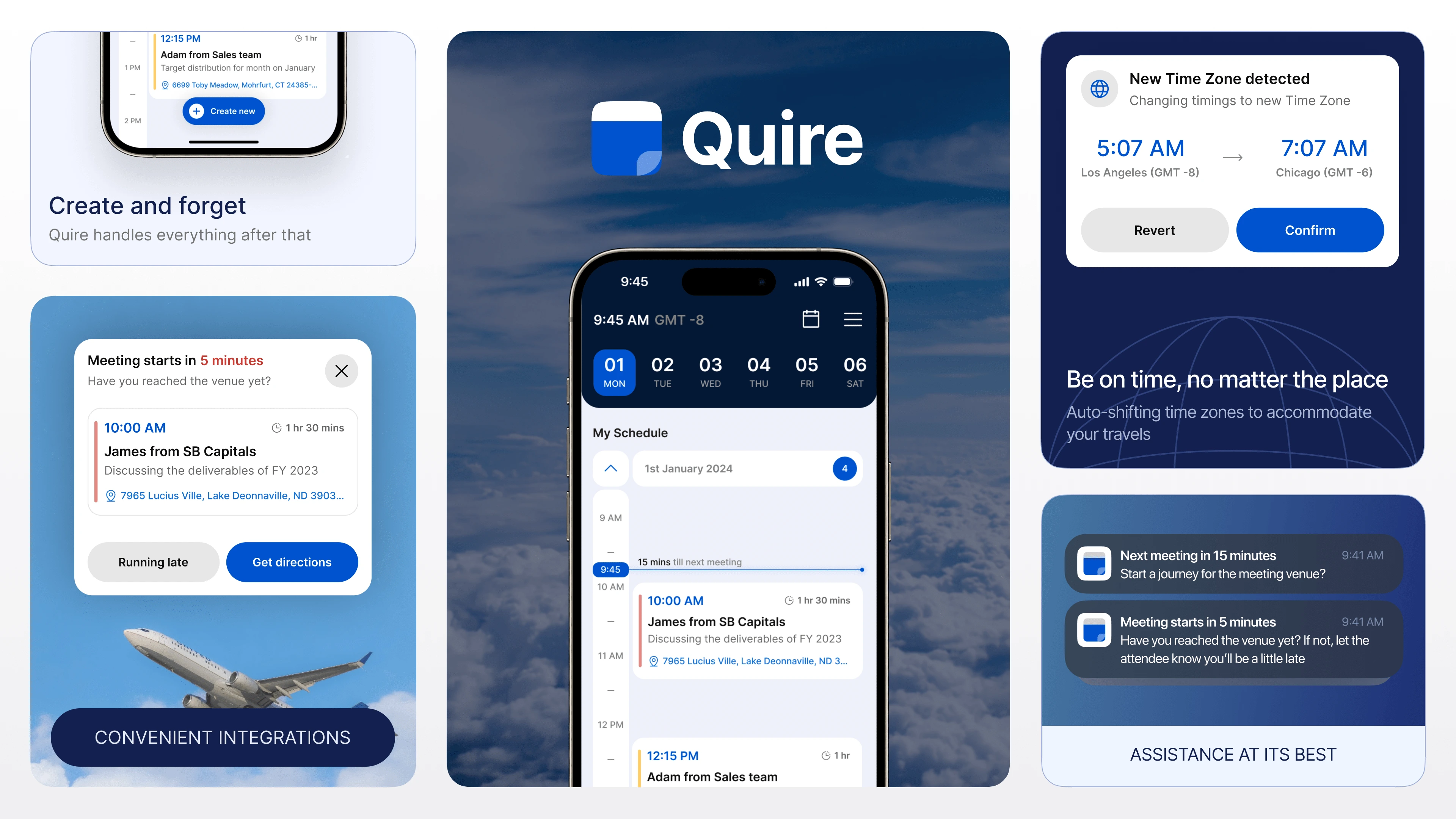
Let’s paint a picture for context
Meet Valentina. She is the perfect example of who we are crafting this application for. Let’s get know her together.
Valentina leads sales and business development for a Fortune 500 company. She travels 3 out of 4 weeks in the month, and when she travels, it’s almost always internationally. Between all her travel to different time zones and a busy meeting schedule in different cities, she finds it challenging to keep up with her calendar to show up to the right places at the right time.
The Problem Statement
Design a calendar flow and interface that is smart enough to suggest meeting times, accounts for changing time zones, and is proactively working for Valentina to make sure she is always on time for her meetings. The proposed solution has to be mobile-friendly and has to use viable technologies from today.
Nothing like some Good ol’ fashioned research
Clarity is key
Even with a tight 96 hour time limit (including my coffee and nap breaks) I knew I had to do some digging to gain clarity about our target user and their goals. I needed to know her wants and needs which will help me guarantee the success of the product I am designing.
The main questions behind all the research were:
What apps Valentina might be using currently?
What are the possible shortcomings of said apps?
How is Valentina compensating for those problems currently?
What are Valentina’s priorities when it comes to her meetings and appointments?
How solving those problems will affect business metrics that determine the success of our app?
Discovery of truth
learning about how Valentina is managing her appointments currently is the first step to discovery. Here are some of the apps she has tried out/using currently:
Google Calendar
Apple’s Calendar app
Outlook
Evernote
Todoist
Now, we can do a competitive analysis of the current apps in this space and figure out the problems and pain points with them. Here are some notable insights I discovered after analyzing these products:
No dedicated features for sales professionals who travel to multiple cities or overseas to meet clients to setup meetings and appointments while keeping record of all the essential details conveniently.
No support for handling time-zone changes or aiding seamless location navigation frustrates users, requiring them to manage these aspects independently, increasing cognitive load.
Lack of convenient scheduling options and timely alerts causes stress, impacting punctuality and forcing rushed travel between back-to-back meetings. This creates anxiety and fatigue over long business days impacting their performance in work.
Lack of assistance in finding optimal meeting timings diminishes app retention, adding cognitive load for users and making it less viable as a solution.
So basically, this is what the current apps are telling Valentina
Let’s get a deep understanding of our user
With Valentina as the ideal persona, I created an empathy map to get a more objective view of our user’s needs and goals.
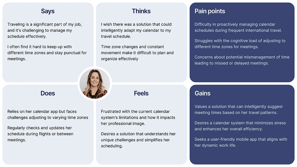
Through this process I gained more and more clarity of what the core problems are rather than ideating superficial solutions. But there is something else I need to do before I flex my design muscles.
Accessibility Considerations
We know that Valentina travels far and wide across the globe. But being her appointment management solution is a full-time job, and our app has to be there for her through ups and downs, all the time. To enable that reliability, keeping Valentina’s area of work in mind, I discovered that these inclusions were necessary:
Contrast and legibility of all information on the App should be suitable for outdoor environments
Reduce resource-heavy design assets to enhance usability in diverse network conditions
For accurate time-zone tracking, the app should utilize both GSM and GPS services as needed
Integrate popular map services for efficient guidance, minimizing time lost in locating meeting venues.
We need to talk business now
By now I had received a lot insights to understand and empathize with Valentina (I practically felt like I’ve talked with her about her work on a Friday evening). But now I need to look inwards and determine how we can guarantee the success of our product from a business point of view. Here are the most notable metrics which will act as our KPIs
Increasing adoption by providing solutions catered specially for Sales professionals positioning it as the go-to solution for our target user group.
Tracking and maximizing retention to validate whether the benefits we provide are sustainable long term and iterate on how we can add more value over time.
Driving up Engagement of the app to ensure that users consistently get value from the host of features provided and there is seamless integration between all of them.
User Satisfaction should be at the core of all the solutions designed. For such a highly consumer facing product, user impressions will make or break the app especially because it’s a product that affects their work.
And with that, we are ready to dive into the favorite part of every designer; letting the ideas flow. So without further ado…
Can you hear the Design gears moving?
With a good understanding of the problem statement, our user, and the possible pain points, I need to create a structure before diving into creative chaos.
And that begins by documenting our fuzzy ideas into comprehensive tasks that we want the user to accomplish through our product
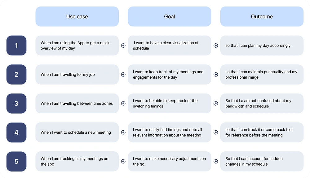
The jobs to be done method
I personally love this methodology of mapping the idea of a product because of three main reasons
It puts us in the user’s shoes and breaks down their overall goal into fundamental tasks that we want to enable the user to do
It educates us about the adjacent features we need to formulate or include to improve the experience of accomplishing those tasks
It serves that the foundation of our user flows and information architecture down the line
I know it sounds awesome, because it is. Take a look yourself…
Key features of the app
ideating elegant and seamless solutions for all of Valentina’s pain points was my main objective now. With the insights for the jobs to be done methods, I divided the entire app experience into these user flows:
A homepage that offers a detailed daily overview in a visual timeline format, including meetings, events, venue, and attendees
Effortlessly create and save new meetings, noting essential details for future reference and timely alerts
Automatic time zone change that updates all relevant timings in the user’s calendar after informing them about the same
Integrating map services to help users navigate to locations and venues seamlessly
Automations and seamless flows for rescheduling, postponing and editing meetings and appointments on the go
Smart recommendation feature to facilitate easily scheduling new meetings and appointments
Assumptions
Due to the time constraints and the nature of the assignment I had to consider some assumptions to ensure the viability of the solutions I had designed. They are:
Valentina always has access to either cell service or an internet connection (including fight Wi-Fi) during her travels
She has basic contact information of all the people is scheduling meetings with (Email, phone)
Visual Design
Let’s get into the pretty pixels. I created a mood board of inspiration for the look and feel of the app as well as finalizing design guidelines like typeface and color palette.
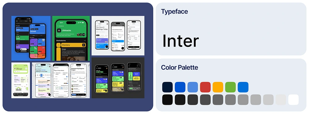
Let’s talk about some of my decisions here:
The UI design focuses on clear legibility and communication of information throughout the experience. Semantics are utilized to communicate important details more seamlessly. Incorporating affordance of all necessary call-to-actions and edge cases that the user might need or face are accounted for in the interface
The typeface was chosen as Inter because its the first love of all designers…just kidding. Inter provides really good legibility across a variety of font size and weights. It also aligns with the theme of our app which a professional tool for people in sales
The color palette aligns with the professional and clean look of the app along with accommodating for a variety of semantics that communicate important information.
Congratulations! You made it to the reveal of the app where I take through the entire experience and features. Now I’m going to let my work do the talking, so sit back and Enjoy…

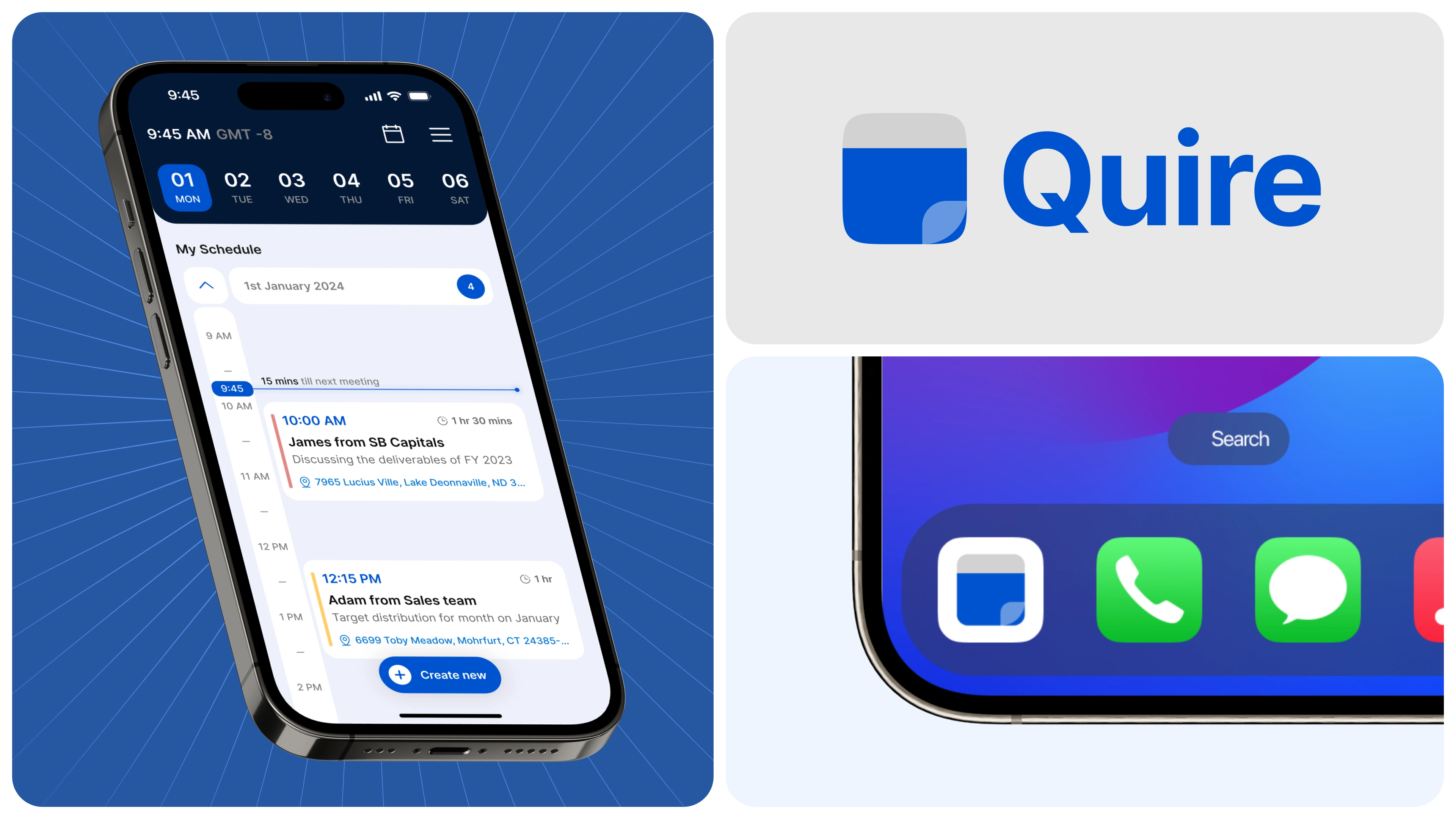
Less talk, more flows
Now we will go though each and every flow that I designed for the Quire app to help you experience the robust set of features we have put in place to help Valentina get to the right place at the right time, always.
The home screen
Let’s discuss the anatomy of the home screen, it’s utility, how it solves user pain points and accounts for all scenarios
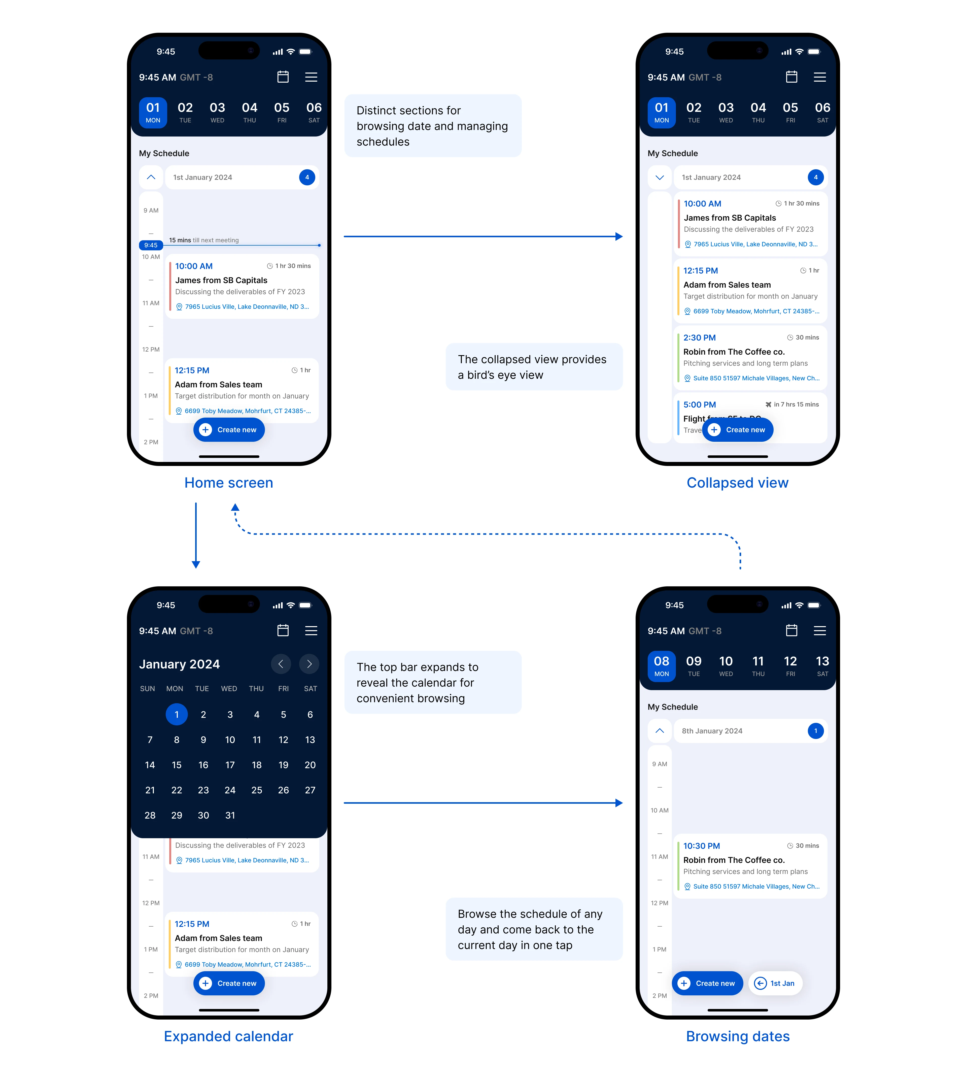
Notable features of the home screen:
The home screen is divided into 2 distinct parts. The top bar and the schedule section
The schedule can be collapsed for a list view to minimize redundant scroll distance
Expanded calendar view on the top bar for enabling easy browsing to dates
Dynamic button to help users come back to the present day in a single tap
The home screen aims to give the user a overview of the current day or any future day while minimizing redundant interactions and maximizing real world utility and usability.
Creating new events
Event creation is a super smooth ride on the Quire app. Just a few taps a and your schedule is updated. The app actively works for you to record events seamlessly and manage them.

Some details about the new event creation flow:
A balance of convenience and user ownership is the top priority of the flow. The ability to assist users while keeping their ability to change things themselves is considered carefully
Boring form are out! Recording meeting details won’t need excessive scrolling and typing anymore
Quire remembers the important things. The app stores organization names along with the contacts when you fill it in for the first time. From then on, you just select the contact and the organization is detected automatically
Record the venue of the meeting which works in tandem with map services on the day of the event to make sure you get to the right place on time
Smart timing suggestion curated specially for the use case of our target user group while keeping their existing schedule in account. Relative timing suggestions like “first 30 min opening of the day”, “after other meeting of the day”, “first 1 hour slot after noon” streamlines the time selection process reducing cognitive load
Actions and alerts
Here’s how the quire app works keeps you on track or lets you browse your schedule so you are the boss of your day
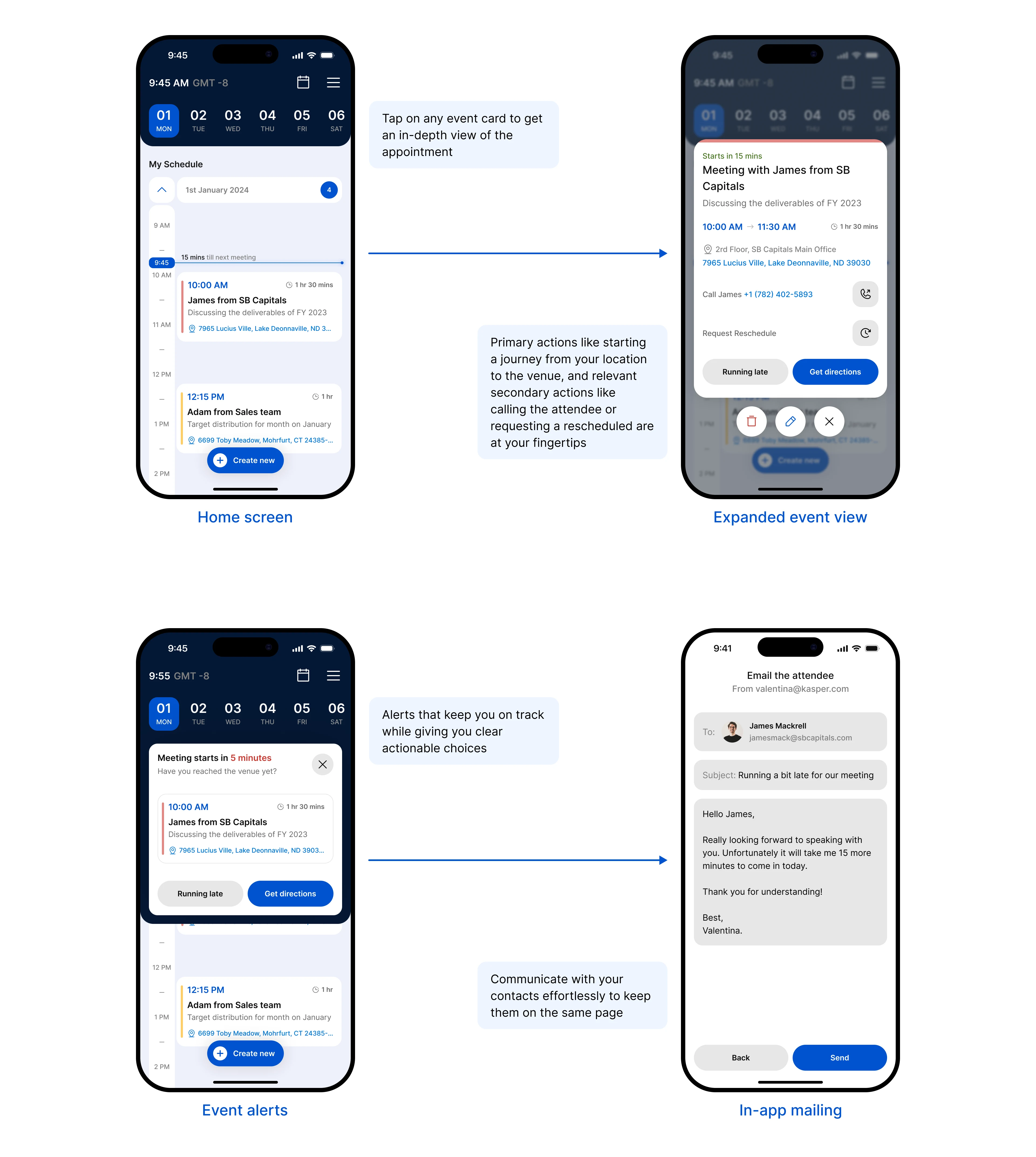
About the actions and alerts features
Quire app is not only your assistant when it comes to keep you on track but also as your own repository of information. You can learn more about each day’s schedule by browsing the event cards
Integration with map services enables the quire app to instantly start journey from the user’s current location to the venue of the meeting which minimizes the amount of time lost trying to find the right place when the user might already be running late.
Speaking of running late, transparency is very important for sales professionals like Valentina to maintain her professional image. That is why when or if the user is running late, they have the choice of informing the attendee about their late arrival through the in-app mail feature of the app
By default, a professionally written mail is already composed depending upon the context, but the user can obviously edit the content themselves
Rescheduling events
Rescheduling events are something which might occur frequently given the busy and dynamic schedule of sales professionals. Here’s how the Quire app simplifies that process
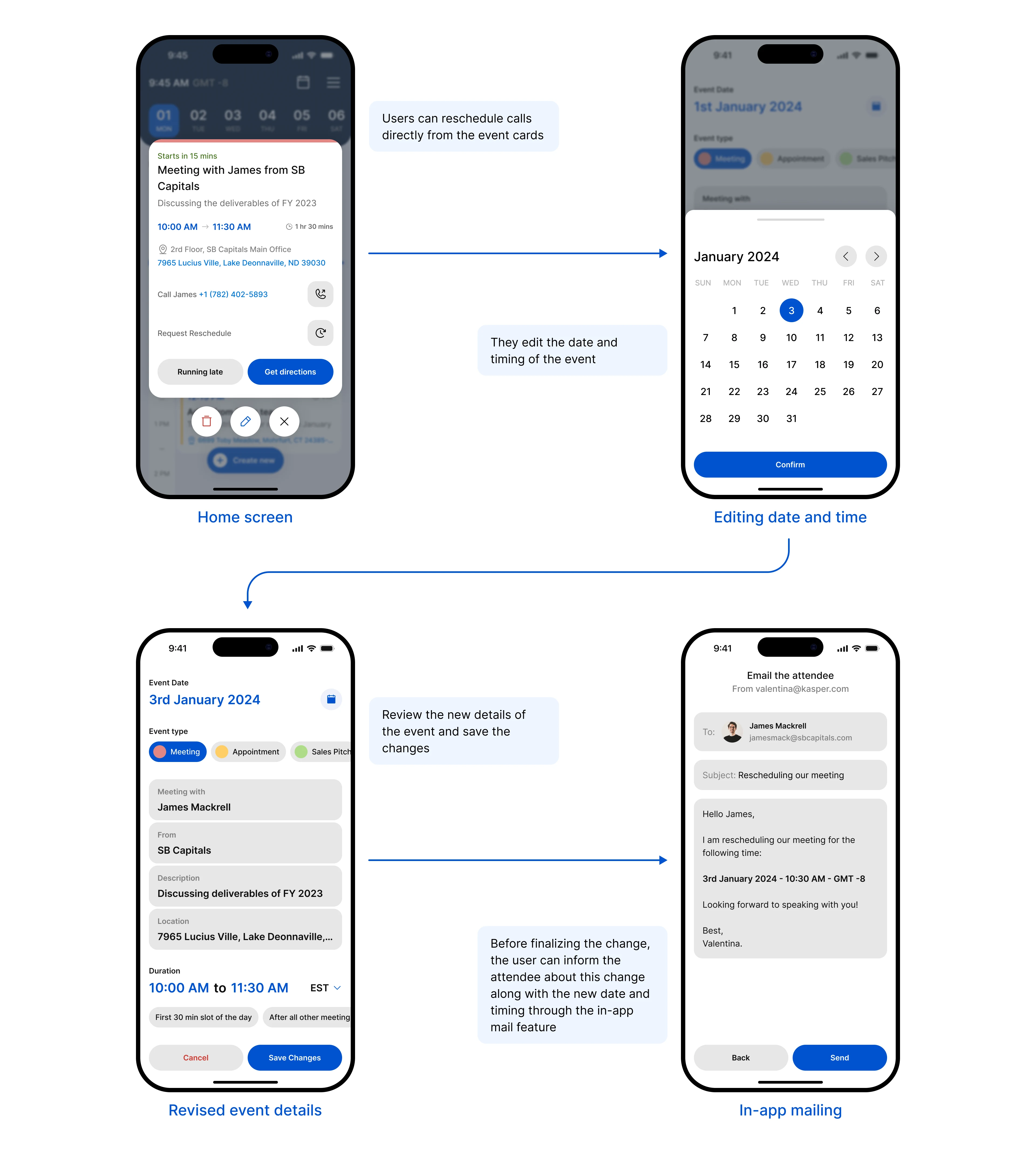
about the rescheduling experience:
Something as common as rescheduling a meeting is always accessible to the user at all time in the event cards
After the changes in date and timing is made, the user seamlessly informs the attendee not only about the change, but also about the new timings through the in-app mail feature
Time zone shifts
Did you think I forgot about the fact that we’re designing this product for someone who travels to different corners the world and gets things done? The Quire app obviously keeps track of all time-zone changes and alerts the user when this changes happen
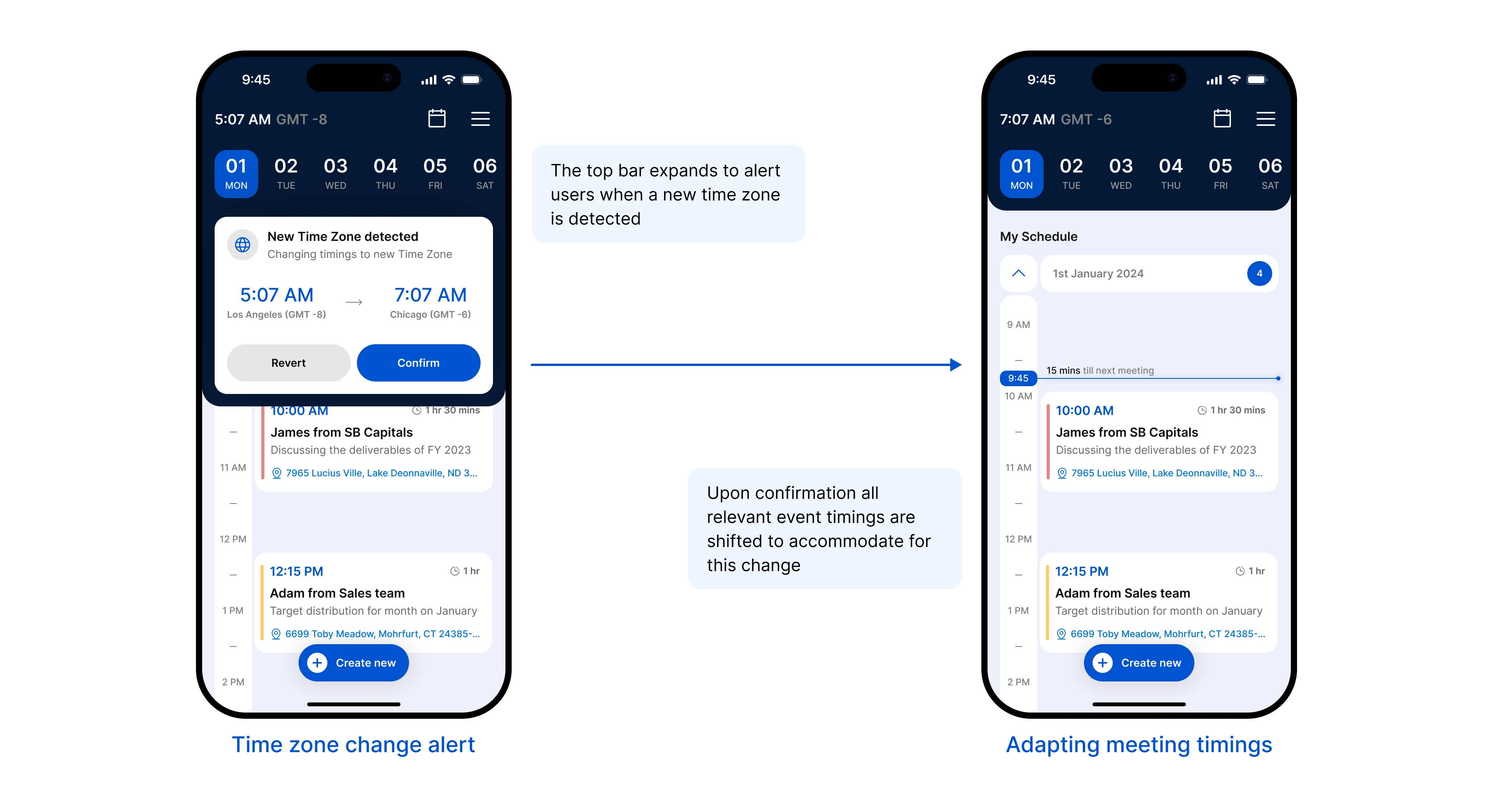
Notable aspects about the feature:
When a time zone change is detected by the app, the user is instantly informed about it along with how it will affect their schedule as well as two main actions, to implement the change into their schedule of revert these changes (since the user might just be passing through some other region)
Upon confirmation, the main clock in the home screen changes to the time of the current location and shifts all event timings respectively
A robust notification system
Like I said being accountable for someone’s schedule is a full time job, and Quire understands that quite well
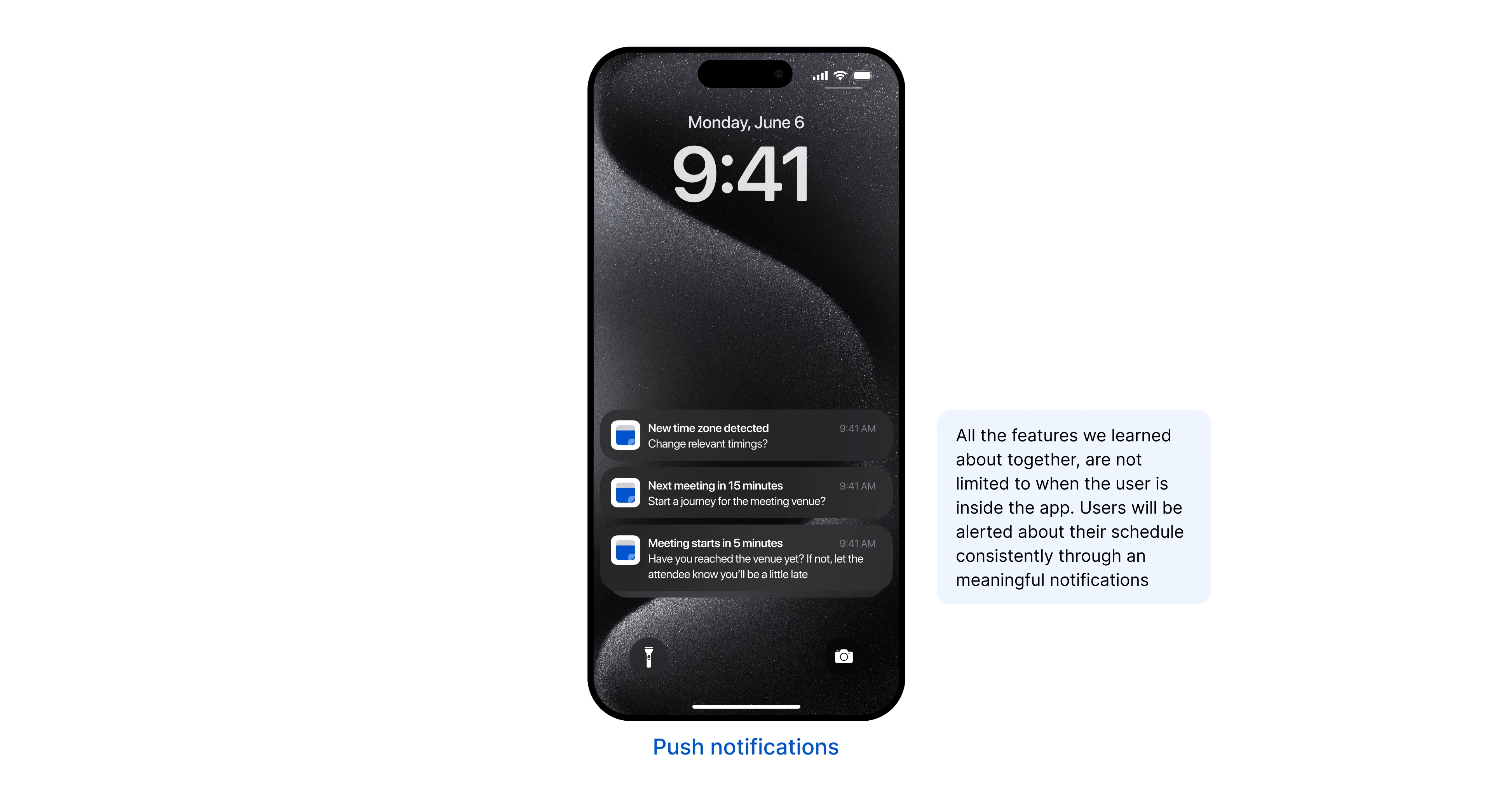
Active alerts and updated are not limited to the app interface. A meaningful notification system alerts you only when necessary about the things that matter.
And with that we are done with the UI and visual design
But before you go…
here are some business metrics I designed this product to drive and it will positively impact the success of the product
The intuitive timeline feature view, seamless event creation and editing makes Quire a one of a kind tool for sales professionals increasing adoption and customer acquisition
Since Quire learns from your schedule and contacts to help you out in the long term futures users will invest more time improving retention and derive more value over time increasing the user’s loyalty towards the product
All the features of the app focuses on relieving the users’ cognitive load about their schedule and decision fatigue, this improves consumer satisfaction drastically
Now we’ve covered everything I created for the premise of this project. there are countless more scenarios and edge cases we could explore given the target user group we are dealing with but these features serve as the foundational first step towards a robust product that helps professionals like Valentina get sh*t done effortlessly.
You’re a real one for sticking around to the end! Respect.
Did this case study color you curious about my work?
You can follow follow my work and life on my socials. I recommend following me if you’re into banger memes and product design.
Like this project
Posted Mar 31, 2024
How I designed an app for travelling sales professionals end-to-end within a 4 day sprint
Likes
0
Views
11

