Phillip Laurence Real Estate Brand Revamp

Deepannita Paul
1 collaborator


Phillip Laurence Real Estate Limited
Giving a local estate agency the presence of a premium property brand
For years, Phillip Laurence Real Estate Limited built its reputation through relationships, local expertise, and trusted service in West London. But while the business had grown, its identity hadn't. The brand lacked the confidence, consistency, and premium presence expected from a modern estate agency.
The challenge wasn't visibility—it was perception.
The credibility gap
Buying or selling property is built on trust. Clients make decisions worth hundreds of thousands of pounds, often within minutes of forming a first impression.
Phillip Laurence's visual identity wasn't reflecting that level of confidence. The logo, signage, and brand assets felt inconsistent, making the business appear smaller than the quality of service it actually delivered.
The objective wasn't simply to redesign a logo. It was to build a brand that immediately communicates professionalism, reliability, and expertise.
The strategy: Build trust before aesthetics
Before exploring colors or typography, we defined what the brand should represent.
Phillip Laurence Real Estate helps people navigate one of life's biggest decisions with confidence, honesty, and local expertise.
Everything that followed was designed to reinforce that message.
Rather than creating a trendy identity, the focus was on designing something timeless—one that would remain credible for years while supporting both digital and physical customer touchpoints.
A visual identity built on confidence
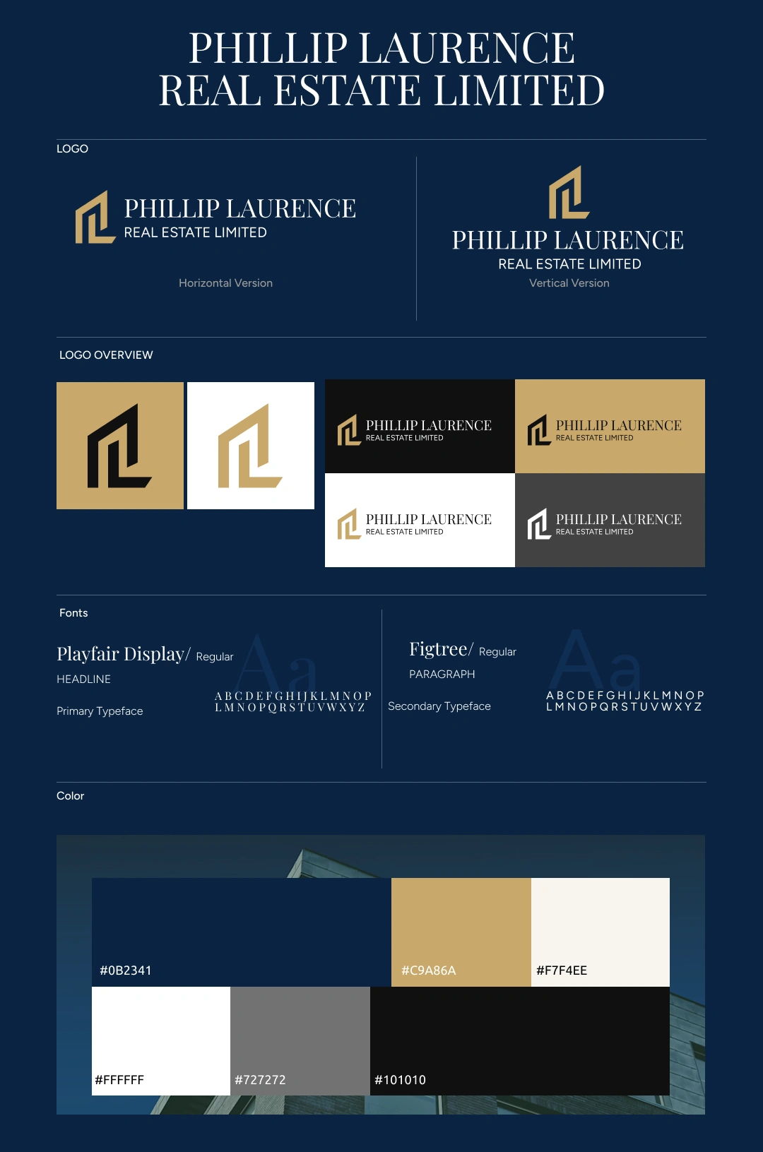
The identity revolves around a refined PL monogram, representing partnership, professionalism, and long-term relationships.
Every element was intentionally simplified to create a clean, memorable mark that scales effortlessly across storefront signage, digital platforms, business stationery, and marketing materials.
The result is a logo that feels established rather than decorative.
A color system inspired by luxury and trust
The palette balances confidence with sophistication.
Deep navy establishes stability and professionalism.
Gold introduces warmth and premium positioning without becoming excessive.
White creates clarity, while neutral tones provide space for content and photography.
The restrained use of colour allows the properties—not the branding—to remain the hero.
Typography with authority
The typography combines classic elegance with modern clarity.
A refined serif headline communicates heritage and trust, while a contemporary sans-serif ensures excellent readability across websites, brochures, and property listings.
Together they create a brand voice that feels premium, approachable, and confident.
Designed beyond the logo
A brand only succeeds when it works everywhere.
The identity was extended across:
Exterior storefront signage
Office branding
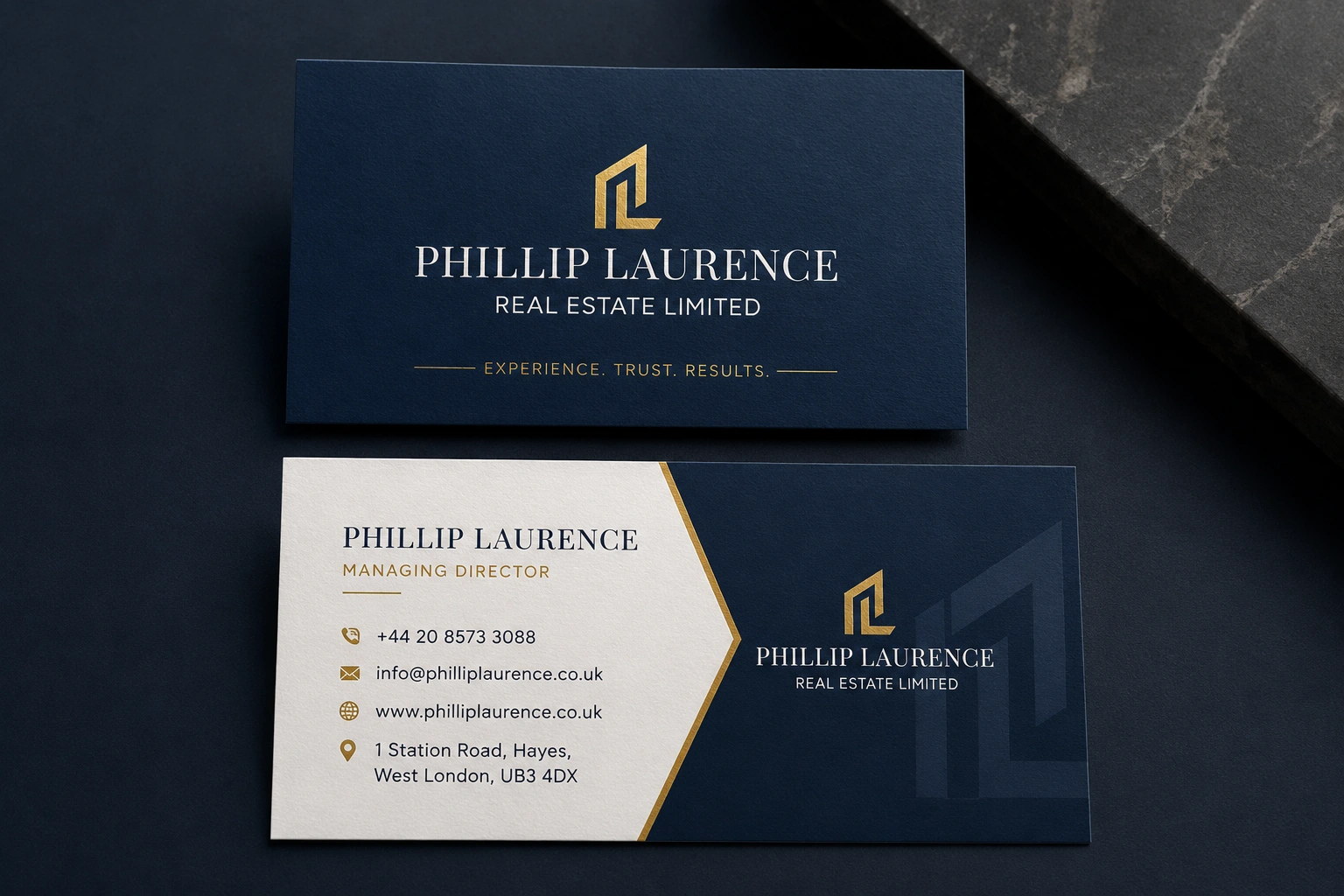
Business cards
Letterheads
Property brochures
Social media templates
Website interface
Presentation materials
Every touchpoint follows the same visual language, creating a seamless experience for clients.
Bringing the brand into the real world
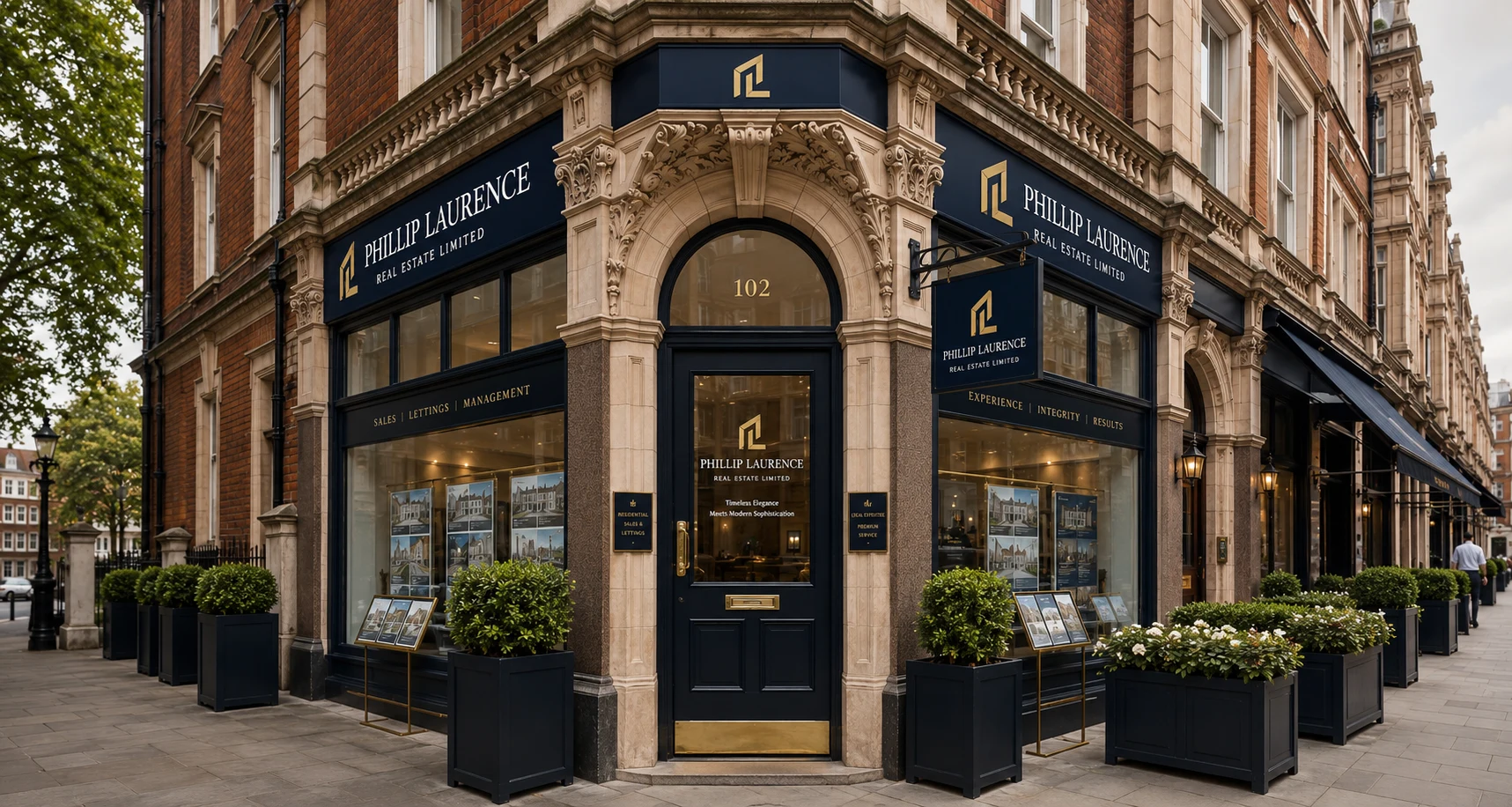
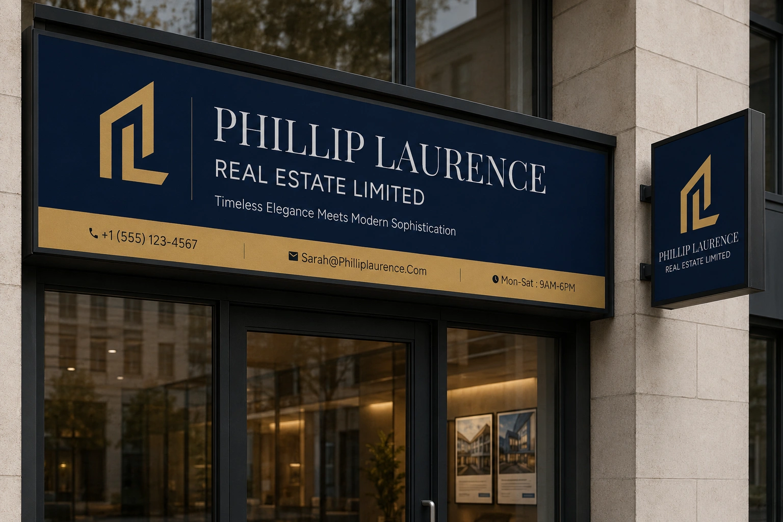
The new storefront signage transforms the agency's physical presence, giving the office the appearance of an established premium real estate brand.
From the street, the business now projects the same confidence clients experience once they walk through the door.
The office becomes both a workspace and a brand statement.
The outcome
Phillip Laurence Real Estate Limited now presents itself as the premium agency it has always aspired to be.
The identity creates consistency across every customer interaction, strengthens first impressions, and gives the business a scalable foundation for future marketing, digital experiences, and office expansion.
The brand no longer relies solely on reputation—it communicates trust before a conversation even begins.
The takeaway
Great real estate branding isn't about luxury for its own sake.
It's about making people feel confident enough to trust you with one of the most important decisions they'll ever make.
For Phillip Laurence Real Estate Limited, the goal wasn't simply to design a new identity.
It was to create a brand that looks as dependable, established, and professional as the service behind it.
Like this project
Posted Jul 21, 2026
Rebranded real estate agency for a premium and consistent brand identity.
Likes
0
Views
17
Collaborators