
Framer Expert | Web Designer | No-Code Developer

Framer Expert | Web Designer | No-Code Developer


Web Designer (UX/UI) & Digital Marketer
Web Designer (UX/UI) & Digital Marketer


View more →


Exceptional Wordpress & WooCommerce Specialist
Exceptional Wordpress & WooCommerce Specialist


SaaS Product Designer | UI/UX, Webflow & B2B Websites
- $1k+
- Earned
- 4x
- Hired
- 5.0
- Rating
- 437
- Followers
SaaS Product Designer | UI/UX, Webflow & B2B Websites

Woodstyle Design — E-commerce Website for a Luxury Wood Furniture Brand 🪵
We designed and developed a full e-commerce website for Woodstyle Design — a California-based studio crafting sculptural wood furniture pieces inspired by nature, flow, and organic form.
🚀 The design mirrors the brand's philosophy: raw material meets refined craft. A full-bleed wood-texture hero sets the tone immediately, while the clean white interior pages let each piece speak for itself — no distractions, just the work.
🧩Special attention was given to:
- immersive hero that puts the material front and center;
- product catalogue with editorial-style photography layout;
- individual product pages with material specs, dimensions, lead time, and cart flow;
- responsive mobile experience that preserves the premium feel;
- contact and footer design consistent with the brand's warm, artisanal identity.
A tactile and elegant digital experience for a brand where every piece is one-of-a-kind — designed to attract collectors, interior designers, and anyone who appreciates furniture as art.
🔗 Live site: woodstyledesign.com (http://woodstyledesign.com)
Looking to build a website that truly reflects the soul of your brand? Let's create something worth remembering😍
3
29
1.4K

Luxury Lighting Website Design and Development
✨Designed a premium website for a high-end lighting consultancy focused on delivering tailored lighting solutions for architectural and interior projects.
Large visuals and refined typography create a sense of space and allow the projects to speak for themselves.
Special attention was given to:
• visual storytelling through projects
• smooth and subtle interactions
• clean and structured layout
• focus on atmosphere and emotion
The final design creates a balance between minimalism and emotional impact, making the website feel both premium and inviting.
Looking to create a premium website that reflects your brand and converts visitors into clients?
Let’s build something exceptional together.
6
25
2.6K
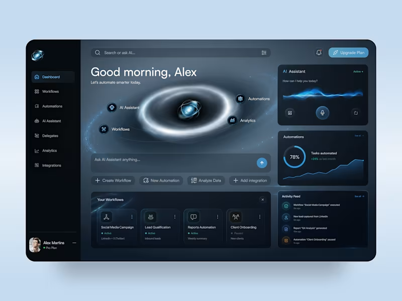
AI Automation Platform — SaaS Dashboard & Mobile App UI Design
✨ Smarter Workflows, Powered by AI
A futuristic AI automation platform concept that brings workflows, intelligent assistance, and performance analytics into one digital workspace. The design combines a deep navy interface, electric blue accents, and immersive orbital visuals to make complex automation tools feel intuitive and accessible.
Special attention was given to:
• Immersive dashboard composition with glowing orbital graphics and futuristic visual elements
• AI assistant interface featuring voice interaction controls, animated-inspired waveforms, and quick actions
• Organized workflow cards, automation management, and real-time activity feeds
• Clear analytics widgets with progress indicators, performance charts, and automation status controls
• Responsive desktop and mobile layouts with consistent dark-mode styling and streamlined navigation
The result is a modern SaaS experience that balances futuristic aesthetics with practical usability, giving users a clear view of their workflows, AI tools, and automation performance.
4
10
293

Fullstack Engineer | AI Engineer | 6+ years of experience
- $5k+
- Earned
- 2x
- Hired
- 5.0
- Rating
- 58
- Followers
Fullstack Engineer | AI Engineer | 6+ years of experience


Design and Webflow development built for real use.
- $1k+
- Earned
- 1x
- Hired
- 5.0
- Rating
- 44
- Followers
Design and Webflow development built for real use.


You already know how I feel about navbars and footers so this time I'm sharing a footer 💙
Take a look at the balance, typography, and color. One glance and it's immediately clear — this belongs to a serious website. That kind of confidence doesn't come from decoration, it comes from decisions.
This footer is from Nevan Mott's portfolio and it even got noticed by the Footer Design gallery, (https://www.footer.design/) which honestly made my day some time ago 😊
Curious what you see in it, guys!
2
3
333


Recently had a chance to work on a finance-focused project and this was one of the hero-section concepts built around the company’s goals, positioning, and existing brand elements.
Wanted to keep the balance between a clean financial feel and something a bit more dynamic visually. Strong readable typography, accent-driven CTA’s, layered glassmorphism elements, and a moving background that gives the whole screen a more alive and modern atmosphere without making it feel overloaded.
Overall, I think the result came out pretty clean, user-oriented, and flexible enough to scale naturally across the rest of the website!
Would honestly love to explore more projects in this space 👀
9
8
707