Freelancers in WarsawFreelancers in Warsaw
Launch Videos for funded AI Startups | Motion Design
$50k+
Earned
10x
Hired
5.0
Rating
221
Followers
Launch Videos for funded AI Startups | Motion Design
SaaS Product Designer | UI/UX, Webflow & B2B Websites
$1k+
Earned
3x
Hired
5.0
Rating
282
Followers
SaaS Product Designer | UI/UX, Webflow & B2B Websites
Cover image for ENDURX — Smartwatch & Fitness
ENDURX — Smartwatch & Fitness Tech Landing Page ⌚🔥 ENDURX is a landing page concept for a performance-focused smartwatch built around endurance, health tracking, and active everyday lifestyles. The goal was to make the product feel powerful and energetic from the first screen while keeping the experience premium and product-focused. A bold orange palette, oversized typography, and a large smartwatch visual create a strong sense of movement and performance. Special attention was given to: • a product-first hero composition that makes the smartwatch the main visual focus ⌚; • oversized “ENDURANCE” typography to communicate strength and performance; • an intense orange gradient that gives the brand a distinctive, energetic identity 🟠; • supporting product details around health metrics, activity tracking, battery life, and comfort; • a clear “Get Started” CTA positioned close to the main product; • additional product imagery that highlights the strap and all-day comfort; • clean navigation around Features, Health, Reviews, and Contact; • responsive mobile layouts that preserve the visual impact while simplifying the information hierarchy 📱; • a compact mobile menu with social touchpoints and easy access to key sections. The result is a bold digital experience that positions ENDURX as a modern wearable for people who want technology that keeps up with an active lifestyle. Looking to launch a wearable, fitness product, or consumer tech brand? Let’s create a product experience built to perform 🚀
4
7
39
Cover image for PLAYBIT — Retro Handheld Gaming
PLAYBIT — Retro Handheld Gaming Console Landing Page 🎮 PLAYBIT is a landing page concept for a pocket-sized gaming console that combines nostalgic retro gaming with a clean, modern product experience. The goal was to make the console the visual hero while building a digital identity that feels playful, tech-driven, and premium. The interface combines oversized typography, warm neutral tones, sharp orange accents, and product-focused visuals inspired by classic handheld gaming. Special attention was given to: • a large product-centered hero composition that immediately puts the console in focus 🎮; • retro-inspired typography and graphic details that reinforce the gaming aesthetic; • a neutral beige palette paired with bright orange accents for a recognizable visual identity 🟠; • oversized “PLAY MORE” typography that adds energy and strengthens the core message; • clear conversion-focused CTAs such as “Get Access” and “Buy Now”; • compact navigation for Console, Games, Specs, and Store; • supporting game previews and social elements without distracting from the main product; • responsive mobile layouts that preserve the oversized product presentation while reorganizing content for smaller screens 📱; • a simplified mobile menu designed to keep key sections easy to access. The result is a bold product experience that blends retro gaming nostalgia with contemporary ecommerce design — making the console feel both familiar and fresh. Looking to launch a gaming product, consumer tech device, or hardware brand? Let’s create a digital experience people will want to play with 🚀
3
7
105
Cover image for VYRA — Immersive VR Experience
VYRA — Immersive VR Experience Landing Page 🥽✨ VYRA is a futuristic landing page concept for a spatial VR platform that helps brands and teams create immersive digital environments for launches, storytelling, training, and interactive experiences. The goal was to translate the feeling of entering another world into a clean, premium digital interface. The visual direction combines oversized typography, immersive photography, minimal UI, and vibrant orange accents to create a strong sense of technology and motion. Special attention was given to: • a cinematic hero composition that immediately introduces the VR experience; • oversized typography integrated with the main visual to create depth and movement; • a minimal black, white, and orange palette that keeps the interface futuristic without feeling overly technical 🟠; • subtle orbital graphics and supporting details that reinforce the idea of spatial environments; • a clear “Start your world” CTA that connects naturally with the brand message; • supporting metrics and micro-elements that add a sense of technology and precision; • responsive mobile layouts that preserve the visual impact while simplifying the composition 📱; • a clean mobile navigation experience that keeps product, custom VR, pricing, and support easy to access; • a flexible visual system suitable for VR products, immersive platforms, and emerging technology brands. The result is a bold digital experience that makes spatial technology feel premium, accessible, and exciting — turning the website itself into the first step toward an immersive world. Looking to create a memorable website for your VR, AR, AI, or emerging technology product? Let’s build a digital experience that feels like the future 🚀
34
92
1.9K
Cover image for Premium Garage — Automotive Management
Premium Garage — Automotive Management Dashboard 🚘 A premium automotive dashboard concept designed to bring vehicle management, performance data, maintenance, and garage activity into one connected digital experience. The goal was to combine a luxury automotive aesthetic with a data-rich interface that still feels clean and easy to navigate. The concept explores both light and dark modes, using warm gold accents, spacious layouts, and strong vehicle imagery to create a premium feel. Special attention was given to: • a clear dashboard hierarchy that keeps the vehicle and its key data at the center; • performance insights including top speed, acceleration, drivetrain, and power 📊; • a structured garage experience for managing multiple vehicles; • maintenance tracking with recent activity and upcoming service information 🔧; • quick access to Garage, Catalog, Inventory, Performance, Transactions, and Settings; • premium membership and upgrade touchpoints integrated naturally into the interface; • light and dark themes that maintain the same visual hierarchy and premium character 🌗; • mobile layouts redesigned around vehicle cards rather than simply shrinking the desktop dashboard; • compact filters and bottom navigation for faster mobile interaction 📱; • a consistent gold accent system used for active states, CTAs, performance indicators, and key actions. The result is a polished automotive product experience that turns complex vehicle information into a structured, premium, and easy-to-navigate interface. Looking to create an automotive platform, management dashboard, or data-heavy digital product? Let’s turn complex functionality into an experience users actually enjoy using 🚀
8
19
666
Premium design to grow your business - DesignMe
$10k+
Earned
5x
Hired
5.0
Rating
242
Followers
Premium design to grow your business - DesignMe
Premium UI/UX & Web Design for Fintech, SaaS & Web3 | Framer
$10k+
Earned
1x
Hired
5.0
Rating
290
Followers
Premium UI/UX & Web Design for Fintech, SaaS & Web3 | Framer
Cover image for Vestris — from ratified contract
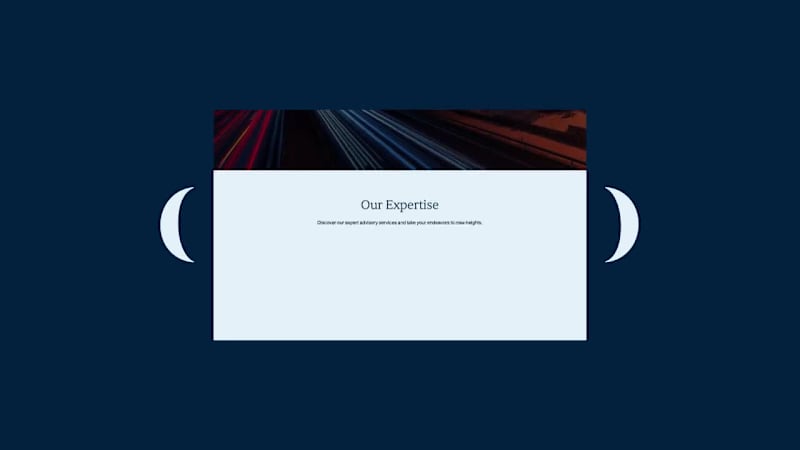
Vestris — from ratified contract to closing-ready, on autopilot Just wrapped one-week sprint designing the landing page for Vestris, a YC S26 startup automating mortgage title & closing work. Sharing the process because a few things about it were genuinely different from a typical SaaS landing page project. The brief Vestris automates the unglamorous middle of a real estate closing — chasing documents, prorating taxes, drafting closing disclosures, coordinating between lender/agents/title company. The founder wanted the site to feel "homey," not like enterprise software — because the buyers here are mom-and-pop title companies, not enterprise IT departments. Process 2 hero concepts tested in parallel (a quieter parenthetical headline vs. a bold full-width one), each with copy variants, sent as a single comparison sheet rather than one "final" direction — let the founder react to real trade-offs instead of guessing what I meant. Redesigned the site's core interactive block — an 11-step "how it works" breakdown — three separate times based on live feedback: first a desktop accordion, then a mobile-specific pass (accordions don't compress well under ~380px), then a full restructure into a 2×2 grid after the client flagged the original zig-zag layout for being "repetitive and too long to scroll." The illustrated hero background (watercolor countryside, cottage) needed to dissolve into the brand's cream background at the edges — but a standard blur/gradient looked flat next to the painterly art style. Built a small custom tool (canvas + JS) that applies ordered Bayer dithering to fade the illustration into the background color pixel-by-pixel instead of blending — it reads as grain, not gradient, and matches the hand-painted texture instead of fighting it. Turned it into a reusable tool with adjustable fade area, blur radius, dot size, and a transparent-overlay export, so it's not a one-off script. Figma for design, Framer for the build, custom canvas/JS tooling for the image-edge treatment, Midjourney for the base illustrations. vestris.ai (http://vestris.ai) — live now.
14
26
1.7K
Designer for your SaaS, app, deck and brand.
$5k+
Earned
2x
Hired
5.0
Rating
57
Followers
Designer for your SaaS, app, deck and brand.
Designer & Webflow Expert
$5k+
Earned
1x
Hired
5.0
Rating
23
Followers
Designer & Webflow Expert