Presentation Design Projects in Ukraine
Presentation Design Projects in Ukraine
Sign Up
Post a job
Sign Up
Log In
Filters
2
Projects
People
Message
24
Heed Collective
pro
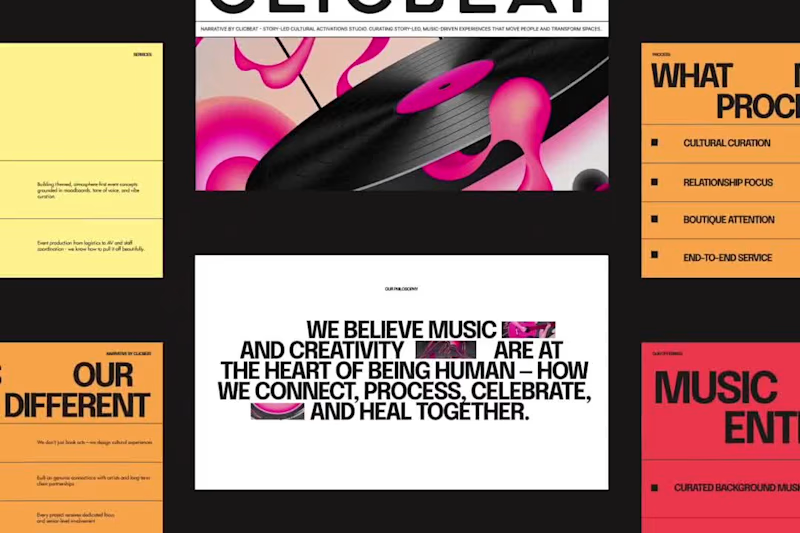
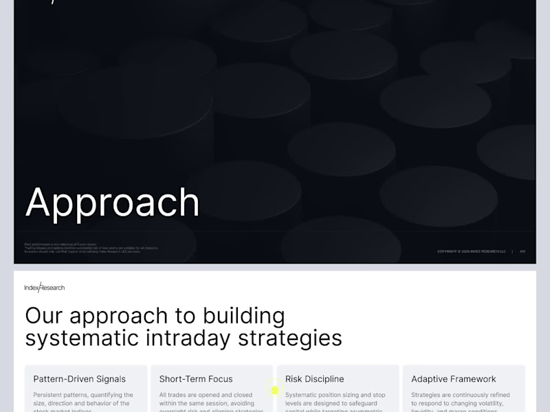
ClicBeat Pitch Deck Redesign
24
538
Message
0
Karina K
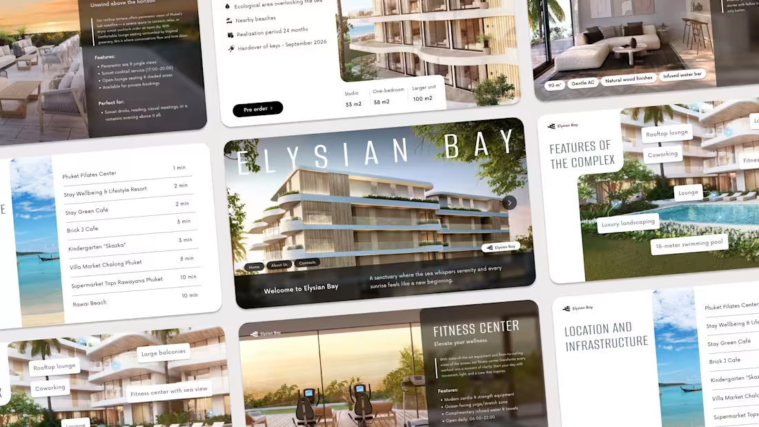
Elysiym Bay | Hotel Presentation
0
63
Message
2
Valery Nova
Visual Identity Design for Fractional CMO Agency
2
10
Message
0
Fillip Lungu
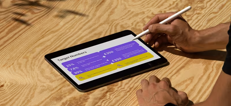
Presentation Slides
0
7
Message
3
Ditych
max
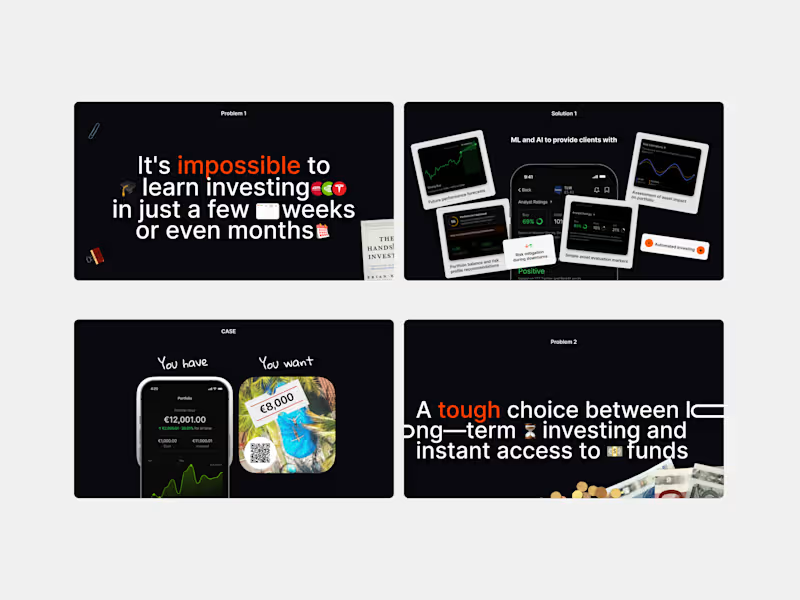
Investor Pitch Deck Presentation
3
9
Message
24
Oleksii K.
pro
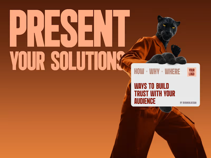
😩we're all tired of empty phrases we all want to be heard 🤝so, how do you build true loyalty? 🙌start a one-to-one conversation and personalised presentations can help with this these are not boring slides; they are a short, human way of saying, 'I hear your pain. here's (https://www.figma.com/proto/Wuxc3YrHrrTIdK7D40Oc6U/prz---okaiukov?page-id=465%3A10&node-id=465-14&viewport=217%2C451%2C0.04&t=PlnBh19vNl9kW9uk-1&scaling=contain&content-scaling=fixed)the solution for you.' 🏃♂️➡️and yes, it takes effort but in a world where everyone is chasing automation, genuine attention is the most valuable currency it builds trust, turning one-time buyers into loyal customers. 🙌I've put together a short guide on how it works → book a call (https://cal.link/okay)I'll be happy to help you find a voice for your brand, company or startup
5
24
1K
Message
1
Marharyta Shmarko
Presentation Slide Design
1
216
Message
8
Nataly Bila
Marketing Presentation Design
8
16
Message
2
Vladyslav Stadnyk
pro
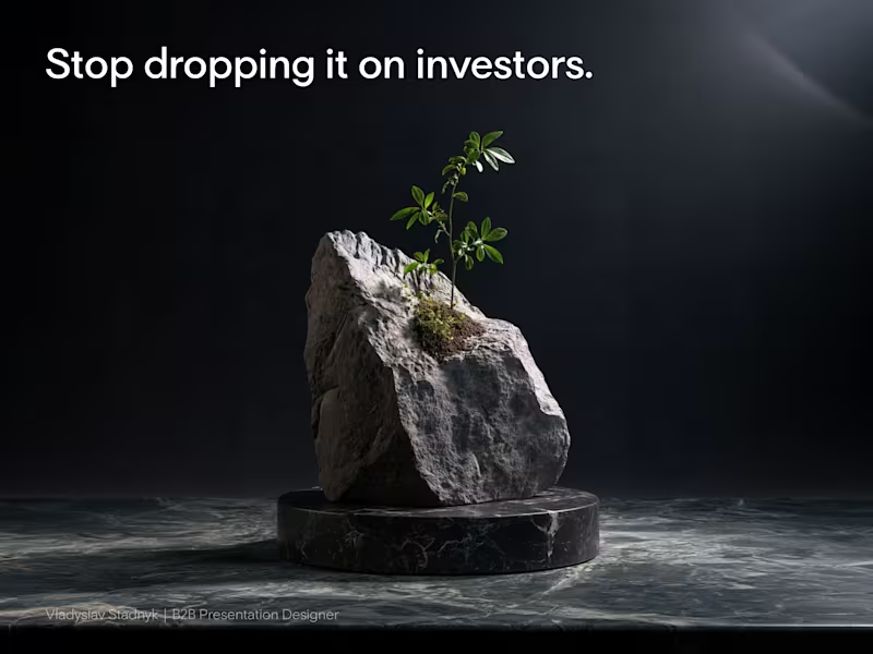
Burying your traction on slide 28 is the fastest way to lose a venture partner. Most founders assume volume equals expertise. They drop a massive rock of information onto venture partners, hoping the investor will dig through it to find a reason to write a check. But reality works differently. Venture partners review materials on their phones in the back of a cab or between meetings. If your core growth metric is hidden under a solid wall of text, nobody is going to see it. You lose their attention before they even understand your business model. Your presentation should be a scalpel, not a sledgehammer. Cut your deck in half. Leave empty space so your most critical numbers can actually breathe. One clean layout proving your unit economics closes rounds much faster than ten pages of technical documentation and product features. Open your current pitch deck. How many slides can you delete today without losing the core narrative?
2
2
205
Message
0
Olena Ulianytska
Business Presentation | Pet care | Wowpet
0
19
Message
1
Diana Advokatova
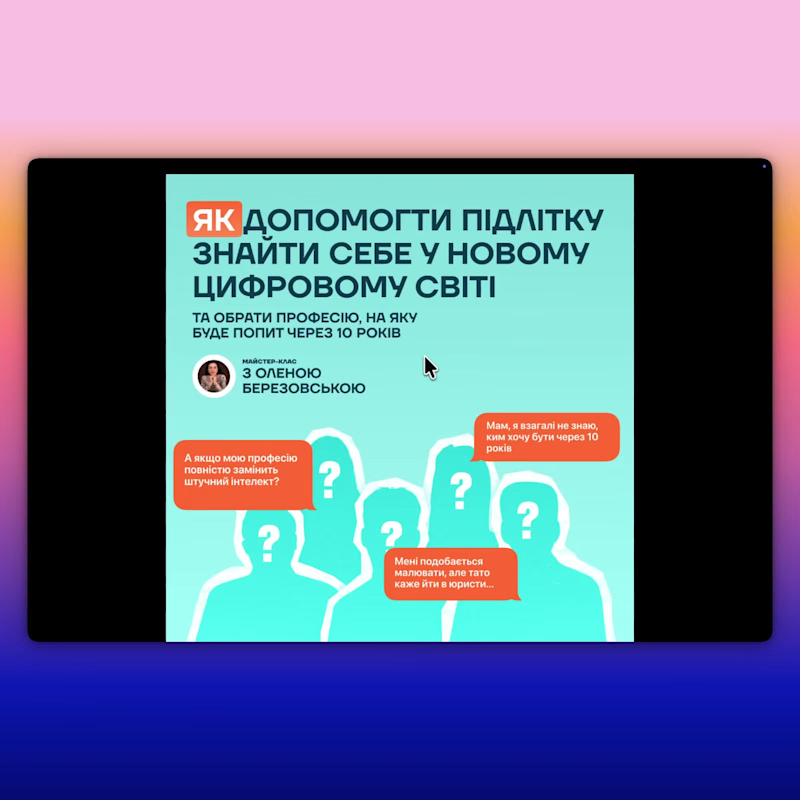
presentation for course
1
67
Message
1
Arsenii Artemiev
YES Mood Zone — Backpack Launch Campaign
1
5
Message
1
Anastasia Buhaenko
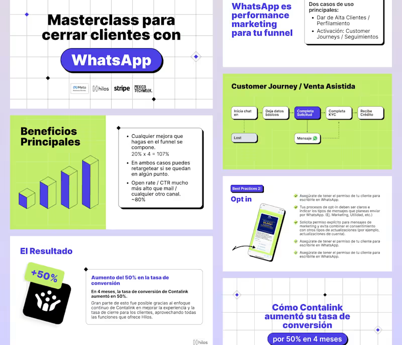
Mexico Tech Week: Masterclass Slide Deck Design
1
10
Message
1
Dmytro Messer
Using less text doesn’t mean leaving out important information. For me, the key is deciding what actually deserves space. Whether it’s a sentence, an image or a chart, every part should have a clear purpose and support the overall message. I pay close attention to visual hierarchy. I want the audience to move through the presentation naturally, starting with the most important point and then noticing the supporting details. Font size, formatting and placement all help create this structure. I also try to be careful with the amount of text. If there is too much, people are less likely to read it. When content doesn’t fit, reducing the font size only makes the slide harder to scan.
1
105
Message
0
Yurii Lototskyi
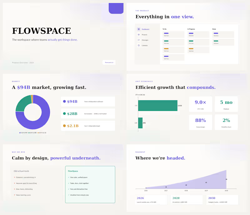
Investor pitch deck for FLOWSPACE — a SaaS workspace platform competing with Notion and Linear. 14 slides covering the problem, product overview, market size ($94B TAM), traction, unit economics (9× LTV/CAC), roadmap to $100M ARR, team, and $8M Series A ask. Clean light design with custom charts, donut graphs, and data visualizations. Delivered in PowerPoint — fully editable.
0
78
Message
0
Emiliya Smuzhanytsia
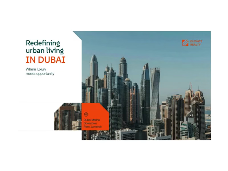
Real Estate Pitch Deck - PowerPoint Presentation Design
0
11
Explore projects