The network for creativity
Join 1.25M professional creatives like you
Connect with clients, get discovered, and run your business 100% commission-free
Creatives on Contra have earned over $150M and we are just getting started
Back to feedPost

Using less text doesn’t mean leaving out important information.
For me, the key is deciding what actually deserves space. Whether it’s a sentence, an image or a chart, every part should have a clear purpose and support the overall message.
I pay close attention to visual hierarchy. I want the audience to move through the presentation naturally, starting with the most important point and then noticing the supporting details.
Font size, formatting and placement all help create this structure.
I also try to be careful with the amount of text. If there is too much, people are less likely to read it. When content doesn’t fit, reducing the font size only makes the slide harder to scan.


The network for creativity
Join 1.25M professional creatives like you
Connect with clients, get discovered, and run your business 100% commission-free
Creatives on Contra have earned over $150M and we are just getting started

Challenges
View all


Related posts

Built this 2-page dental clinic website in Framer.
On desktop, the hero section includes service cards that move into place as you scroll and reveal information about each service.
On tablet and mobile, I placed the cards in the services section below the hero instead.
There simply isn't enough space to fit the same interaction without making the hero too crowded, so I kept the layout simpler on smaller screens.


Great animations that unique great job Rokas ❤️🎉

A portfolio doesn't need more space.
It needs to use space differently.
With OVERLAP, projects don't need their own isolated sections. They can share space, create depth and become part of a larger composition.
It's not about fitting more content on screen.
It's about creating relationships between what you show.
Less separation. More composition.

Love this take. Overlapping projects to create depth vs just stacking sections - way more intentional.

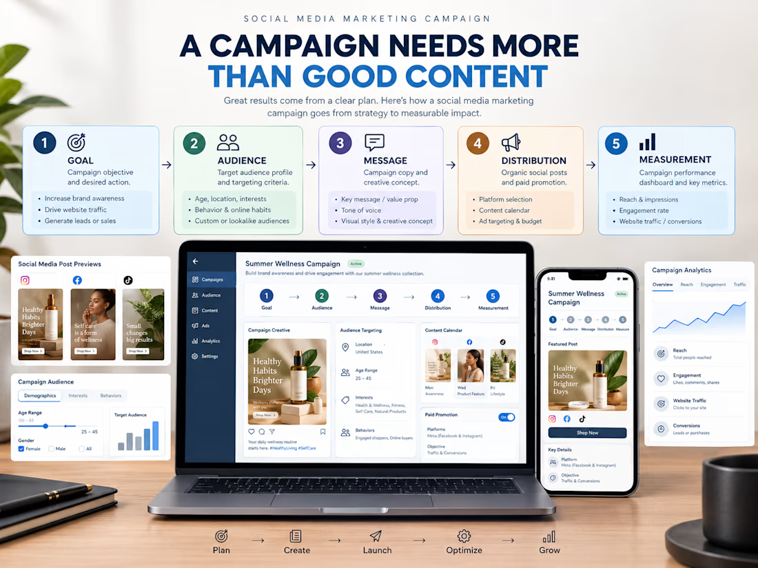
A social media campaign needs more than good content and attractive designs.
Before launching a campaign, I think about five important things:
→ Goal: What do we want to achieve?
→ Audience: Who are we trying to reach?
→ Message: What do we want people to understand?
→ Distribution: How will the content reach them?
→ Measurement: How will we know what's working?
Each part has a role to play.
Without a clear goal, it's easy to create content that looks good but doesn't support the business.
Don't just create a campaign. Build it around an objective.

Well said. When strategy comes first, the content has a much clearer purpose.