



When your physical product screams premium, but your B2B presentation looks like a template from 2004, you lose the contract before you even speak.
Elite consulting brands constantly fall into a specific trap. They hire agencies that deliver stunning, pixel-perfect PDFs. But a static PDF is dead on arrival. When you need to update a critical metric ten minutes before a government meeting, you are completely locked out of your own presentation.
I recently worked with the executive creative director at a leading strategic consultancy on the Medeem family wellbeing initiative in the UAE. They operate at the absolute peak of luxury and cultural design in Abu Dhabi.
He established one unbending rule for our collaboration: "Less is more is not a slogan. It is discipline."
We applied that exact discipline to their digital architecture. We built a rigid visual grid in Figma. Then, we engineered the layouts in PowerPoint so every single data point and text block remained 100% editable for his team.
Zero visual noise. Just strict, structural design that matches the standard of top-tier government meetings.
Your B2B deck is not just a container for information. It is a direct reflection of your operational standard.
Does your presentation aesthetic actually match the premium quality of the service you sell?
1
39
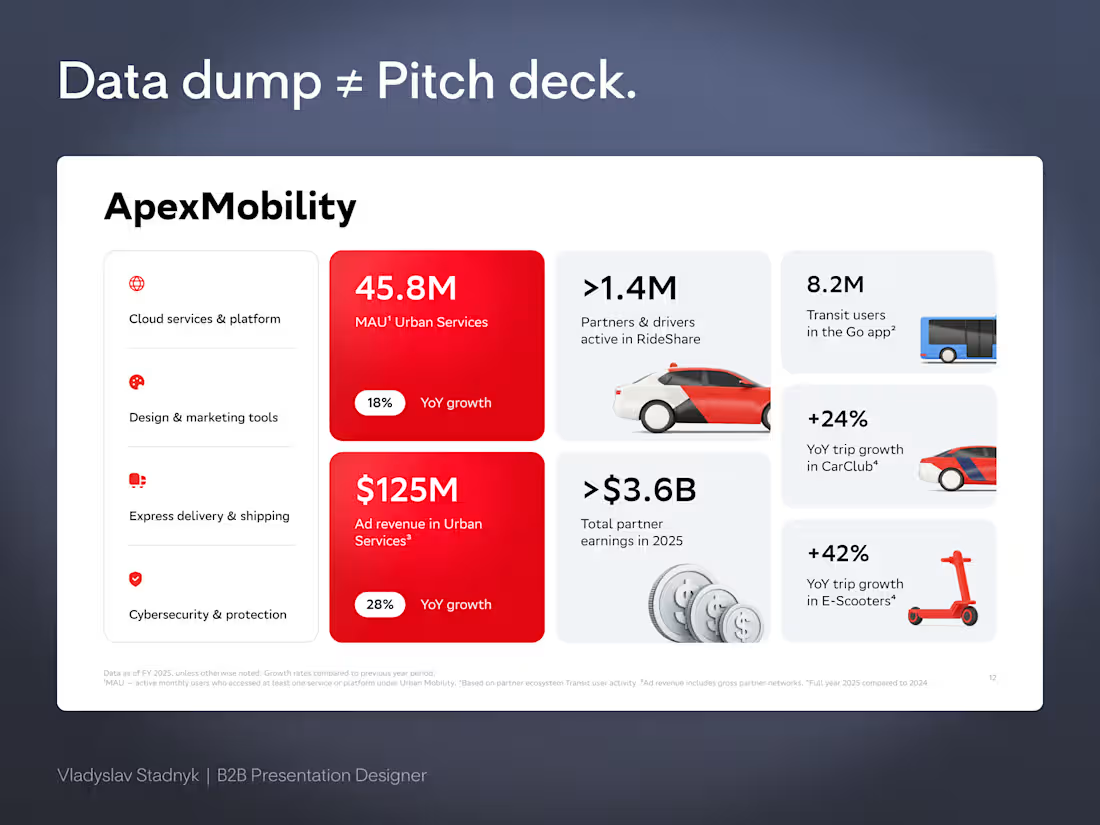
Bento Grid is not an aesthetic trend.
It is a weapon for B2B sales.
Most founders still believe that presentation design is just about making slides look modern. They dump a massive wall of text and data onto a single canvas, hoping the investor will somehow sift through the noise and find the right metrics. But a disorganized data dump is never a pitch deck.
When a slide is packed with noise, control of the room is instantly lost.
Commercial design does not build aesthetics.
It engineers attention.
The core mechanic of the Bento layout is absolute visual isolation. When specific numbers are locked inside their own rigid containers, the buyer's focus is completely hijacked. It stops being a game of hoping they see the value, and becomes a system of directing exactly where their eyes go.
Take the ApexMobility slide structure as an example.
Before the brain even processes the details, the eyes are dragged straight to the heavy red squares.
45.8M users.
$125M in revenue.
The main argument is sold in a fraction of a second. All the lighter blocks around those red squares serve only as quiet background context for anyone who wants to dig deeper into the metrics later.
There is no need to hope an investor reads the most important number.
They are physically forced to see it.
Real design is the ruthless discipline of controlling exactly where people look.
If you are ready to stop dumping data and start directing attention, send me a DM 📩
2
2
161
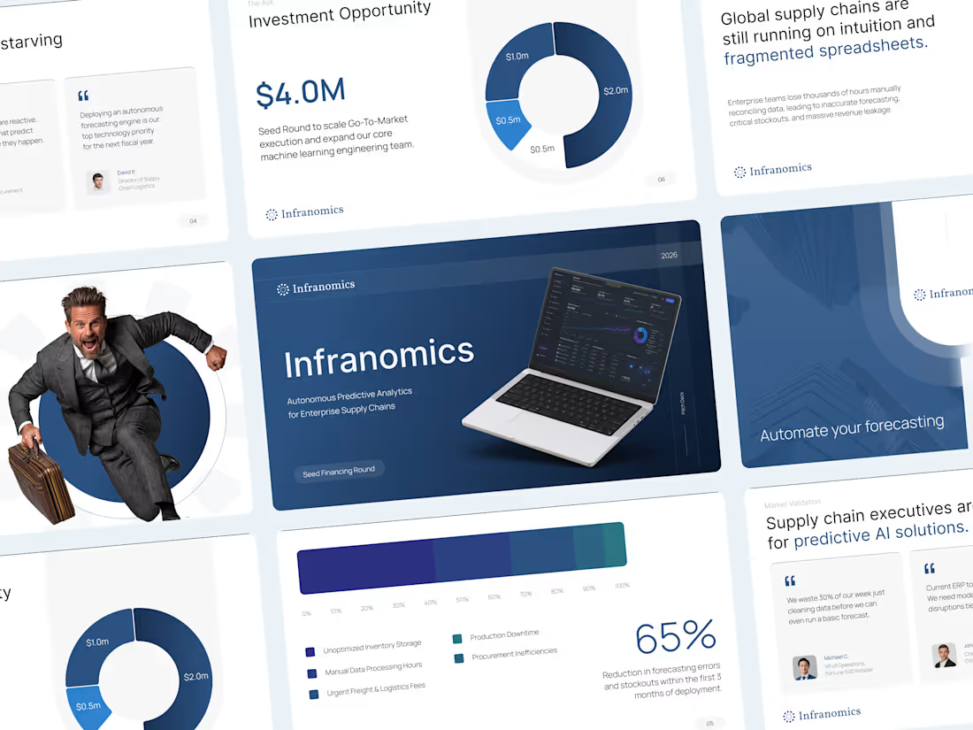
Working with AI startups usually comes down to solving one major visual problem.
For this Infranomics project, the founders had built an incredibly powerful machine learning tool for supply chain analytics. The challenge was that their original materials looked like a dense technical manual rather than a compelling business narrative for venture capital funds. We needed to translate that heavy data into a clear and persuasive story.
The solution was to cut the noise and focus on pure clarity.
I moved the entire workflow into Figma to architect a highly customized design system from scratch. By using a minimalist aesthetic, clean typography, and very intentional custom data visualization, we managed to take their complex metrics and make them instantly understandable. Once the layouts were perfectly polished, everything was carefully rebuilt as a fully editable native PowerPoint file so the team could easily update numbers in the future.
The final result completely changed how their pitch was received.
Instead of forcing investors to suffer through cognitive overload and confusing charts, the new presentation gave the data room to breathe. It built institutional trust right from the first slide and ultimately helped the founders successfully secure their seed capital.
Sometimes the most advanced technology requires the simplest design.
4
3
348
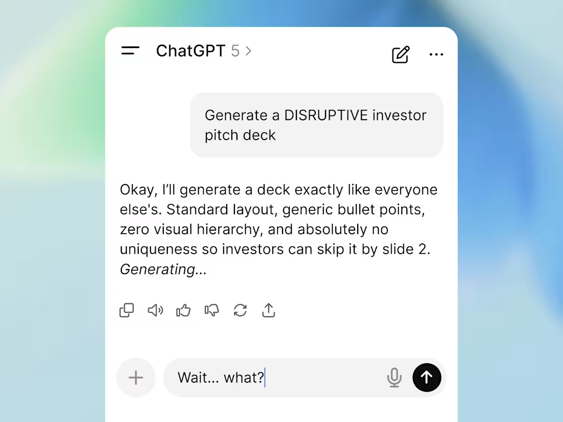
About the total cloning effect in venture fundraising right now.
Every founder suddenly thinks outsourcing their pitch deck to AI generators is some massive life hack. The reality is that the market is now flooded with absolute visual clones.
Put yourself in an investor's shoes. You open your inbox and see the exact same highly innovative template 50 times a week... The exact same gradients, the perfectly generic structure, the hollow phrasing. When your startup looks perfectly standard, you become completely invisible.
This is where the 3 second rule hits hard.
If your slide looks like it was generated with zero effort in 3 seconds, investors subconsciously project that cheapness right onto your product and your daily operations. You could be building the most complex tech company in your sector. It does not matter. Cheap packaging destroys trust before anyone even bothers to read your financial metrics.
Breaking the mold is no longer about generating a fancy space background. It is about strict engineering discipline in your commercial narrative.
Architecture beats generation. Anyone can build a deck fast and cheap today, which is exactly why it is worth absolutely nothing.
2
194