
Investors will reject it in exactly 3.
Every second startup is using algorithms to build their slides right now in hopes of getting a finished presentation in 2 minutes. The problem is that investors have learned to spot that synthetic aesthetic instantly. When a venture capitalist sees an AI generated slide, they subconsciously tag the entire company as lazy.
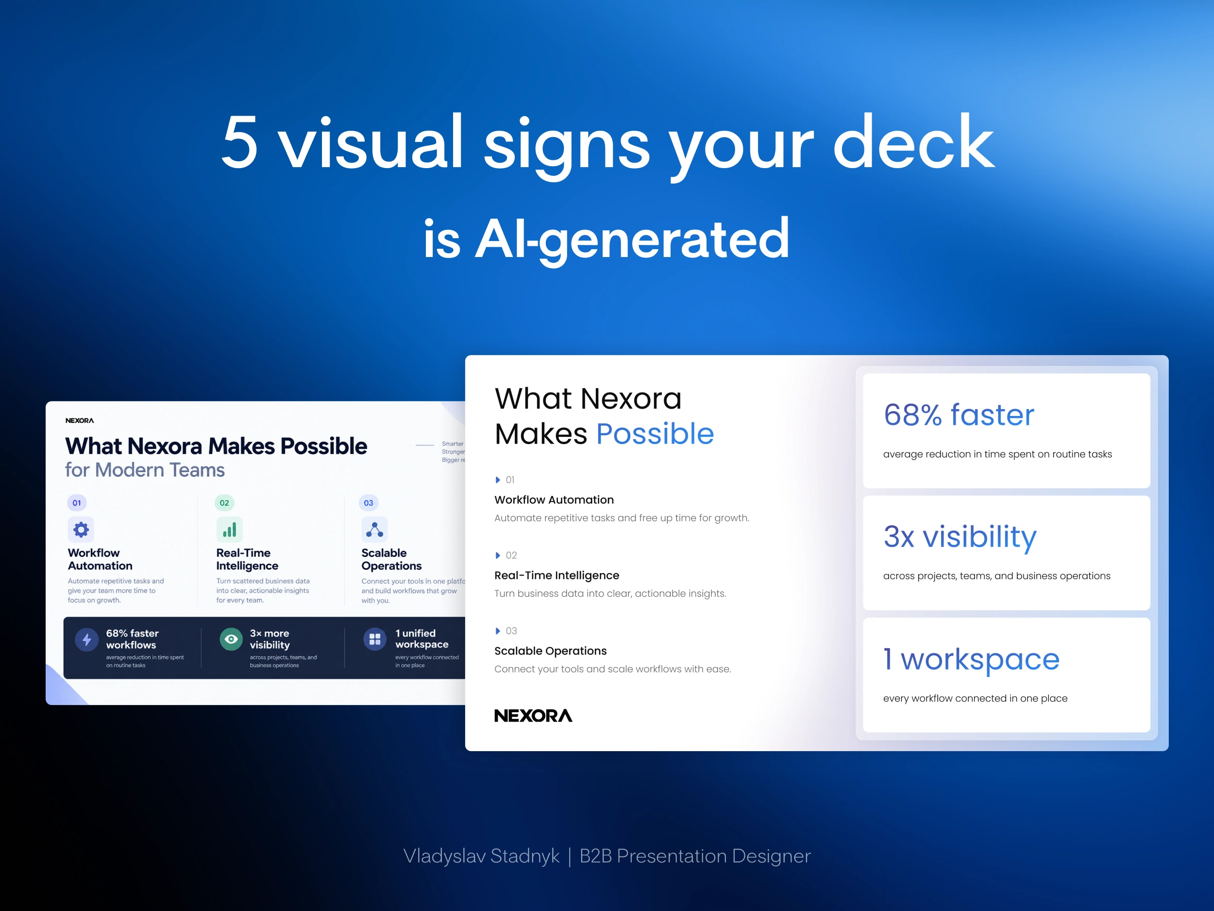
Take a look at the redesign for Nexora.
The left side is your typical algorithm output that simply fills empty space with shapes and text boxes. The right side is true commercial architecture where metrics are isolated and visual hierarchy actually controls the eye.
If you want to know why your automated deck is failing, look for these five visual patterns.
1. The 3 column icon syndrome.
Algorithms love dividing any information into 3 vertical blocks. Then they top them with abstract lightbulbs or gears whether it makes commercial sense or not.
2. Flat visual hierarchy.
AI does not understand the financial weight of a number. It makes a crucial metric like 68% growth the exact same font size as a generic description instead of aggressively highlighting the hard data.
3. Meaningless containers.
Generated slides constantly rely on heavy background blocks. These blocks just eat canvas space and create visual noise without adding any actual value to your pitch.
4. Fear of white space.
Algorithms will stretch text and expand line spacing just to fill the screen evenly. They have no idea how to use negative space to force investor focus exactly where it needs to be.
5. Synthetic alignment.
Instead of grouping logical ideas together based on their meaning, the machine just snaps everything to a rigid mechanical grid.
Algorithm knows how to drop text into a basic container.
Only a human knows how to construct a commercial narrative.
Stop letting a machine dilute your valuation.
If you want to ensure your pitch deck passes the human test and actually controls investor focus, send me a message 📩
0 likes · 1 view · Nov 10, 2026


