Brand Design Projects in State of Rio de Janeiro
Brand Design Projects in State of Rio de Janeiro
Sign Up
Post a job
Sign Up
Log In
Filters
2
Projects
People
$1K+ earned
Message
15
Marcus Dutra
pro
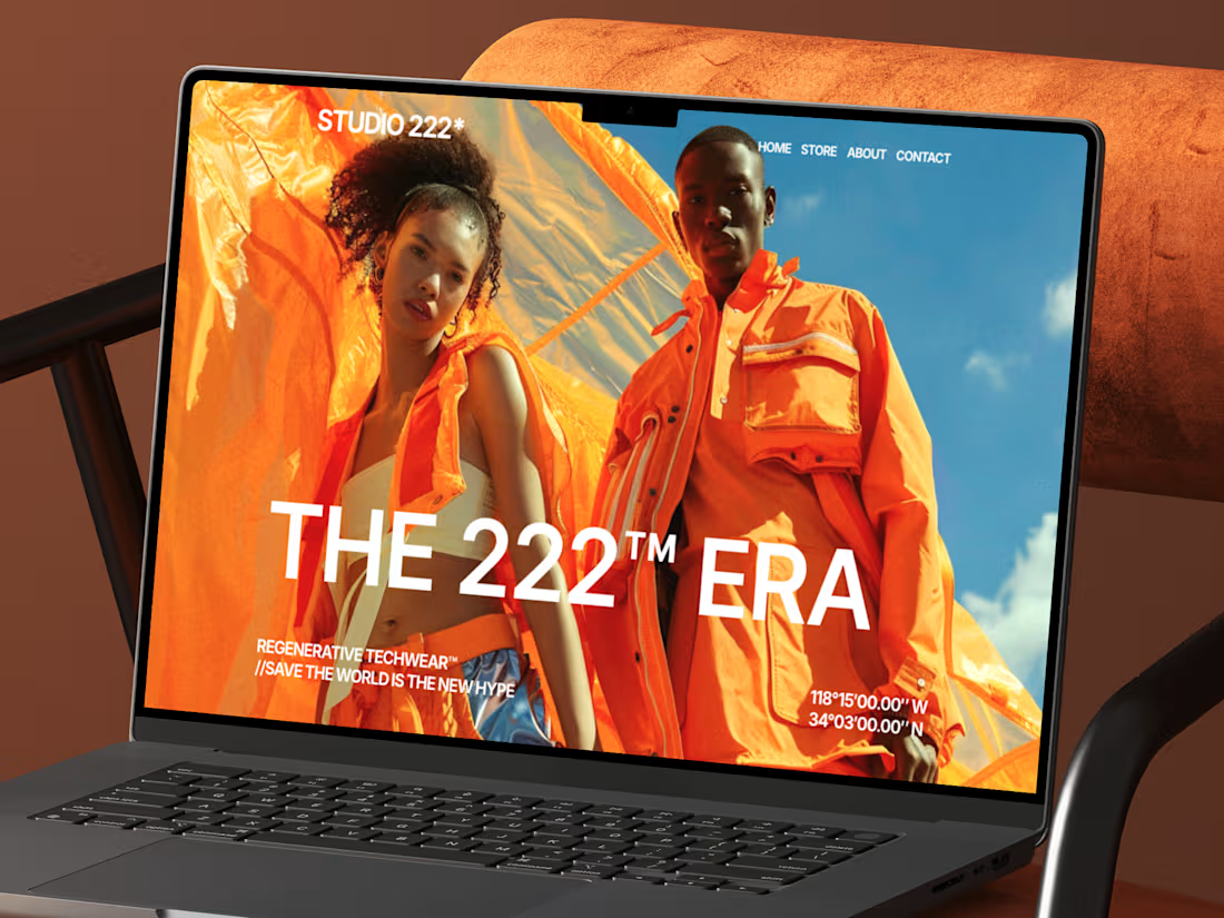
Studio 222™ — Streetwear E-Commerce
15
226
Message
14
STEPHANIE TETIIZ
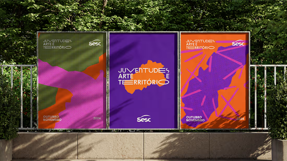
Sesc - Juventudes, Arte e Território
14
83
Message
0
LOST IN IDEAS
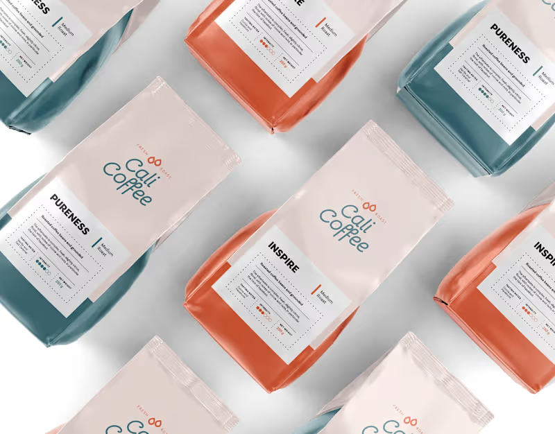
Cali Coffee | Logo, Branding & Packaging
0
18
Message
0
Rodrigo Alves
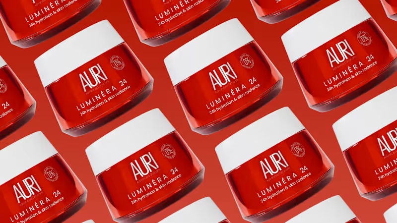
3D Packaging and Branding- Skincare
0
12
Message
0
Vinicius Moreira
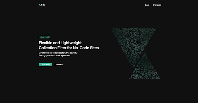
Sift
0
99
Message
0
Philipe Santana
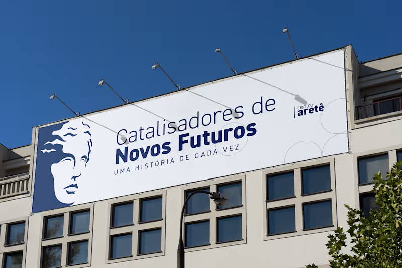
Centro Aretê
0
10
Message
0
Ivam Marchon
pro
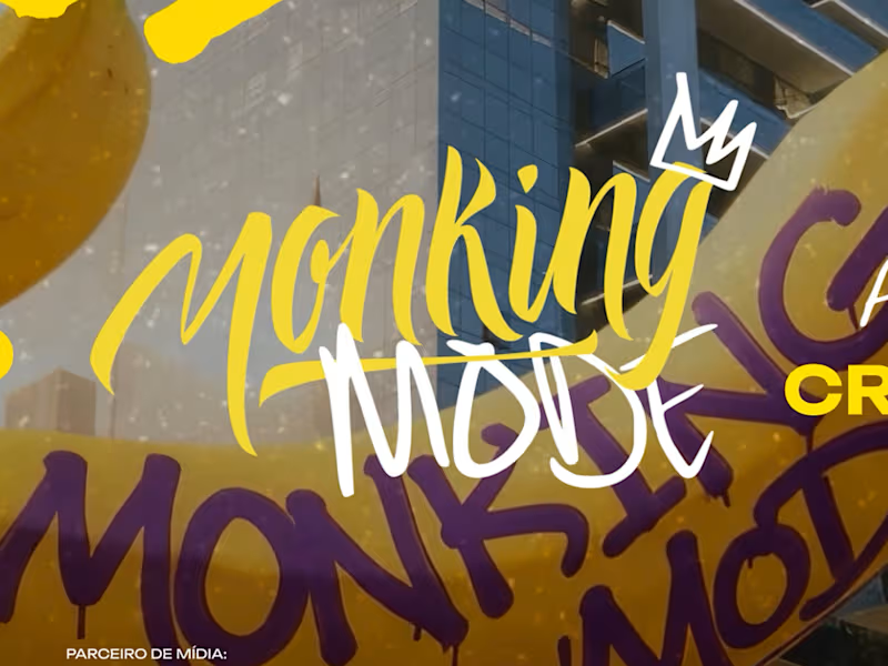
Entrance Screen Design for Monking Mode
0
12
Message
21
Mauricio Pontual
pro
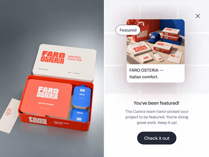
FARO OSTERIA just got featured on Contra! ✨ Really happy to see this one selected by the Contra team. I loved building the world around it, from the red pasta boxes and blue caps to the menu and street campaign. Thank you, Contra, and everyone who has taken a look and supported the work. Explore the project: https://contra.com/community/eVKgBdEl-faro-osteria-italian-comfort-street Independent concept. Creative direction, branding, packaging and AI assisted imagery by Mauricio Pontual / MP House Studio.
6
21
765
Message
0
Aparelho Studio
Generative Particle Identity Design for Sharpi AI
0
4
Message
7
Rafael Storck
pro
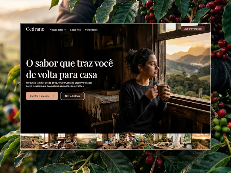
Cedrano | Coffee Brand
7
35
Message
2
Candela Albertini
pro
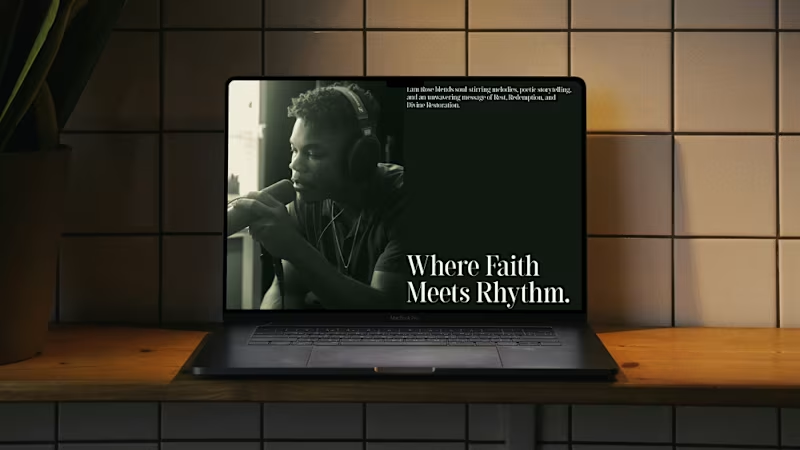
Lani Rose — Web Design Lani Rose is an independent R&B artist. The concept behind this design draws from a deep, earthy green palette — evoking spirituality, soul, and a grounded connection to self. The retro undertones pay homage to the roots of R&B while keeping the overall feel modern and intentional. The layout is minimal and airy, with a strong sense of balance and whitespace that lets the music and visuals breathe. The hero section puts his best tracks and covers front and center, leading listeners directly to where they can stream and connect with his work.
3
2
136
Message
7
Vladmir Oliveira
Hot Birds is a brand identity study developed for a contemporary fast casual restaurant focused on hot chicken and bold flavors. The project explores the creation of a strong and recognizable visual system that reflects intensity, quality and personality. Inspired by the culture of Nashville hot chicken and the warmth of Southern hospitality, the brand combines a vibrant color palette, bold typography and a playful yet confident visual language. The intention was to build a brand that feels approachable while still standing out in a highly competitive food market. From logo design to real world applications, the identity was designed to be flexible and impactful across multiple touchpoints including packaging, social media and physical environments, ensuring consistency and memorability.
3
7
163
Message
1
Fábio Alencar
pro
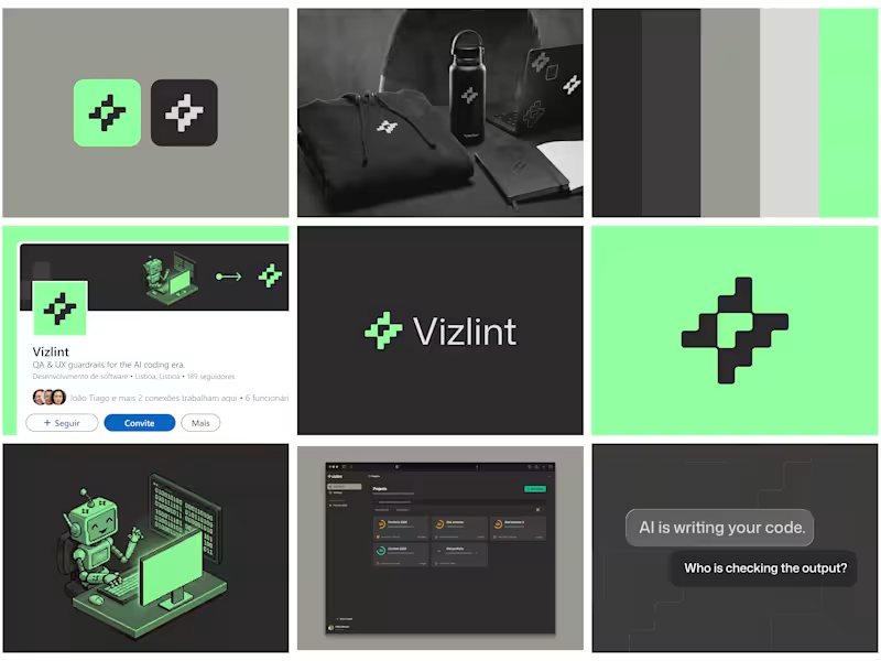
Branding and product design for QA Dev Tool
1
204
Message
0
Barbara Abbes
pro
Hungry for More
0
7
Message
0
Laiza Reis
Yoru Candy - Docinhos - Logotipo
0
0
Message
1
Sibelius Claussen
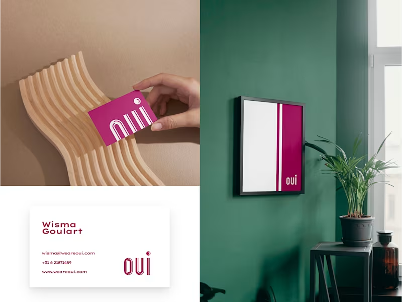
I created the entire brand ecosystem using my own methodology, leading a three‑week sprint with Wisma Goulart, a female‑led European design agency, to build a visual identity with more vitality while staying true to the director’s vision. I worked entirely in Figma, using a presentation structure I developed to guide the team through research, exploration, and final directions, and relied on third‑party tools to prepare assets for different devices. A key outcome was the “OUI” logo: a clean wordmark with subtle cuts that symbolize a new era for the agency, paired with a circular symbol that embeds a discreet smile to convey positivity and approachability. This direction gave Wisma Goulart a cohesive visual foundation and logo system that strengthens their positioning as an optimistic, welcoming studio in the European market.
1
143
Explore projects