Freelance UI Designers in Saint Paul
Sign Up
Post a job
Sign Up
Log In
Filters
2
Projects
People
Lee Allan
pro
Minneapolis, USA
Creative Director, Brand Identity & AI Film
1x
Hired
5.0
Rating
13
Followers
Follow
Message
Creative Director, Brand Identity & AI Film
0
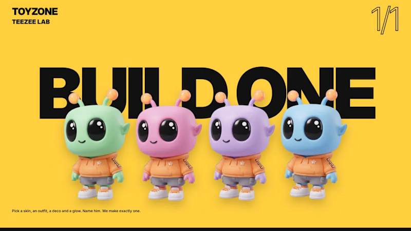
One alien, infinite editions. TEEZEE’s mint skin, glossy black eyes and orange antenna tips anchor four editions: Blast, Skate, Groove and Explore. Bold colour, oversized typography and graphic packaging create a flexible identity with the character at its centre. The store demo follows a shopper from homepage to checkout, using motion to guide browsing, clarify product choices and confirm purchases. Animated edition transitions, quick-add interactions and a four-figure set builder make the journey playful and easy to follow. TEEZEE Lab extends the concept into customization. Shoppers choose skin, outfit, print and antenna colour, then name their character. Live pricing and packaging previews track each choice before the finished figure becomes a boxed “1 OF 1” collectible. A looping brand-guidelines film carries the identity across packaging, merchandise, retail and digital applications. AI-assisted imagery was refined by hand to maintain consistent typography, branding and pricing. Together, the films demonstrate a complete creative system—from character and identity to an animated shopping experience.
0
65
1
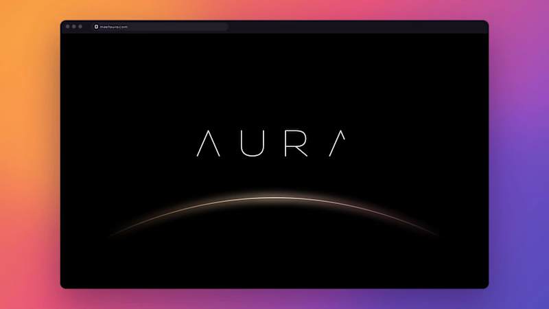
Aura is a home AI device: a soft, fabric-wrapped pebble that lives quietly in the room instead of demanding attention. Most smart tech is cold, blue-lit and talks too much. Aura needed a brand that felt the opposite: warm, calm and human, technology that knows when to step back. The idea: The glow The identity is built on one image: the horizon at first light, and the last. A single gradient sweep from ember orange through bloom pink to dusk violet acts as the brand's light source. It's always used as one continuous wash across a surface, never chopped into flat blocks of colour. The product's soft status light, the packaging and every screen share that same glow. The system The wordmark is reduced to almost nothing. AURA is set in hairline geometric caps, with the A drawn without its crossbar so the letters feel like light rather than type. The colour names come from times of day. Ember is first light, Bloom is the heart, Dusk is evening and Night is rest, all set on Ink and Mist. The colourways go straight onto the product: five pebbles on a shelf, one for every mood of the day. Typography whispers. Josefin Sans in extra light and light handles headlines, with widely tracked caps for labels and UI. Iconography is one thin line inside a halo. Three icons carry the product promise: Aware, Intuitive and Private. Imagery lives in the moments between. Golden-hour lifestyle photography, closed eyes and quiet rooms, with the product never shouting. Launch Website: opens on a silhouette in the glow with "Meet Aura", then moves through "Designed for life, not just tech" and "Technology that knows when to step back". It builds to a keynote-style product reveal and a "Be the first" pre-order. Packaging: a soft-touch box with the wordmark debossed in gold. Out of home: "Intelligence you can feel", lit at dusk on a wet city street. Social: a feed and stories system: golden-hour photo first, one quiet line in the lower third, the wordmark top right, nothing shouting. Deliverables Brand identity, colour and type system, iconography, packaging, animated brand guidelines, website, out-of-home and a social launch campaign.
1
113
0
Ocean Getaways Brand identity, guidelines, website and social A private yachting advisory, established in 1984 in Flushing, New York, curating charters and journeys worldwide. The identity rests on one gesture: a wave drawn through the A, the moment a hull meets open water. Deep Ocean navy, Aegean blue and warm sand, set in Playfair Display and Montserrat, with photography that leads with the journey and lets the brand stay quiet. Identity A stacked and a horizontal wordmark, a Q-shaped monogram for small spaces, and four fine-line icons drawn like a nautical chart: wave, compass, journey and horizon. The voice is short and confident. Discover. Explore. Charter. Experience. Belong. Website Every page leads with the journey, then the advisory. Full-bleed destination photography, generous white space, a sticky navigation that turns solid as you scroll, and a single navy call to action that ends in a one-line inquiry.
0
72
0
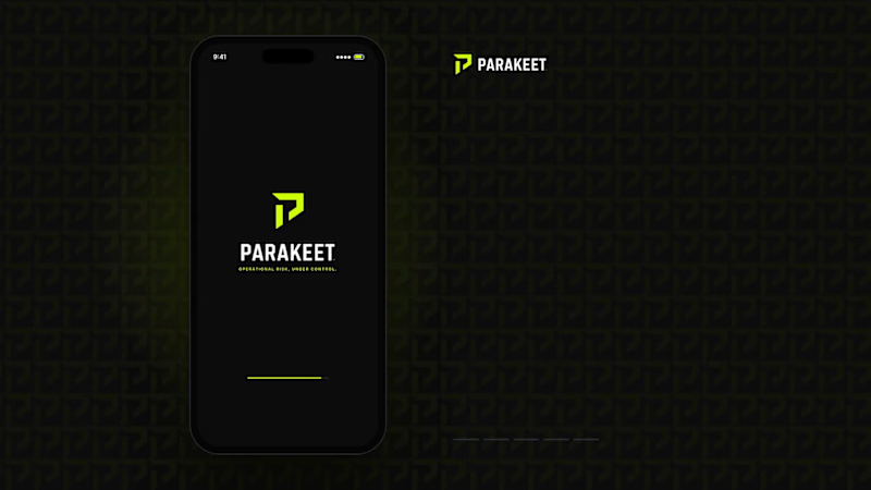
Overview Parakeet is a brand concept created to demonstrate how a complex B2B software platform could be transformed into a modern, enterprise-grade technology brand. The objective was to move beyond generic SaaS aesthetics and position Parakeet as a trusted operational risk intelligence platform serving industrial, energy, manufacturing, and infrastructure organizations. Challenge Most risk and compliance platforms rely on outdated corporate branding that feels technical but lacks clarity, authority, and differentiation. The goal was to create a brand that communicated trust, precision, operational excellence, intelligence, and enterprise credibility while remaining visually modern and scalable. Solution I developed a complete brand system including: Brand positioning Logo and visual identity Color palette and typography system Iconography suite Website direction Product UI concepts Social media assets Sales deck and collateral design The visual language combines industrial strength with technology-forward sophistication through a high-contrast black, carbon, and safety-lime palette inspired by control rooms, infrastructure, and mission-critical operations. Result The final concept demonstrates how strategic branding can elevate a technical software product into a premium enterprise platform with a clear market position, strong visual differentiation, and a cohesive customer experience. Services: Brand Strategy, Creative Direction, Visual Identity, UI/UX Direction, Product Marketing, Sales Enablement Assets
0
73
UI Designer
(5)
Follow
Message
Miri Rusakov
Minneapolis, USA
Crafting impactful brand identities and websites
1x
Hired
2
Followers
Follow
Message
Crafting impactful brand identities and websites
0
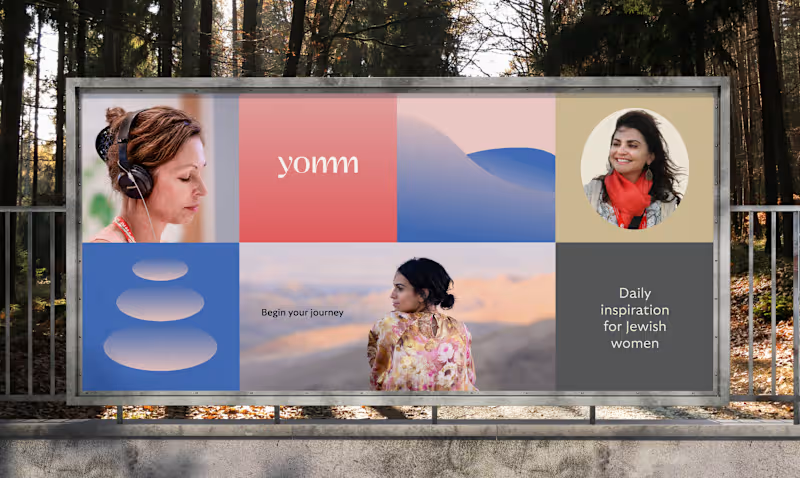
Empowering women to connect, learn, and discover.
0
33
0
Quick breakfast, done right.
0
21
0
Driving ahead with a revamped brand
0
27
0
Designing a platform for collaborative climate action
0
31
UI Designer
(2)
Follow
Message
Safa Aden
Minneapolis, USA
UI/UX Design for High-Converting SaaS Landing Pages
Follow
Message
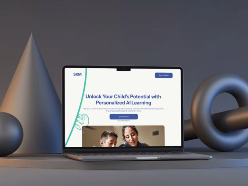
UI/UX Design for High-Converting SaaS Landing Pages
1
SRM - Personalized Learning
1
19
1
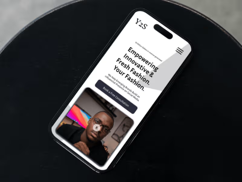
Y2S Brands
1
11
1
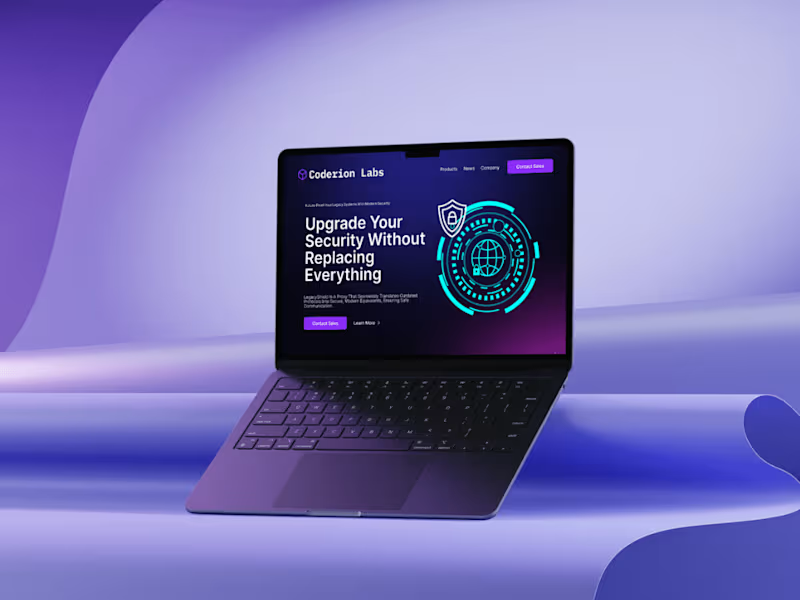
Cybersecurity Ai Saas
1
10
1
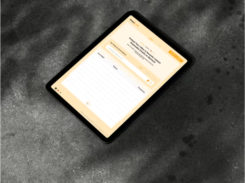
PostaSwift - Disposable Email
1
19
UI Designer
(7)
Follow
Message
Kyle Larson
Shakopee, USA
UX · Product Design · Front-End · WordPress
Follow
Message
UX · Product Design · Front-End · WordPress
1
Web Design Gallery
1
12
0
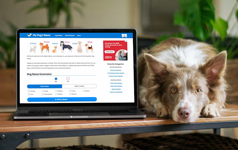
My Dog's Name - Dog Name Search Engine
0
10
0
Front-End Development Gallery
0
14
1
Workfront
1
15
UI Designer
(2)
Follow
Message
Olu Akinyemi
Minneapolis, USA
Visioneer™ | Founder & Operational Systems Architect
Follow
Message
Visioneer™ | Founder & Operational Systems Architect
1
Burn Rate: Bodhi Digital
1
39
0
In reality, operational chaos doesn't necessarily come from bad tools; it usually comes from fragile operational systems, and that’s where a simple operational cadence helps. The C·B·A™ (https://galoriousexpression.com/) framework breaks execution into three steps: Clarity: Define what matters most → capturing leads reliably. Boundaries: Design a structured intake pipeline. Action: Implement automation that routes submissions into a tracking system. In this walkthrough I show a simple data capture pipeline: Website form ↓ Form backend processes submission. ↓ Submission is automatically logged into a tracking sheet. No manual copying. No lost messages. No operational guesswork. Framework explanation here: https://galoriousexpression.com/
0
131
1
"ALWYS LØVE(D)" Visual Experience Campaign: øLu AnuAkin
1
56
View more →
UI Designer
(1)
Follow
Message
John Akhilomen
pro
Minneapolis, USA
PixelForge Labs
$5k+
Earned
1x
Hired
5.0
Rating
15
Followers
Follow
Message
PixelForge Labs
11
A modern mobile app dating experience. - Clean, immersive UI - Emotion-driven visuals - Smart location-based matching - Intuitive user flow The mobile app UI pairs bold visuals, smooth interactions, and a refined dark aesthetic to build a brand that feels warm, safe, and exciting. Great design should make people feel something.
16
11
1.3K
5
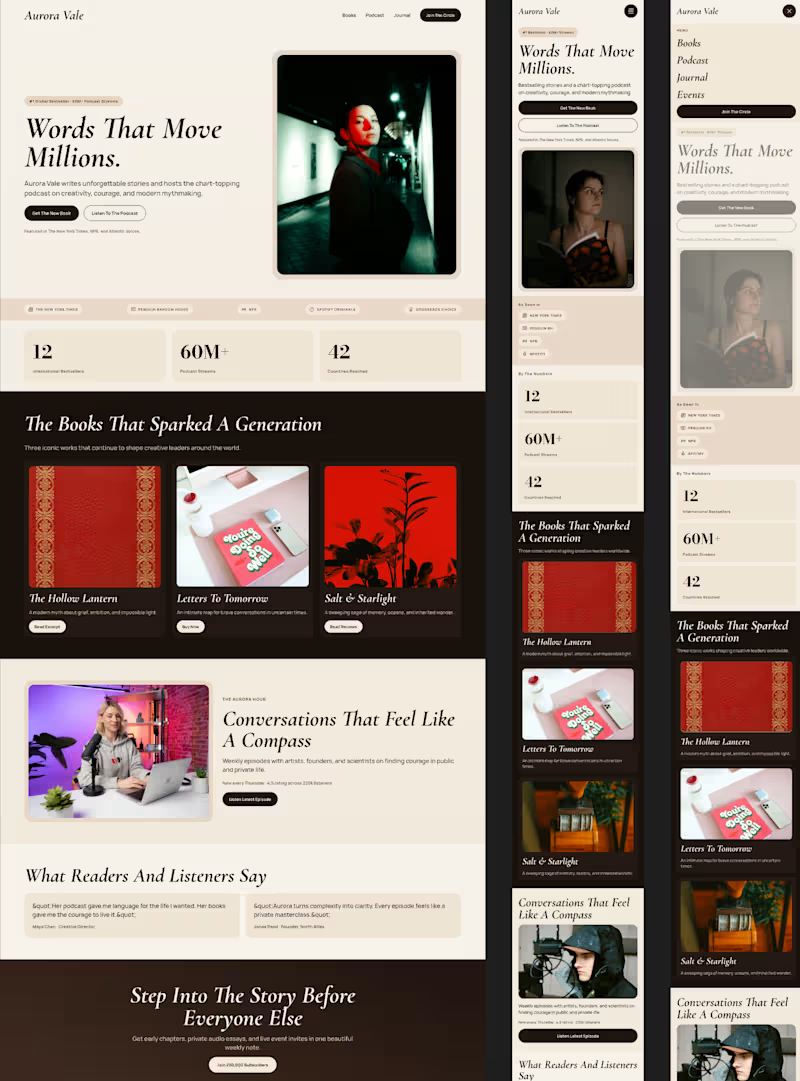
Poster + Responsive Landing page for a Book Author/Podcaster
5
5
779
4
A UI/UX-focused personal website with intentional or typography and layout.
4
806
1
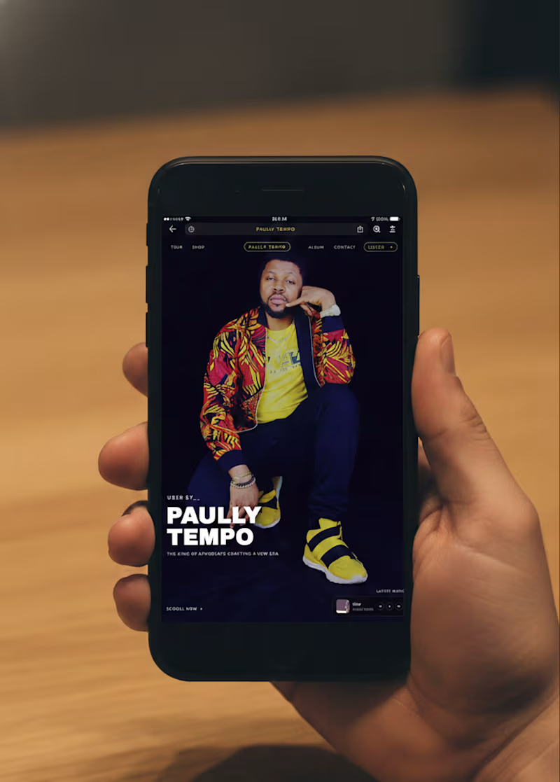
A Landing page for a music artist (Paully Tempo) with a 🎧 Music Player UX with familiar controls handled as a Small footprint . The interface is luxurious and modern which is aligned with a high-profile Afrobeats artist brand. Dark-mode dominant palette (deep blacks, purples) to create a cinematic stage. Gold/yellow accents signal prestige and warmth. Strong contrast ensures text and CTAs remain readable and impactful.
1
716
UI Designer
(4)
Follow
Message
William Marrujo
St Paul, USA
A step up from the average programmer
Follow
Message
A step up from the average programmer
0
TradeSeek
0
71
0
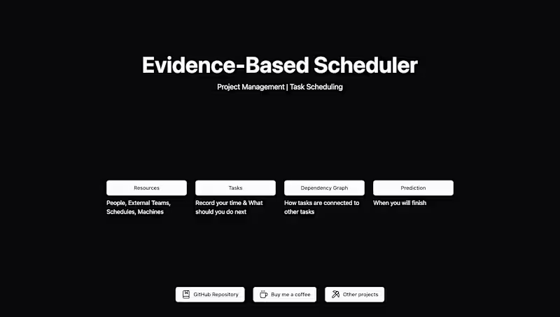
Evidence-Based Scheduler
0
27
0
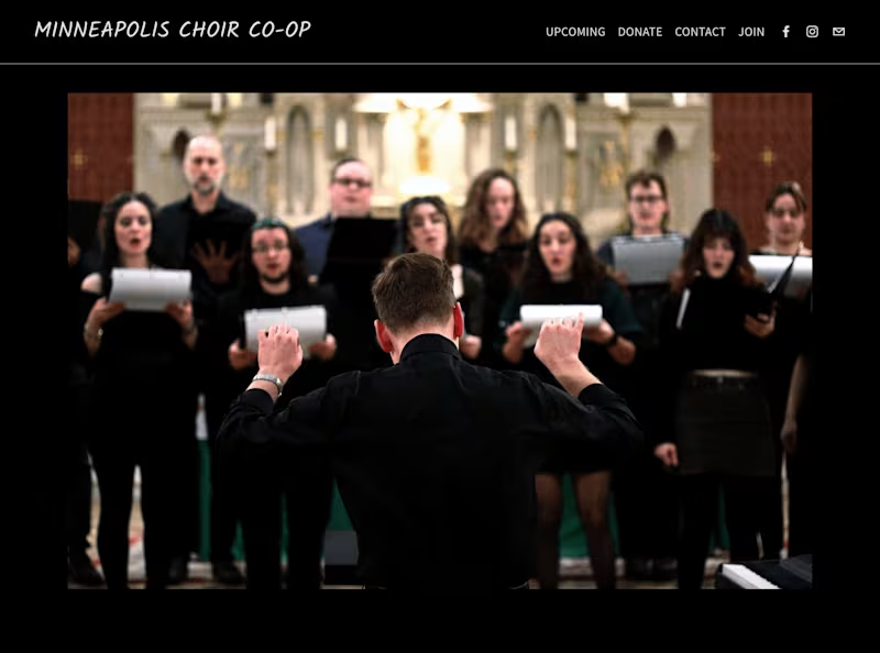
Minneapolis Choir Co-Op Website
0
32
View more →
UI Designer
(1)
Follow
Message
Matthew Paul
Minneapolis, USA
Software Product Designer
$1k+
Earned
2x
Hired
2
Followers
Follow
Message
Software Product Designer
1
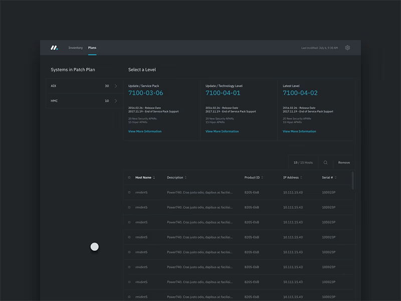
IBM Monocle
1
8
1
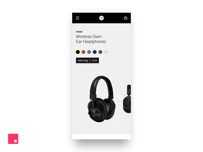
Master & Dynamic
1
9
1
Time Timer Mobile App Prototype
1
9
View more →
UI Designer
(3)
Follow
Message
Explore people