The network for creativity
Join 1.25M professional creatives like you
Connect with clients, get discovered, and run your business 100% commission-free
Creatives on Contra have earned over $150M and we are just getting started
Back to feedPost

Aura is a home AI device: a soft, fabric-wrapped pebble that lives quietly in the room instead of demanding attention. Most smart tech is cold, blue-lit and talks too much. Aura needed a brand that felt the opposite: warm, calm and human, technology that knows when to step back.
The idea: The glow
The identity is built on one image: the horizon at first light, and the last. A single gradient sweep from ember orange through bloom pink to dusk violet acts as the brand's light source. It's always used as one continuous wash across a surface, never chopped into flat blocks of colour. The product's soft status light, the packaging and every screen share that same glow.
The system
The wordmark is reduced to almost nothing. AURA is set in hairline geometric caps, with the A drawn without its crossbar so the letters feel like light rather than type.
The colour names come from times of day. Ember is first light, Bloom is the heart, Dusk is evening and Night is rest, all set on Ink and Mist. The colourways go straight onto the product: five pebbles on a shelf, one for every mood of the day.
Typography whispers. Josefin Sans in extra light and light handles headlines, with widely tracked caps for labels and UI.
Iconography is one thin line inside a halo. Three icons carry the product promise: Aware, Intuitive and Private.
Imagery lives in the moments between. Golden-hour lifestyle photography, closed eyes and quiet rooms, with the product never shouting.
Launch
Website: opens on a silhouette in the glow with "Meet Aura", then moves through "Designed for life, not just tech" and "Technology that knows when to step back". It builds to a keynote-style product reveal and a "Be the first" pre-order.
Packaging: a soft-touch box with the wordmark debossed in gold.
Out of home: "Intelligence you can feel", lit at dusk on a wet city street.
Social: a feed and stories system: golden-hour photo first, one quiet line in the lower third, the wordmark top right, nothing shouting.
Deliverables
Brand identity, colour and type system, iconography, packaging, animated brand guidelines, website, out-of-home and a social launch campaign.


The network for creativity
Join 1.25M professional creatives like you
Connect with clients, get discovered, and run your business 100% commission-free
Creatives on Contra have earned over $150M and we are just getting started



Related posts

Photographer Portfolio Website
"Capturing light, emotion, and the moments you never want to forget." That line set the tone, and the layout follows it.
The hero is one motion-blurred portrait washed in red. The photographer's name runs across the bottom in a condensed white face, so large the screen cuts it off. The photo keeps its soft focus, and the name still reads first.
Thin grid lines split the page into narrow columns, and the small copy sits justified inside them. The loose photo gets a strict structure to lean on.
A single round red button with an arrow sits right on the letters and marks where to go next.
Designed by the Hue & Machine team.
#WebDesign #Photography #PortfolioWebsite #EditorialDesign #Typography #UIDesign #ProductDesign #CreativeDirection #ResponsiveDesign #FigmaDesign


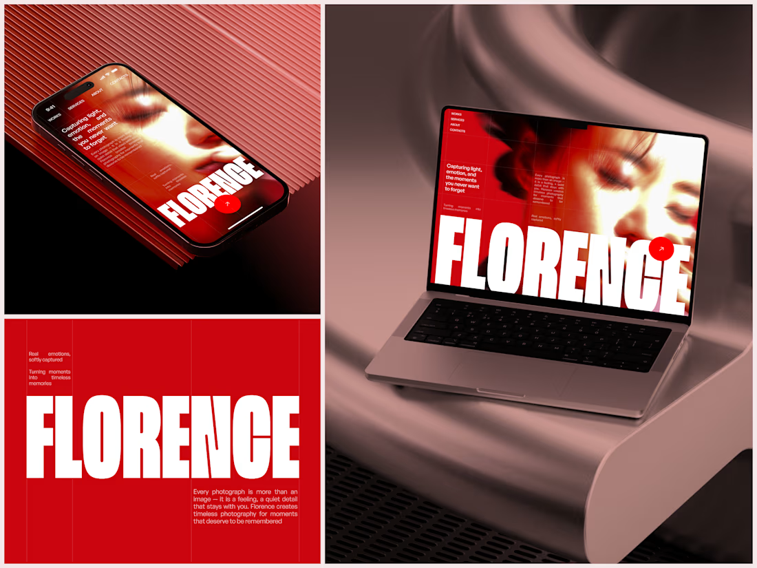

The heavy condensed white FLORENCE over the red portrait is bold, and keeping the same red across phone, laptop and type tile makes the case study read as one system. Did the red come from the photographer's own work, or was it your call?


Branding & Visual Identity for AirCon West based in London.
Designers! Present your work with motion! It breathes life into your work and conveys your ideas in a dynamic way.
Use free online motion tools to do it.
My favorites:
https://animos.app/
https://arqe.ai/
https://orelin.app/editor
https://openvid.dev/en
(Or animate it yourself, like I did here using EffectCraft!)


Nice work!!

A beautiful Shopify store is great. But does it make people want to shop?
Take a look at my latest e-commerce design project for Amora Renae, a luxury hair extension brand.
I wanted the experience to feel as premium as the products themselves.
From the bold pink hero section and elegant product collections to the detailed product pages and responsive layouts, every design decision was made to bring the brand's identity to life while keeping the shopping journey intuitive.
But here's where I need your honest opinion:
If you were the customer visiting this store for the first time, what would catch your attention first?
The homepage and overall visual identity 🎨
The product presentation and collections 🛍️
The product page experience
The mobile shopping experience 📱
And for the designers here, what would you improve?
I genuinely want to hear different perspectives. Let's talk design, user experience, and what makes an online store memorable.
#Shopify #EcommerceDesign #WebDesign #UIDesign #UXDesign


Love the creativity behind this. The visual identity feels consistent and well thought out.