The network for creativity
Join 1.25M professional creatives like you
Connect with clients, get discovered, and run your business 100% commission-free
Creatives on Contra have earned over $150M and we are just getting started
Back to feedPost

Photographer Portfolio Website
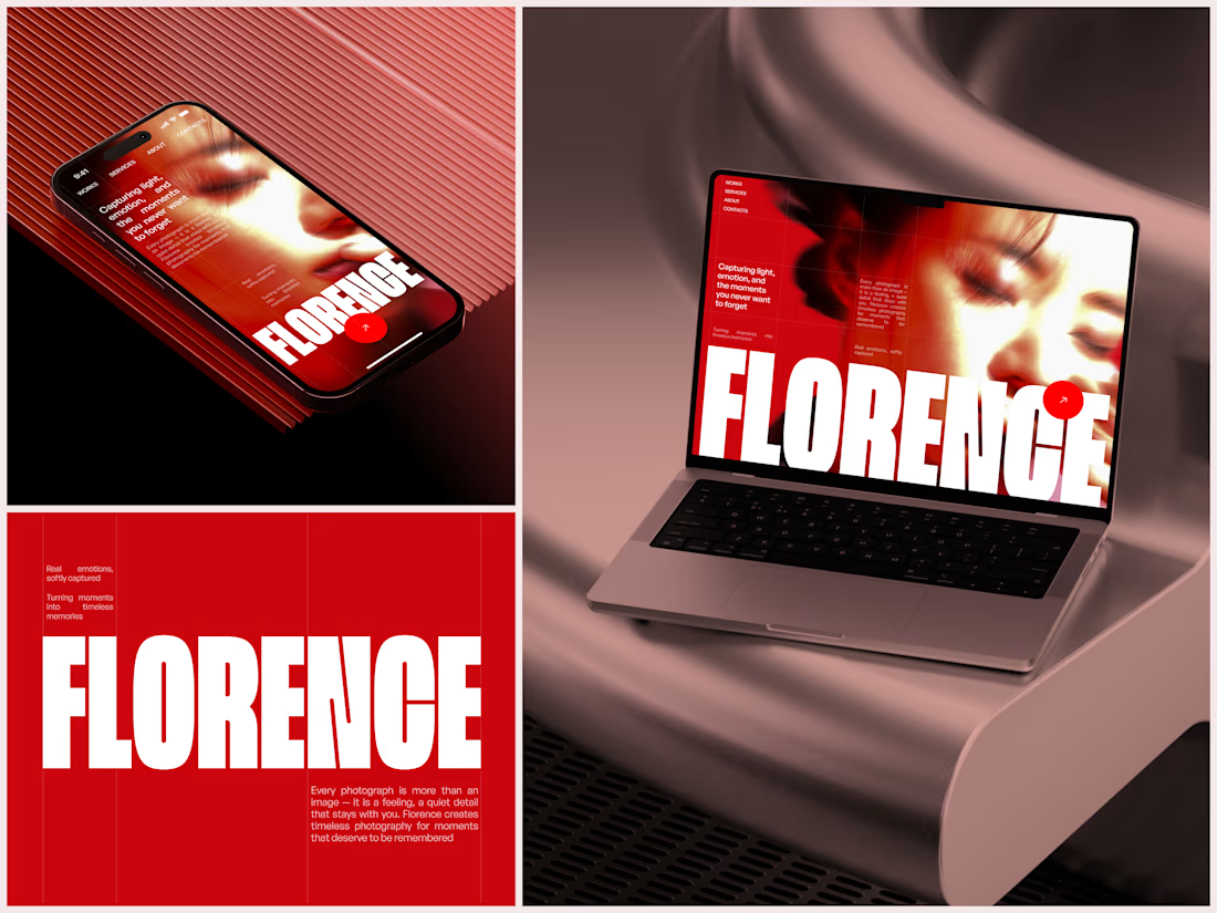
"Capturing light, emotion, and the moments you never want to forget." That line set the tone, and the layout follows it.
The hero is one motion-blurred portrait washed in red. The photographer's name runs across the bottom in a condensed white face, so large the screen cuts it off. The photo keeps its soft focus, and the name still reads first.
Thin grid lines split the page into narrow columns, and the small copy sits justified inside them. The loose photo gets a strict structure to lean on.
A single round red button with an arrow sits right on the letters and marks where to go next.
Designed by the Hue & Machine team.
#WebDesign #Photography #PortfolioWebsite #EditorialDesign #Typography #UIDesign #ProductDesign #CreativeDirection #ResponsiveDesign #FigmaDesign



Nice!


The heavy condensed white FLORENCE over the red portrait is bold, and keeping the same red across phone, laptop and type tile makes the case study read as one system. Did the red come from the photographer's own work, or was it your call?


"The loose photo gets a strict structure to lean on" is such a good principle. Soft imagery inside a hard grid is what keeps a portfolio feeling editorial instead of messy. The name running off the screen is a confident touch.

Looking good

Amazing work! 🔥

Letting the name run so big the screen crops it, while the red motion-blurred portrait stays soft, is a bold call that pays off. The thin grid lines keep it feeling editorial instead of busy.

Nice color palette


Great work


Liked the font a lot


Amazing 🔥

The red-washed, motion-blurred hero and the oversized condensed 'FLORENCE' type make the whole page feel like a magazine cover.

nice work guys

woww

The layout gives the photos so much room to breathe. Exactly what a photographer portfolio needs

Original and memorable.

Solid work, very pleasing to look at!

Top-notch design

Great work!

This FLORENCE concept is fire! 🔥 Love how the bold condensed type takes over — it feels confident and editorial. The red + motion blur makes it feel alive, not static.
In my estate branding work I use the same idea — let the type dominate to show luxury and confidence. Great execution!

Really love the overall direction. The layout, spacing, and visual consistency make this project stand out.
The network for creativity
Join 1.25M professional creatives like you
Connect with clients, get discovered, and run your business 100% commission-free
Creatives on Contra have earned over $150M and we are just getting started
Related posts

Hero section exploration for Oldhand
Framer MCP + claude doing magic


The dotted heads against such a clean hero is a nice touch. How much of the layout did you have to fix by hand after Claude?


New project in progress: the website for Adara, a residential architecture and planning practice in London. We'll post updates as the build comes together.
First, the services section on the homepage. As you scroll, the house comes apart floor by floor, and each service opens on the right, from planning advice to building regulations.


Earlier this year, I redesigned and developed the website for Trayler, a truck advertising company.
Within two weeks of handing off the website, they booked their first call through the new booking flow and closed a new client, instantly delivering a return on their website investment.
A great feeling!

such a surreal feeling!