I make founder brands premium, trusted & story-led


I make founder brands premium, trusted & story-led


Art Director and Brand Identity Designer
- $5k+
- Earned
- 11x
- Hired
- 5.0
- Rating
- 124
- Followers
Art Director and Brand Identity Designer


Design Partner for B2B Companies

Design Partner for B2B Companies
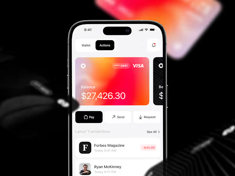


Raise the bar. ✦ Perfect the rare.



Brand Designer | Brand Strategy & Visual Identity | Branding
- 24
- Followers
Brand Designer | Brand Strategy & Visual Identity | Branding
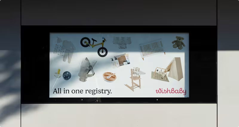
What does a baby registry look like when it actually feels calm?
For Wishbaby, the work wasn’t about adding more softness; it was about removing noise. Less “cute,” more clarity. Less scattered, more considered.
We designed a system that feels warm, but structured. Something that guides you without getting in the way.
Because when everything is in one place, it stops feeling like a task.
0
115
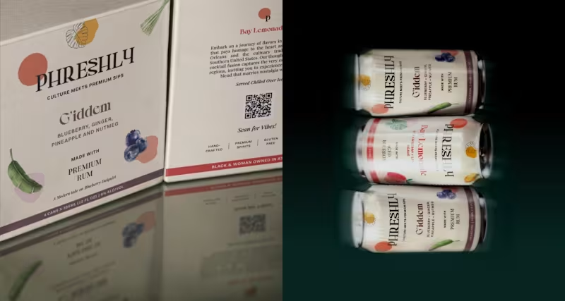
Can typography carry a whole package?
That was the starting point. Instead of building around graphics or effects, I let the type define the structure, how it sits, how it scales, how it holds everything together.
Once that was in place, the rest became a matter of restraint. Nothing needed to compete, just support.
It’s built so the packaging feels intentional the moment you see it.
1
136

What should a cocktail brand feel like before you even open the can?
When I started working on the identity for SeventhWave, that question shaped everything.
This isn’t a drink designed for a bar counter. It’s designed for the in-between moments: warm air, late afternoons, and plans that unfold naturally. Convenient, yes. But more importantly, effortless.
The brand design had to capture that balance. Playful, without feeling loud. Premium, without feeling formal.
2
2
143
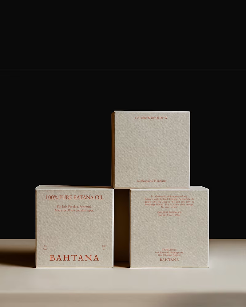
You all showed so much love to the Bahtana project, so I wanted to share a deeper look.
Here are more moments from the case study — the typography details, the earth-led palette in context, the packaging decisions, the quiet structure behind it all.
Bahtana was built around one idea: luxury is reverence. Every element had to feel rooted, not decorative.
Let me know which detail stands out to you the most.
1
116

I make decent logos

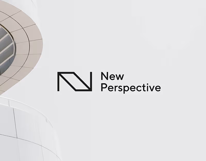


My work is about emotion, honesty, and connection
- 31
- Followers
My work is about emotion, honesty, and connection