Welding Engineering™ - Brand Identity
Logo Symbol
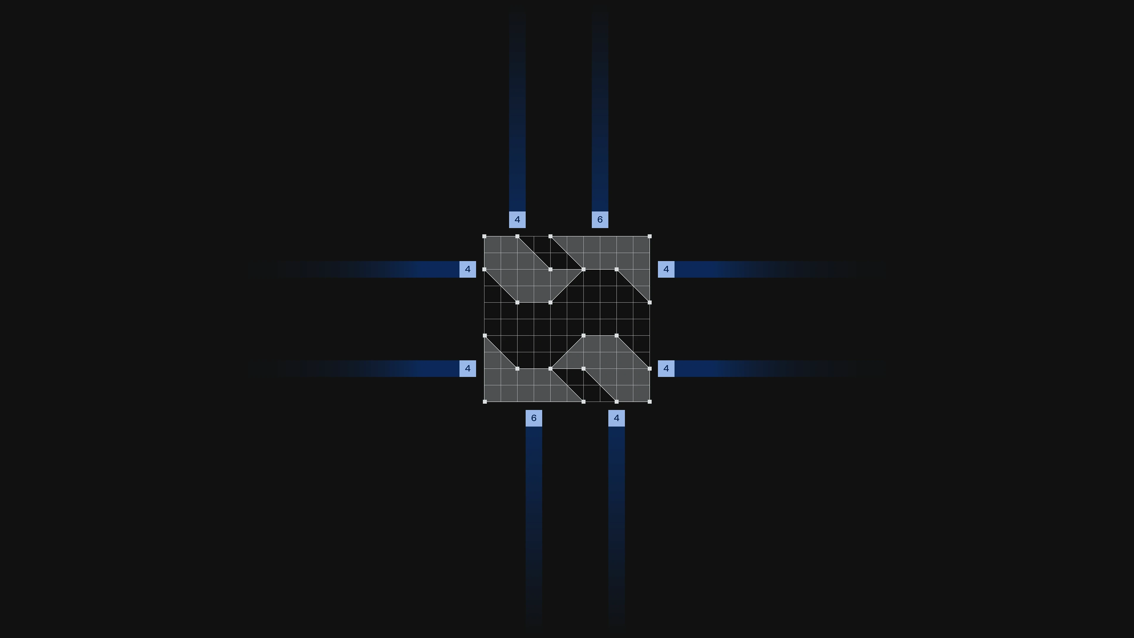
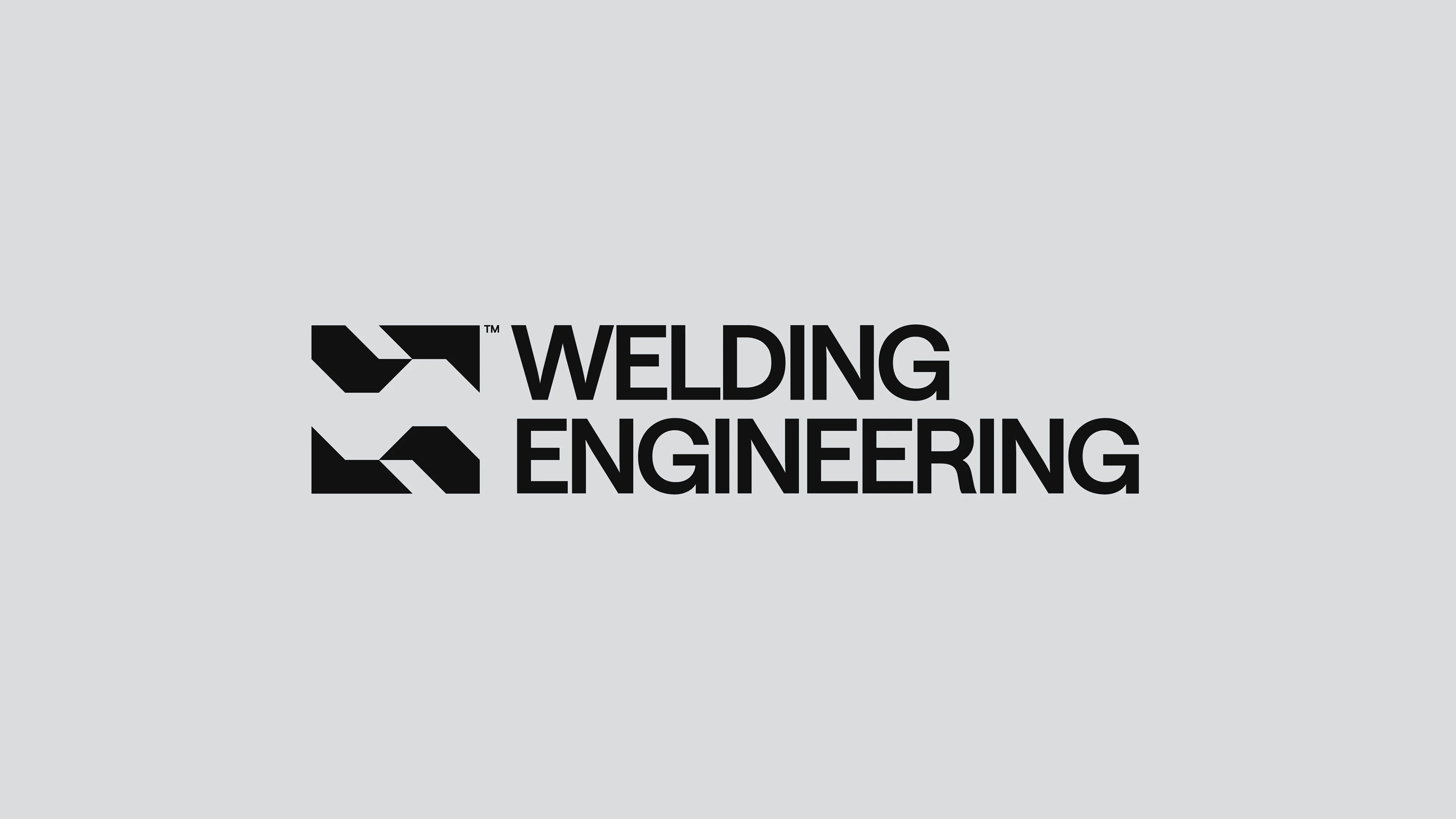
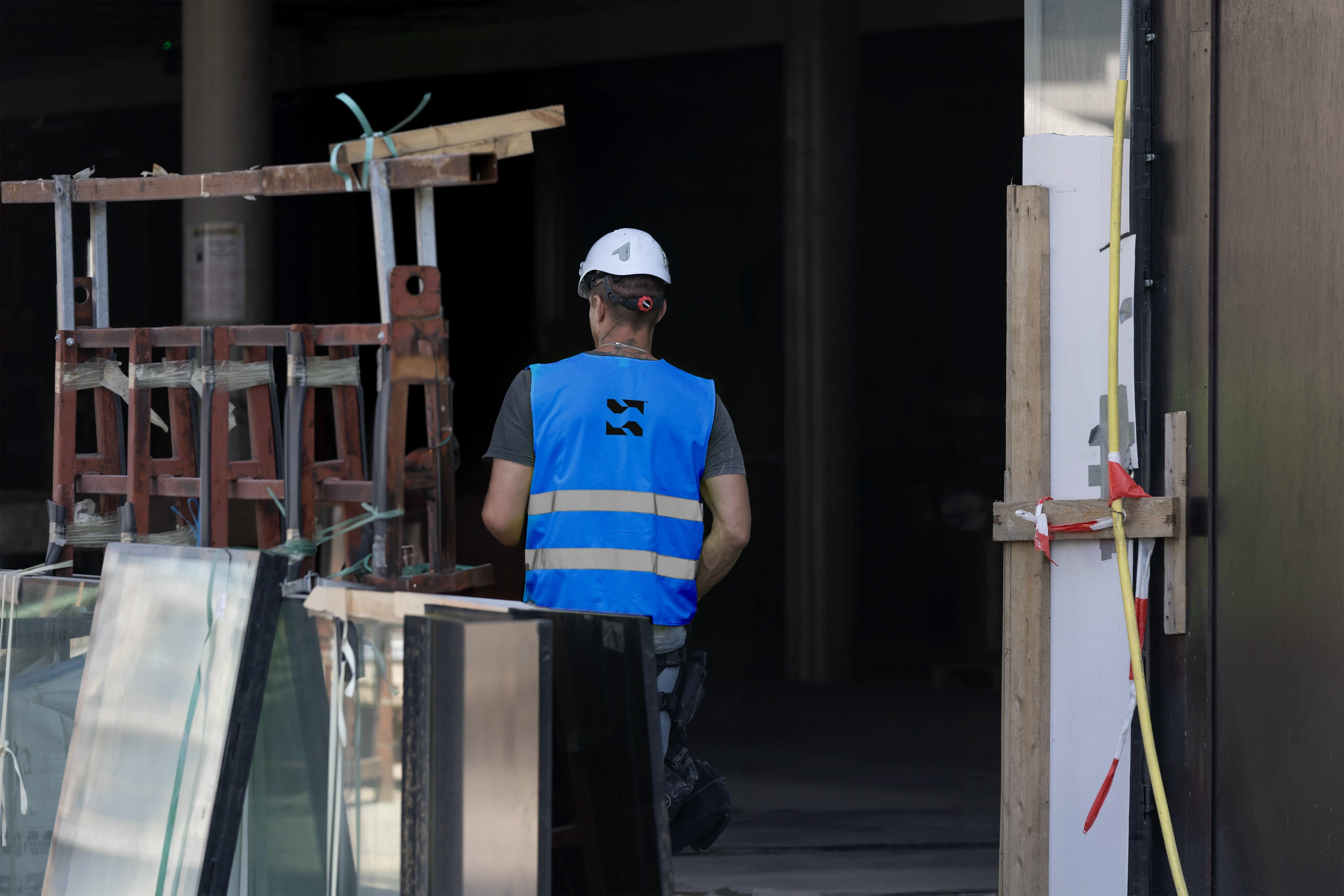
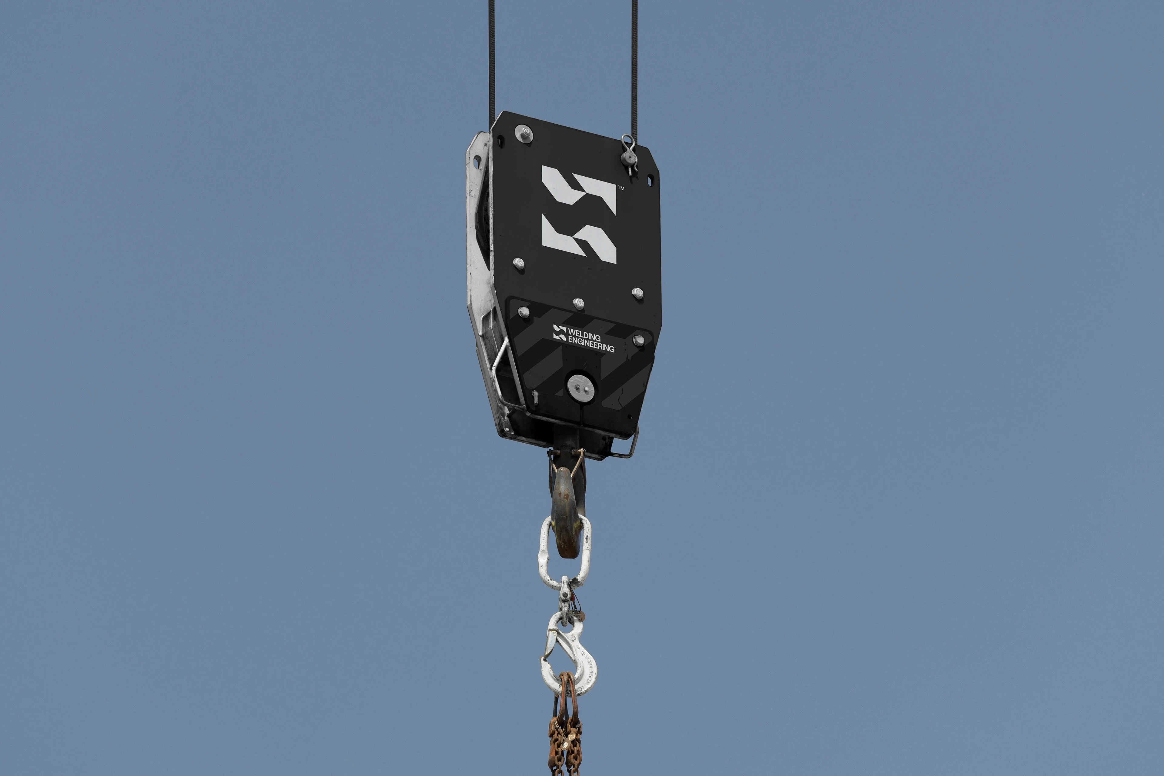
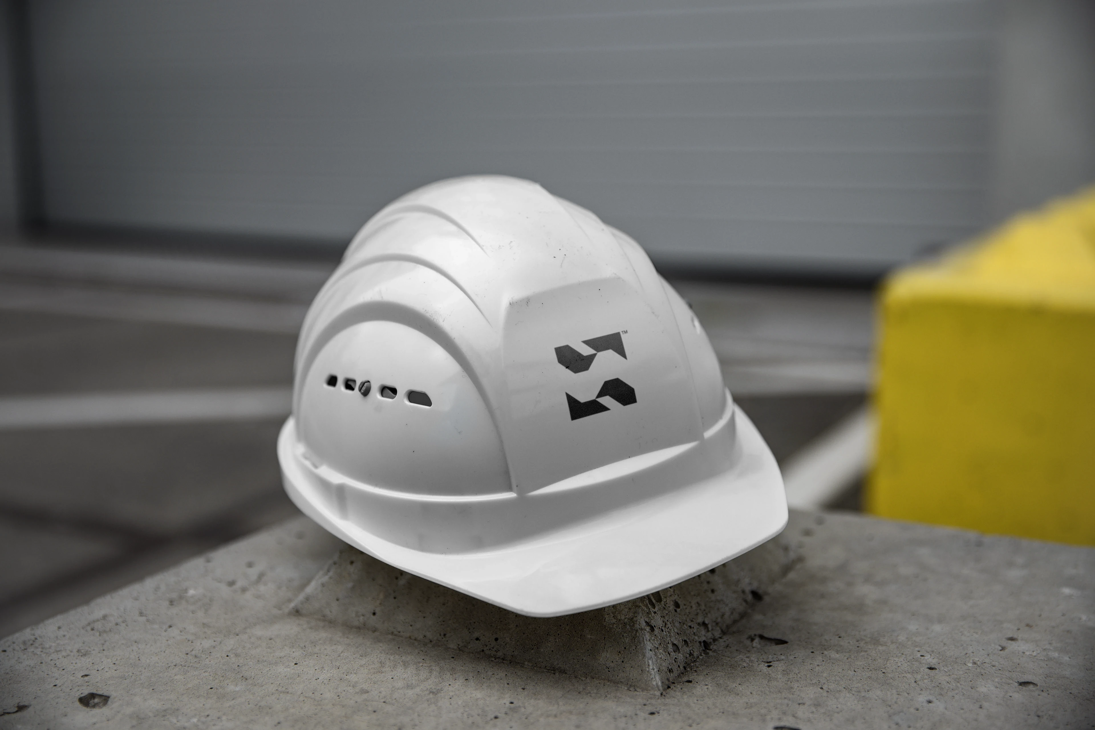
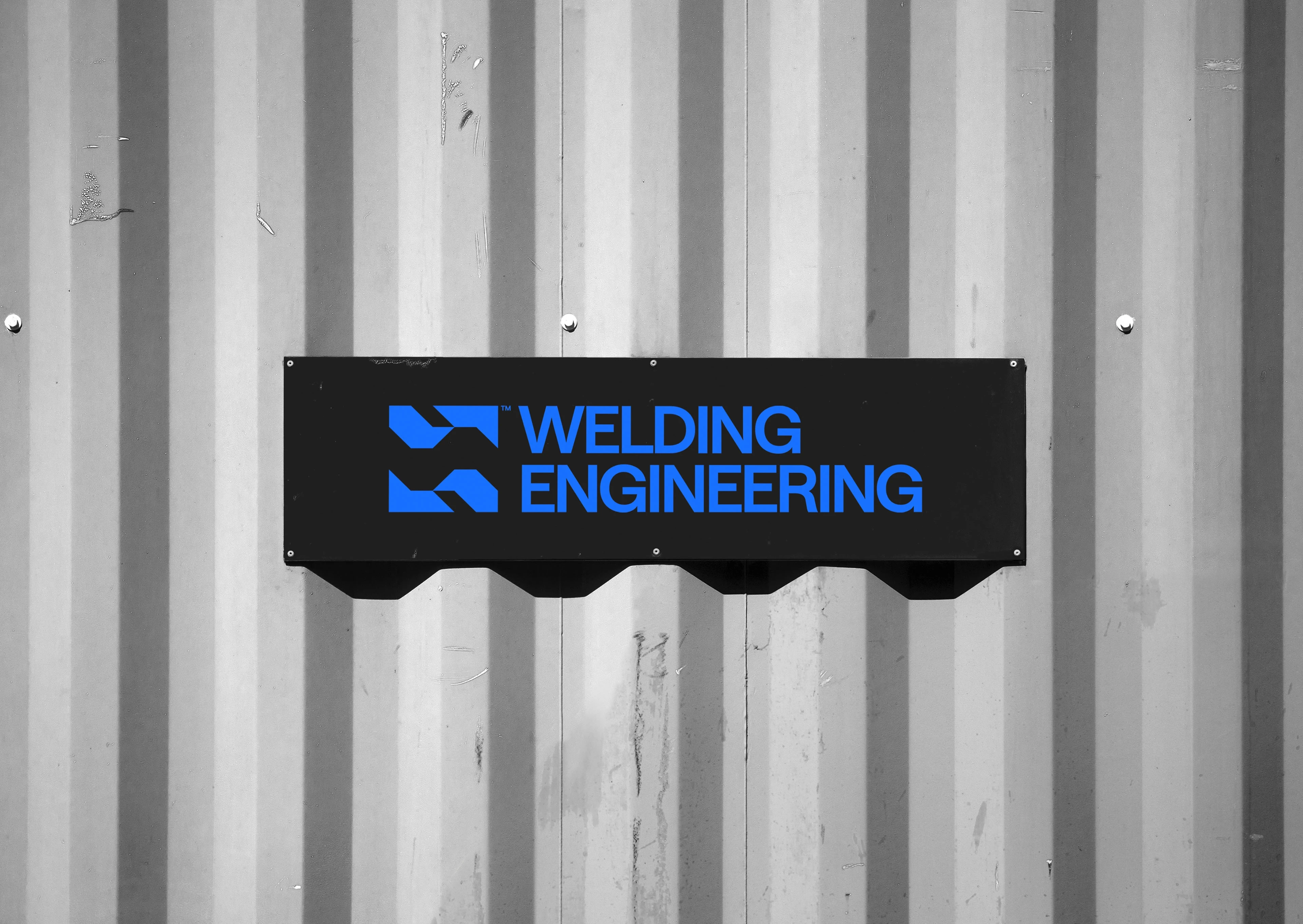
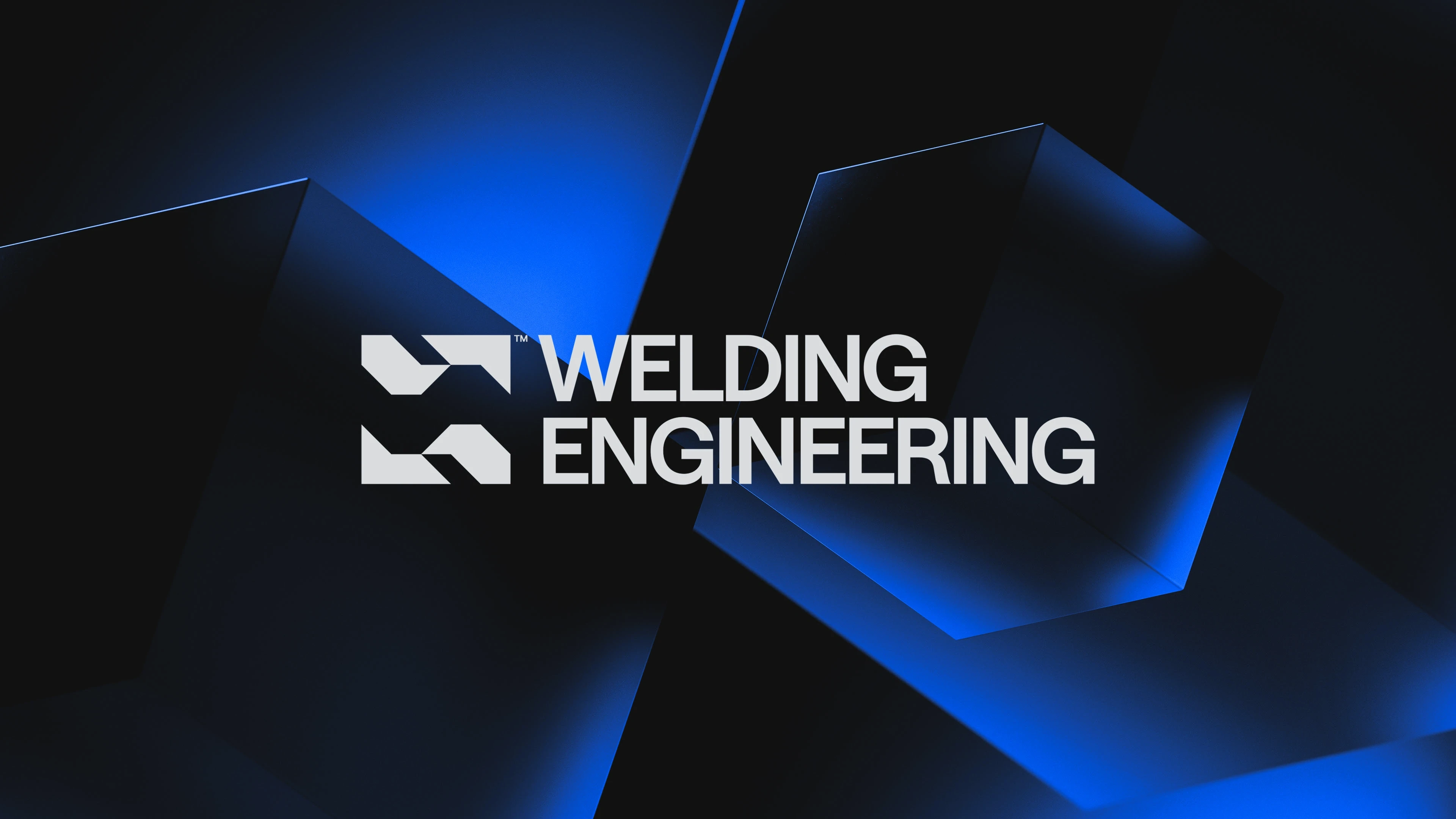
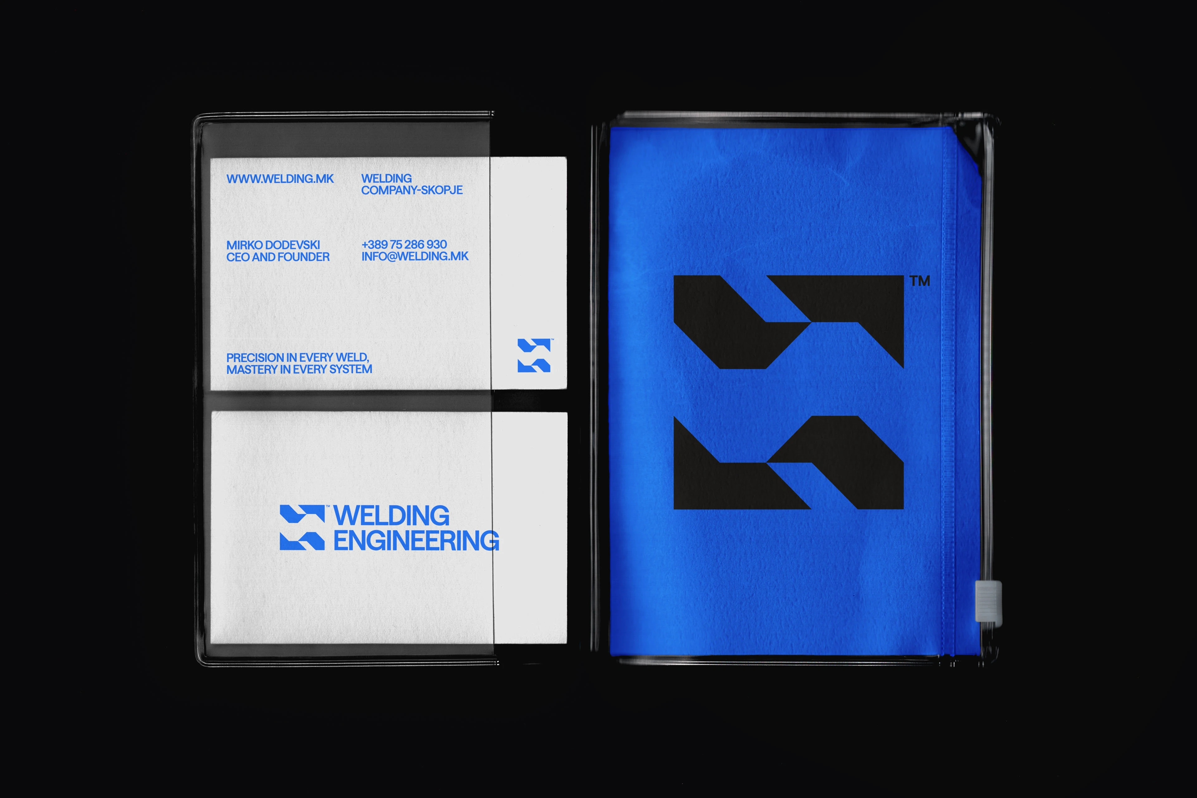
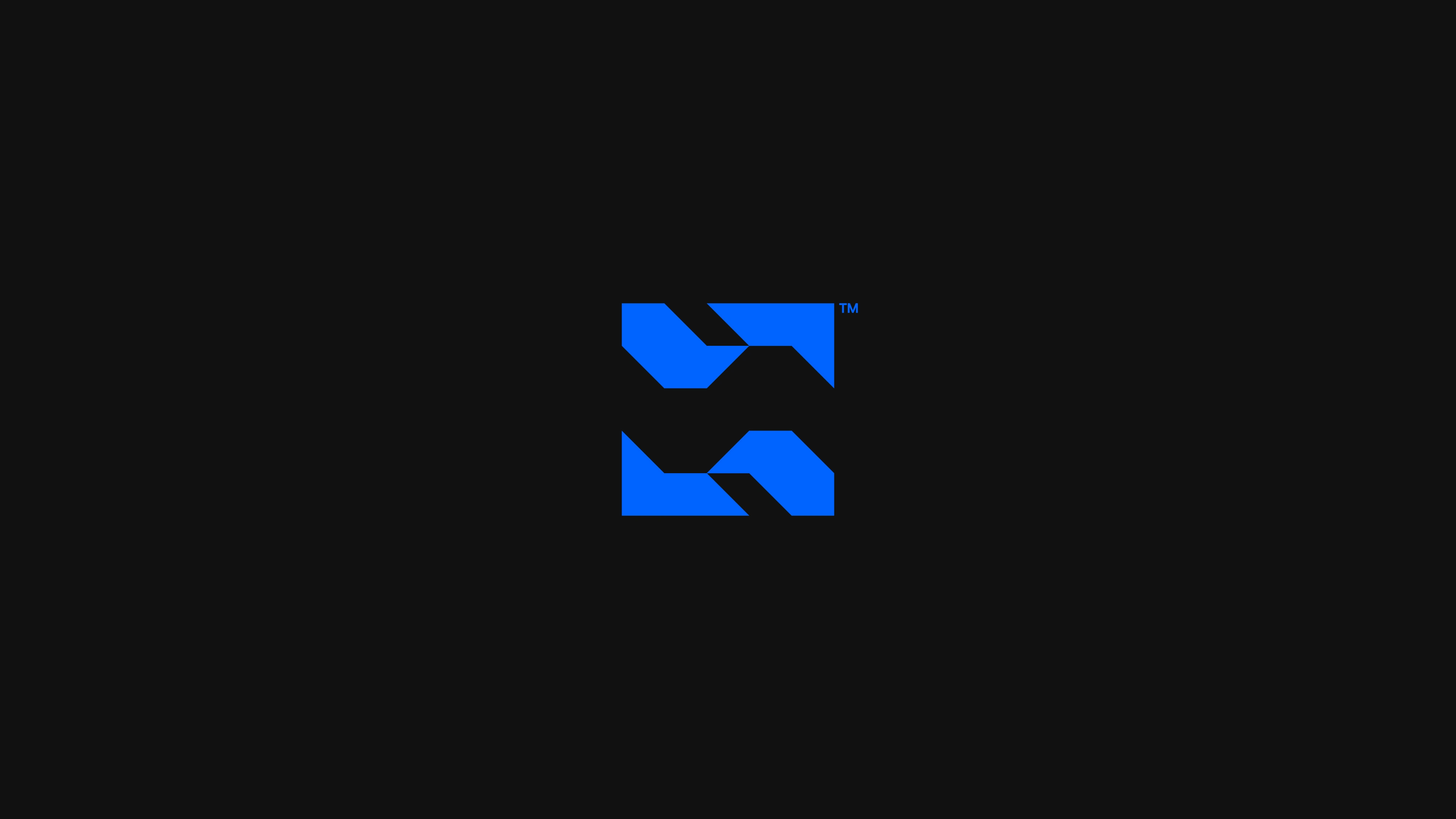
The redesigned logo is a visual embodiment of connection, structure, and expertise. Four sharp, modular shapes converge around a central negative space that subtly forms a pipe — a clever nod to the company's core in piping and welding. Each element appears as if it could seamlessly fuse with the others, representing the company’s role in integrating complex systems into unified, functional solutions. The sharp edges emphasize precision, while the overall composition conveys a sense of engineered order. It’s a symbol that finally mirrors the scale and sophistication of the company’s real-world
work.
Welding Engineering™ Brand Identity
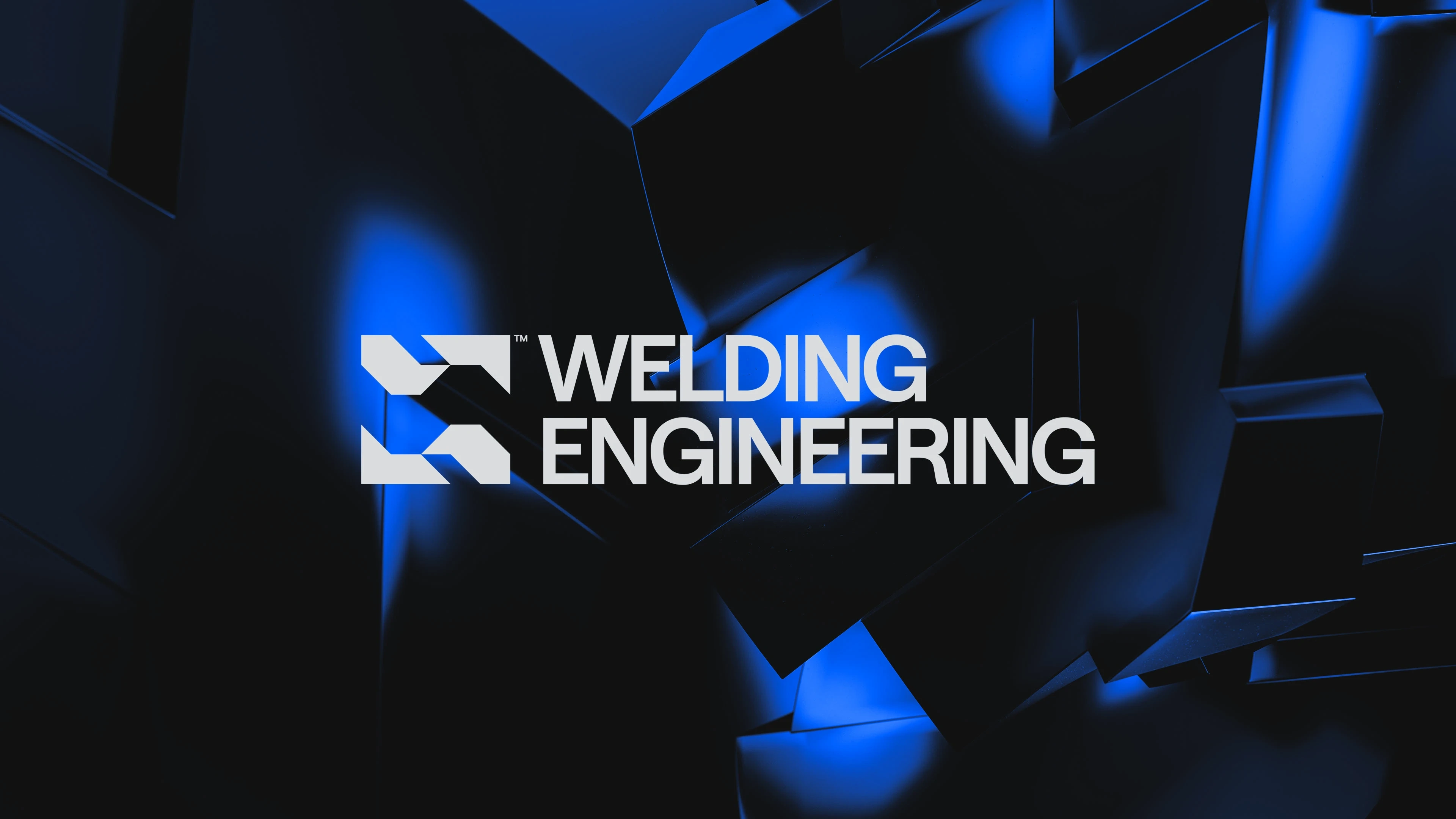
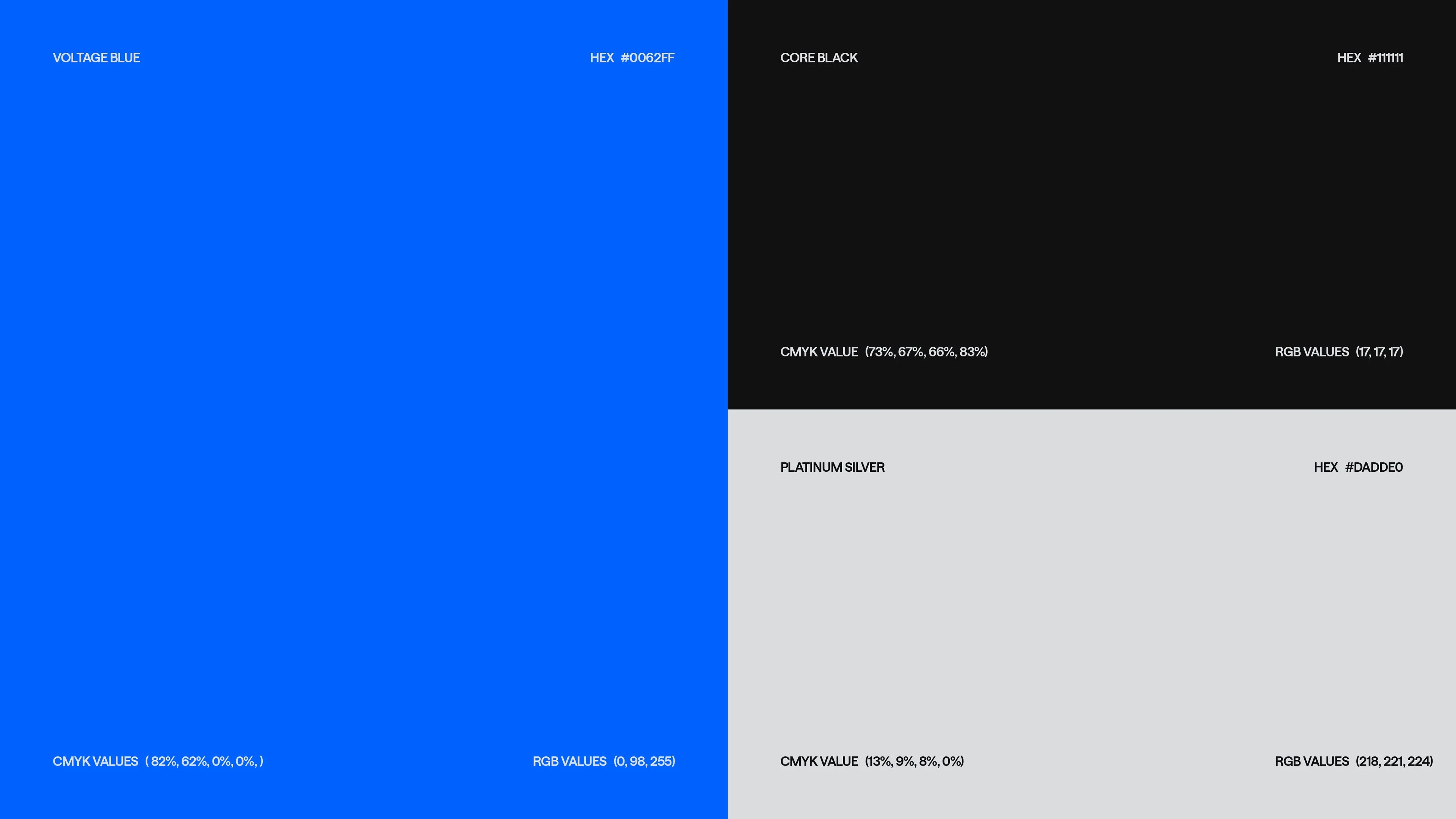
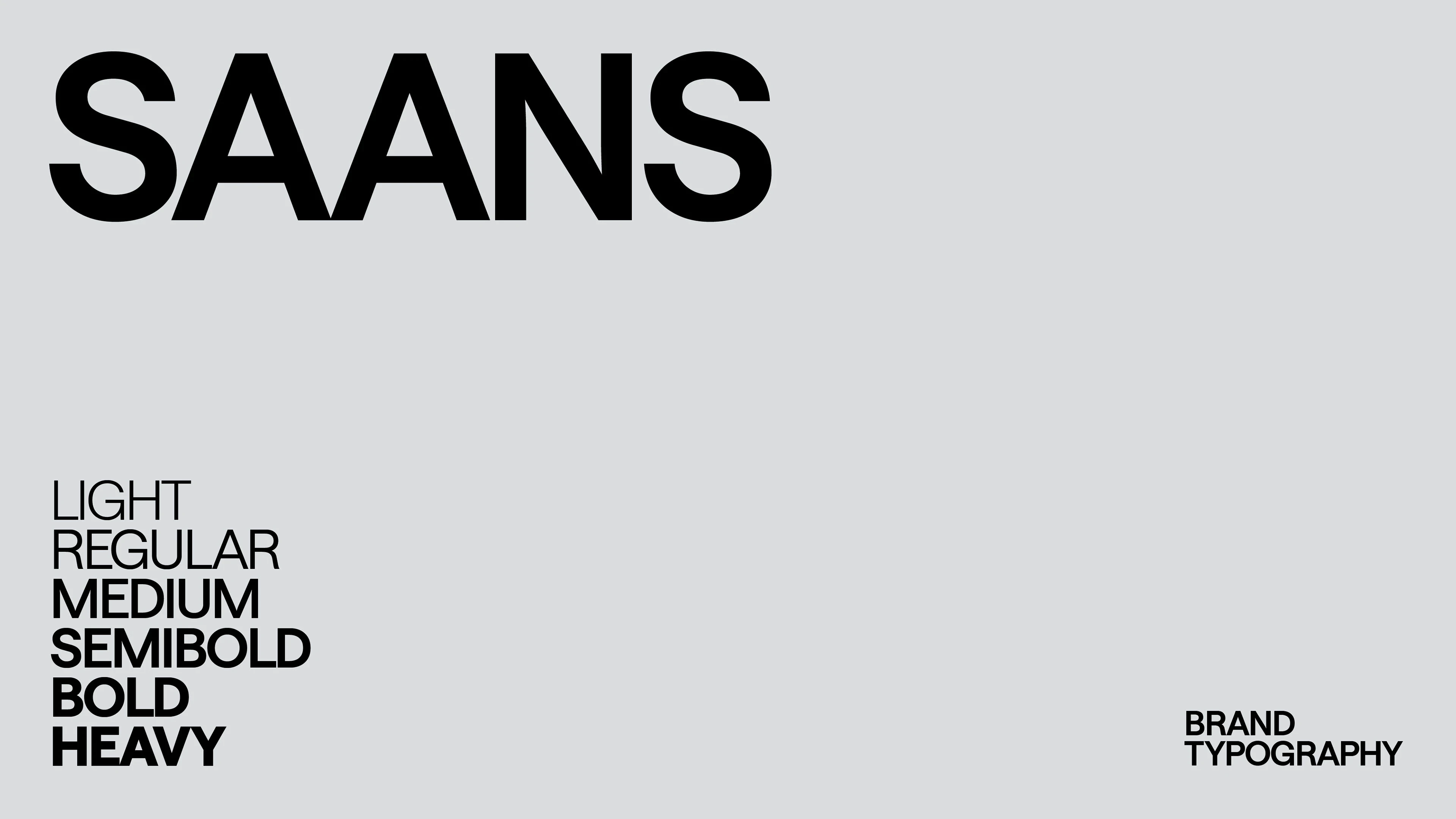
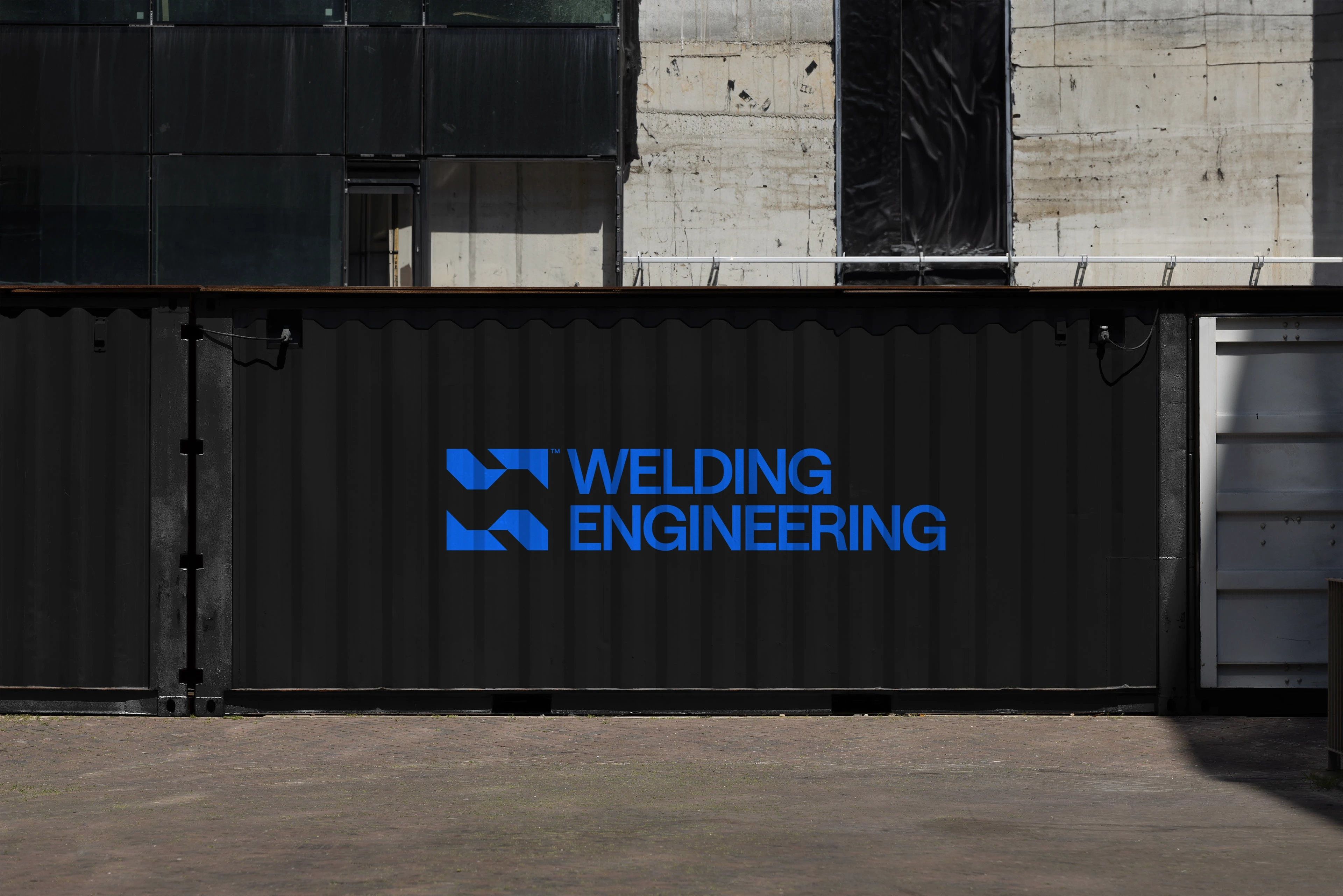
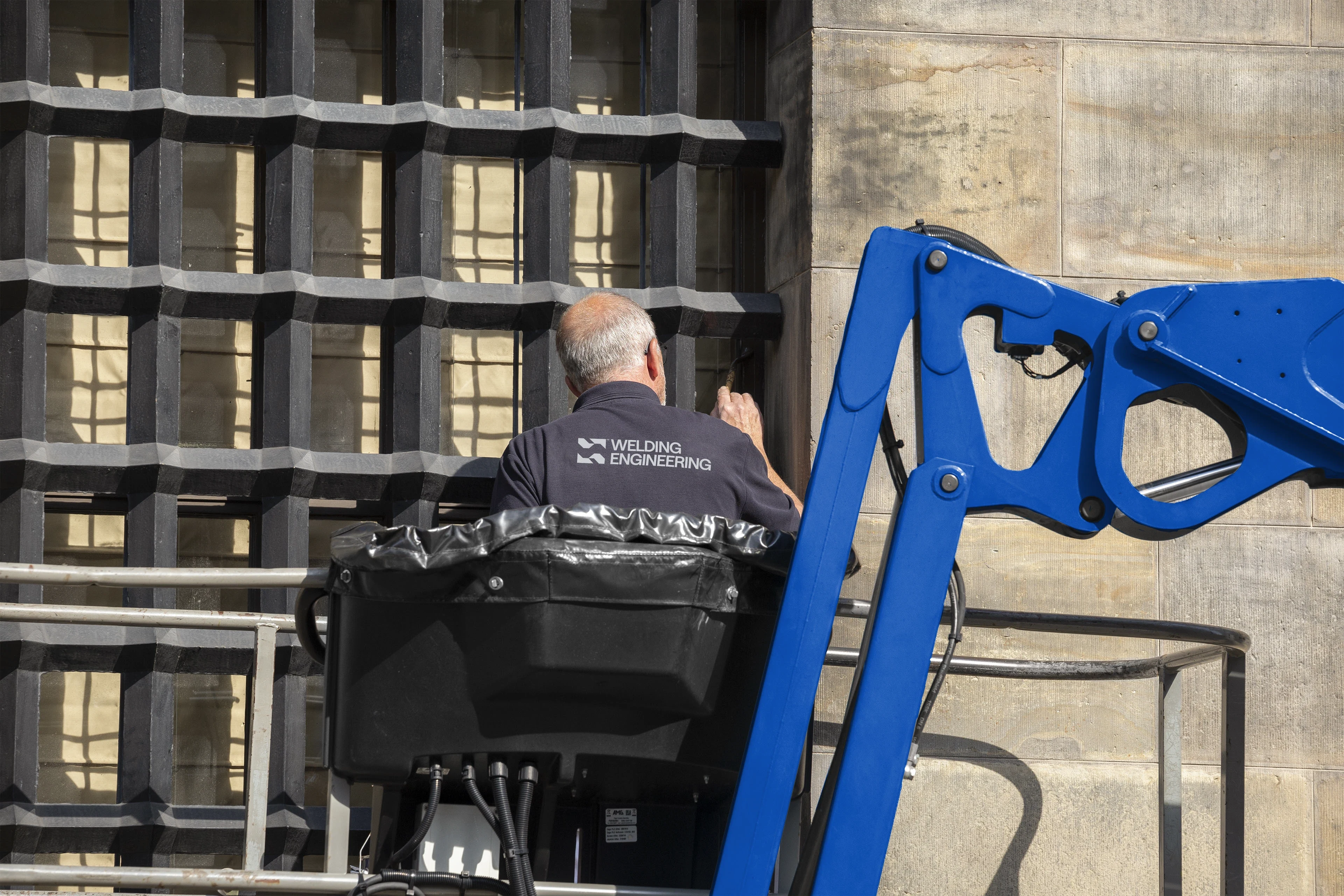
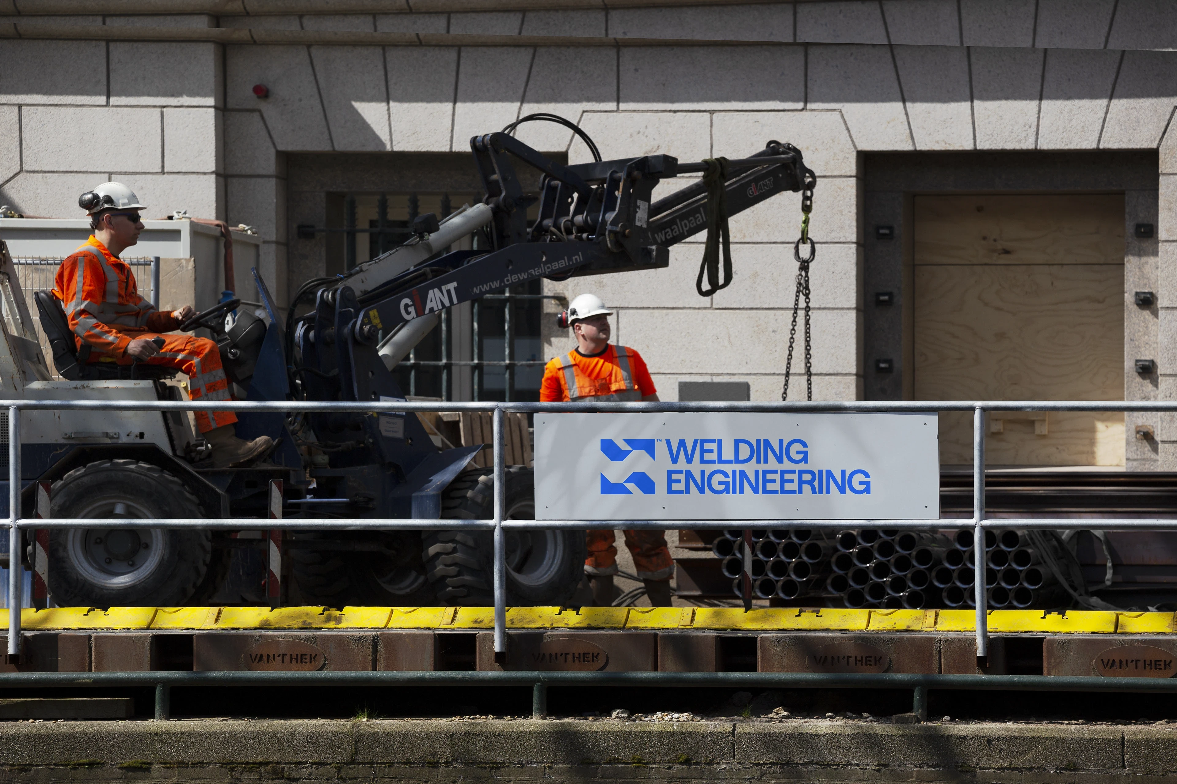
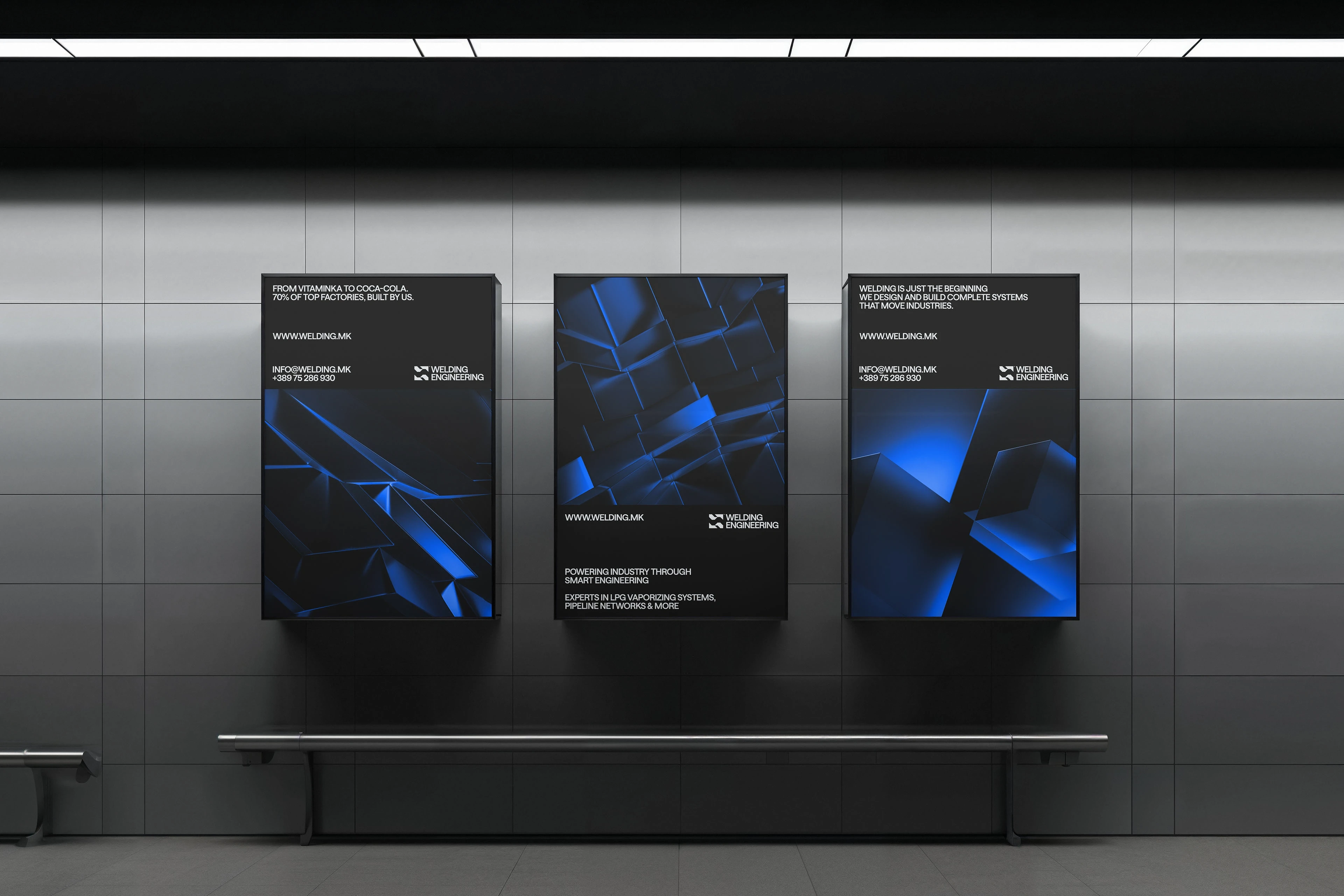
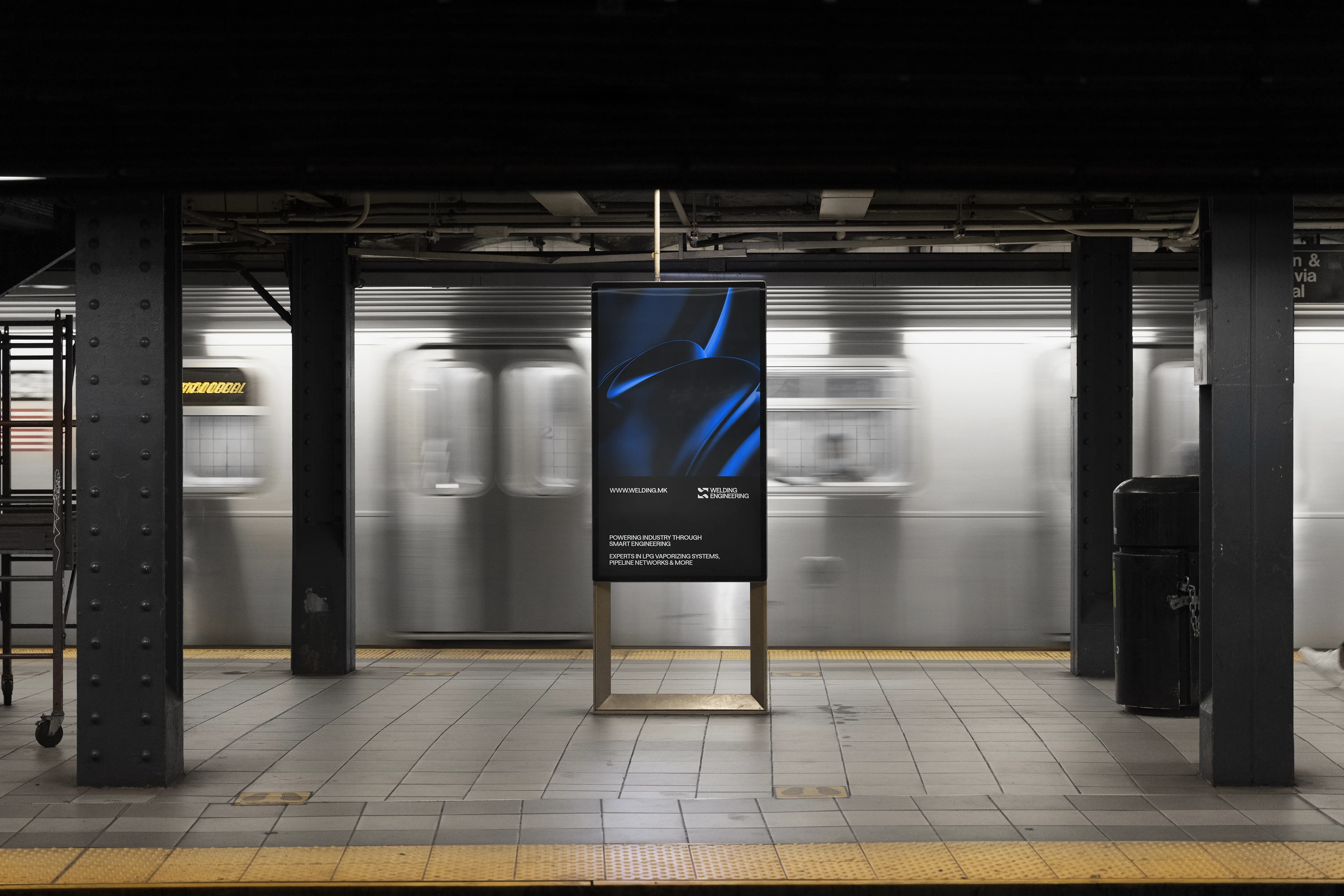
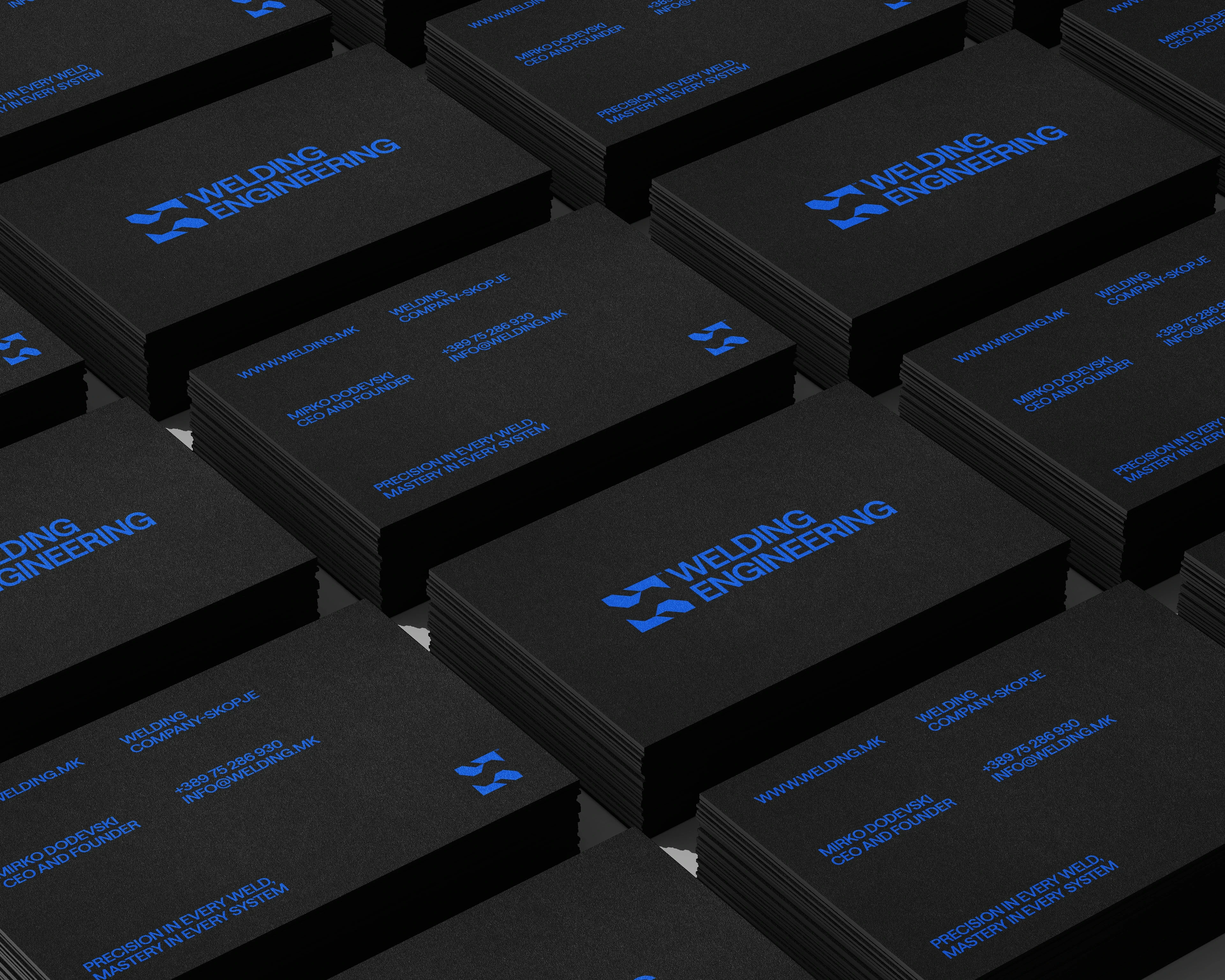
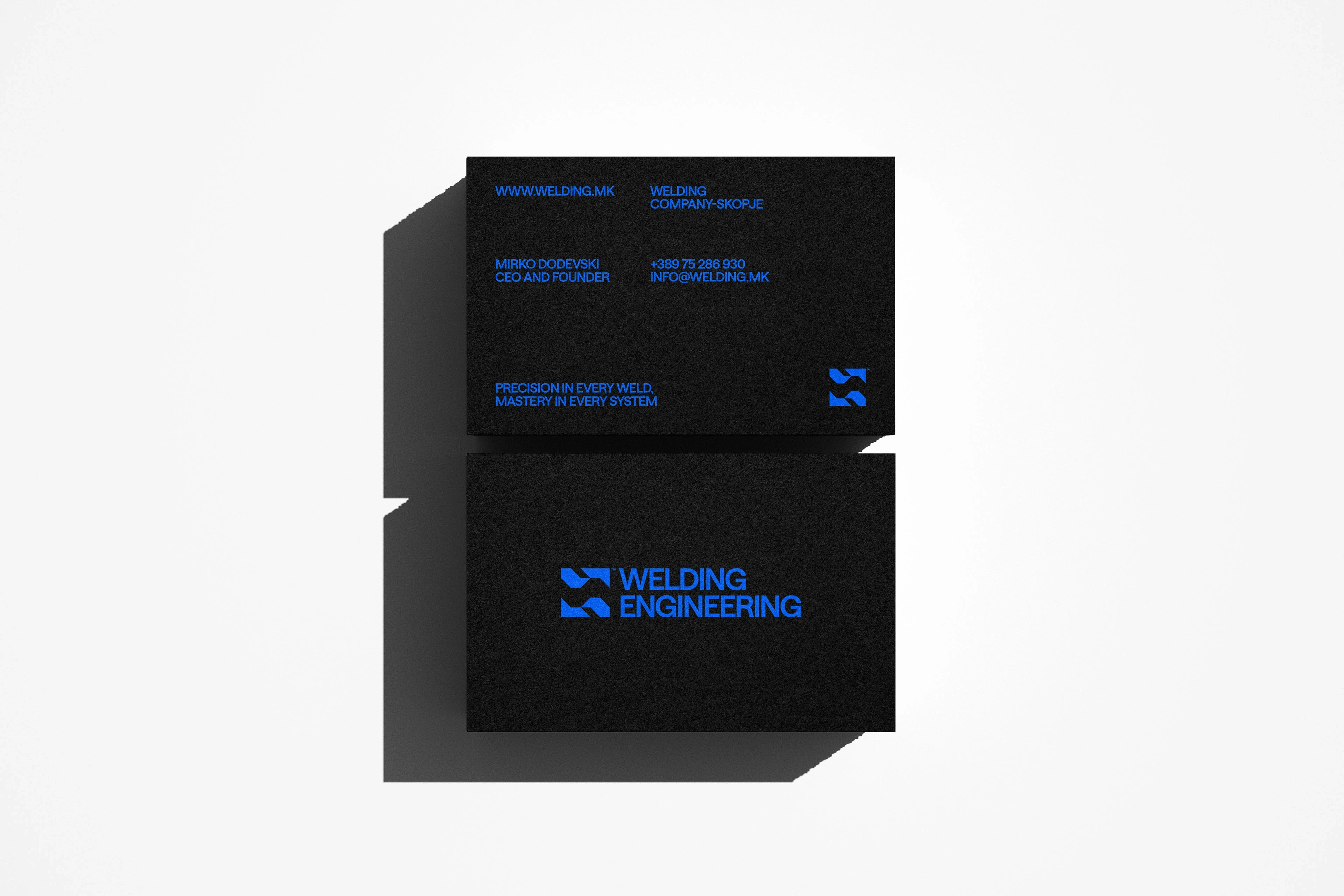
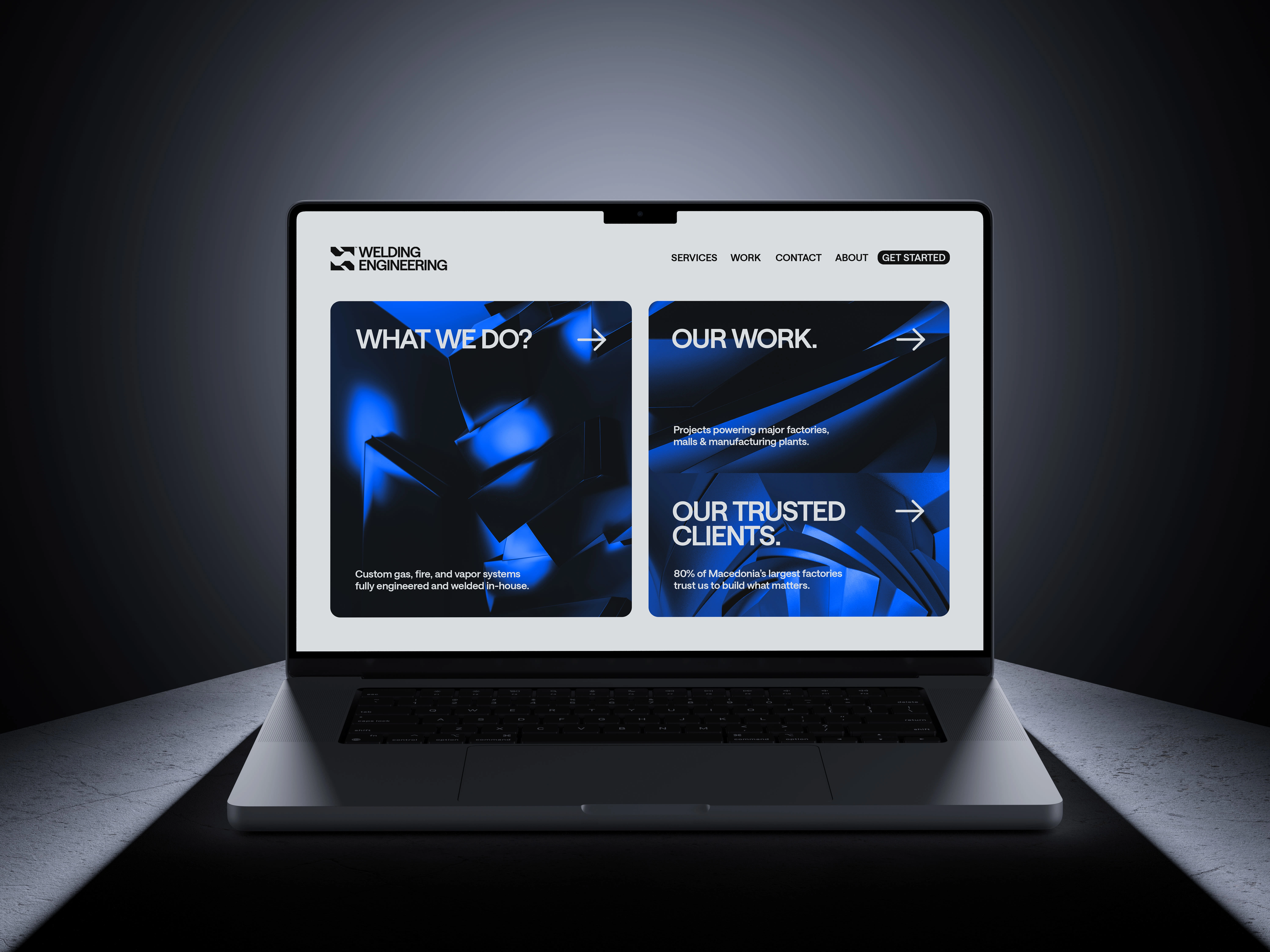
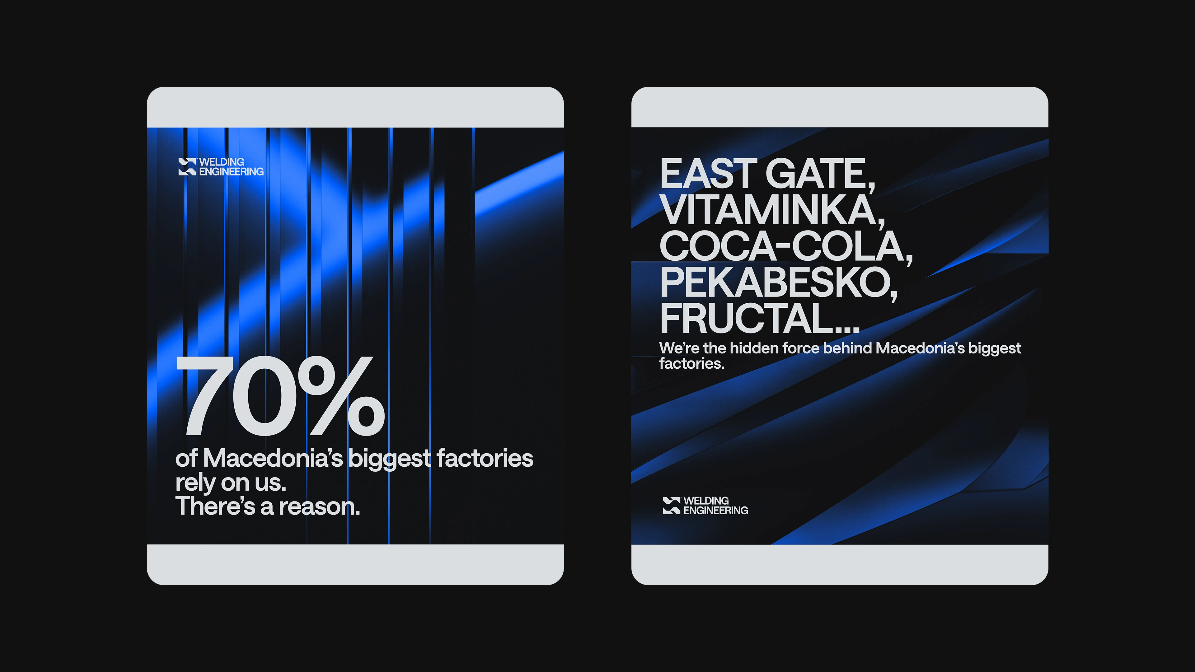
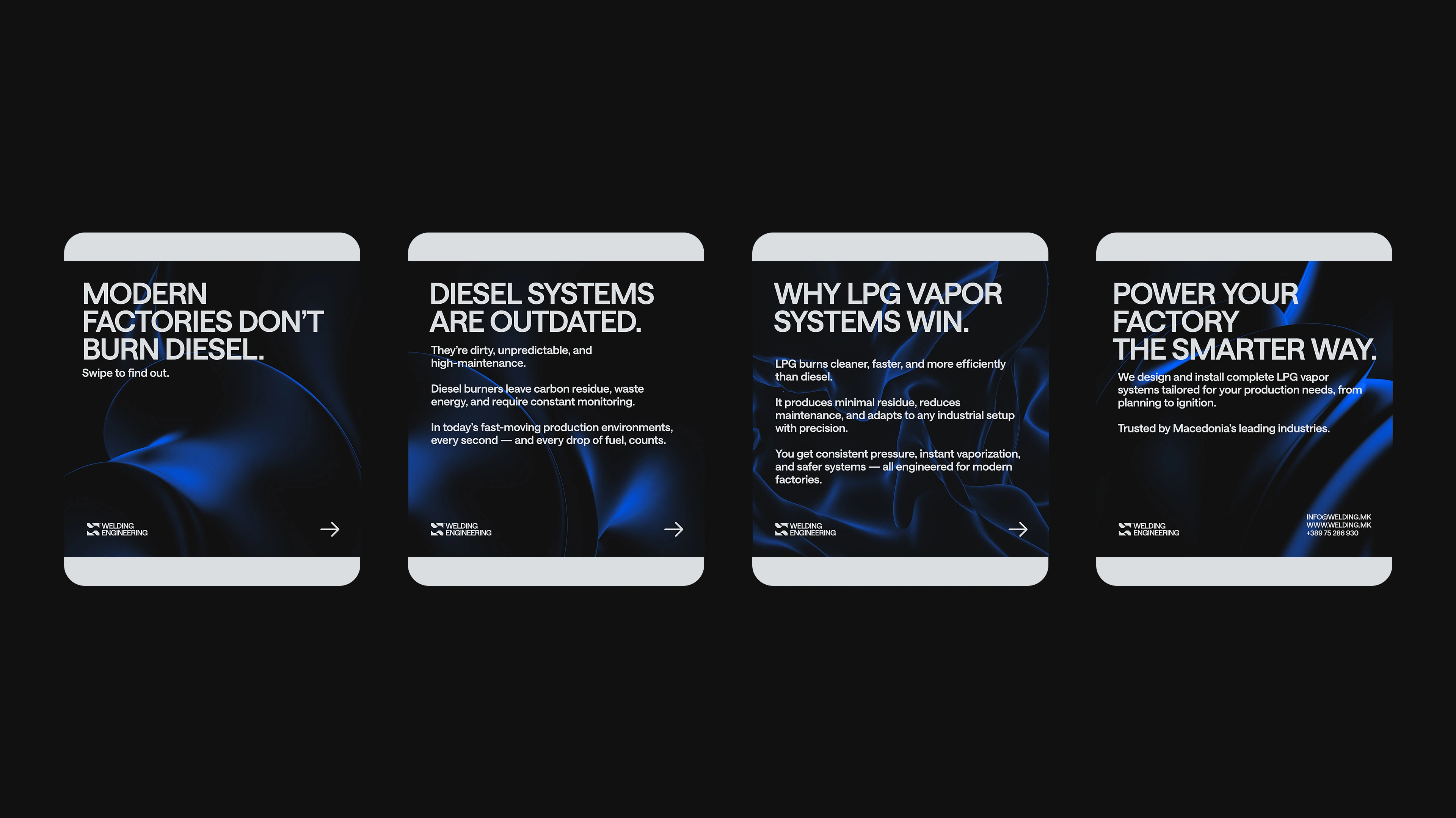
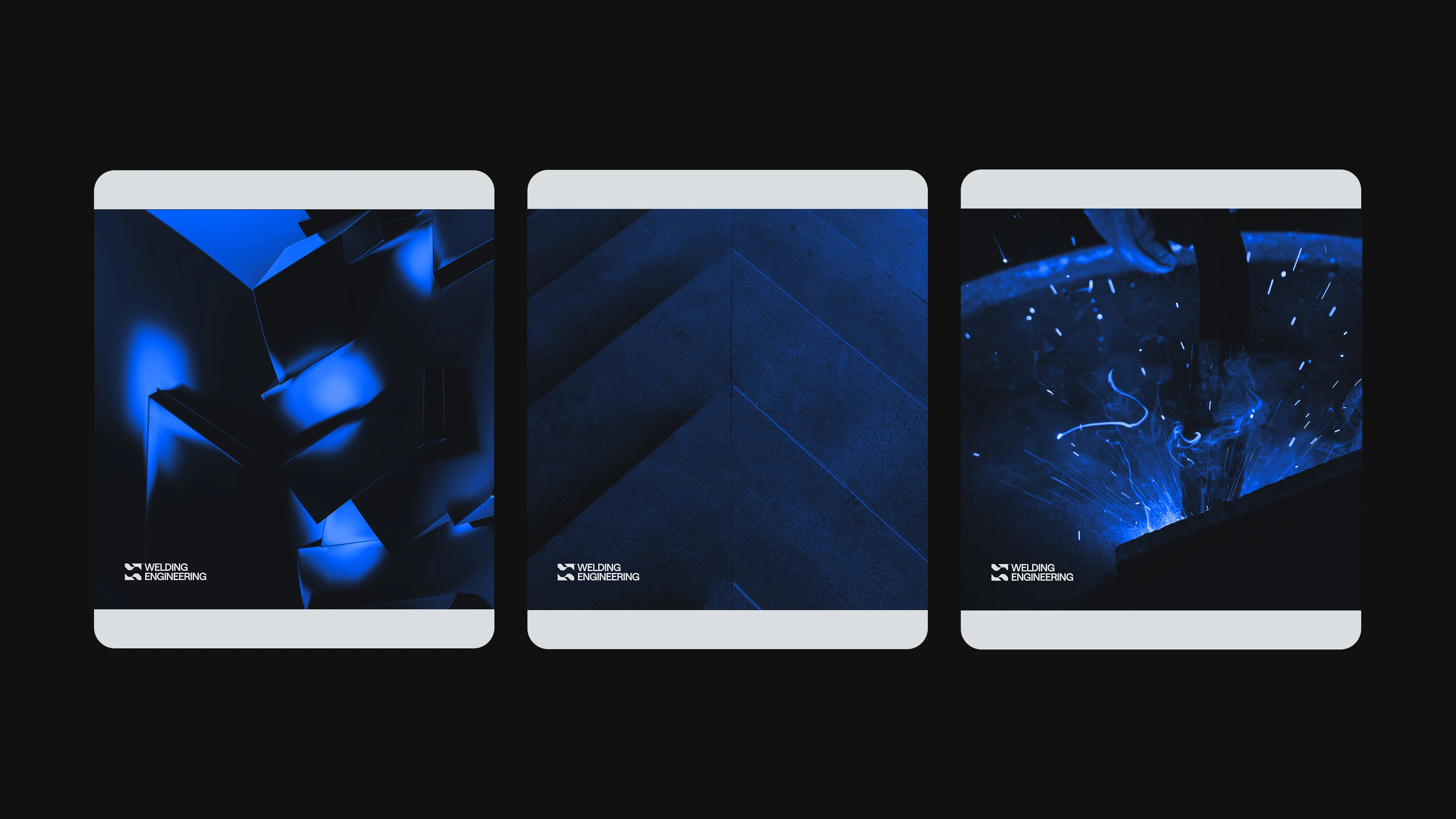
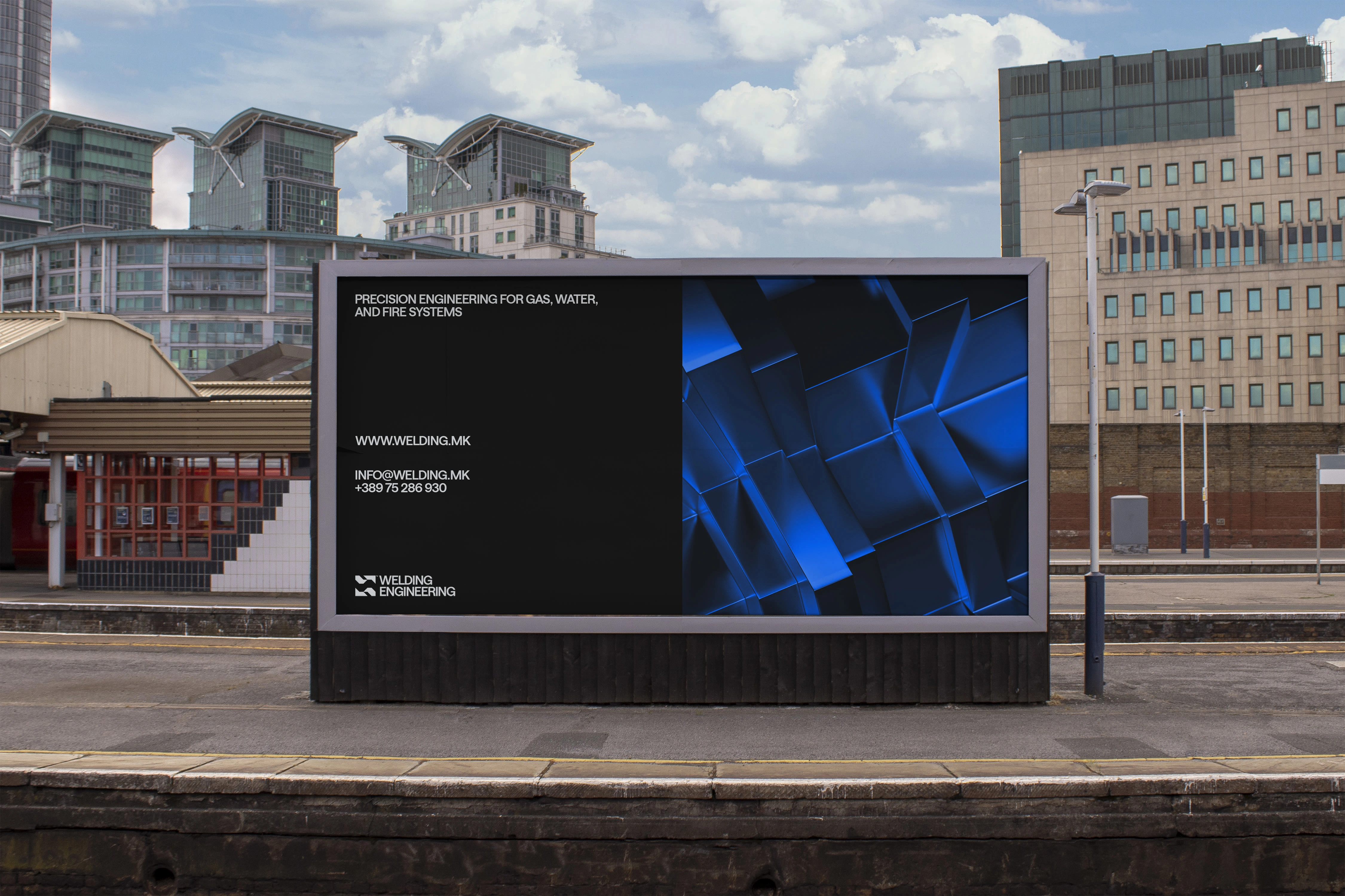
This rebrand marks a pivotal shift in how the company presents itself to the world. For over a decade, it has been operating at a high professional level, trusted by elite factories and delivering complex welding systems with precision. Yet, its previous visual identity gave off the impression of a small local workshop, failing to reflect the scale, credibility, and expertise behind the name. The goal of this rebrand was to close that disconnect and craft a visual system that mirrors the company’s true standards. The new identity brings clarity, strength, and confidence to the forefront. Clean layouts, bold typography using the Saans typeface, and a confident color palette reflect the precision, trust, and professionalism the company is known for in the field. Abstract 3D renders were introduced as a key visual element to express the technical and engineered nature of their work, offering depth and a modern tone without relying on literal representations. Altogether, the new identity elevates the brand into the space it already operates in, a serious, dependable partner for industrial-scale welding solutions.
Client: Welding Engineering™
Service: Brand Identity
Creative Direction: Gogo Dodevski®
Year: 2025

Like this project
Posted Jun 6, 2025
Rebranded Welding Engineering™ to reflect its true standards and market position.
Likes
14
Views
91
Timeline
Jan 16, 2025 - Apr 10, 2025
Clients
Welding Engineering
