
Anja Petrushevikj
My work is about emotion, honesty, and connection
Ready for work
Anja is ready for their next project!
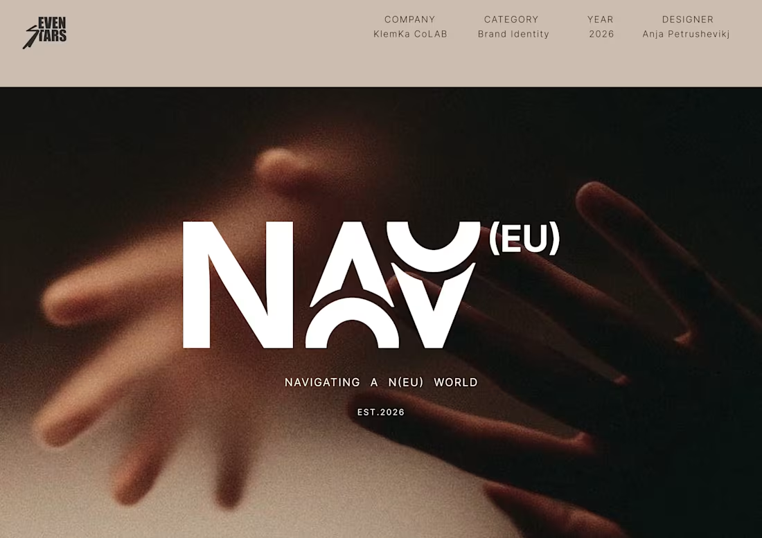
Brand identity NAV(EU)
0
2
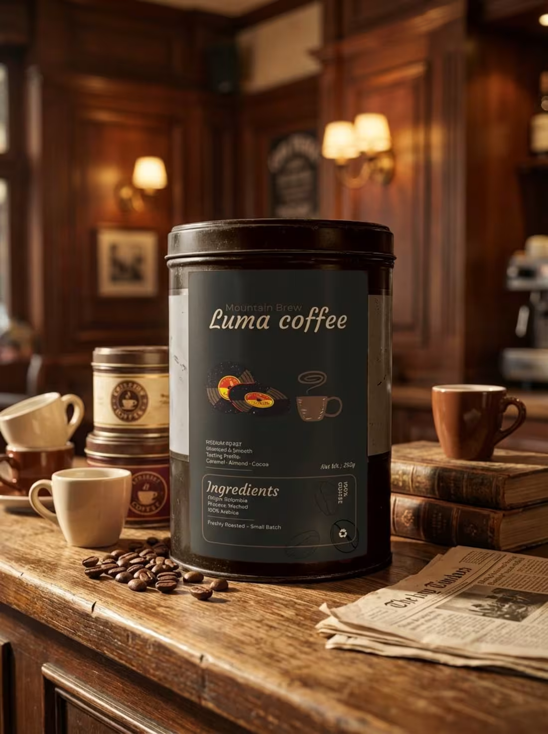
Luma Coffee Brand Identity Design
0
3
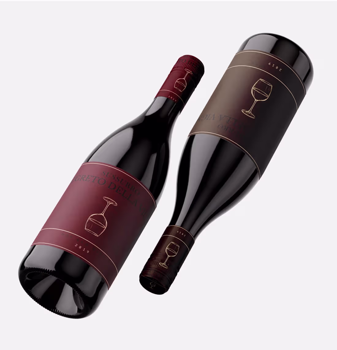
Wine Label Design for Segreto Della Vigna
0
1
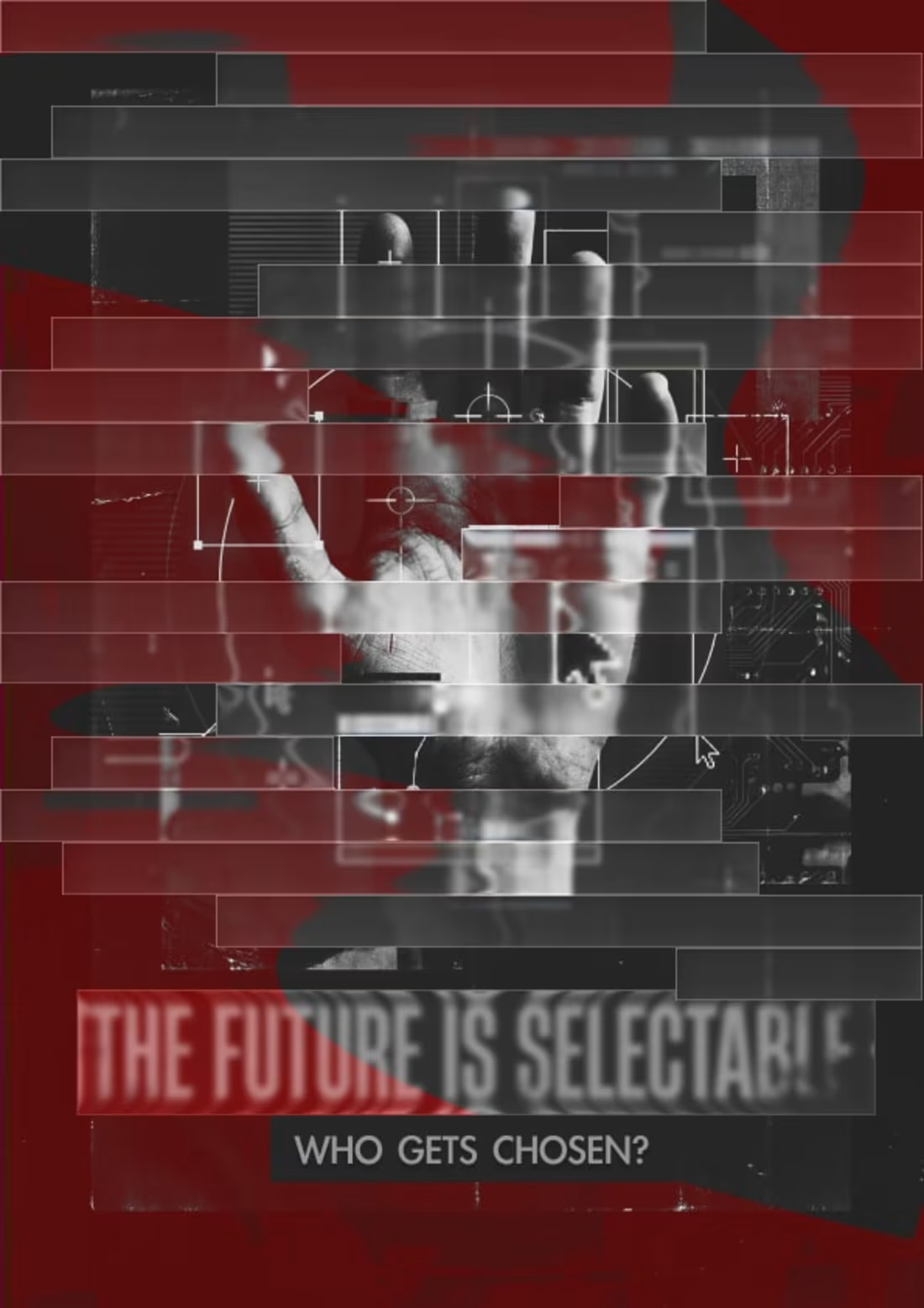
The Future is Selectable: A Conceptual Poster Campaign
0
1
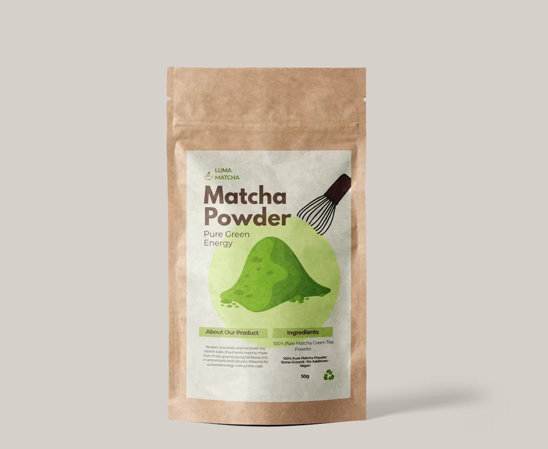
Would you buy this matcha? 👀🌱
I created this packaging concept inspired by natural energy and clean, modern design.
Focused on purity and minimalism—using structured typography, soft earthy tones, and a fresh matcha palette.
Now booking packaging and branding projects for wellness + CPG brands.
Fresh branding for fresh matcha. 🌿
2
116
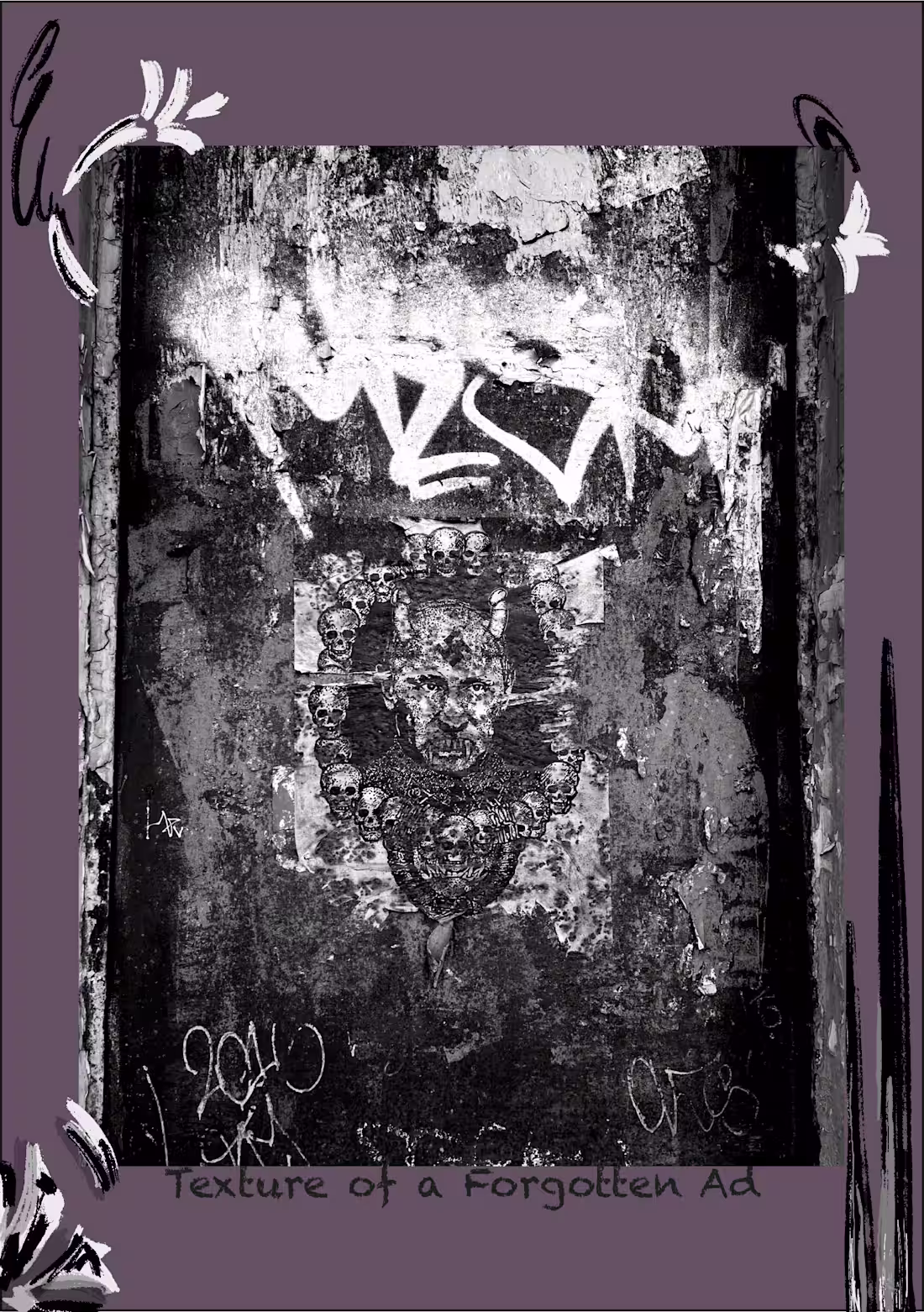
“Texture of a Forgotten Ad”
The image endures, but the message dissolves — a quiet record of disappearance.
19
251
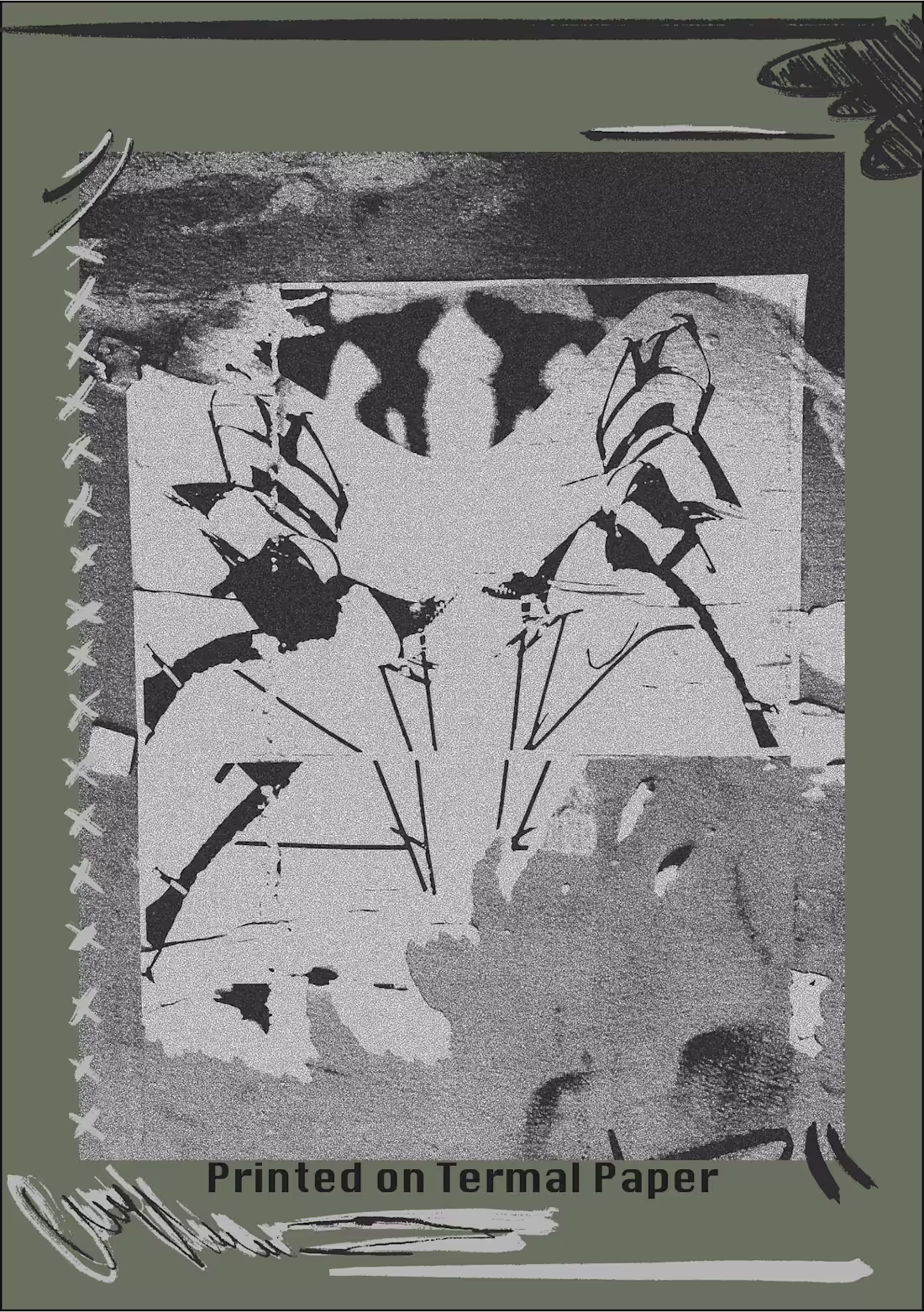
“Printed on Thermal Paper”
Dual renderings examining the relationship between print texture, tone, and material decay.
18
240
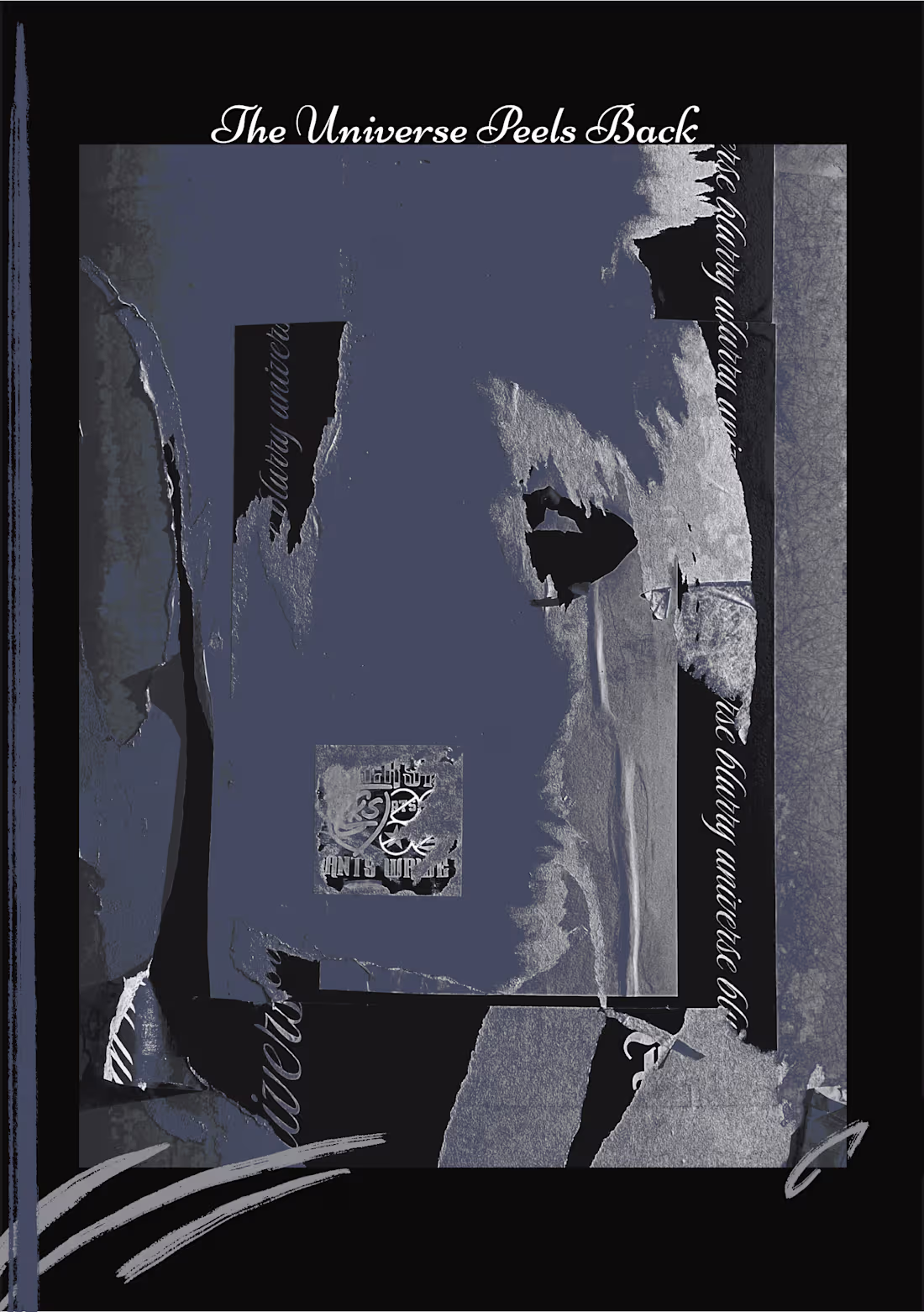
“The Universe Peels Back”
Two treatments of the same image — testing how subtle color shifts can alter emotional and visual impact.
1
22
239
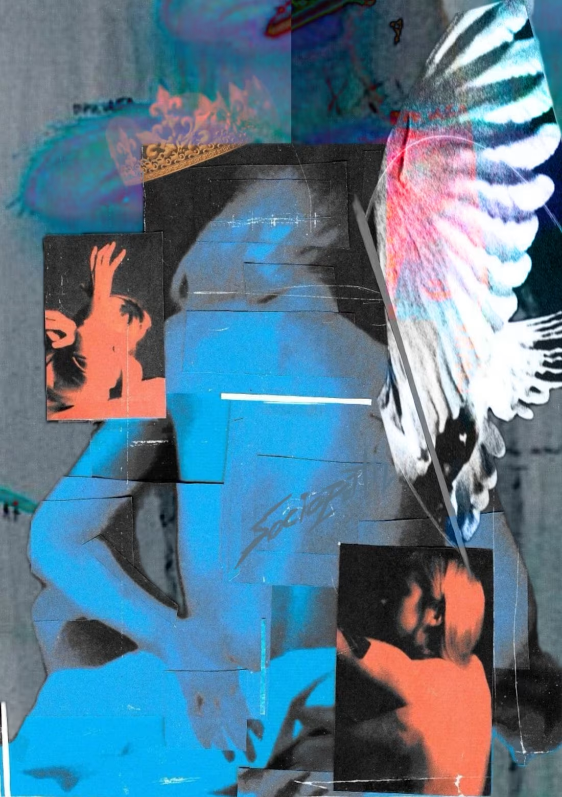
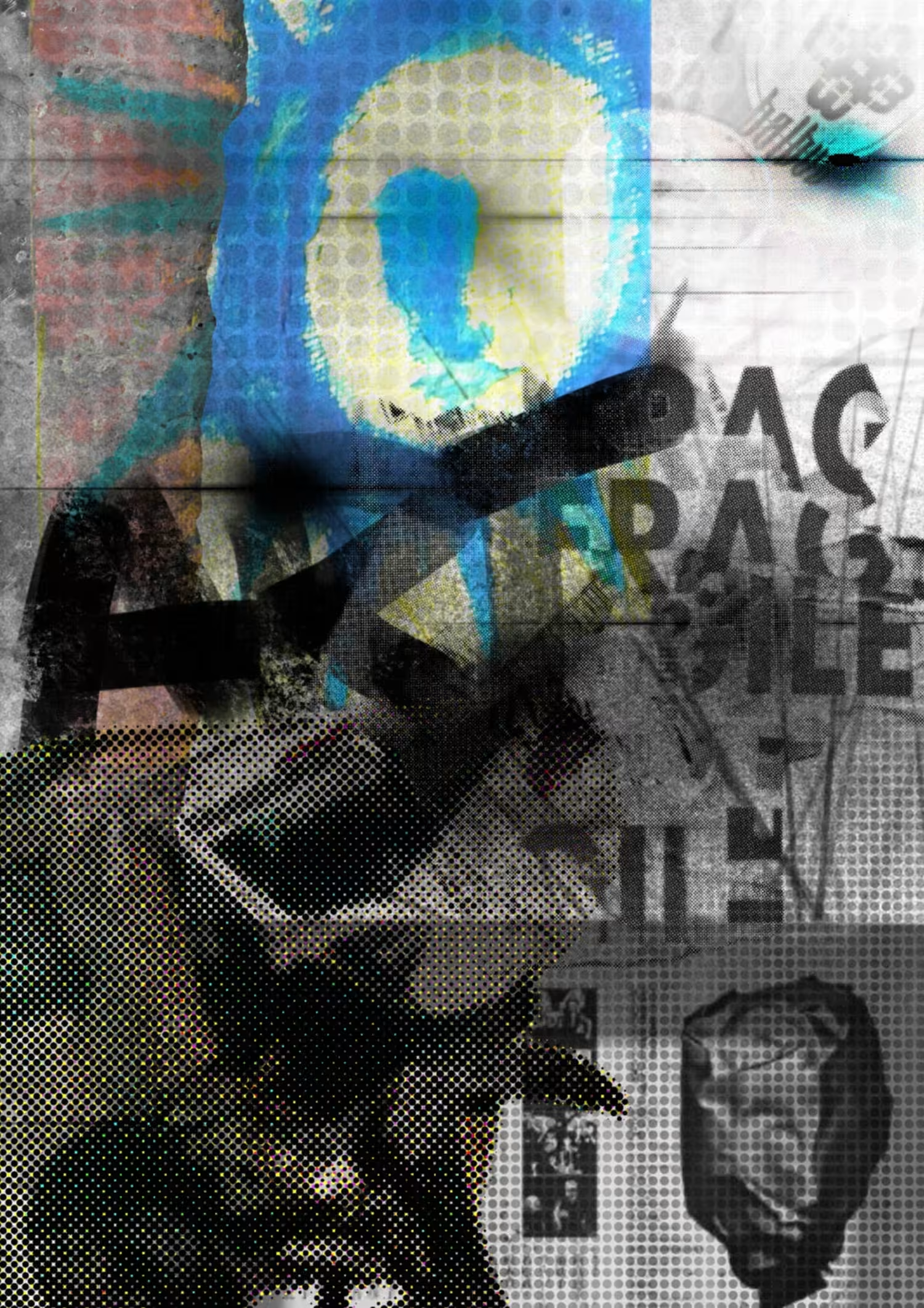
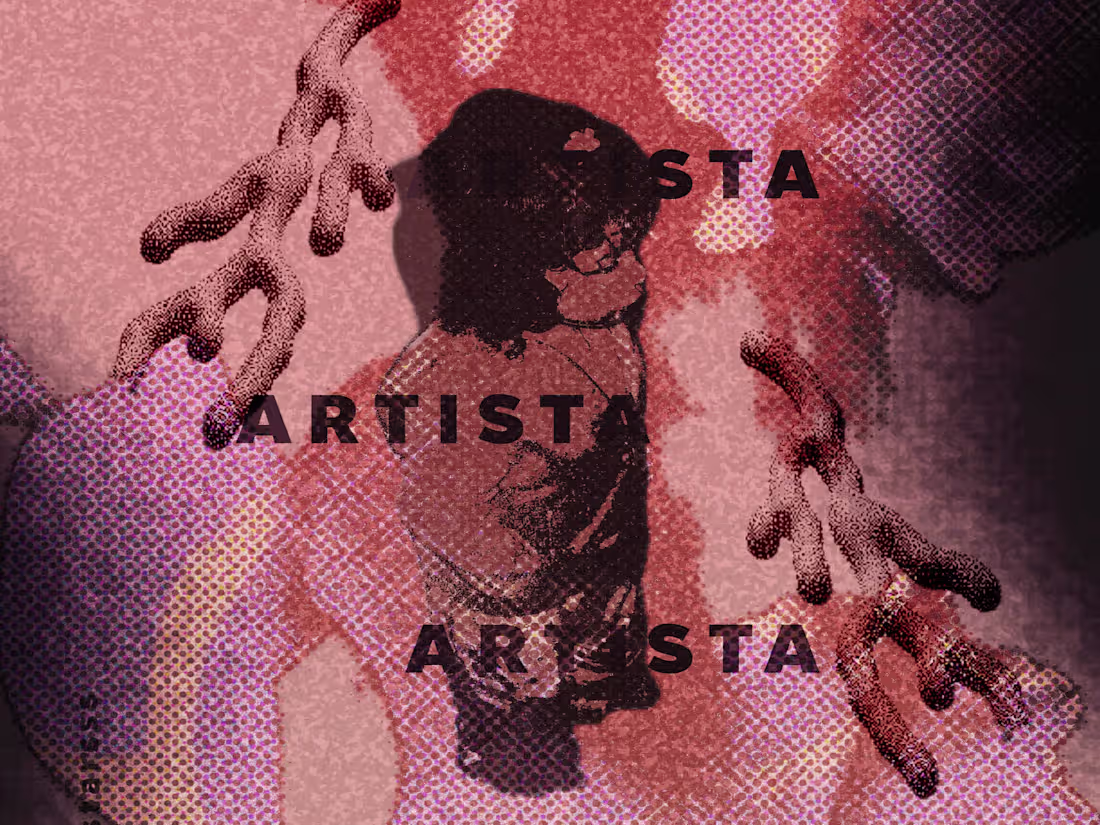
This work asks you to pause and feel - not just to see. Through overlapping textures and fragmented forms, it mirrors the pulse of emotion and the shifting balance between control and release. It's less about what's shown, and more about what it stirs within you.
14
167
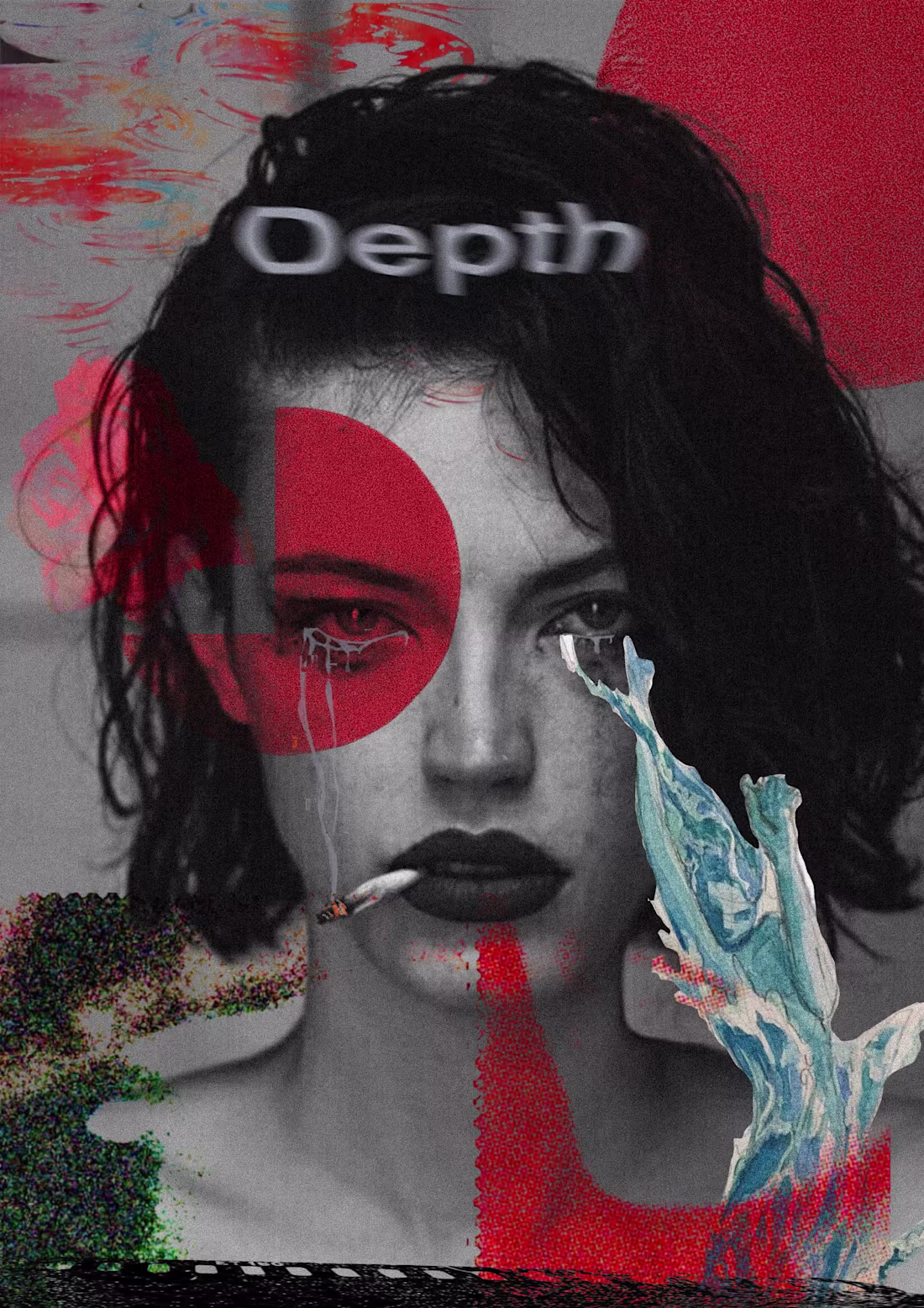
There's a quiet way behind the eyes "Depth" is that space - where beauty meets exhaustion, and the truth bleeds through the cracks.
1
148
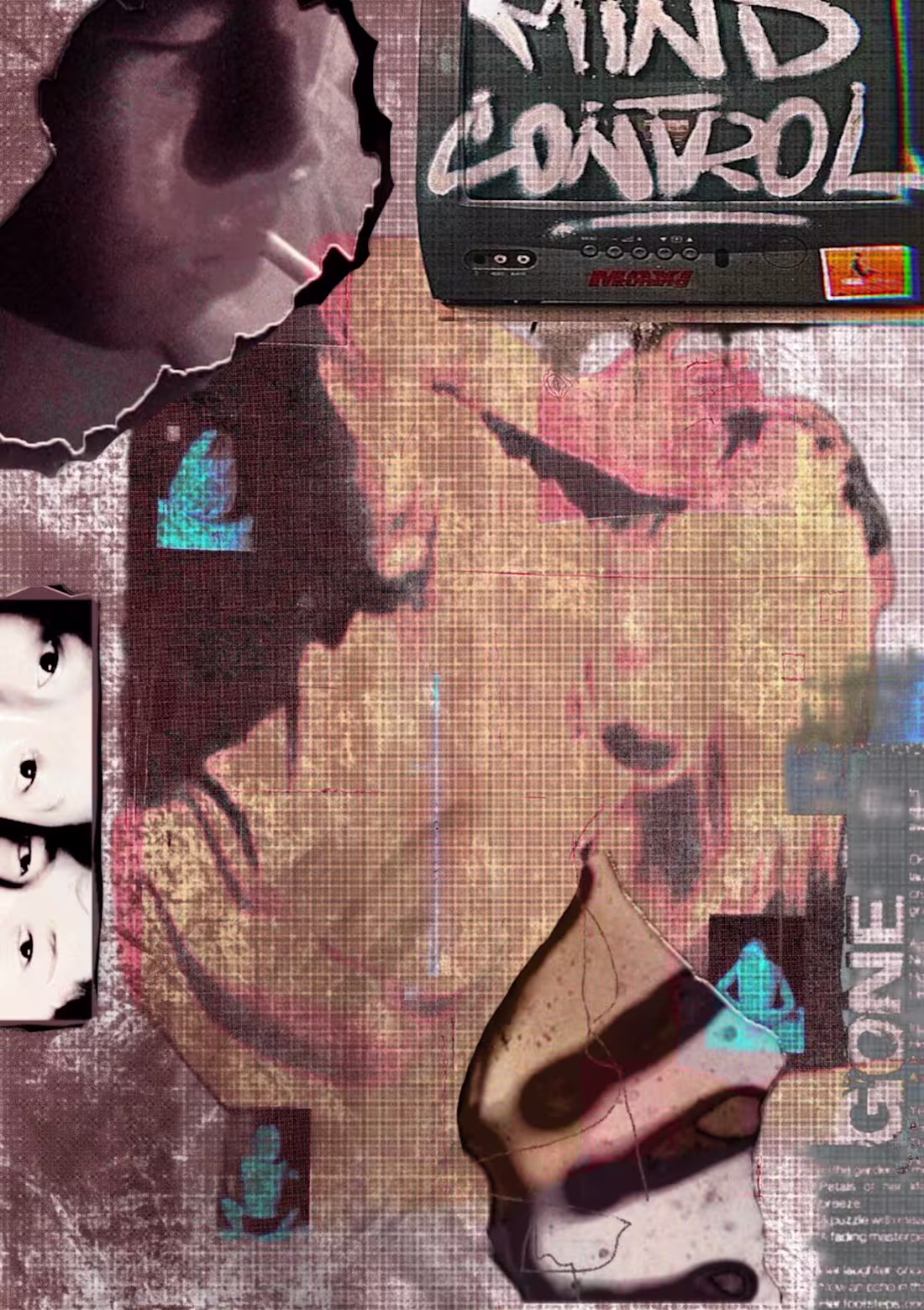
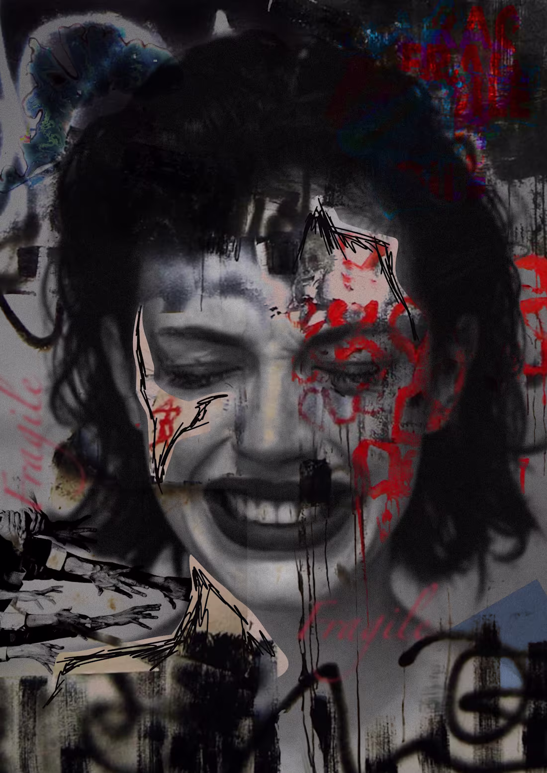
Control is a fragile illusion. This work reflects the chaos between mind and media - how much of what we think is truly ours anymore?
14
210
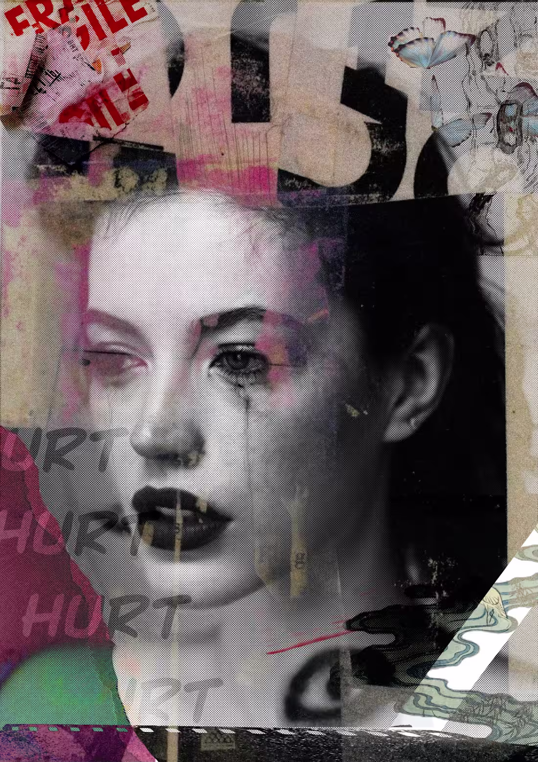
Hurt is layered - not erased. This mixed media poster mirrors the way memories stain, fade and return. It's fragile, yet somehow still whole.
20
233

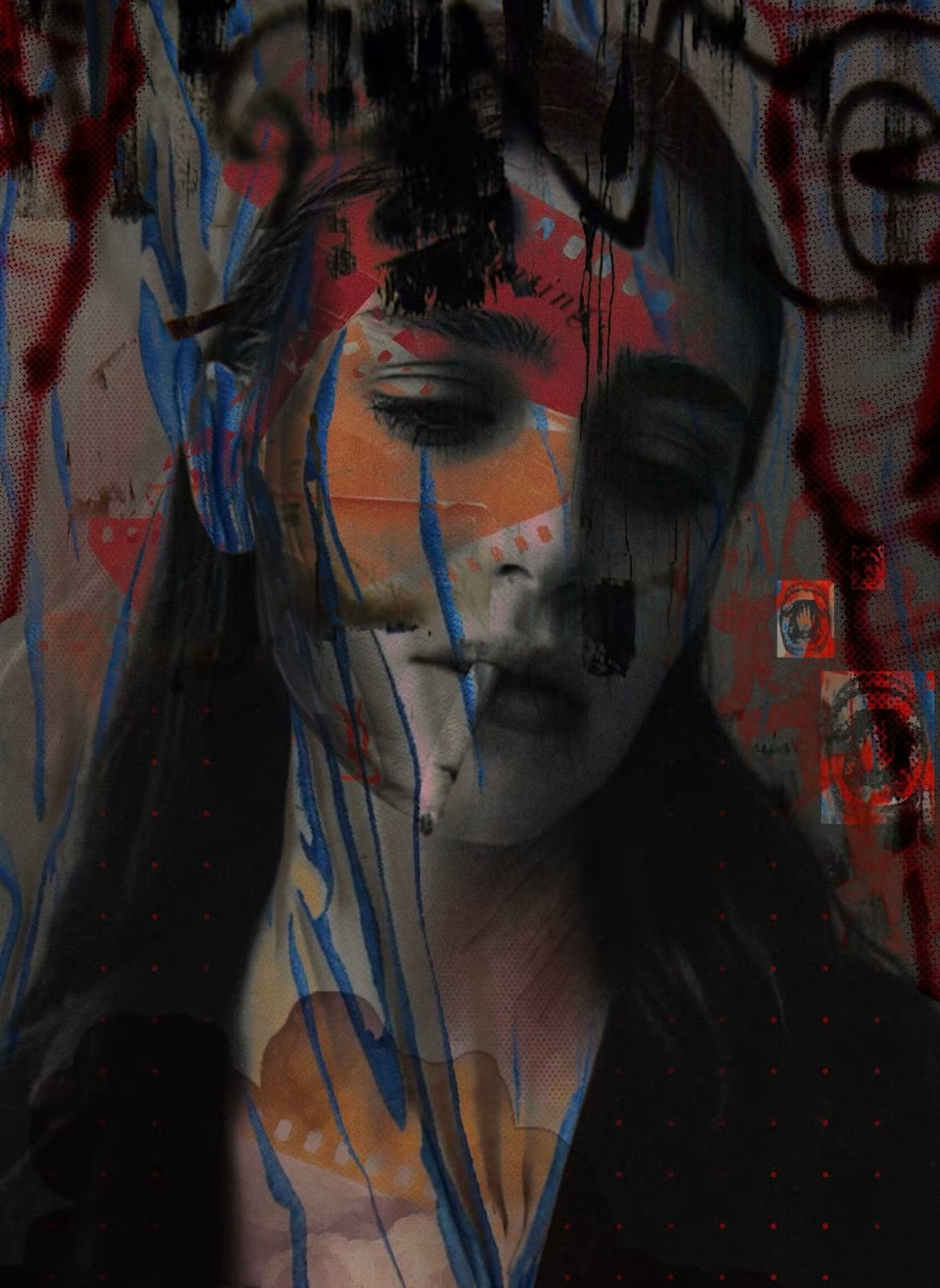
Visual dialog between order and chaos. This work combines college, digital overlay and texture to explore identity and communication brakes apart and rebuild.
21
210
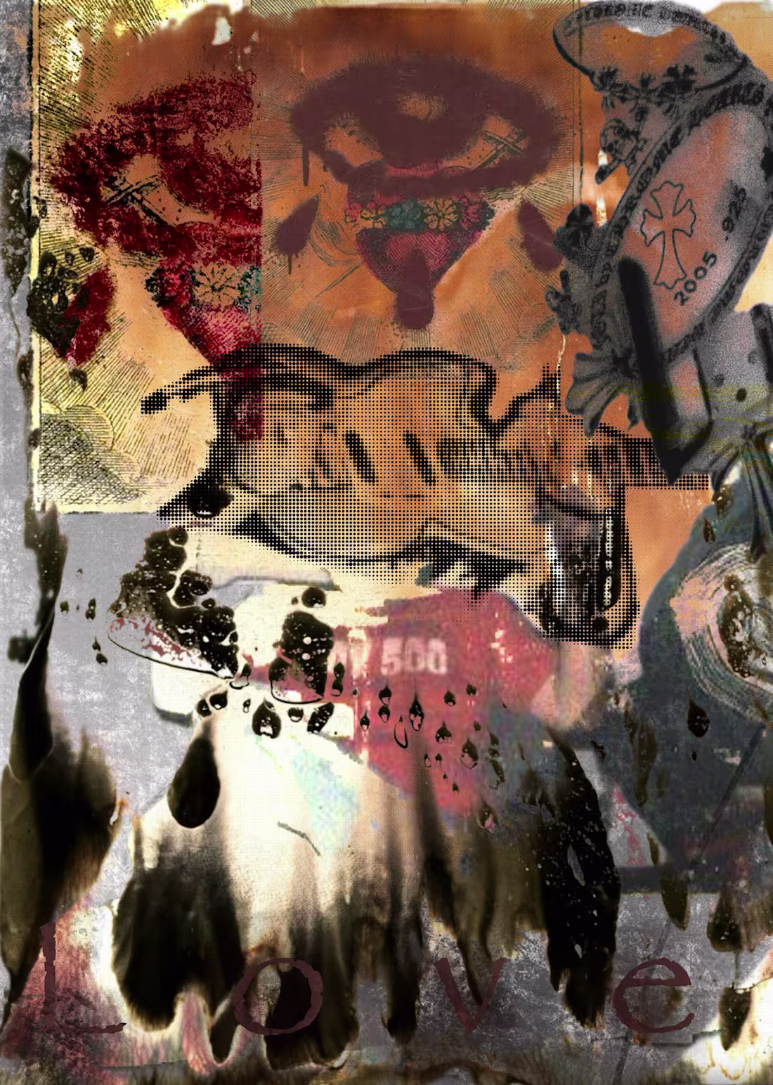
This is a mixed media exploration in emotion and identity - layering photography and digital textures to express chaos and beauty in inperfection
26
241
Mixed media poster
2
4
Collage poster
1
5
Poster collage
1
2