
Top-Rated Independent Design. Develop. Deliver Results

Top-Rated Independent Design. Develop. Deliver Results


UI/UX Designer | Framer & Video Editing
- $1k+
- Earned
- 3x
- Hired
- 5.0
- Rating
- 35
- Followers
UI/UX Designer | Framer & Video Editing

3D Animator & Designer

Day 1 fixing sh*tty ads on meta
#metaads (https://www.instagram.com/explore/tags/metaads/) #fbads (https://www.instagram.com/explore/tags/fbads/) #3dadvertising (https://www.instagram.com/explore/tags/3dadvertising/) #rendering (https://www.instagram.com/explore/tags/rendering/) #aiads (https://www.instagram.com/explore/tags/aiads/)
0
251



Graphic Designer, Branding and Print Expert
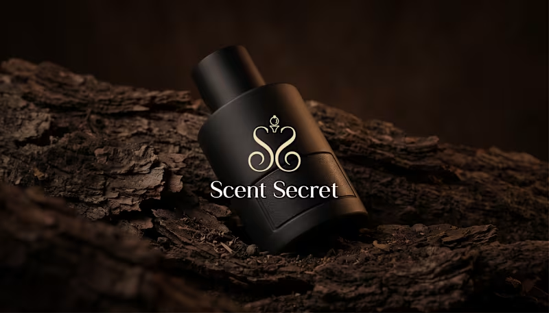
I designed Scent Secret, a luxury perfume branding concept inspired by elegance, sophistication, and timeless beauty.
The goal was to create a distinctive visual identity that captures the essence of luxury fragrance through rich chocolate brown, warm terracotta, soft beige tones, elegant serif typography, and a custom ornamental logo.
From the logo design and typography to perfume packaging, stationery, shopping bags, social media, and digital applications, every element was carefully crafted to create a consistent and memorable brand experience.
0
47


Logo & Brand Identity Designer for Growing Businesses
- 5.0
- Rating
- 10
- Followers
Logo & Brand Identity Designer for Growing Businesses
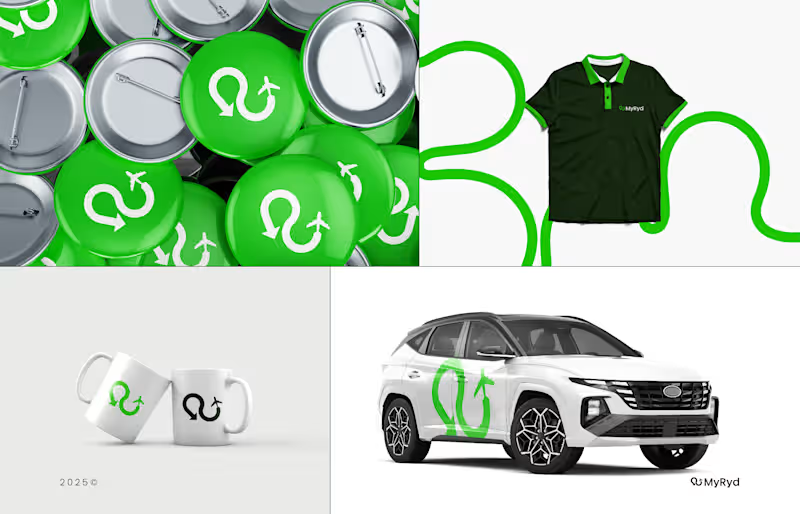
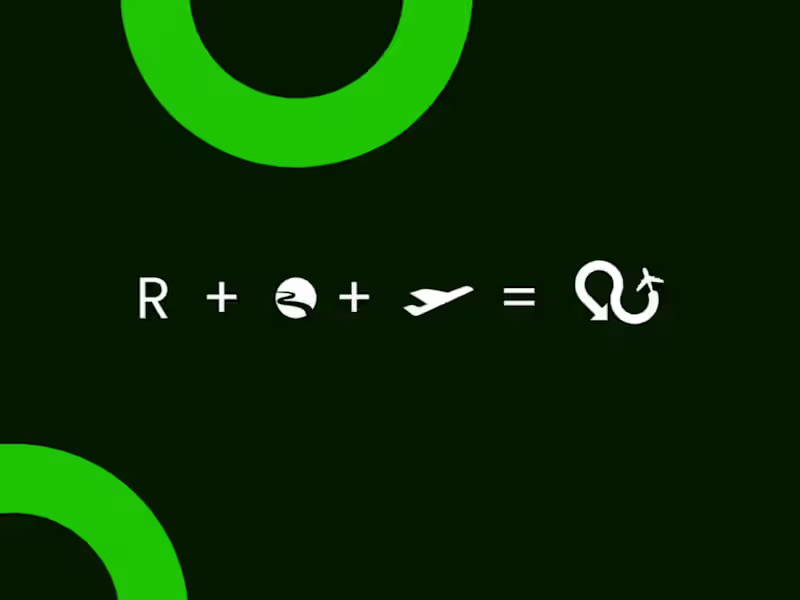
MyRyd: UK Airport Taxi Transfer Logo & Brand Identity Design
Logo design and brand identity for MyRyd, a UK airport taxi transfer service built on one promise: fixed prices, no surge pricing, no surprises. The brand needed to feel dependable, professional, and stress-free for travellers heading to and from airports like Heathrow, Gatwick, Luton, and Stansted.
The symbol combines a looping road-style arrow with a small airplane, showing the journey between the door and the departure gate. Paired with a bold wordmark in deep green, the logo stays clear and recognizable at any size, from a booking button and app icon to a vehicle decal. The green and black palette feels calm and trustworthy, and carries across the live website.
This animated showcase presents the logo, symbol, and wordmark in action.
Live brand: myryd.co.uk (http://myryd.co.uk)
Ideal for UK taxi and private hire companies, airport transfer services, chauffeur businesses, and travel startups looking for a memorable identity.
Role: Logo design and brand identity
Tools: Adobe Illustrator
Need a logo for your transport or travel business? Message me to collaborate!
#AirportTransfers #TransportBranding #LogoDesign #BrandIdentity #GraphicDesign
2
296
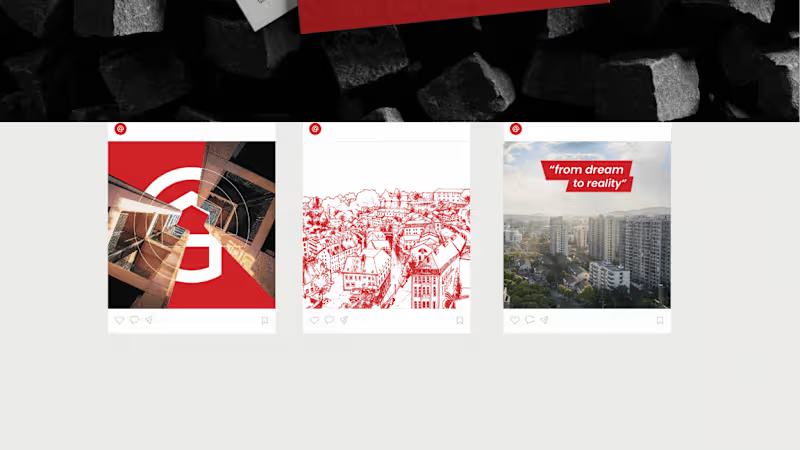
EarthCon Properties: Real Estate Logo & Brand Identity Design
Logo design and brand identity for EarthCon Properties, a real estate and property company. The brand needed to feel trustworthy, welcoming, and rooted in the idea of home, summed up in its tagline, "from dream to reality."
The logo combines a house shape inside a bold circular mark, paired with a clean, modern lowercase wordmark. A strong red palette and a hand-drawn rooftop illustration give the brand warmth and a human touch that sets it apart from typical corporate real estate branding.
This animated showcase presents:
- Primary logo and wordmark
- Logo mark and tagline lockup
- Brand colors and typography
- Illustration style and brand applications
Perfect for real estate agencies, property developers, construction companies, and home builders looking for a memorable brand identity.
Role: Logo design and brand identity
Tools: Adobe Illustrator
Looking for a real estate logo or complete brand identity? Message me to collaborate!
#RealEstateBranding #LogoDesign #BrandIdentity #PropertyLogo #GraphicDesign
2
285
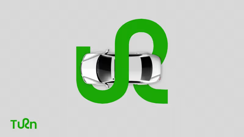
Turn: Brand Identity & Guidelines
Complete brand identity for Turn, an institution for driving schools. The wordmark turns the "r" into a winding road, so the logo itself expresses the idea of a turn and the journey of learning to drive.
This animated walkthrough covers:
- Logo and wordmark
- Clear space and grid construction
- Logo versions: color, outline, and dark
- Brand pattern built from the symbol
- Typography: Poppins
- Color palette: green (#14A800) and charcoal (#303030), with red and lime as supporting colors
- Applications on vehicles
Bold green, a clean geometric typeface, and a flowing symbol give the brand a confident, friendly, and trustworthy look for learners and parents alike.
Role: Brand identity and logo design
Tools: Adobe Illustrator
Need a brand identity or logo for your business? Message me to collaborate!
#BrandIdentity #LogoDesign #BrandGuidelines #Branding #GraphicDesign
2
251

Brand, Product & Motion Systems for Funded Startups
- 1x
- Hired
- 5.0
- Rating
- 10
- Followers
Brand, Product & Motion Systems for Funded Startups
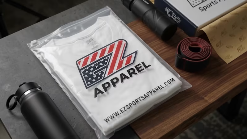
One System, Every Season.
Mockup to vendor file, six accounts running.
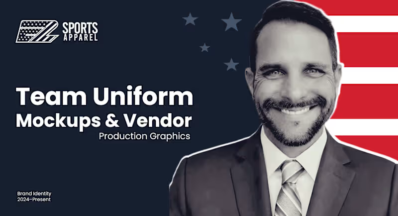
A look at the finished product: branded merchandise from EZ Sports Apparel's own line, built on the same repeatable system that powers every team's mockup-to-vendor pipeline, season after season since 2024.
0
99


Creating Visual & Brand Identities


UI/UX Designer, End-to-End Product Design for Web & Mobile
- 5.0
- Rating
- 57
- Followers
UI/UX Designer, End-to-End Product Design for Web & Mobile
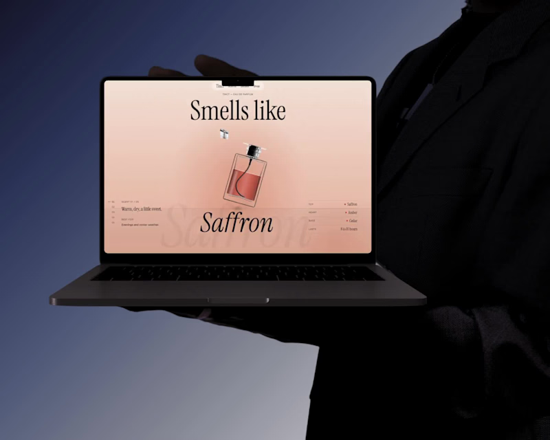
You can't smell a perfume on a screen, and most fragrance sites fall back on long lists of notes that don't mean much to a first-time buyer. Tinct is a fragrance brand with one bottle and five scents, and each scent is described by its notes, its mood and when to wear it.
The site gives visitors a quick, clear picture of each scent without reading a long list.
With one bottle and five choices, there is little to compare, so a first-time buyer can decide faster and feel sure about it. It also gives the brand a clear identity: people remember one bottle and five colors more easily than a long catalog. And because every scent follows the same pattern, the brand can add a sixth or seventh later without redesigning anything.
Built in Lovable.
Check it Out (https://tinct-perfume.lovable.app)
5
6
312