MyRyd: Brand Identity & Website Design

Shahwaiz Mustafa


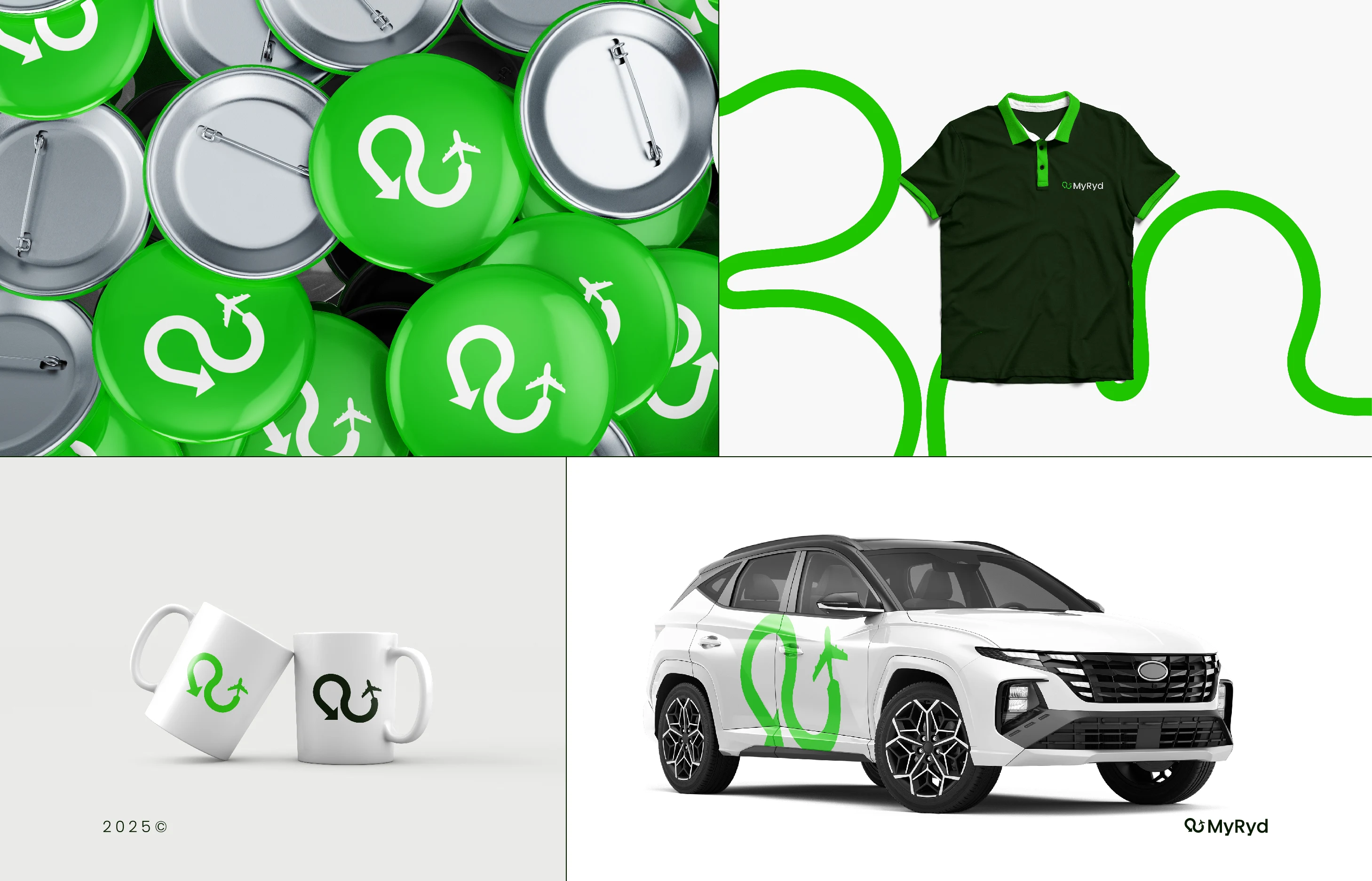
MyRyd brand identity applied to vehicle, merchandise and stationery
MyRyd: Brand Identity & Website Design
MyRyd is a UK taxi service offering fixed-price airport transfers and city-to-city rides, with a strong focus on London Luton Airport. Taxi brands tend to look the same: loud colours, generic car icons, and nothing that tells you why to trust one over another. MyRyd needed to feel easy, reliable and fairly priced from the first glance.
The brief
Make travel feel simple and trustworthy, not like "just another app"
Work at every size, from the side of a car to a tiny app icon
Give the business one consistent look across vehicles, print, social and web
The idea
The mark is built from three things:
R: the starting point of the name
Path: one smooth, unbroken line from pick-up to destination
Flight: a subtle airplane for speed, precision and airport travel
That curved path became the heart of the whole visual system. It runs through the stationery, social posts, app icon and vehicle branding like a road that never breaks.
Colour
Fresh green for energy, deep forest green for trust, and white and soft grey for clarity. Deliberately calm, because that's what you want from someone picking you up after a long flight.
What I delivered
Logo design and full brand identity
Brand guidelines and visual system
Mockups across vehicles, merchandise, stationery and social
Website design in Figma
See it live
The brand is live at myryd.co.uk.
Building a service brand that needs to look established from day one? Message me with a short description of your business.
Like this project
Posted Oct 12, 2026
A calm, recognisable brand for a UK airport transfer service: one continuous line from pick-up to destination, carried through vehicles, app icon, stationery and website.
Likes
2
Views
6
Clients
MyRyd