Built for the hard stuff.
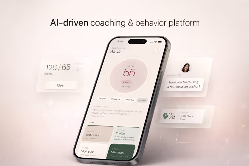
Fixing & building AI apps with clean UX + reliable outputs
New to Contra
Fixing & building AI apps with clean UX + reliable outputs
AI SaaS architect for scalable MVPs and workflows.
Extensive design background
Extensive design background
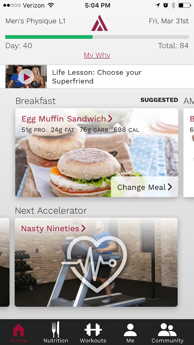
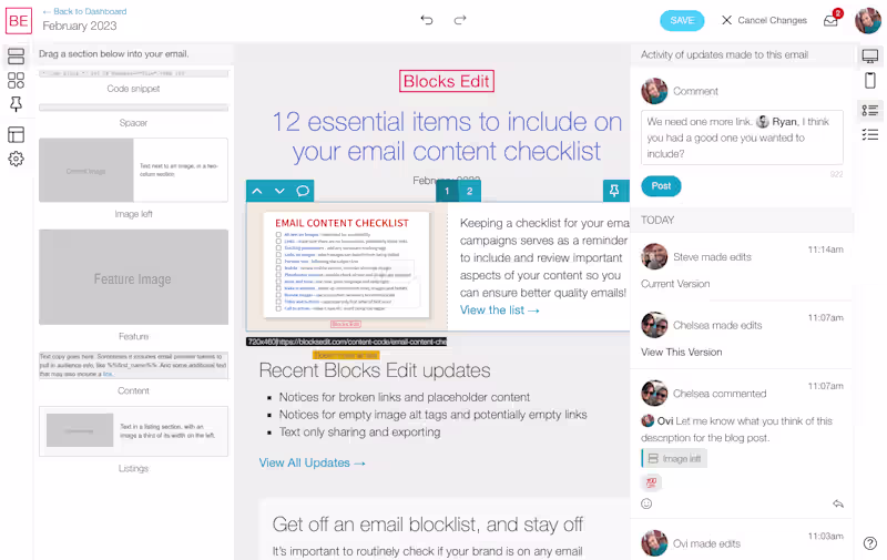
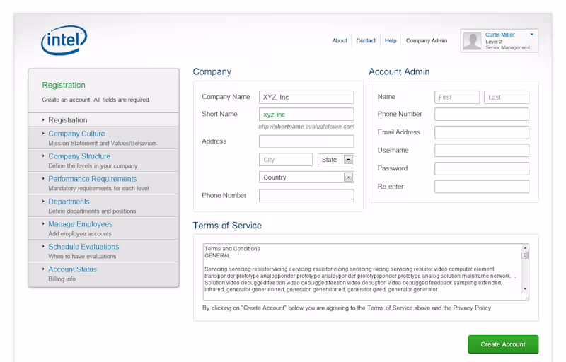
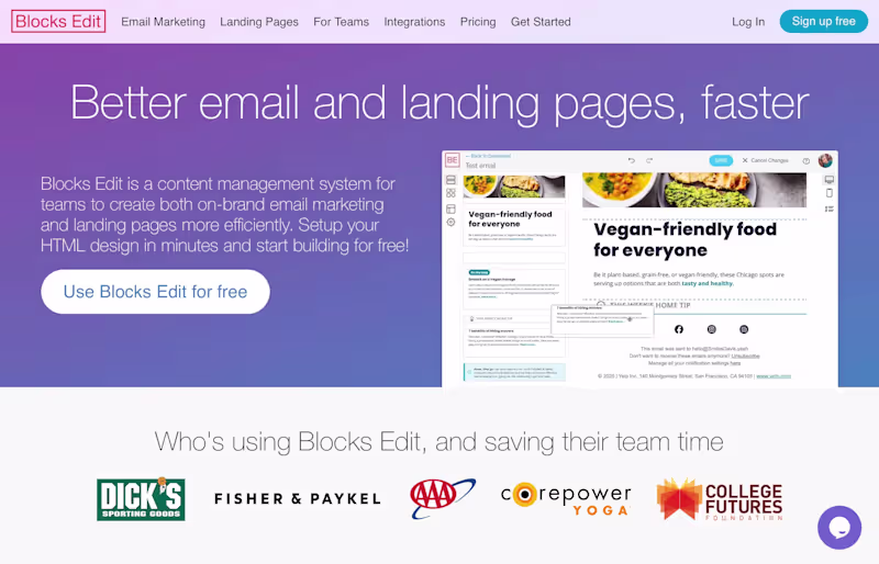
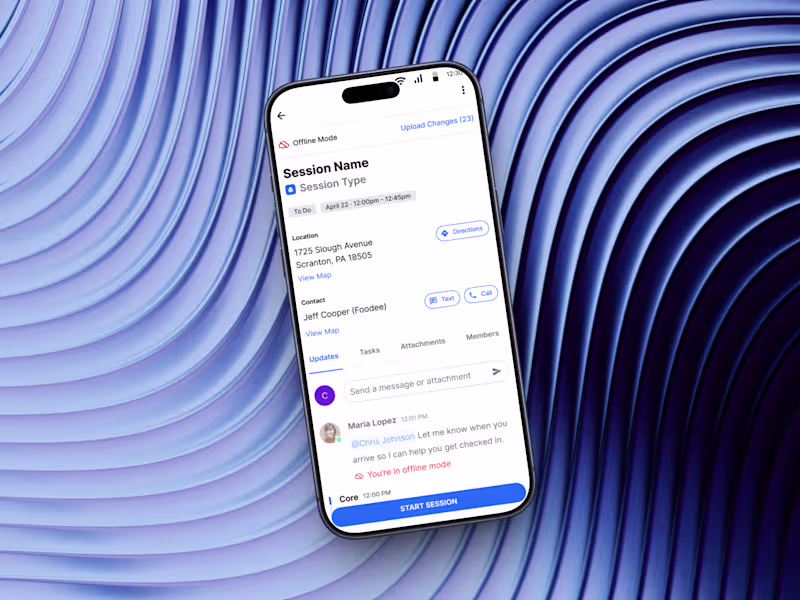
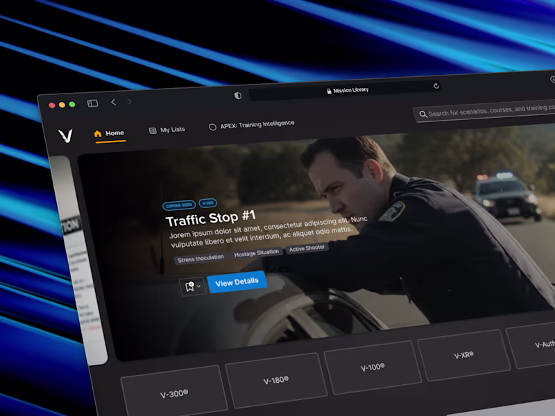
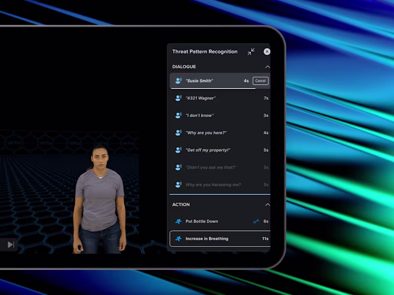
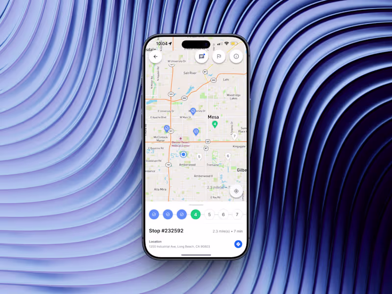
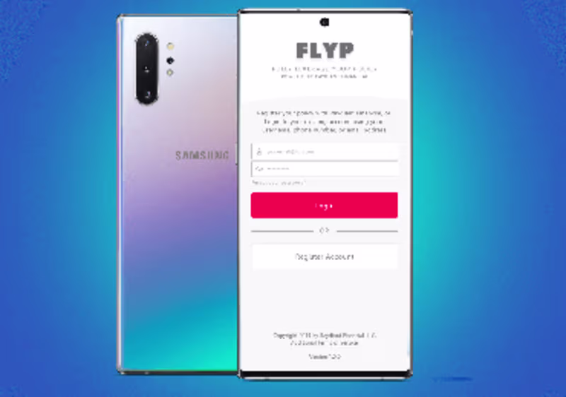
Touch Screen, Mobile, Web / Software Design
Touch Screen, Mobile, Web / Software Design


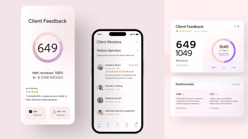
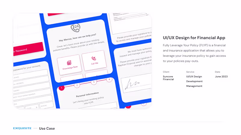
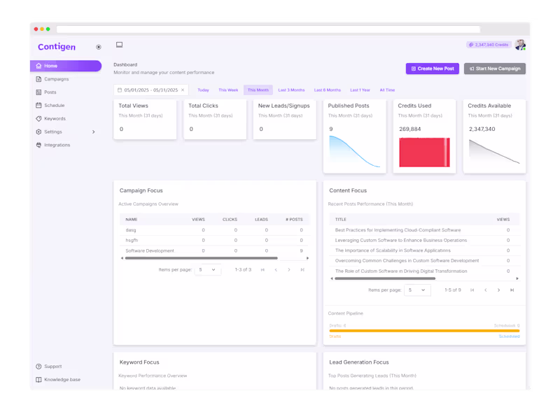
Custom software solutions that deliver measurable results.
- $5k+
- Earned
- 1x
- Hired
- 6
- Followers
Custom software solutions that deliver measurable results.

View more →