
pro
Alexia Valenzuela
Fixing & building AI apps with clean UX + reliable outputs
New to Contra
Alexia is ready for their next project!
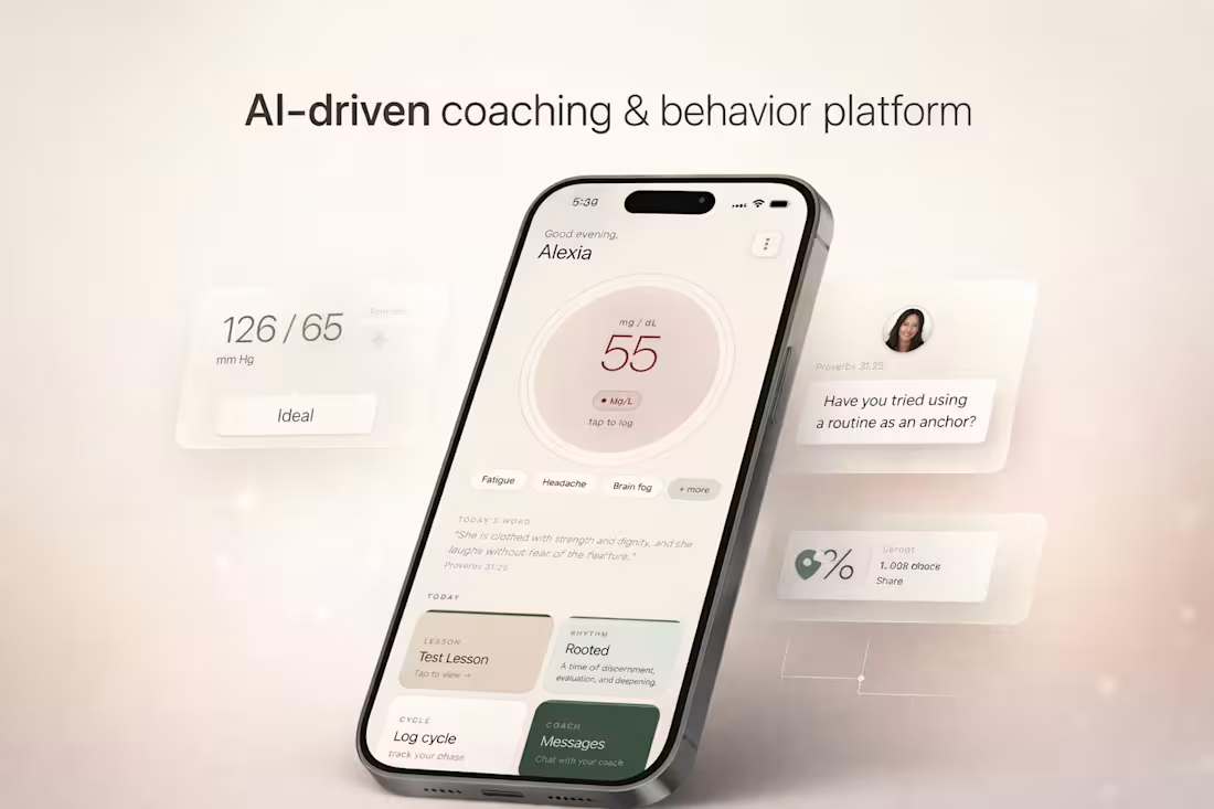
This project is an AI-driven coaching and behavior platform designed around women’s physiological cycles, combining health tracking, guided routines, and structured coaching into a single system.
The product integrates glucose tracking and cycle-based fasting protocols, adapting recommendations based on different phases of a woman’s cycle. Instead of static tracking, the experience shifts contextually, guiding users through daily decisions, energy patterns, and habits in a way that feels aligned rather than restrictive.
A key part of the system is the coaching layer. The platform supports both 1:1 coaching and multi-week group programs, where users move through structured lesson plans, guided routines, and check-ins. The experience is designed to feel continuous, not fragmented, blending education, action, and reflection into one flow.
There is also a built-in spiritual component, where scripture and reflection prompts are integrated into the experience alongside behavioral guidance. This creates a more holistic system that supports not only physical health, but mental and emotional alignment.
From a product perspective, the focus was on designing a system that encourages consistency and long-term engagement. This includes adaptive feedback, clear progression, and interaction patterns that reinforce daily use without overwhelming the user.
The result is not just a tracking tool, but a structured environment for behavior change, combining health data, coaching systems, and guided experiences into one cohesive platform.
1
4
195
This project focused on executing a fully designed website into a live, responsive Framer build within a tight deadline.
The design, structure, and copy were already finalized. The goal was precise implementation, performance, and clean delivery without compromising visual quality.
Section 2: My Role
I handled the full execution layer inside Framer, including: Translating static designs into responsive layouts. Structuring reusable components. Implementing interactions and transitions. Ensuring consistency in spacing, typography, and hierarchy
Final QA and publishing
This was purely a build-focused role. Prioritizing accuracy, speed, and polish.
Section 3: Execution Approach
To ensure a smooth and fast delivery, I followed a structured approach:
Design Audit
Reviewed layout, spacing systems, and component patterns before building.
Component System Setup
Built reusable sections to maintain consistency and speed up implementation.
Responsive Build
Designed across breakpoints early — not as an afterthought.
Interaction Layer
Added subtle motion and transitions to elevate the experience without overcomplicating it.
Final QA + Polish
Checked alignment, spacing, responsiveness, and performance before publishing.
Section 4: Outcome
Delivered a fully functional, published Framer site within deadline
Maintained high visual accuracy to the original design
Ensured clean responsiveness across devices
Created a polished, production-ready experience
The result was a smooth transition from design to live product with no execution gaps.
Section 5: Key Strength
I focus on the execution stage where most projects lose quality.
Instead of treating development as a technical step, I approach it as a continuation of design, where spacing, timing, and responsiveness are just as important as layout.
That’s what allows me to deliver builds that feel finished, not just functional.
0
69
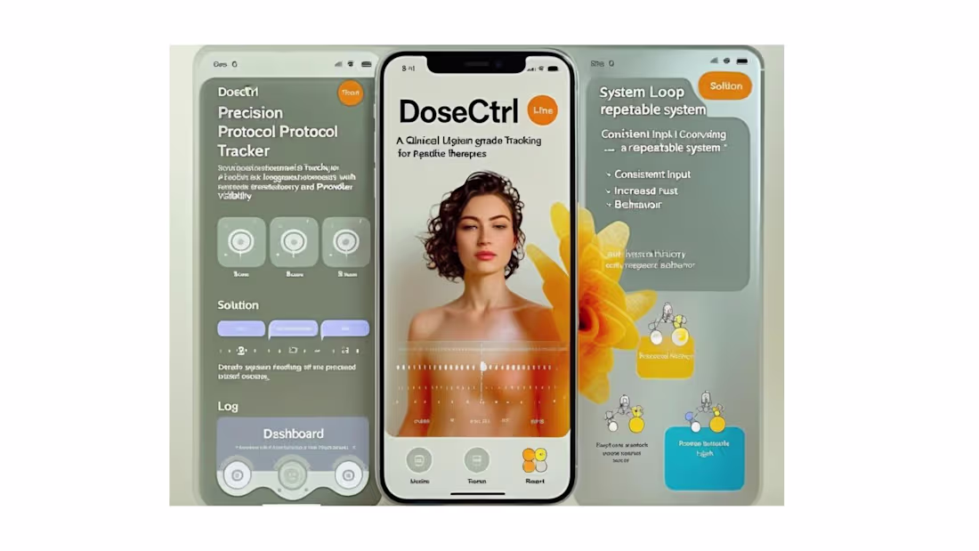
DoseCTRL — Clinical UX System (Biotech Aesthetic Layer)
One-liner
A biotech-inspired interface system that blends clinical clarity with premium, sensory-driven design.
Problem
Health tracking tools often feel either overly clinical or overly generic, failing to build trust or emotional engagement.
Users need an interface that feels both medically credible and personally engaging.
Solution
DoseCTRL introduces a visual system inspired by molecular structures, liquid forms, and soft clinical environments.
The UI balances precision and calmness, reinforcing trust while maintaining usability.
Experience System
Visual language derived from glass, liquid, and molecular structures
Soft gradients and translucency to create depth without distraction
Minimal UI layers to reduce cognitive load
Interaction flow designed for speed and repetition
Key Interaction Moments
Fast log entry with minimal fields and immediate feedback
Timeline updates instantly after each action
Subtle visual hierarchy guiding attention without overwhelm
Reminder prompts that re-engage users without friction
Visual / Aesthetic Direction
Neutral base (off-white, beige) with soft biotech blue accents
Glassmorphism elements to create a premium clinical feel
High spacing and clean typography for clarity
Subtle depth and shadow for a tactile interface
Technical Considerations
Mobile-first responsive design (Next.js + Tailwind)
Component-based architecture for scalability
Lightweight rendering for fast interactions
Structured data model supporting future expansion
Outcome / Impact
The interface elevates the perception of peptide tracking from a utility tool to a trusted system.
It creates a foundation where users feel both guided and in control, increasing long-term engagement and retention.
1
76
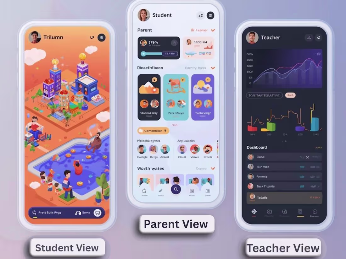
Trivium Cohort — A Multi-Role Learning Ecosystem
Overview
Trivium Cohort is a connected educational platform designed to unify students, parents, and teachers into a shared digital environment. Instead of treating each role as separate, the system creates a cohort-based experience where progress, communication, and engagement are continuously visible and interactive.
The platform transforms traditional education workflows into a dynamic, role-specific experience, blending structure, gamification, and emotional engagement.
⸻
🧠 Core Concept
A three-sided system where each user experiences the same data differently through tailored UI/UX:
⸻
👩🏫 Teacher Experience (Tools + Control Layer)
Purpose: Provide clarity, oversight, and control.
UI/UX Direction:
• Clean, dashboard-driven interface
• Data visualization (progress tracking, completion rates)
• Task and curriculum management tools
• Cohort-level insights
Key Features:
• Assign tasks and lesson plans
• View student progress and trends
• Generate worksheets and structured content
• Monitor engagement across the cohort
👉 Feels like: Command center + analytics dashboard
⸻
🧒 Student Experience (Immersive + Game-Like)
Purpose: Make learning feel interactive, motivating, and alive.
UI/UX Direction:
• 3D-inspired or spatial interface
• “World-like” navigation (classroom, tasks, progress zones)
• Gamified progression system
Key Features:
• Interactive task completion (“quests”)
• Visual progress (levels, points, achievements)
• Direct connection to teacher and parent
• 2-player interactive experiences with parent
👉 Feels like: A playable learning world
⸻
👨👩👧 Parent Experience (Emotional + Engaged)
Purpose: Turn passive observation into active participation.
UI/UX Direction:
• Soft, immersive digital environment
• Less “gamey,” more guided + rewarding
• Focus on emotional reinforcement and visibility
Key Features:
• Real-time activity feed (child progress, achievements)
• Interactive engagement tools (encouragement, participation)
• Shared experiences with child (light gamification)
• Clear visibility into growth and development
👉 Feels like: A nurturing, interactive support space
⸻
🔁 Core System Loop
1. Teacher assigns task
2. Student completes task (gamified interaction)
3. Progress is updated + visualized
4. Parent receives update + engages
5. Student receives feedback + motivation
→ Loop reinforces consistency, connection, and accountability
⸻
💡 Differentiation
Unlike traditional education tools, Trivium Cohort:
• Designs 3 completely different UX layers for the same system
• Integrates family engagement directly into the product loop
• Uses gamification selectively (fun for students, meaningful for parents, structured for teachers)
• Treats learning as a shared experience, not an isolated task
⸻
🎯 Outcome
A platform where:
• Students feel motivated
• Parents feel involved
• Teachers feel in control
All within a single, cohesive system
1
97
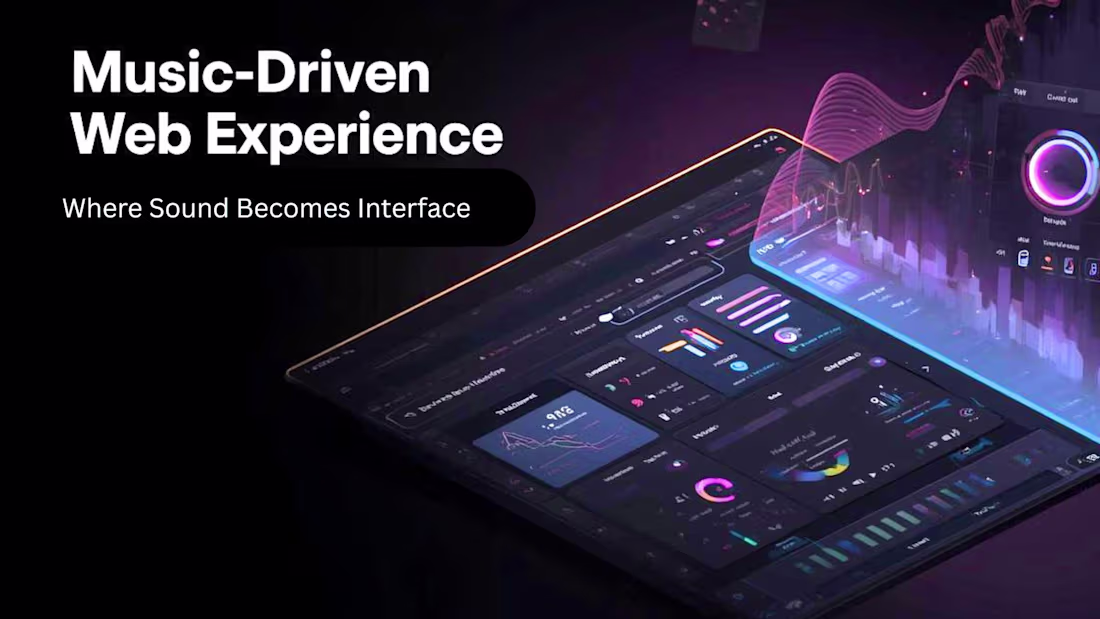
Case Study 2: Searching for Sound Engineers
Music-Driven Web Experience — Emotion-Based UX System
One-liner: A web experience where the currently playing track controls the visual environment, creating a dynamic interface that responds to sound as a first-class design input.
Problem
Music platforms treat audio and UI as separate layers — you hear a song while looking at static metadata and album art. There is no system that allows sound itself to become a generative design material, leaving a significant emotional bandwidth on the table.
Solution
The system treats audio as a live data source. As music plays, extracted properties — tempo, frequency range, energy level, mood classification — drive UI state in real time. Color, motion, layout density, and interaction behavior all respond to what is playing. The experience is not visualized audio; it is an interface that feels like the music.
Experience System
Audio → State: The audio engine extracts properties per track (BPM, energy, key, mood). These map to a set of defined UI states — not a 1:1 linear translation, but a curated system of thematic environments.
State → Visual: Each UI state has a corresponding visual language: color temperature, typography behavior, background motion, and element density. A high-energy track produces a compressed, kinetic interface. A slow, low-frequency track expands the layout and reduces motion.
Visual → Interaction: User interactions (hover, scroll, click) are modulated by the current audio state. Hover effects are faster in high-BPM states, slower and more diffuse in ambient states. The interface is never static — behavior is continuous and reactive.
Key Interaction Moments
Track Transition — When a track changes, the UI transitions through a bridging state rather than cutting abruptly. Color and motion shift over 1–2 seconds, matching the audio's fade behavior.
Energy Peak — At detected energy peaks (chorus, drop, climax), a brief full-screen pulse or layout shift signals the moment without interrupting the experience.
User Hover / Explore — Hovering over track metadata or navigation elements reveals information through motion rather than a static tooltip. Reveal behavior scales with current audio energy.
Silence / Pause — When audio stops, the UI enters a resting state — reduced contrast, minimal motion, slow breathing animation. The interface communicates absence without becoming dead.
Visual / Aesthetic Direction
The visual language is defined by restraint with controlled moments of intensity. The base palette is near-neutral — dark ground with desaturated tones — allowing color to carry full meaning when audio state triggers it. Typography shifts between a geometric grotesque (high-energy states) and a high-contrast serif (ambient states), reinforcing mood through form. Motion is physics-based: easing curves match the emotional texture of each audio state rather than defaulting to ease-in-out uniformity.
Technical Considerations
Audio Analysis: Web Audio API for real-time frequency and amplitude data; track metadata (BPM, energy, key) sourced from a music intelligence API (Spotify Audio Features or equivalent) for non-real-time properties.
State Management: A finite set of UI states (~5–7) maps to audio property ranges. State transitions are debounced to prevent thrashing on rapid audio changes.
Performance: CSS custom properties (--energy, --tempo, --mood-hue) are updated by a single JavaScript loop, keeping layout-triggering reflows out of the animation path. All background motion runs on the compositor via transform and opacity only.
Responsiveness: The system degrades gracefully on mobile — motion is reduced, layout simplifications are applied, and battery-sensitive devices receive a low-motion mode via prefers-reduced-motion.
Accessibility: Audio-reactive motion respects the OS-level reduced motion preference. Color contrast is validated against WCAG 2.1 AA at all UI states, including high-saturation peak moments.
Outcome / Impact
The experience creates a demonstrably higher sense of immersion and presence compared to static music interfaces — users spend more time in active listening states and engage more with track discovery. The system design is reusable: the audio-to-UI-state mapping layer can be extended to any visual theme without rearchitecting the core engine. As a portfolio piece, it demonstrates mastery of interaction design, real-time system behavior, and the use of sensory input as a first-class UX variable.
0
78