



Hot take: aesthetics and clinical results should walk hand in hand.
Most brands in this space lean into cold, sterile whites or aggressive dark tones. It reads functional, but it also feels like something you'd hide in a medicine cabinet, not display on your vanity.
For this rebrand, we anchored the identity in classical beauty and organic sophistication. By combining warm earthy tones, botanical cues, and timeless iconography, we moved away from the "pharmacy product" feel into true high-end personal care.
It was a deliberate shift: positioning the brand not for someone who feels like they are treating a flaw, but for someone investing in a premium daily ritual.
Would a piece like this deserve a spot on your display shelf?
53
86
6.2K
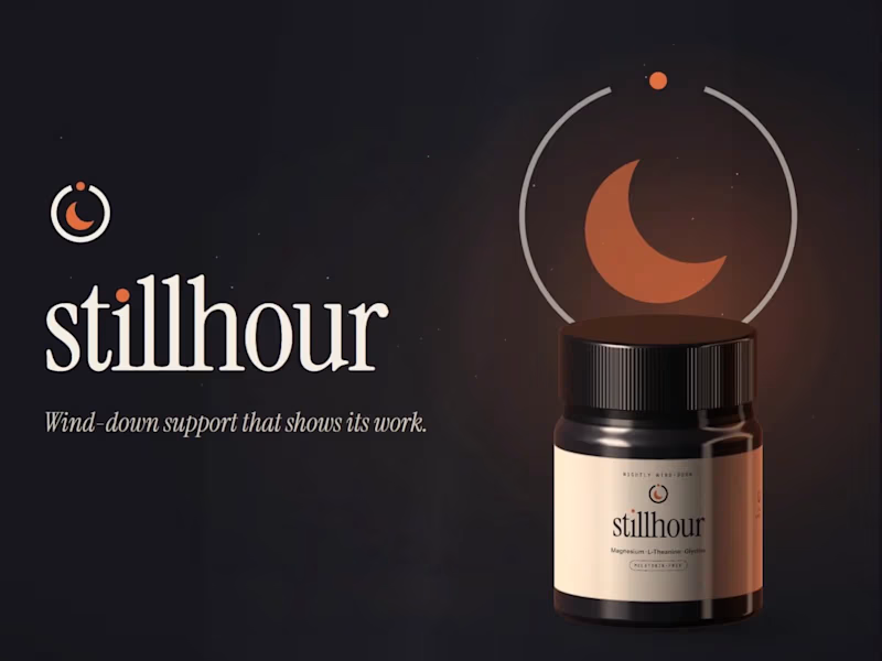
Stillhour: Supplement Brand Identity (Concept)
Stillhour is a self-initiated brand identity concept. The brand is fictional and there was no client. It imagines a melatonin-free drink you stir into warm water before bed to support your wind-down routine.
The strategy started with one problem. Independent lab studies keep finding melatonin products that don't match their labels, so careful buyers have stopped trusting the category. Stillhour's answer is to show its work: every dose printed in full, and a lab report for every lot, linked from the jar.
The mark is a dial that stops at the right hour, with a crescent for stillness. Warm ember on deep night replaces the usual purple sky.
Included: a one-page strategy, logo suite, type and color system, jar and refill packaging with a full side panel, web hero, three social templates, a guidelines page, and an animated logo with custom sound.
1
194
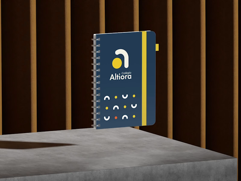
Torna-te quem tu és. Become who you are.
That is the motto of Colégio Altiora, and the whole identity starts from it. Altiora is Latin for "higher things", so the symbol is a small "a" built from two pieces, an arch that rises and a yellow ball.
From those two pieces came everything else. The patterns, the brand elements, the icons for the school app, the classroom signs and the uniform all share the same arch and the same ball.
A school for those who always reach higher.
17
23
1.1K


Talking Therapies UK | Brand Design
This is an own private practice, that provides evidence based, quality Psychotherapy services for individuals whom are seeking treatment for a range of mental health difficulties.
The solution was to create a chearful and bright brand. The icon represents the talking act but also the good feeling of share our worries. A serif typography was choosen to give more credibility once the icon is funier.
1
189




What a joy it’s been working with Bandeiras FC! They came to us growing fast with giant flags, stadium-sized prints, and bold graphics that lit up the stands, but they felt their brand look wasn’t keeping up.
So we dove in deep: studied the market, sharpened their purpose and values, repositioned the brand, and built a visual identity that screams quality, speed, and the passion they bring to everything they do. Jerseys, business cards, digital portfolio... everything lined up perfectly.
An amazing partnership. They embraced every idea we brought with total trust. The result turned out incredible, and I’m truly grateful for the opportunity!
Check out on Instagram @bandeirasfc to see more of this project.
#strategicdesign #kingostudio
1
104