Soul Brand Transformation for a Dual Audience
Creating a Brand for Two Opposite Audiences
Soul was already used by millions of students in public and private schools across Brazil. The program worked, educators trusted it, government institutions evaluated it regularly. But everything was analog. When the company decided to build a digital platform with gamification and AI, we needed to rethink the brand. The challenge was clear: how do you create an identity that works for institutional decision makers and for the students who would use it every day?
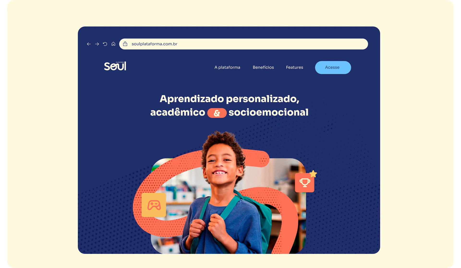

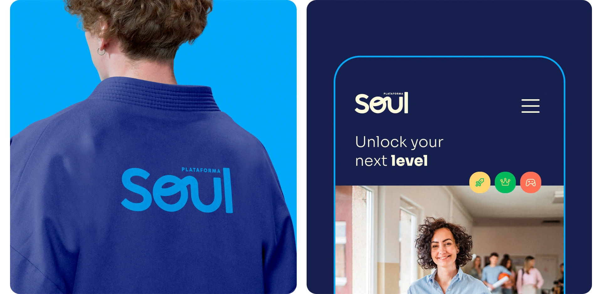
The tension became obvious quickly. School administrators and government partners need to see structure, clarity and credibility. Students need color, energy and reasons to stay engaged. We explored different approaches and realized the brand couldn't commit to just one audience. It had to adapt depending on who was interacting with it, without losing consistency.

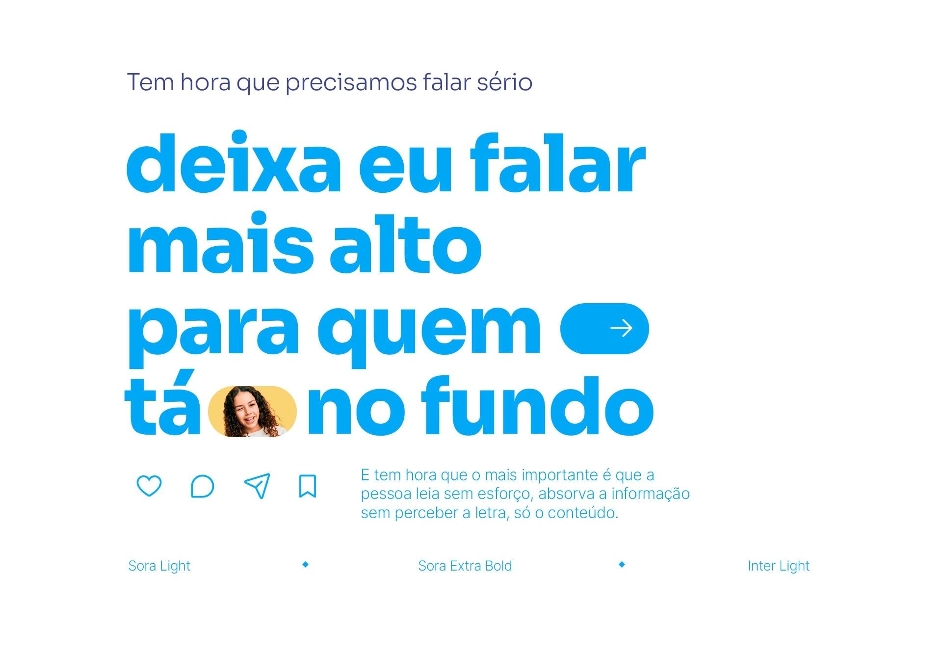
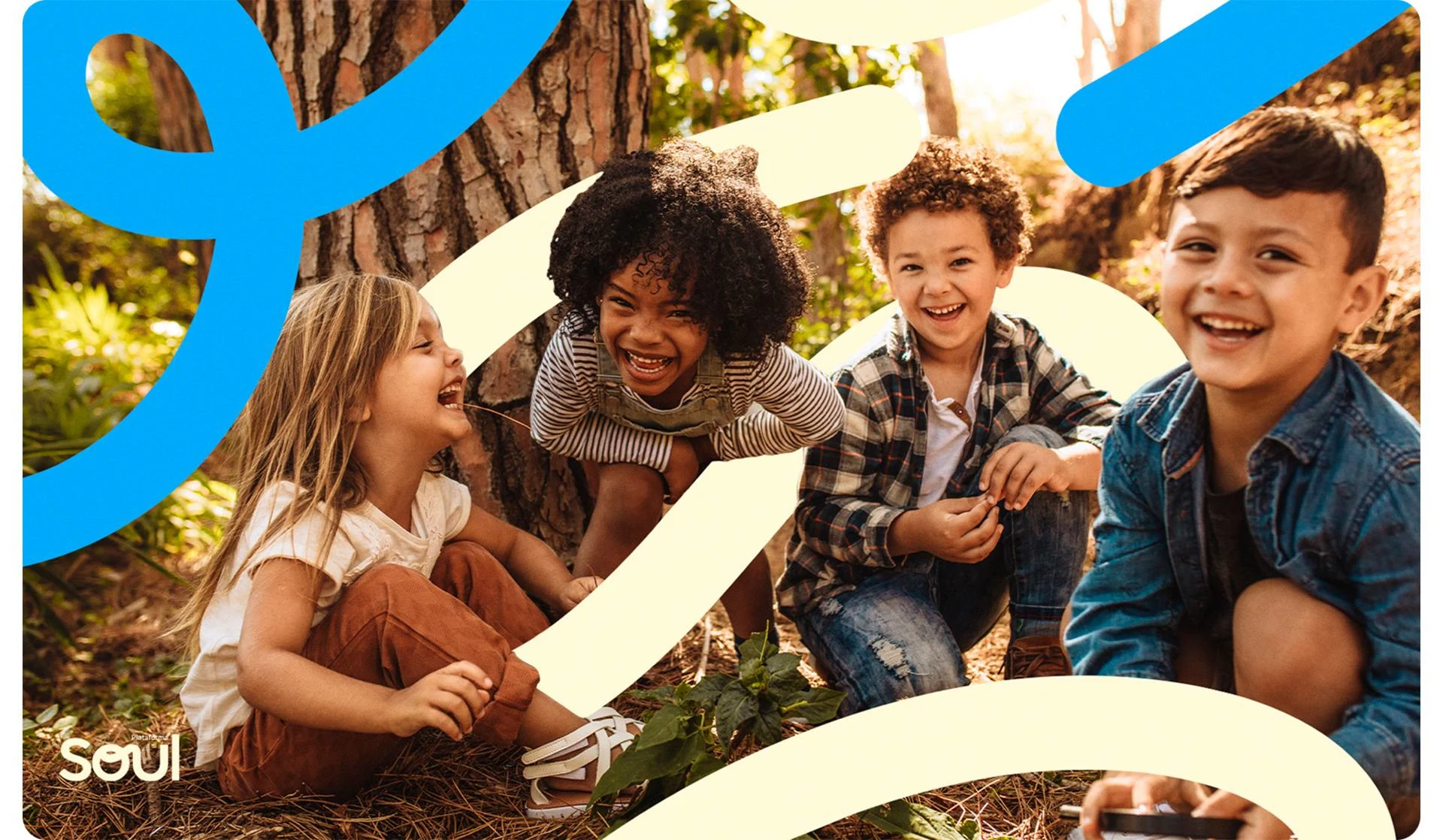
We built a visual system that operates on a gradient. Institutional materials use a restrained palette and focus on readability. As the communication gets closer to teachers and students, secondary colors and more expressive elements start appearing. The system uses Inter for consistency and a display typeface that can feel formal in a government document or playful inside the platform. The logo follows the same logic, combining digital precision with a subtle cursive detail.
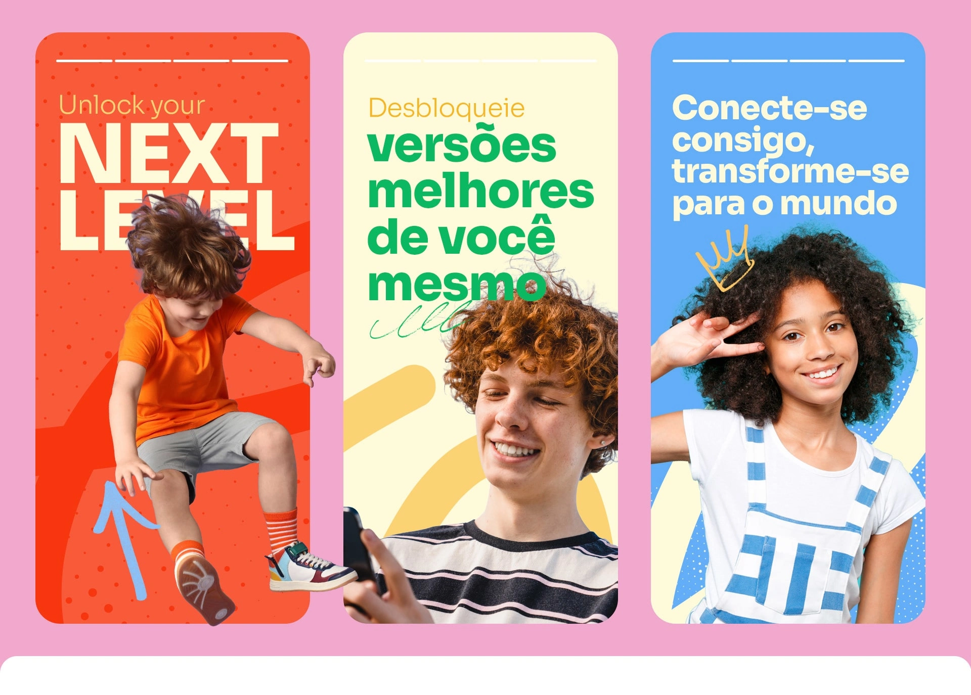
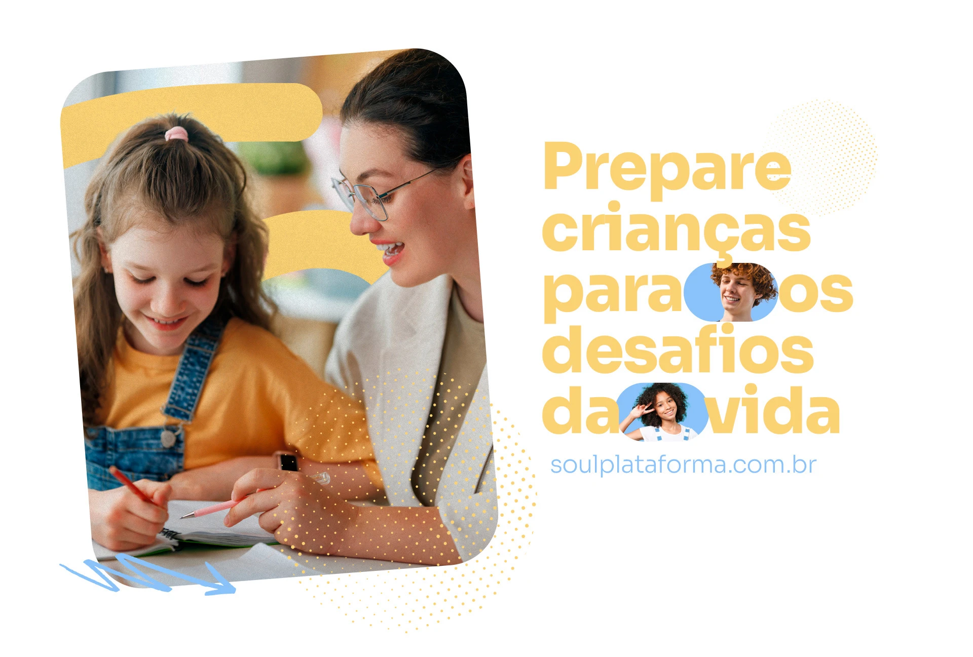
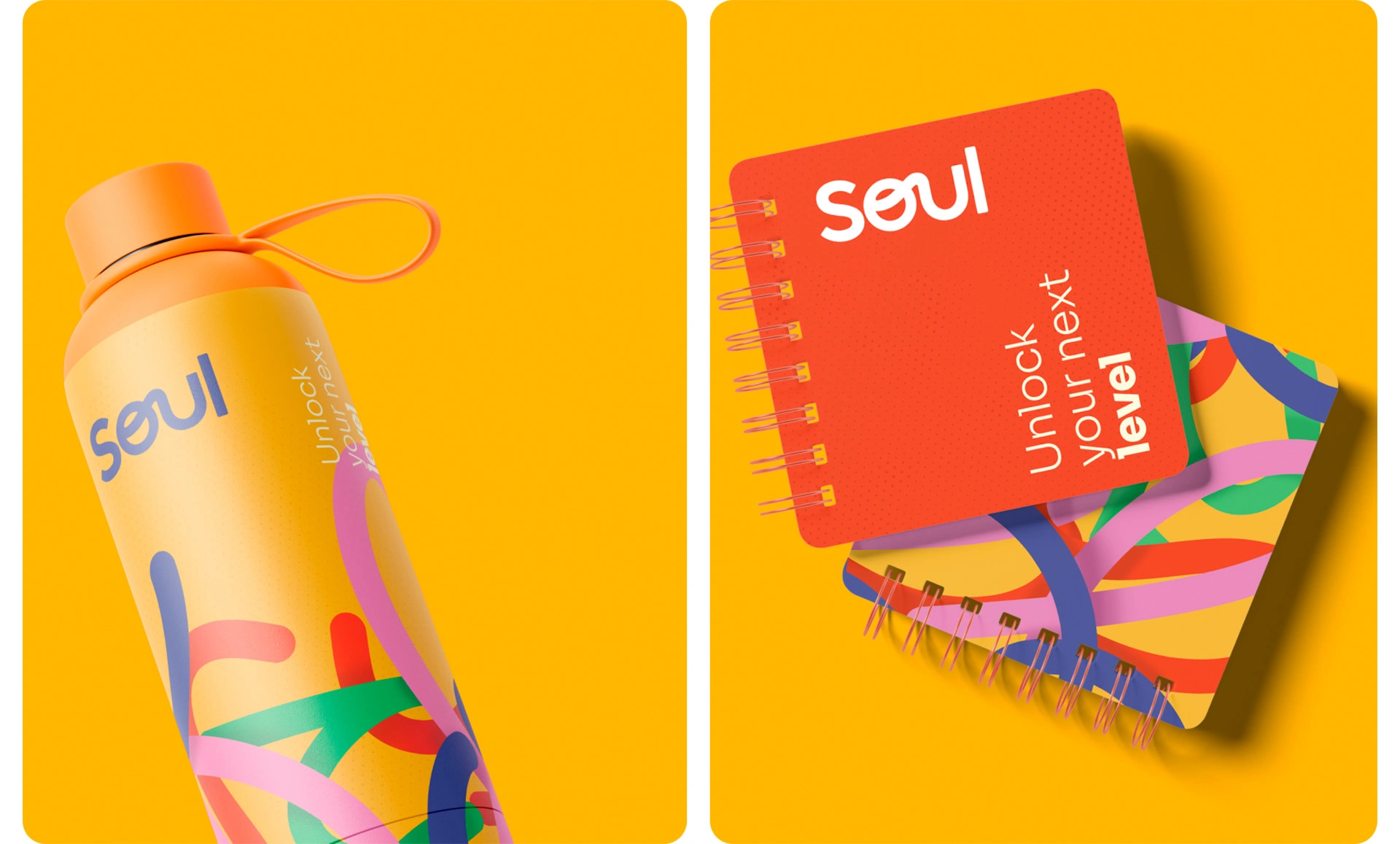
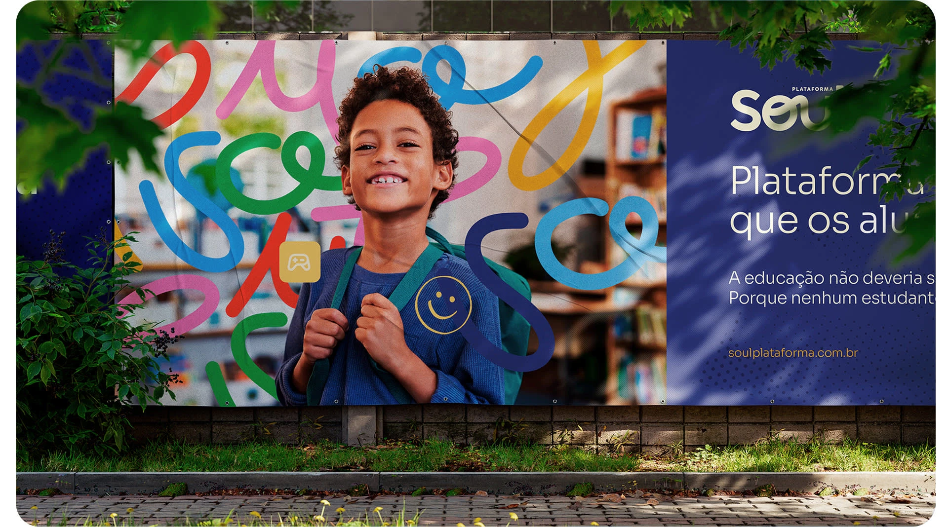
The brand now moves from boardroom presentations to student dashboards without breaking. It respects the seriousness of educational decisions while creating space for discovery and engagement. The system gave the company a foundation to transition millions of students from workbooks to a digital experience that needed to feel both meaningful and approachable.
Like this project
Posted Dec 5, 2025
Rebranding Soul to serve both institutional stakeholders and students as it moved from analog to digital.
Likes
0
Views
1
Clients
Soul


