


ARK — Inventory Management SaaS: Motion Design & Video Editing for an Inventory Management Platform
ARK is a web-based inventory management platform that helps businesses manage stock, warehouses, procurement, and orders without relying on spreadsheets.
The goal was to create engaging motion-design videos that clearly communicate ARK’s features, value, and how it simplifies inventory management.
I handled the video editing, motion design, visual storytelling, and creative execution for the project.
I also collaborated with another designer on specific 2D animation elements to bring some of the product visuals to life.
One of the biggest challenges was managing an evolving creative direction.
The project involved frequent creative changes and multiple rounds of revisions, making it difficult to maintain a clear scope and production timeline.
I adapted the videos to the evolving requirements while maintaining visual consistency and collaborated with another designer on the 2D animation.
The project taught me the importance of clear scopes, revision limits, timelines, and client response terms—helping me build a more structured workflow for future projects.
0
145

Unfog Your Mind — Book Design & Publishing Project
Reclaiming Mental Clarity and Productivity
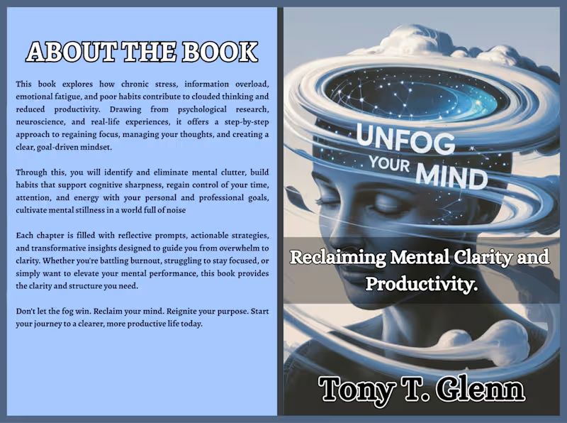
I had the opportunity to work on the book presentation for Unfog Your Mind by Tony T. Glenn, a practical book focused on overcoming mental clutter, chronic stress, information overload, emotional fatigue, and unproductive habits.
The goal was to create a professional visual presentation that communicates the book’s central message—moving from mental fog to clarity—while keeping the design clean, modern, and engaging.
What I Worked On
Book cover design and visual direction
Back-cover layout and content organization
Typography and hierarchy
Professional text placement
Visual consistency between the front and back cover
Reader-focused presentation for a publishing-ready finish
Design Approach
The visual concept uses an abstract human mind surrounded by layered, orbit-like elements to represent mental overload, information, distraction, and cognitive clutter.
The cool blue visual palette reinforces the themes of calm, clarity, focus, and mental restoration, while the bold typography gives the title and core message strong visual impact.
The back cover was structured to clearly communicate what readers can expect from the book, highlighting its practical approach to developing focus, managing thoughts, improving productivity, and creating a clearer mindset.
The Result
A professional book presentation designed to help the book communicate its message before the reader even opens the first page.
From mental fog to clarity. From overwhelm to focus.
I help authors transform their manuscripts and ideas into professionally presented books—from editing and formatting to cover design and Amazon KDP publishing.
0
104
The design for "Marky24 Foodhub" was created to feel as warm, trustworthy, and authentic as the food it represents.
The goal was to build a visual identity that feels simple, recognizable, and rooted in culture, while still being modern and scalable.
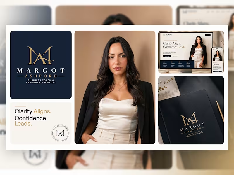
The logo features a clean badge-style mark paired with friendly, bold typography—almost like a seal of quality on every product. The green and orange color palette brings a sense of freshness, nourishment, and energy, reinforcing the idea of natural ingredients and rich Nigerian flavors.
What makes the identity truly work is how easily it adapts. From food packaging and export boxes to social media, delivery bags, and digital platforms, the brand always feels consistent and familiar.
0
110

I turned a simple snack into a craving. Choosen Original Egg Roll.
People don't buy snacks with their eyes closed. They buy with craving.
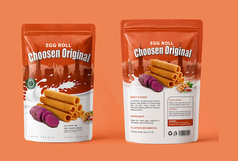
For Choosen Original Egg Roll, the brief was clear — make it look crispy, crunchy, delicious and unforgettable on the shelf. So I built a story around the crunch itself.
The top half is bold city energy with deep orange that pops on any supermarket shelf. The bottom half is pure indulgence, a splash of milk for creaminess and freshness, stacked golden egg rolls that look so crispy you can almost hear them, and the sliced purple yam that tells you instantly this is not your regular flavor, this is original.
I added small details that sell, the Original Foods Industry seal for trust, the small serving shot with dip for appetite, and the tagline at the bottom, YOUR CRUNCH. YOUR CHOICE. It is personal. It makes the buyer feel like this snack was made for their moment.
This is packaging design that does not just sit, it sells.
If you have a food product, snack, or consumer brand that needs to stand out and get picked up, let's create your bestseller packaging.
DM me "CRUNCH" to get your own product packaging that converts.
#PackagingDesign #FoodPackaging #SnackPackaging #EggRollDesign #ProductPackaging #PouchDesign #ChoosenOriginal #FoodBranding #PackagingDesigner #GraphicDesigner #BrandDesigner #DesignThatSells
1
169