Projects in Rajshahi Division
Projects in Rajshahi Division
Sign Up
Post a job
Sign Up
Log In
Filters
1
Projects
People
Message
0
Md Toufic Ahmed Khan Badhon
pro
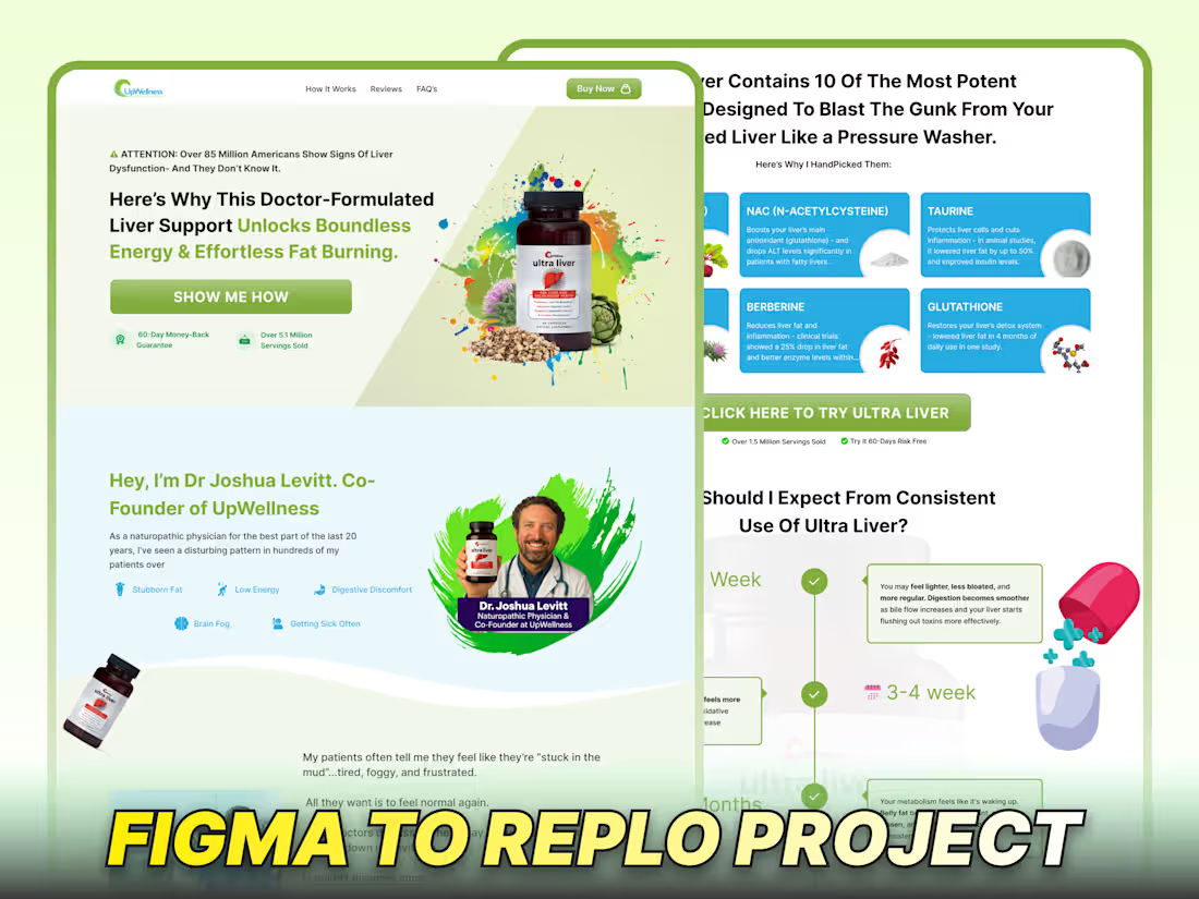
Figma Design + Replo Development For Ultra Liver
0
45
Message
0
Wasi Sorkar
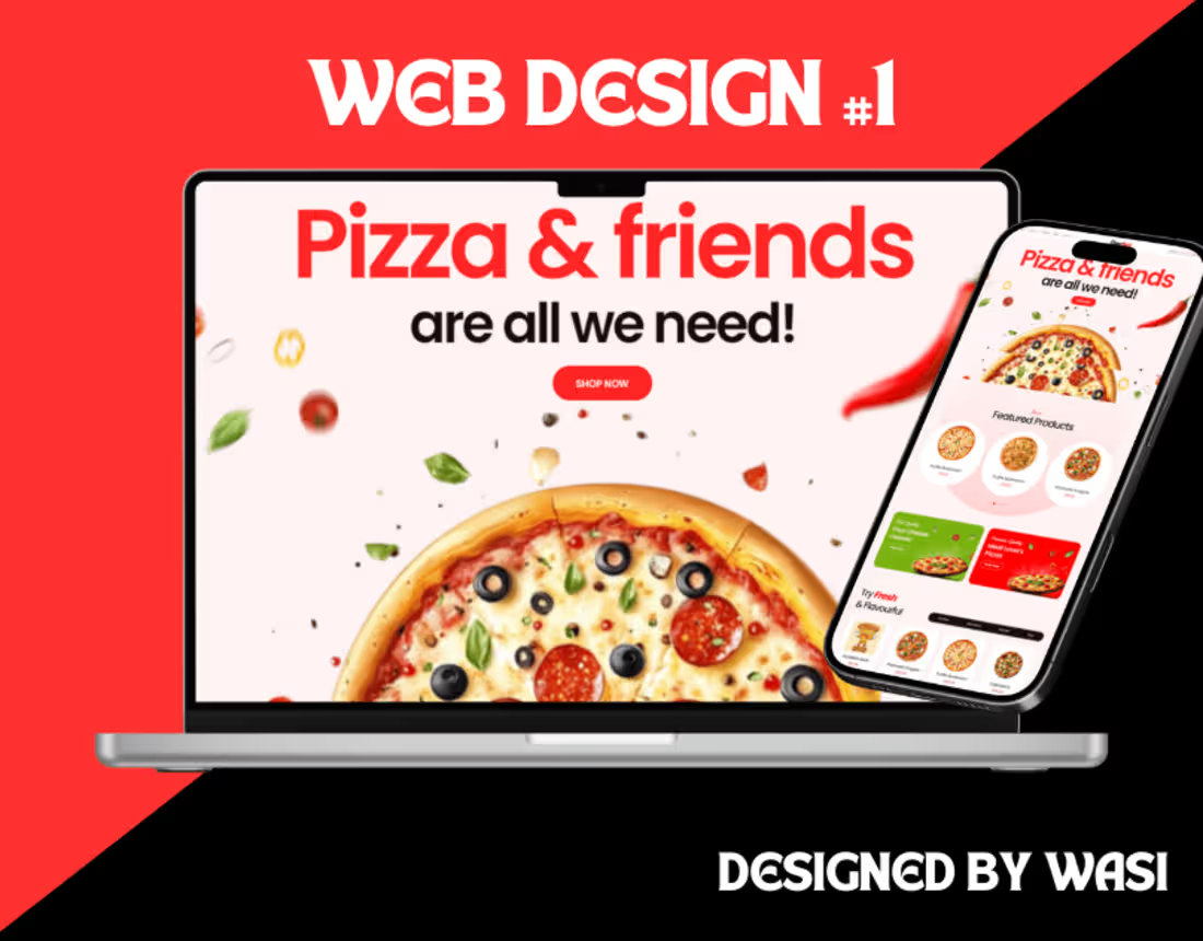
Pizza Shop Website
0
14
Message
0
md zakiul haque
pro
Motion design for dental implant course
0
0
Message
0
Alex Smith
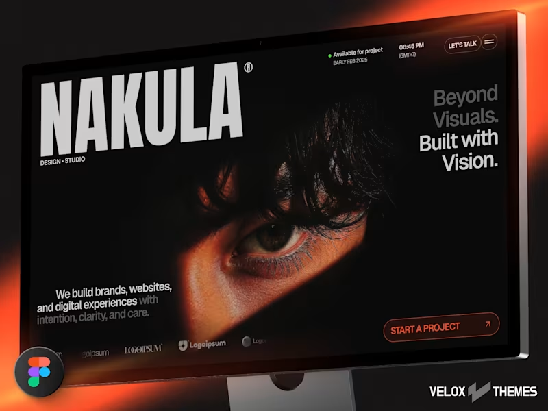
Portfolio Website
0
11
Message
1
Humaun Atelier
pro
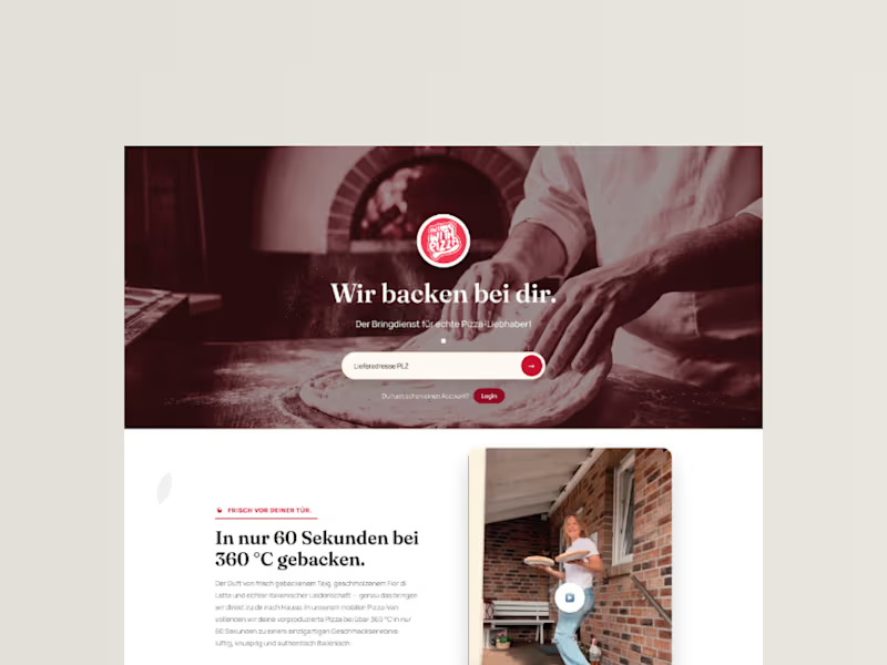
InLoveWithPizza Premium Landing Page Redesign
1
5
Message
2
Md Zahid Hasan Khan
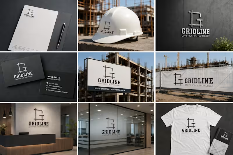
Project Overview: Gridline is a concept project tailored for a modern construction technology firm. The objective was to design an impactful lettermark logo that instantly communicates durability, engineering precision, and modern construction practices. Design Strategy: Iconography: Integrated the letter 'G' with steel reinforcement bars (rebar) to represent structural integrity and modern building frameworks. Typography: Paired with a bold, modern serif/slab typeface for the primary brand name to emphasize strength and reliability. Color Palette: Monochrome/dark grey tone to keep the feel industrial, professional, and clean. Deliverables: Logo Mark & Wordmark Brand Identity Assets Are you looking for an impactful visual identity for your business? Let's work together! Feel free to reach out via Contra.
2
20
Message
0
Sharmin Suraiya
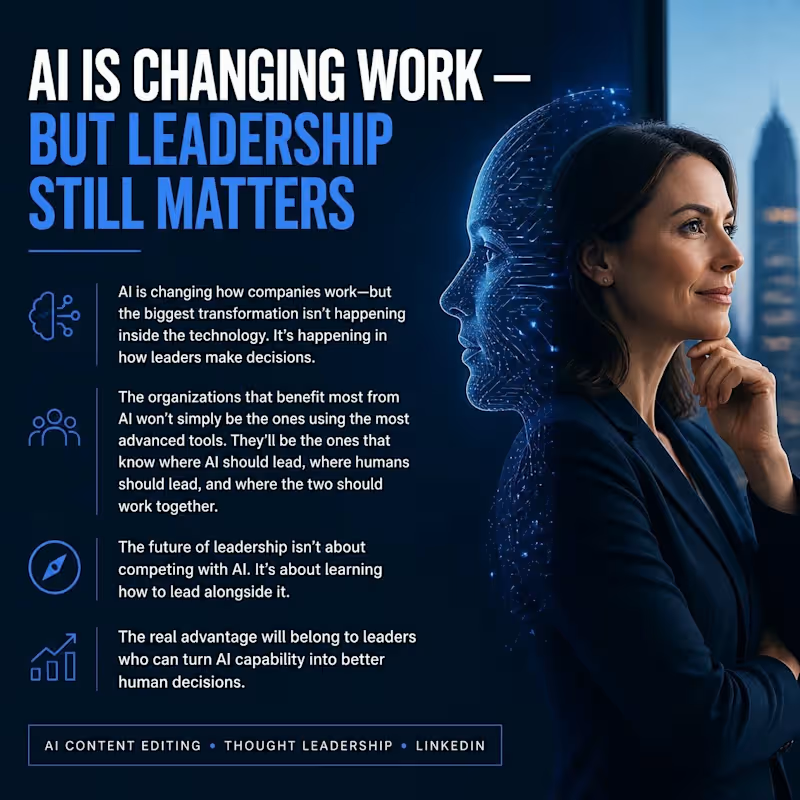
AI Content Editing & LinkedIn Thought Leadership Sample This sample demonstrates my ability to create and refine AI-assisted content for a professional LinkedIn audience. I focused on clear messaging, natural English, strong editorial structure, executive-level tone, and audience engagement. The content is designed to communicate complex ideas about AI and leadership in a concise, credible, and professional way while maintaining a human voice.
0
15
Message
4
Md. Abdur Rahman
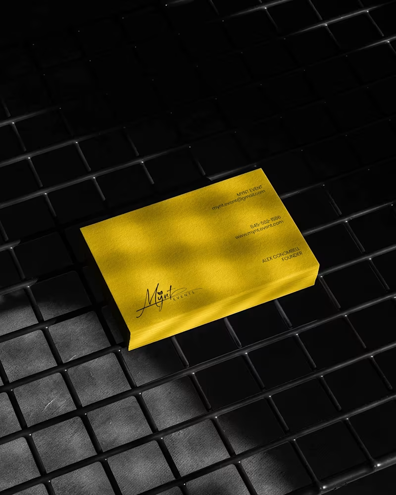
Luxury Brand Identity System for a Premium Event Planning Business PROJECT DESCRIPTION: Mynt Events is a premium event planning business built around moments that matter — proposals, curated celebrations, and experiences where every detail is considered and nothing is left to chance. The founder came to me with a business that had already outgrown its brand. The work was operating at a premium level. The identity wasn't communicating that yet. The brief was clear: build a complete brand identity system that positions Mynt Events as the obvious choice for clients who already know what they want and are deciding who to trust with it. The Strategic Starting Point Every decision in this project started with a single question: what does a client need to feel the moment they encounter this brand for the first time? For Mynt Events, that feeling needed to be confidence. Trust. The quiet certainty that this is a business that handles things properly — that the moment they're planning will be in the right hands. That emotional target shaped every mark, every color choice, and every surface application that followed. The Logo The primary mark is a signature script logo with a leaf detail structurally embedded within the letterforms. The script was chosen deliberately — in the events industry, clients are trusting you with moments that cannot be redone. A signature communicates personal commitment. It feels authored, not assembled. The leaf element does secondary brand work quietly. It signals organic intention, care, and attention to detail without requiring explanation or a separate icon. The underline sweep grounds the composition and gives it the horizontal confidence it needs to hold across wide-format surfaces — packaging lids, signage panels, and environmental applications where a floating mark would lose presence. A monogram M was developed as a secondary mark for applications where the full signature loses legibility at small scale — product labels, cap patches, and interior packaging details. The Palette Gold and black. Not chosen for trend. Chosen for emotional function. Gold carries warmth, occasion, and perceived value — the feeling of something worth celebrating. Black carries authority, precision, and restraint — the feeling of a business that delivers without drama. Together they position Mynt Events exactly where it needs to sit: celebratory but controlled, personal but professional. The palette was tested across matte, gloss, foil, backlit, and fabric applications to confirm it held integrity across every surface in the system without compensation or adjustment. The Full Identity System Every deliverable was designed as part of a single coherent brand expression — not a collection of individual design tasks, but a system where every piece reinforces every other piece: — Primary signature logo and monogram secondary mark — Full brand palette and typography hierarchy — Premium gold foil business card — Luxury magnetic gift box with full interior branding — Ring box and product packaging application — Branded tote bag — Apparel — t-shirt and structured cap with patch application — Backlit environmental signage panel — Digital UI and mobile wallpaper application The Result A brand identity system that closes the gap between what Mynt Events delivers and what a client sees before they ever make contact. The brand now works at a proposal ring box and a storefront signage panel simultaneously — with the same presence, the same authority, and the same unmistakable identity at every scale. That's not styling. That's positioning. And positioning is what turns a great business into the obvious choice. SERVICES INCLUDED IN THIS PROJECT: Brand Strategy, Logo Design, Visual Identity System, Monogram Design, Business Card Design, Luxury Packaging Design, Gift Box Design, Apparel Design, Environmental Signage Design, Digital UI Application, Brand Collateral Design, Full Brand System KEYWORDS: Luxury Event Brand Identity, Signature Logo Design, Event Planner Branding, Gold Brand Identity, Script Logo Design, Visual Identity System, Custom Logo Design, Brand Identity Designer, Luxury Logo Design, Event Brand Design, Handcrafted Logo Design, Premium Brand Identity, Calligraphy Logo Design, Brand Mockup Design, Logo Design Concept, Black And Gold Branding, Event Planner Logo, Signature Brand Identity, Full Brand System, Brand Strategy Design
2
4
103
Message
0
Syed Shihab
pro
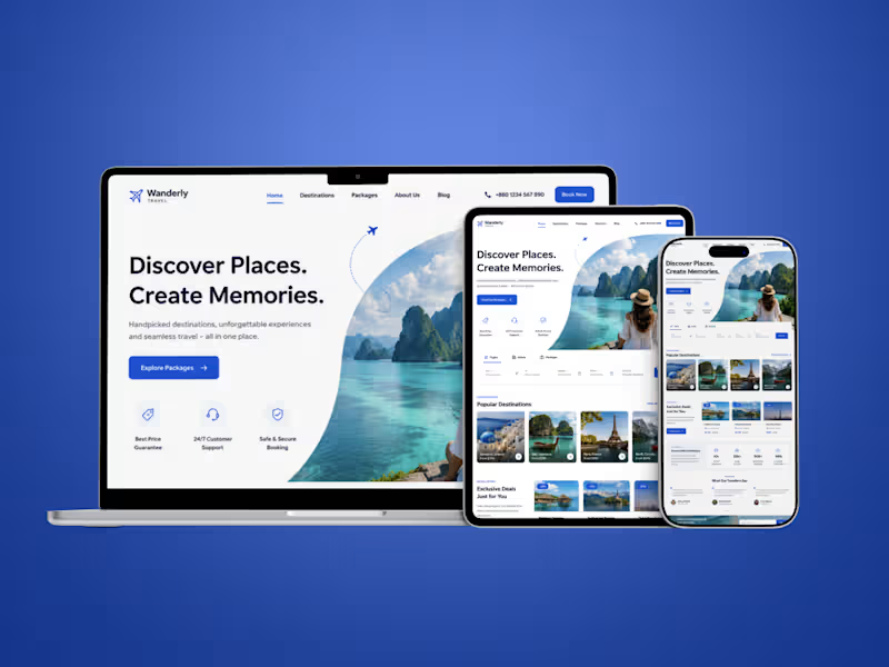
Wanderly Travel- Full Website Design & Development
0
136
Message
0
AI Sohan
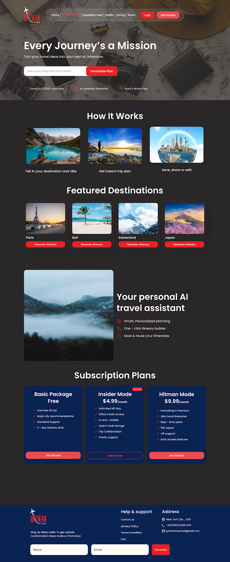
Most travel websites help you search. But what if they helped you decide? I’ve been exploring how AI can make travel planning feel less like research and more like a conversation. Instead of opening 20 tabs for: → Flights → Hotels → Places to visit → Restaurants → Activities → Budget Imagine simply saying: “I have 5 days, a $1,500 budget, and I want a relaxing trip with some adventure.” The website understands the context. Then it builds the experience around you. That’s where I see the real opportunity with AI travel products. Not just adding a chatbot to a website. But using AI to understand intent, connect information, and reduce decision fatigue. Good travel technology helps you find options. Great travel technology helps you choose the right ones. The future of travel websites won’t just be about better search. It will be about better decisions.
0
45
Message
1
Md Mamun Hossain
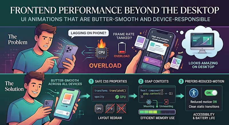
"The animations look amazing, but why is the page lagging on my phone?" The Problem: We’ve all seen modern websites loaded with high-end scroll effects, smooth micro-interactions, and floating cards. On a powerful developer desktop, it looks stunning. But hand it over to a user on a mid-range mobile device or a battery-saving laptop, and the frame rate tanks. The issue is that heavy animations are often tied directly to the browser’s main rendering thread. When your visual effects start competing with data fetching and DOM updates, the entire user experience grinds to a halt. The Solution: Smooth animations shouldn't cost you user performance. If you want high-end motion that stays butter-smooth across all devices, here is the 3-step technical approach to use: Animate Only the "Safe" CSS Properties: Never animate properties that trigger a layout redraw (like width, height, top, or margin). Stick strictly to transform (for moving/scaling) and opacity. These are handled directly by the GPU, bypassing the heavy CPU rendering pipeline. Isolate with GSAP Contexts: If you are building dynamic user interfaces in React or Next.js, use a dedicated animation library like GSAP paired with useGSAP() or explicit context cleanup. Unmounted components with leftover scroll triggers will quietly eat up device memory in the background. Respect prefers-reduced-motion: Always add a media query check for reduced motion. If a user has motion sensitivity or low-power mode enabled on their operating system, serve them clean, static transitions instead of complex scroll triggers. It’s better for accessibility and saves battery life. Visual polish should enhance the user experience, not break it. What’s your go-to strategy for balancing heavy UI animations with real-world website performance? Let’s chat in the comments! 👇
2
1
93
Message
1
Masum Ahammed
Premium Fintech & SaaS UI/UX Design | Modern Core Banking Web Design Welcome to my latest UI/UX design showcase. This project features a modern, intuitive, and high-converting web interface crafted specifically for Fintech platforms, SaaS products, and Core Banking solutions. As a digital designer committed to crafting exceptional user experiences, my goal with this project was to combine sleek aesthetics with a conversion-focused layout. The design emphasizes clarity, security, and seamless navigation to ensure users enjoy a frictionless banking and financial management journey. Key Features of this UI/UX Project: Conversion-Driven Layout: Optimized CTA placements, structured content hierarchy, and intuitive navigation flows designed to drive user engagement. Modern & Clean Visual Aesthetic: A sophisticated color palette and modern typography tailored to build trust and authority for financial brands. Interactive Showcase: Dynamic visual elements and smooth transitions that bring complex banking workflows to life. Developer-Ready Assets: Clean Figma component architecture, flexible auto-layouts, and responsive design systems ready for seamless implementation. Whether you are launching a new Fintech startup, revamping an existing SaaS application, or building custom web UI/UX solutions, I am here to help transform your vision into an impactful digital reality.
1
65
Message
0
Md Arifur Rahman
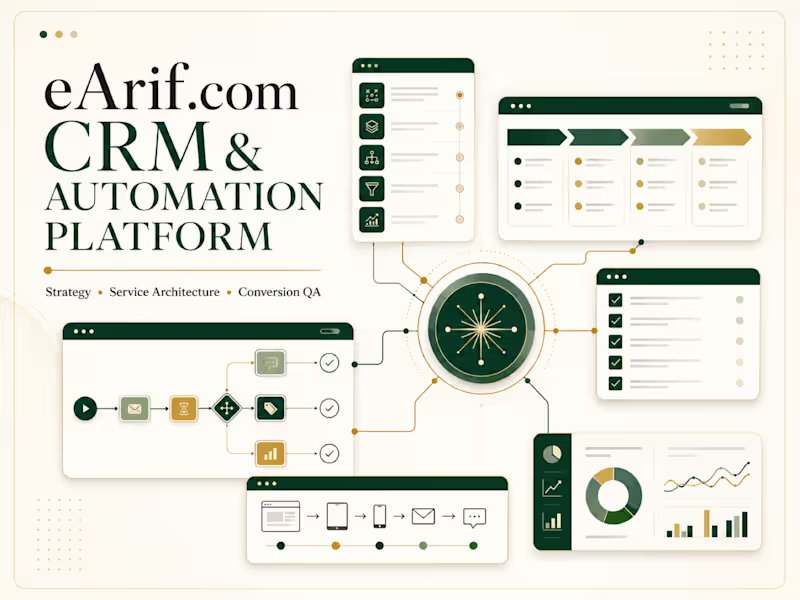
eArif.com — CRM & Automation Service Platform
0
7
Message
1
Ferdausur Rahman
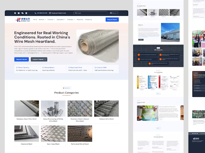
⚙️ Built a B2B Mesh Manufacturing Website Designed to Generate Sales Manufacturing websites shouldn’t just look industrial—they should help businesses win more enquiries and sales. For this project, I designed a modern B2B mesh manufacturing website focused on: → Clear product & service presentation → Strong industrial branding → Easy navigation → Conversion-focused UX → Trust-building content → Qualified lead generation The goal: turn a traditional manufacturing website into a professional digital sales tool. Built with B2B buyers in mind. 🎯
1
66
Message
0
Md Rashed Mia
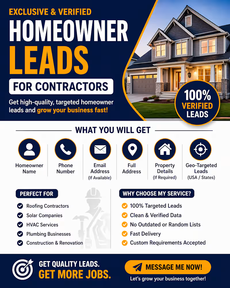
🚨 High-Quality Homeowner Leads for Contractors | Verified Data | USA Targeted 🚨 Are you a contractor looking for real homeowners who are ready for your services? I will provide you with verified homeowner leads that are highly targeted and ready for outreach. 🔹 What you will get: • Homeowner Name • Phone Number • Email Address (if available) • Full Address • Property Details (if required) • Geo-targeted leads (USA / specific states) 🔹 Perfect for: • Roofing Contractors • Solar Companies • HVAC Services • Plumbing Businesses • Construction & Renovation Companies 🔹 Why choose my service: ✔ 100% targeted leads ✔ Clean & verified data ✔ No outdated or random lists ✔ Fast delivery ✔ Custom requirements accepted 💬 Feel free to contact me before placing an order to discuss your target area and requirements.
0
102
Message
0
Md Shafi
Dev
0
4
Explore projects