The network for creativity
Join 1.25M professional creatives like you
Connect with clients, get discovered, and run your business 100% commission-free
Creatives on Contra have earned over $150M and we are just getting started
Back to feedPost


Premium Fintech & SaaS UI/UX Design | Modern Core Banking Web Design
Welcome to my latest UI/UX design showcase. This project features a modern, intuitive, and high-converting web interface crafted specifically for Fintech platforms, SaaS products, and Core Banking solutions.
As a digital designer committed to crafting exceptional user experiences, my goal with this project was to combine sleek aesthetics with a conversion-focused layout. The design emphasizes clarity, security, and seamless navigation to ensure users enjoy a frictionless banking and financial management journey.
Key Features of this UI/UX Project:
Conversion-Driven Layout: Optimized CTA placements, structured content hierarchy, and intuitive navigation flows designed to drive user engagement.
Modern & Clean Visual Aesthetic: A sophisticated color palette and modern typography tailored to build trust and authority for financial brands.
Interactive Showcase: Dynamic visual elements and smooth transitions that bring complex banking workflows to life.
Developer-Ready Assets: Clean Figma component architecture, flexible auto-layouts, and responsive design systems ready for seamless implementation.
Whether you are launching a new Fintech startup, revamping an existing SaaS application, or building custom web UI/UX solutions, I am here to help transform your vision into an impactful digital reality.

The network for creativity
Join 1.25M professional creatives like you
Connect with clients, get discovered, and run your business 100% commission-free
Creatives on Contra have earned over $150M and we are just getting started



Related posts


Fantastic execution man, what is the billboard for?

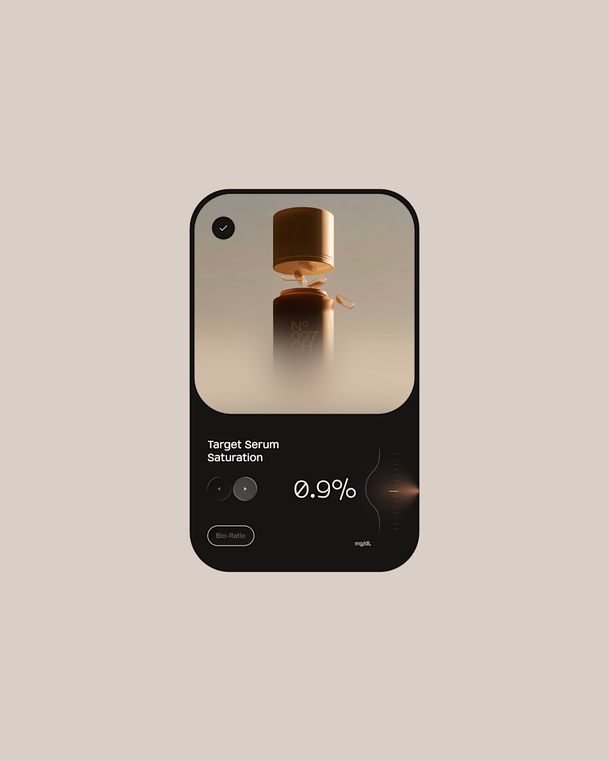
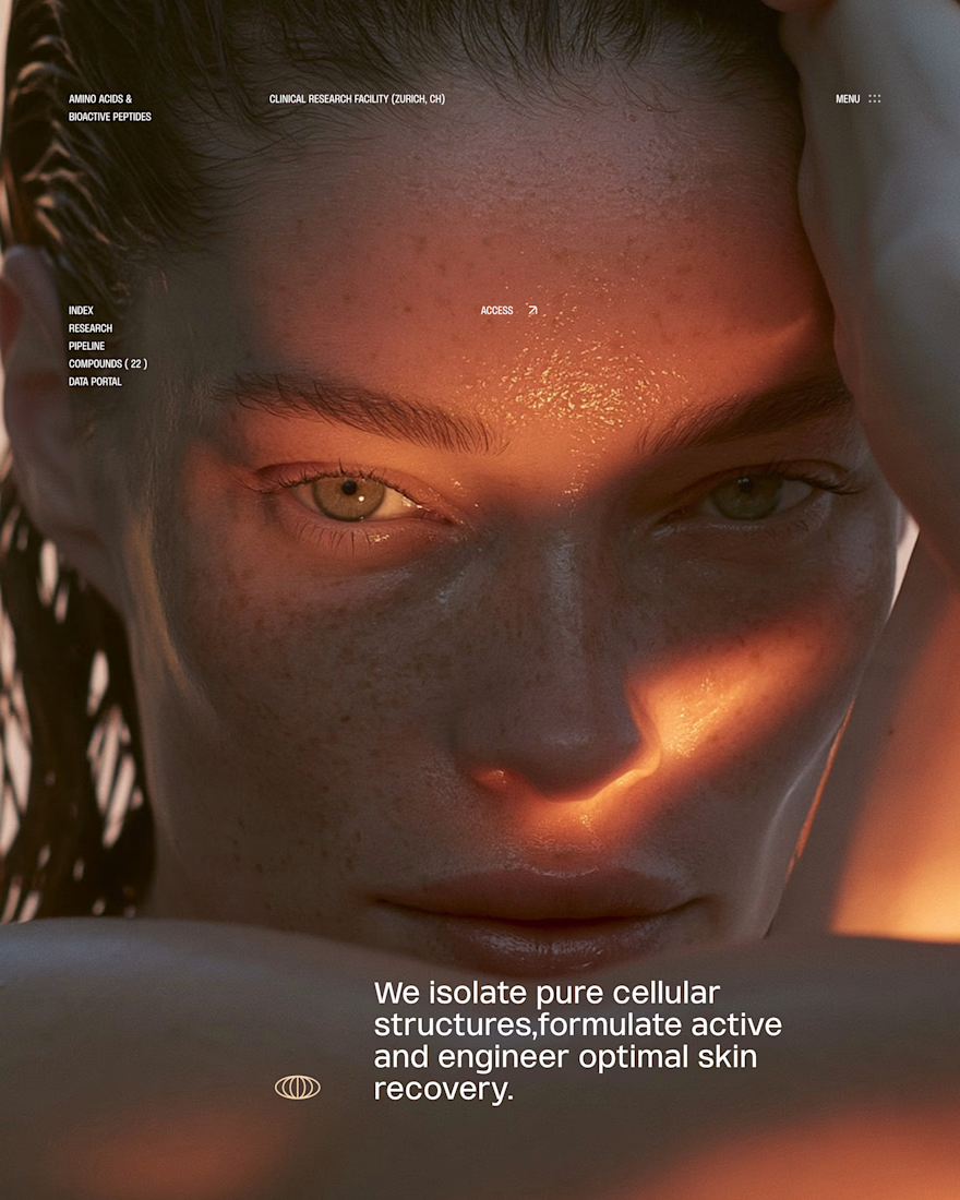
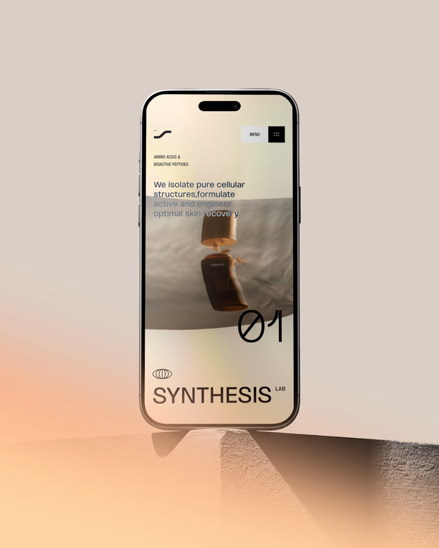
Hot take: Interaction isn't just decoration. It is the brand
I built this visual concept for a Peptides brand using WebGL and fabric physics. The fluid motion isn’t a gimmick it’s the core identity.



GOATED

What should a creative agency website actually feel like?
For Orvika, we didn't want another agency site built around the same safe layouts and predictable sections.
We pushed the visual direction further with oversized typography, editorial layouts, bold imagery, and stronger contrast, while keeping the experience structured enough to communicate the agency's work and capabilities clearly.
The goal wasn't just to make it look different.
It was to make the agency feel different.
Designed in Figma and built in Framer.
We're sharing more of the websites and digital experiences we've been working on here over the next few weeks.


Very neat man