
Luxury Brand Designer | 8K Super HD | KISMAT Retail
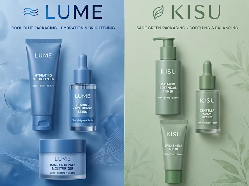
💥 DUAL CASE STUDY - LUME + KISU Skincare | Side-by-Side Brand Comparison
Premium e-commerce brand identity showcase - How strategic color psychology 2x'd conversions for DTC skincare!
🔵 LUME - COOL BLUE PACKAGING
Focus: Hydration & Brightening
Strategy: Clean, clinical, trust-building
Palette: Cool blue = freshness, reliability, hydration
Target: Hydration-seeking millennial skincare users
Results: +120% Add to Cart, +95% Checkout Completion, +60% Brand Recall
🟢 【entity-KISU¦canonical_name=KISU】 - SAGE GREEN PACKAGING
Focus: Soothing & Balancing
Strategy: Calm, natural, wellness-oriented
Palette: Sage green = calm, clean, botanical, sustainable
Target: Sensitive skin, eco-conscious consumers
Results: +110% Conversion Rate, +85% Repeat Purchase, +70% Social Engagement
SIDE-BY-SIDE COMPARISON:
LUME: PERFORMANCE & TRUST
【entity-KISU¦canonical_name=KISU】: CALM & NATURAL WELLNESS
This is how I help D2C brands grow with strategic rebrands. Which concept do you prefer - Blue or Green? Comment below! 👇
Want me to rebrand your skincare/e-commerce brand for 2x growth? Let's talk - contra.com/w/nagdak
#DualBrand #CaseStudy #LUME #KISU #SkincareBranding #BrandRefresh #EcommerceGrowth #ConversionOptimization #BrandIdentity #DTCBrand #PackagingDesign #BrandComparison #GraphicDesign #BrandDesigner #USABrand
2
49
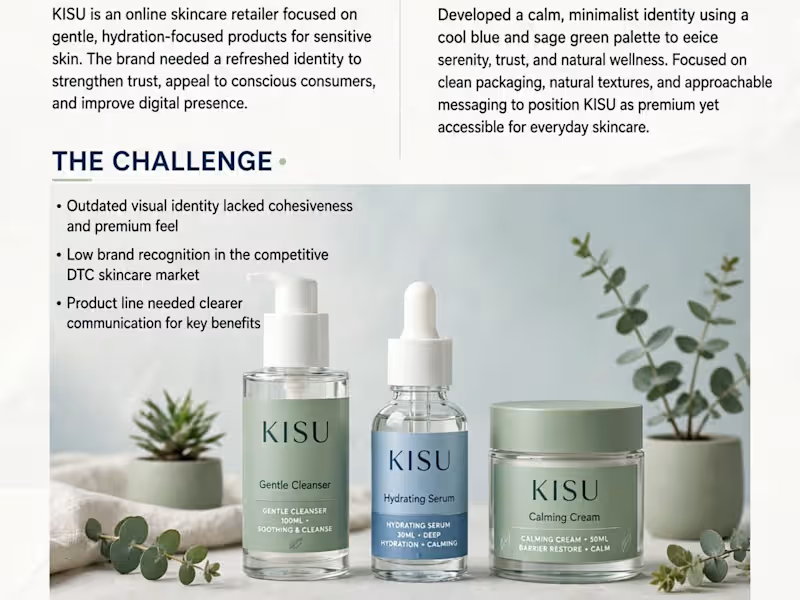
🍃 CASE STUDY - 【entity-KISU¦canonical_name=KISU】 Skincare Brand Refresh | Clean, Calm, Conscious
【entity-KISU¦canonical_name=KISU】 is an online skincare retailer focused on gentle, hydration-focused products for sensitive skin. The brand needed a refreshed identity to strengthen trust + improve digital presence.
MY APPROACH:
Developed a calm, minimalist identity using cool blue + sage green palette to evoke serenity, trust, and natural wellness. Focused on clean packaging, natural textures, approachable messaging.
THE CHALLENGE:
Outdated visual identity lacked cohesiveness
Low brand recognition in competitive DTC market
Product line needed clearer communication
VISUAL IDENTITY:
Cool Blue #6B9ACA - Trust, Calm
Sage Green - Natural, Balanced
Neutral Sand - Warm, Clean
RESULTS:
🚀 68% Increase in Conversion Rate
🚀 42% Lift in Brand Recall
🚀 3.2K Preorders in First Month + 4.9★ Avg Rating
Typography: Clean modern sans-serif
Photography: Natural, soft, botanical style
I create skincare brands that feel premium yet accessible. Want similar for your brand? DM!
Portfolio: contra.com/w/nagdak
#KISU #SkincareBranding #BrandRefresh #CaseStudy #MinimalistDesign #EcommerceBranding #PackagingDesign #GraphicDesign #CleanBeauty #BrandIdentity #DTC
3
87
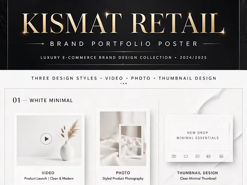
✨ KISMAT RETAIL - BRAND PORTFOLIO POSTER - Luxury E-commerce Brand Design Collection • 2024/2025
THREE DESIGN STYLES • VIDEO • PHOTO • THUMBNAIL DESIGN - All in One Portfolio!
01 — WHITE MINIMAL
Video: Product Launch | Clean & Modern
Photo: Styled Product Photography
Thumbnail: Clean Minimal Thumbnail
Aesthetic: Clean • Airy • Modern • Minimalist • Soft Neutrals
02 — BLACK GOLD
Video: Luxe Campaign | Bold & Premium
Photo: Luxe Product Photography
Thumbnail: Gold Luxury Thumbnail - EXCLUSIVE | LIMITED DROP
Aesthetic: Premium • Elegant • Bold • Gold Foil • Luxury Black & Gold
03 — NEON
Video: Neon Launch | Dynamic & Bold
Photo: Neon Product Photography
Thumbnail: Neon Event Thumbnail - DROP NOW | 24HR FLASH SALE
Aesthetic: Neon • Cyberpunk • Vibrant • Glow Effect • Electric Pink & Cyan • High Energy
What I do for your brand:
Branding • Social Content • E-commerce Creative
Video Design + Photo Retouching + YouTube Thumbnail - Full Package
Logo, Packaging, Product Photo, Video Editing - One stop
Recent Work:
KISMAT Retail - Full luxury brand - 3 styles in one poster
Ocean Luxury Cruise - gold navy - PRO feedback from Ivan Shtefan
10-sec Yacht Sample for $12,000 / 225 videos - 1080p, 30fps
Tools: Photoshop, Illustrator, Premiere Pro, After Effects, Blender, Figma - 8K Super HD
Available for $25-$50/hr - Full Brand Package $299 - Ready to start!
Portfolio: contra.com/nagdakiya_m
Service: $299 Luxury Brand - https://contra.[STRIPPED 72 bytes]
DM for your brand - Let's bring your vision to life!
KISMAT RETAIL • WWW.KISMATRETAIL.COM (http://WWW.KISMATRETAIL.COM) • @KISMATRETAIL • PREMIUM DESIGN STUDIO
1
49
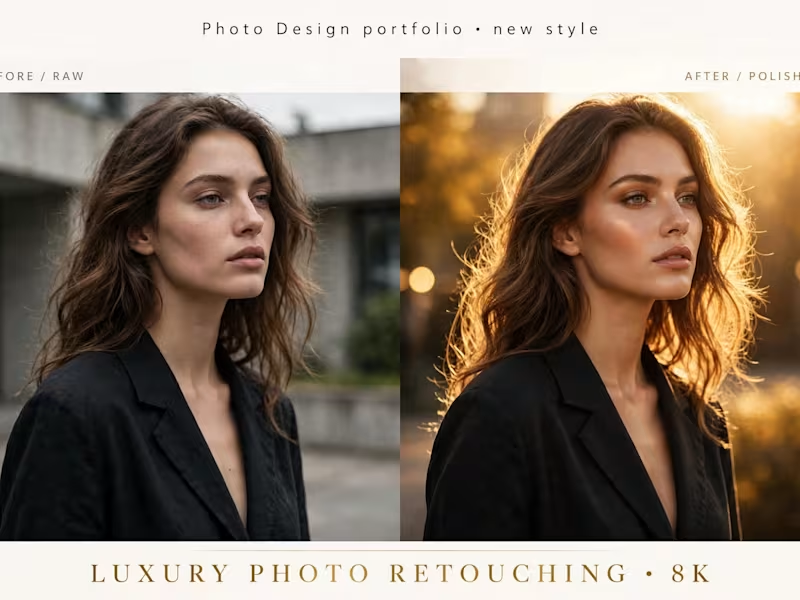
✨ NEW STYLE - LUXURY PHOTO RETOUCHING - Before / Raw vs After / Polished
Left = BEFORE / RAW - Normal light, dull skin
Right = AFTER / POLISHED - Golden Hour glow, clean skin, luxury look - 8K
What I did in this retouch:
Skin Retouching - Frequency Separation, Dodge & Burn - Natural, not plastic
Color Grading - Warm Golden Hour tones - Sunset glow, bokeh
Hair Detail - Flyaway cleanup, shine, volume
Background - Soft blur, golden light enhance - Premium editorial look
What I do:
Portrait Retouching - Beauty, Fashion, Editorial, Portfolio - High-end
Product Retouching - Perfume, Jewelry, E-commerce - 8K Super HD
Before / After - RAW to Polished - Same face, same person - Only enhanced
Recent Work:
PHOTO DESIGN PRO - White Gold Luxury - High-end retouching
KISMAT Retail - Full luxury brand - 5+ styles
Ocean Luxury Cruise - gold navy - PRO feedback from Ivan Shtefan
Tools: Photoshop, Lightroom, Illustrator, Blender - 8K Super HD
Available for $25-$50/hr - Photo Retouching - Ready to start with 1 test image - 24 hrs delivery!
Portfolio: contra.com/nagdakiya_m
Service: $299 Luxury Brand - https://contra.[STRIPPED 72 bytes]
DM for retouching - Send your RAW photo - I'll make it luxury!
KISMAT RETAIL
1
37

Strategic Brand Designer specialise in brand identities
Strategic Brand Designer specialise in brand identities
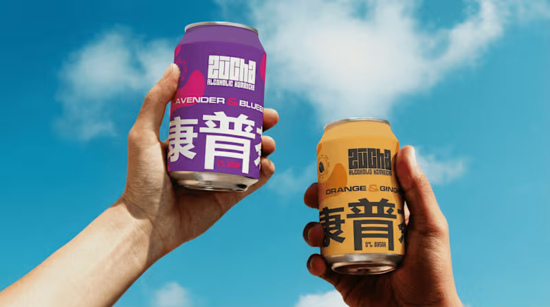
Zucha a brand built on clarity, precision, and quiet confidence.
The objective was simple: remove the unnecessary and let the identity speak with intent.
The wordmark is crafted with balanced proportions and subtle refinements, creating a presence that feels modern yet timeless. Every curve and cut is deliberate not decorative.
In line with the brand philosophy, the visual system leans on minimal elements, allowing space, typography, and structure to do the work. No noise, just clarity.
Typography plays a key role a refined primary typeface paired with a functional secondary font ensures both elegance and adaptability across platforms.
The overall identity is designed to be flexible yet consistent, making Zucha instantly recognizable in every interaction.
~
P.S If your audience needs effort to understand your brand, your identity isn’t working — it’s confusing.
0
13
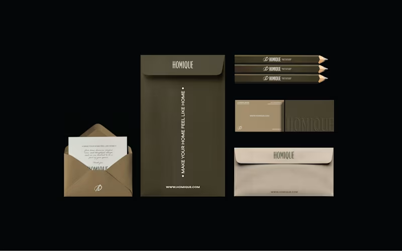
Your brand can quickly start to feel pieced together when decisions are made without a clear direction. Small changes here and there may solve short-term needs, but over time they weaken the overall identity.
This case study for Homiqe explores the importance of building a clear identity system — one that helps a brand remain intentional, consistent, and recognizable.
Homiqe is a brand focused on modern living and thoughtful home solutions. The goal was to create a visual identity that reflects simplicity, comfort, and a sense of belonging.
The direction centered on a clean, structured wordmark paired with a minimal symbol. The design language emphasizes balance, clarity, and modern aesthetics, aligning with the brand’s idea of creating smarter and more refined living spaces.
By developing a consistent identity system, the brand gains flexibility across packaging, digital platforms, and communication while maintaining a unified visual voice.
0
13
Do your brand visuals actually speak to your audience?
Or are they just “looking good” without saying anything meaningful?
If your visuals aren’t aligned with your audience, your brand won’t feel memorable it’ll just exist.
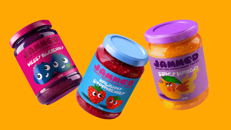
Here’s how I approached this for Jammed 🍓
• Aesthetic
Jammed is built for a younger, playful audience that enjoys bold, indulgent food experiences.
The visual direction is vibrant, glossy, and slightly messy capturing the fun of jam spilling, spreading, and being enjoyed.
• Colors
The palette is rich and high-contrast inspired by real fruit tones.
Deep berry blues, juicy reds, and bold backgrounds are used to make the product feel fresh, appetizing , and impossible to ignore.
• Typography
The type is clean but expressive allowing the visuals to stay dominant while still feeling modern and approachable.
• Brand Assets
The core visual idea revolves around flow and spread.
Jam isn’t static it drips, stretches, and moves. These elements become part of the brand language.
• Photography
Instead of clean, perfect product shots, the focus is on action jam spilling, bread being bitten, textures in motion.
This makes the experience feel real, sensory, and engaging.
~
When your brand visuals are built around how your audience feels, not just how things look, that’s when it starts to connect.
Full case study:
https://lnkd.in/ddkeBPDp
(https://lnkd.in/ddkeBPDp)#Branding (https://www.linkedin.com/search/results/all/?keywords=%23branding&origin=HASH_TAG_FROM_FEED) #PackagingDesign (https://www.linkedin.com/search/results/all/?keywords=%23packagingdesign&origin=HASH_TAG_FROM_FEED) #CreativeDirection (https://www.linkedin.com/search/results/all/?keywords=%23creativedirection&origin=HASH_TAG_FROM_FEED) #FoodBranding (https://www.linkedin.com/search/results/all/?keywords=%23foodbranding&origin=HASH_TAG_FROM_FEED) #VisualIdentity (https://www.linkedin.com/search/results/all/?keywords=%23visualidentity&origin=HASH_TAG_FROM_FEED) #CaseStudy (https://www.linkedin.com/search/results/all/?keywords=%23casestudy&origin=HASH_TAG_FROM_FEED)
0
22

Creative brand specialist: inine
Creative brand specialist: inine
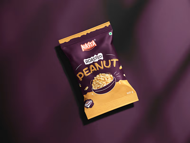


In 2025, packaging design evolved from a functional layer into a strategic brand asset. Consumers didn’t just buy products; they connected with stories, values, and experiences delivered through thoughtful design. Minimalism became sharper, sustainability became non-negotiable, and clarity outperformed clutter. The brands that won attention were the ones that treated packaging as a silent salesperson-building trust, driving recall, and influencing decisions at the shelf and on screens. As we step into 2026, packaging is no longer an afterthought; it is the first conversation between a brand and its customer.
1
2
443

Innovative Graphic Designer
Innovative Graphic Designer


Enterprise AI, UX Architecture & Search Engineering
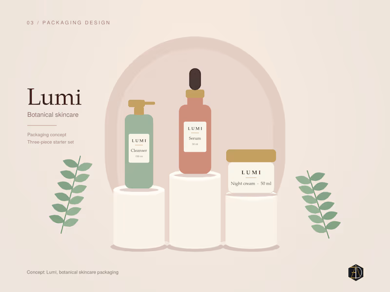
A minimal and elegant packaging identity design for a premium botanical skincare starter set. Built around soft earth tones, organic aesthetics, and clean typography to reflect purity and sustainability.
#packagingdesign #brandidentity #visualdesign #3ddesign #graphicdesign
0
58
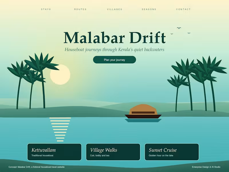
Malabar Drift — Luxury Backwater Hospitality Brand & Digital Experience
Conceptualized and engineered an elite, immersive brand identity and digital interface for a premium Kerala backwaters tourism venture. The visual architecture anchors on a sophisticated tropical-emerald and sunset palette, bespoke typography, and serene Kettuvallam motifs. Designed with high-conversion structure, featuring curated touchpoints for private houseboat stays, immersive village explorations, and exclusive twilight cruises—translating tranquil luxury into a flawless digital journey."
0
38
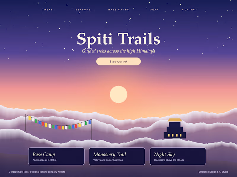
Spiti Trails — High-Altitude Trekking Brand & Landing Page Design
Designed an immersive, atmospheric web interface and visual identity for a high-altitude trekking company. Features custom twilight color palette, minimalist typography, prayer flag and monastery iconography, and structured cards for Base Camps, Monastery Trails, and Night Sky experiences, capturing the raw essence of the Himalayas."
0
34
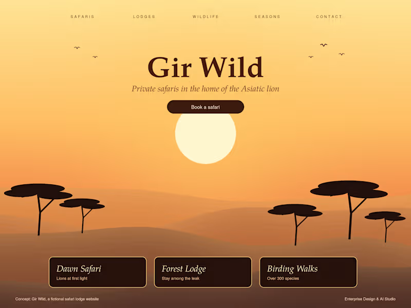

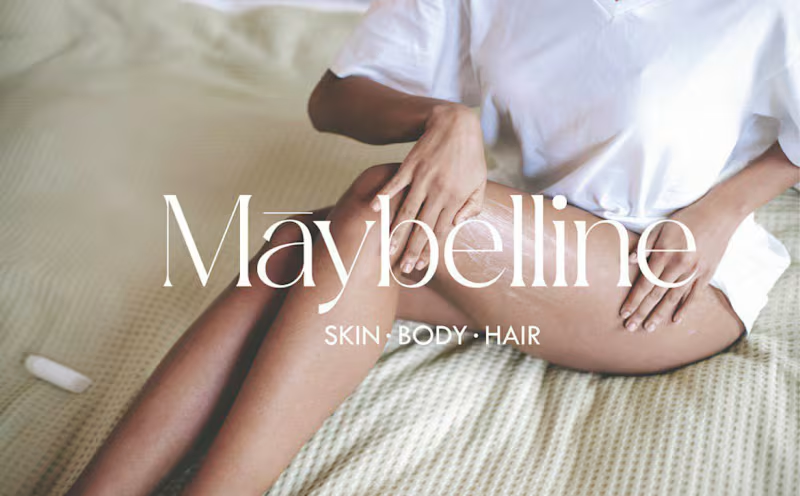
Building brands that stand out and scale.


professional video editor and Graphics designer
professional video editor and Graphics designer

View more →