
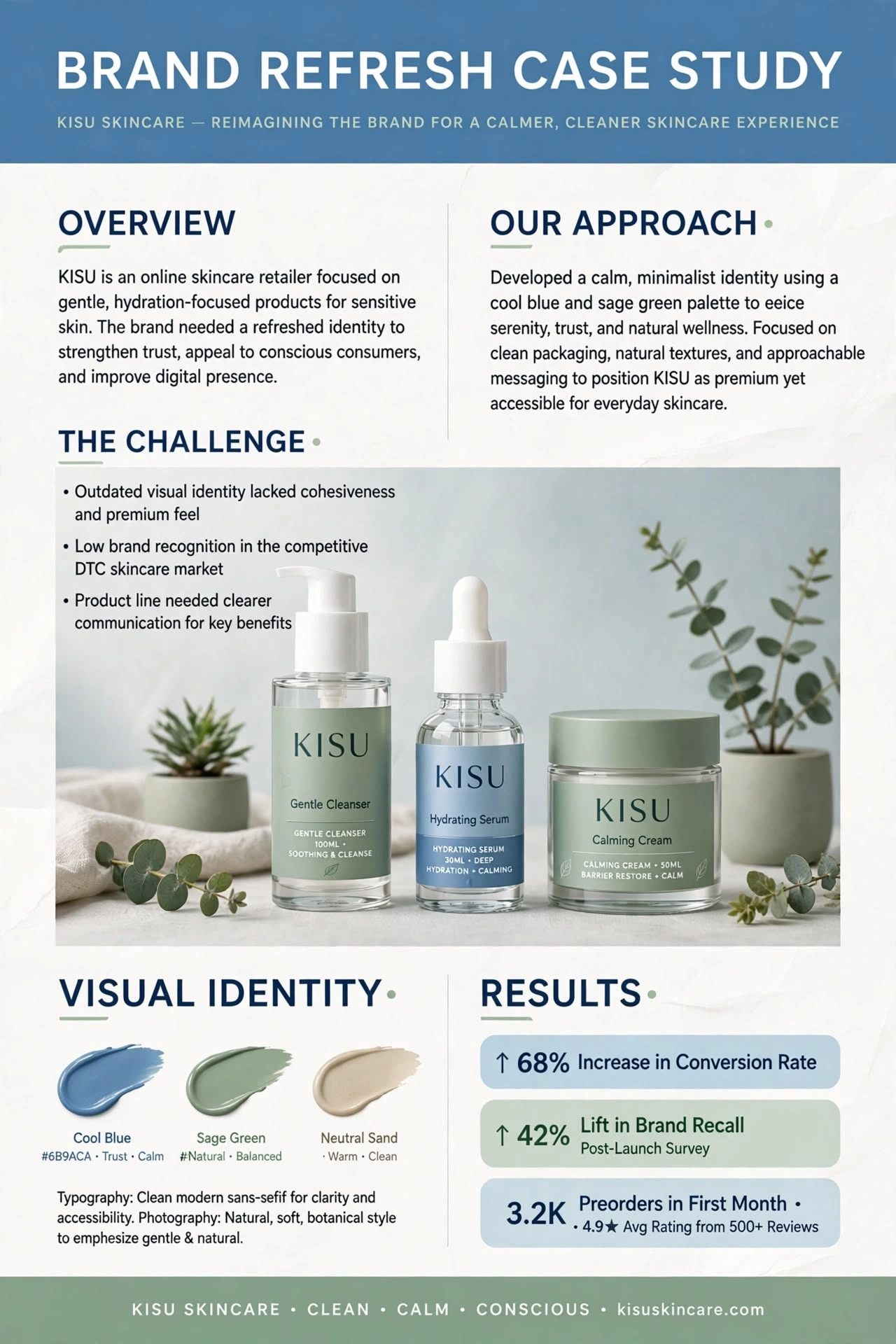
🍃 CASE STUDY - 【entity-KISU¦canonical_name=KISU】 Skincare Brand Refresh | Clean, Calm, Conscious
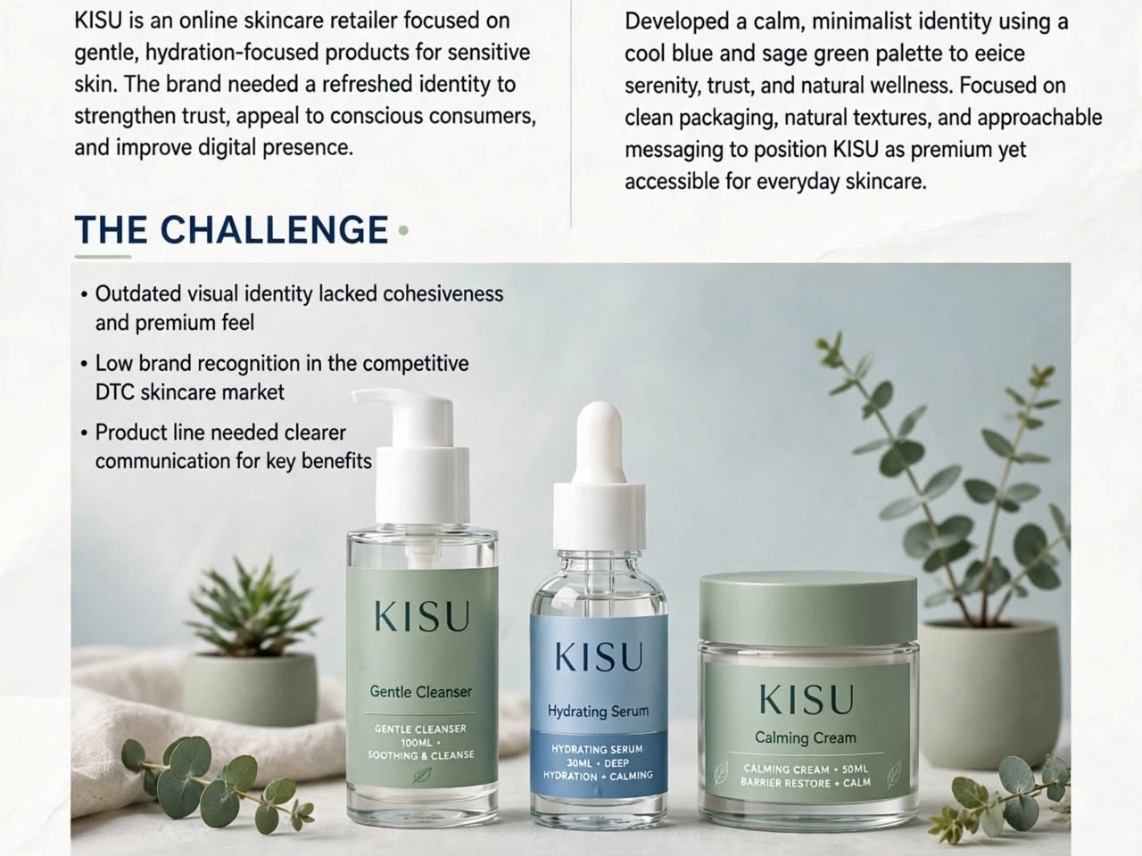
【entity-KISU¦canonical_name=KISU】 is an online skincare retailer focused on gentle, hydration-focused products for sensitive skin. The brand needed a refreshed identity to strengthen trust + improve digital presence.
MY APPROACH:
Developed a calm, minimalist identity using cool blue + sage green palette to evoke serenity, trust, and natural wellness. Focused on clean packaging, natural textures, approachable messaging.
THE CHALLENGE:
Outdated visual identity lacked cohesiveness
Low brand recognition in competitive DTC market
Product line needed clearer communication
VISUAL IDENTITY:
Cool Blue #6B9ACA - Trust, Calm
Sage Green - Natural, Balanced
Neutral Sand - Warm, Clean
RESULTS:
🚀 68% Increase in Conversion Rate
🚀 42% Lift in Brand Recall
🚀 3.2K Preorders in First Month + 4.9★ Avg Rating
Typography: Clean modern sans-serif
Photography: Natural, soft, botanical style
I create skincare brands that feel premium yet accessible. Want similar for your brand? DM!
Portfolio: contra.com/w/nagdak
#KISU #SkincareBranding #BrandRefresh #CaseStudy #MinimalistDesign #EcommerceBranding #PackagingDesign #GraphicDesign #CleanBeauty #BrandIdentity #DTC
0 likes · 0 views · Oct 26, 2026
🍃 CASE STUDY - 【entity-KISU¦canonical_name=KISU】 Skincare Brand Refresh | Clean, Calm, Conscious 【entity-KISU¦canonical_name=KISU】 is an online skincare ret...


