
Do your brand visuals actually speak to your audience?
Or are they just “looking good” without saying anything meaningful?
If your visuals aren’t aligned with your audience, your brand won’t feel memorable it’ll just exist.
Here’s how I approached this for Jammed 🍓
• Aesthetic
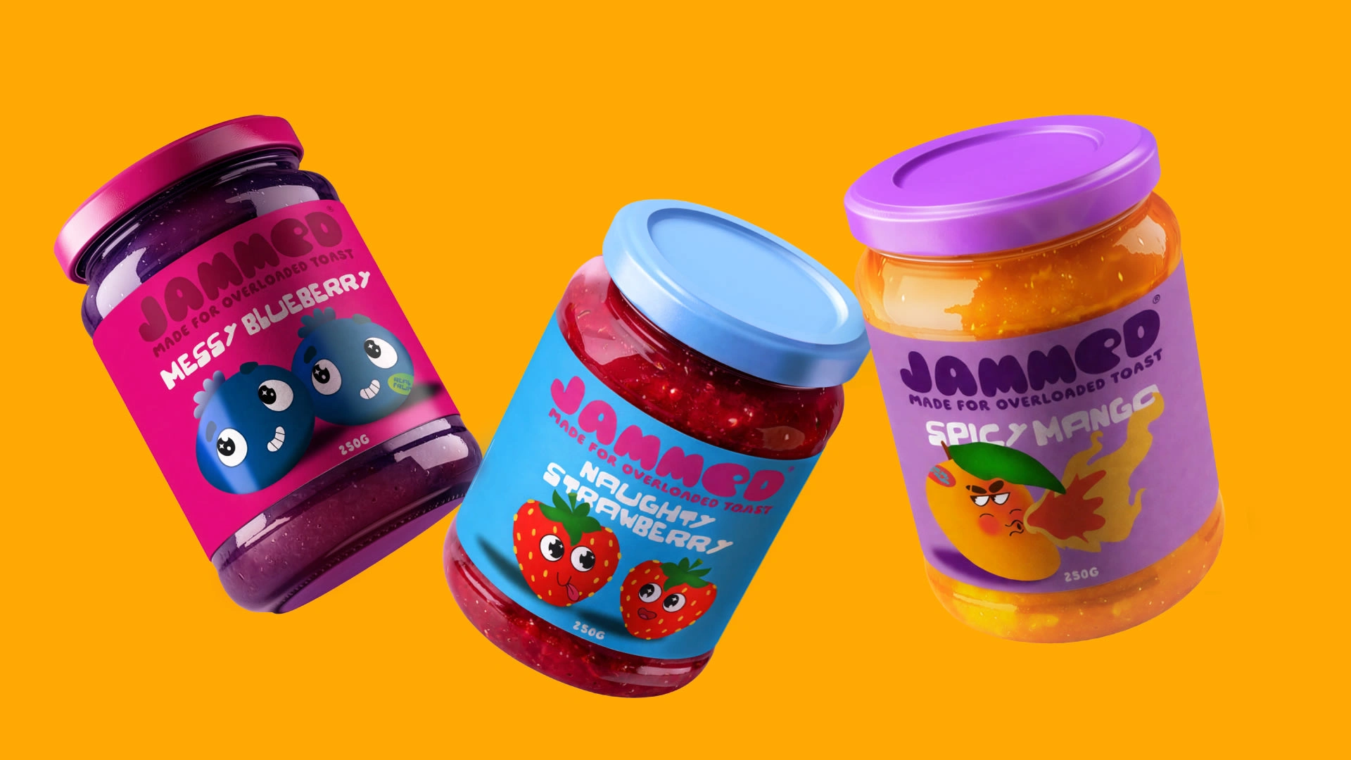
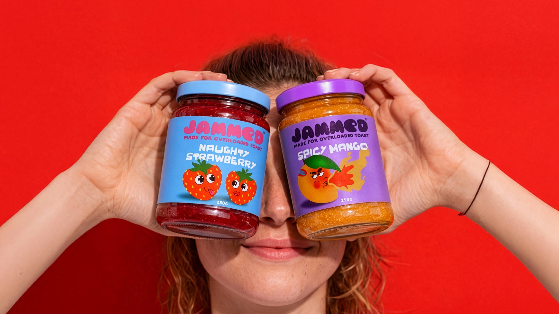
Jammed is built for a younger, playful audience that enjoys bold, indulgent food experiences.
The visual direction is vibrant, glossy, and slightly messy capturing the fun of jam spilling, spreading, and being enjoyed.
• Colors
The palette is rich and high-contrast inspired by real fruit tones.
Deep berry blues, juicy reds, and bold backgrounds are used to make the product feel fresh, appetizing , and impossible to ignore.
• Typography
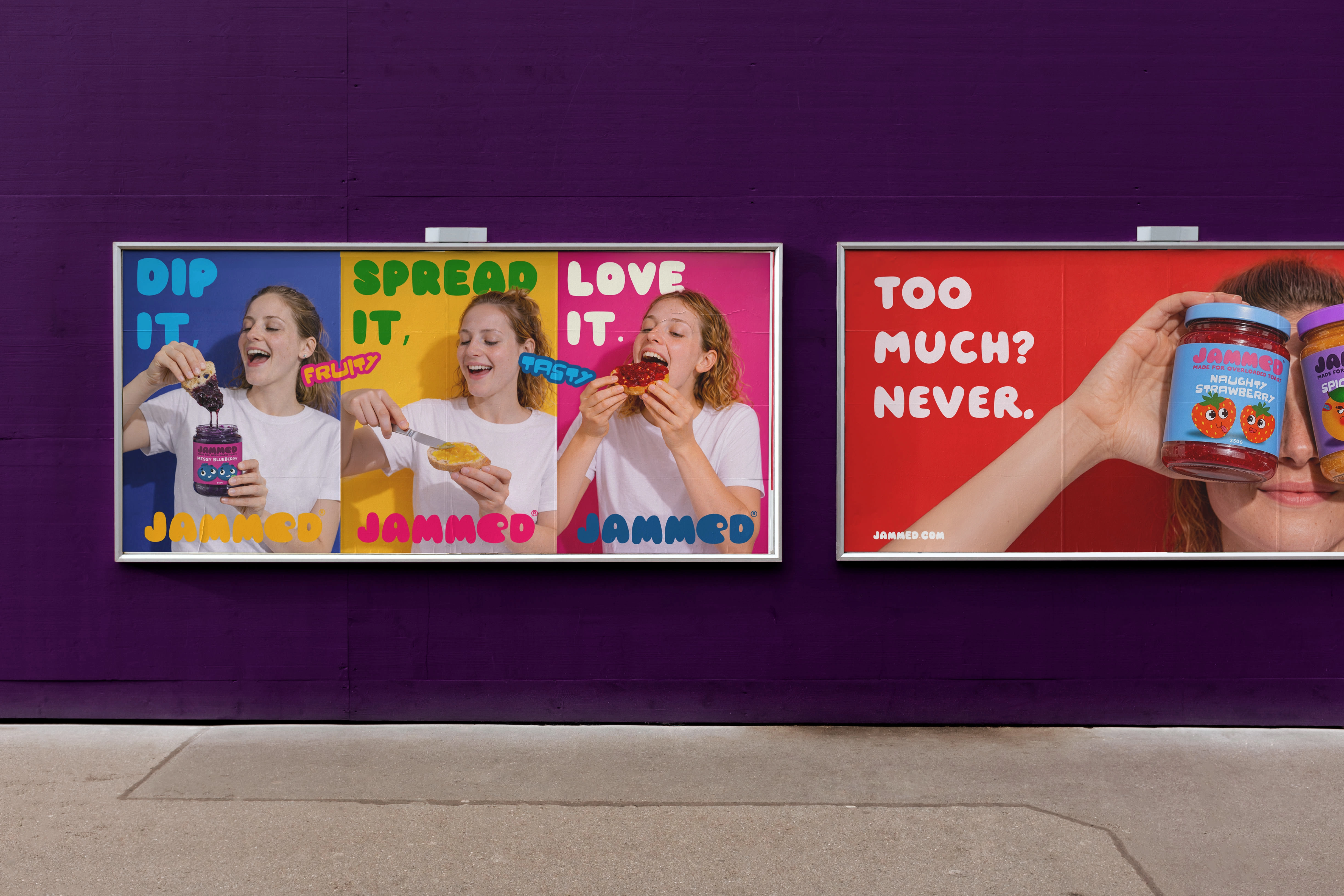
The type is clean but expressive allowing the visuals to stay dominant while still feeling modern and approachable.
• Brand Assets
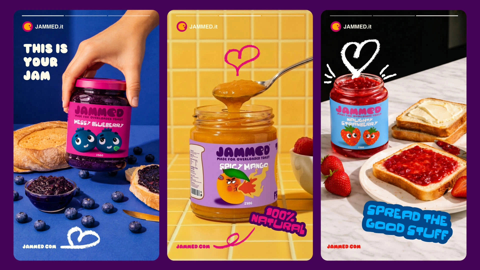
The core visual idea revolves around flow and spread.
Jam isn’t static it drips, stretches, and moves. These elements become part of the brand language.
• Photography
Instead of clean, perfect product shots, the focus is on action jam spilling, bread being bitten, textures in motion.
This makes the experience feel real, sensory, and engaging.
~
When your brand visuals are built around how your audience feels, not just how things look, that’s when it starts to connect.
Full case study:
https://lnkd.in/ddkeBPDp
#Branding #PackagingDesign #CreativeDirection #FoodBranding #VisualIdentity #CaseStudy
0 likes · 1 view · Apr 22, 2026
Do your brand visuals actually speak to your audience? Or are they just “looking good” without saying anything meaningful? If your visuals aren’t aligned w...


