

PULSE — Fitness Intelligence Design System & Full UI Breakdown ⚡📊
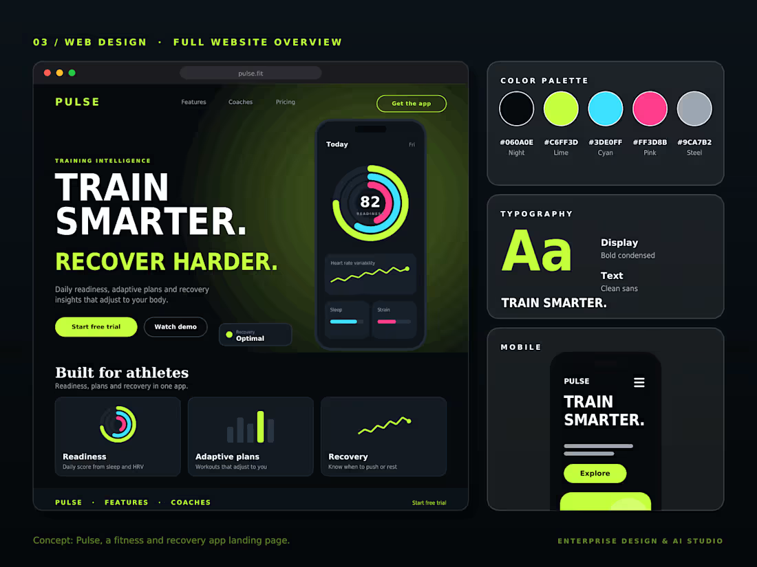
Complete end-to-end design ecosystem for PULSE, an AI-driven athletic recovery and fitness intelligence platform. This overview highlights the design tokens, dark-mode ergonomics, typography hierarchy, feature breakdown, and responsive mobile architecture
Design System & Layout Highlights:
🎨 Color Palette Tokens: Night Black (#0C0E0E), Electric Lime (#CCFF00), Cyan (#33D3FF), Hot Pink (#F73388), and Steel Grey (#9CA7B2).
🔤 Typography System: High-impact display font for condensed headlines and clean sans for readable health telemetry.
🏋️♂️ "Built for Athletes" Modules: Readiness tracking, adaptive workout planning, and heart rate variability (HRV) recovery cards.
📱 Mobile UI Adaptability: Responsive layout built for quick on-the-go biometric checking and workout logging.
Designed for high-performance sports brands, bio-metric tech platforms, and smart wear ecosystem products.
An end-to-end UI/UX architecture designed for modern health-tech platforms. ⚡💪 Let me know your thoughts on this design system below! 👇
#UIUX #DesignSystem #HealthTech #Figma #MobileUX #FitnessDesign #DarkUI #WebDesign #UXCaseStudy
0
15
PULSE — Fitness Intelligence & Recovery Web Design ⚡🏃♂️
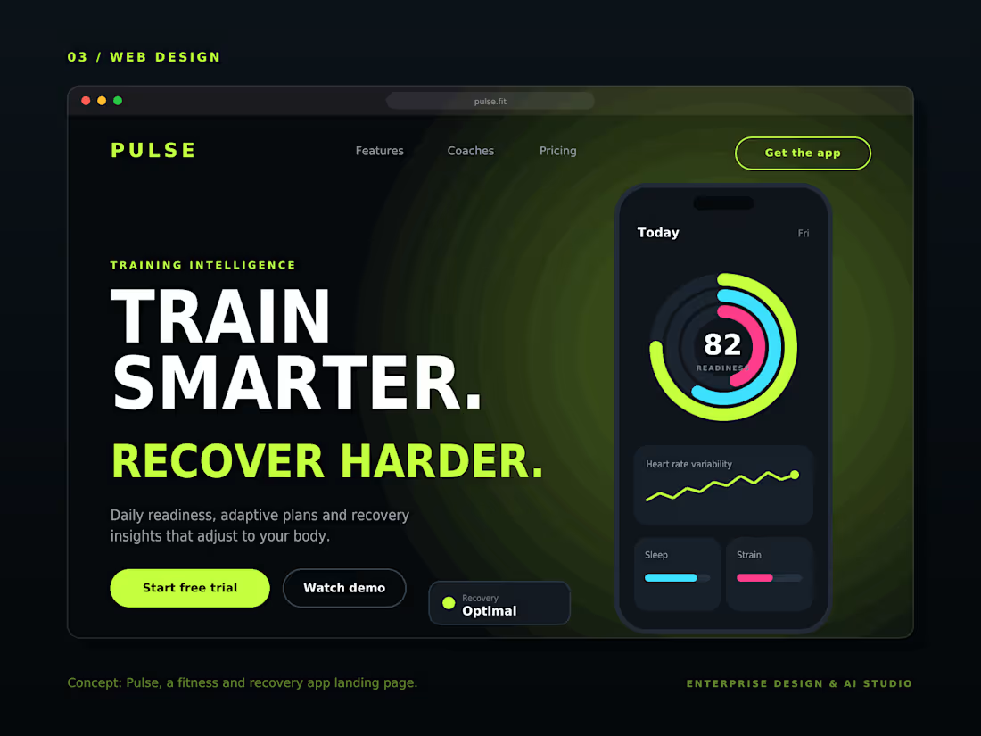
A high-performance landing page concept crafted for AI-driven fitness and athletic recovery apps. Built around the concept "TRAIN SMARTER. RECOVER HARDER," it seamlessly integrates health metrics, daily readiness scores (82/100), strain charts, and adaptive workout plans into a sleek, high-contrast dark UI.
Key Highlights:
📊 Bio-Metric Tracking: Interactive readiness rings, HRV tracking, and real-time recovery status ("Optimal").
⚡ High-Contrast Dark Aesthetic: Deep black backgrounds coupled with high-vis lime green and electric cyan accents for peak engagement.
📱 Seamless Device Ecosystem: Web landing layout showcasing mobile app interface integration.
🎯 Conversion-Optimized Hierarchy: Strategic CTAs like "Start free trial", "Watch demo", and "Get the app".
Designed for fitness tech startups, smart wearable platforms, and bio-hacking health brands.
Data-driven design meets peak athletic performance. ⚡💪 How do you feel about this neon sports-tech visual identity? Let me know below! 👇
#FitnessUI #WebDesign #UIUX #HealthTech #Figma #LandingPage #SportsDesign #UXDesign #AppDesign
0
10
Verdant — Full UI/UX Design System & Mobile View 🥗🎨
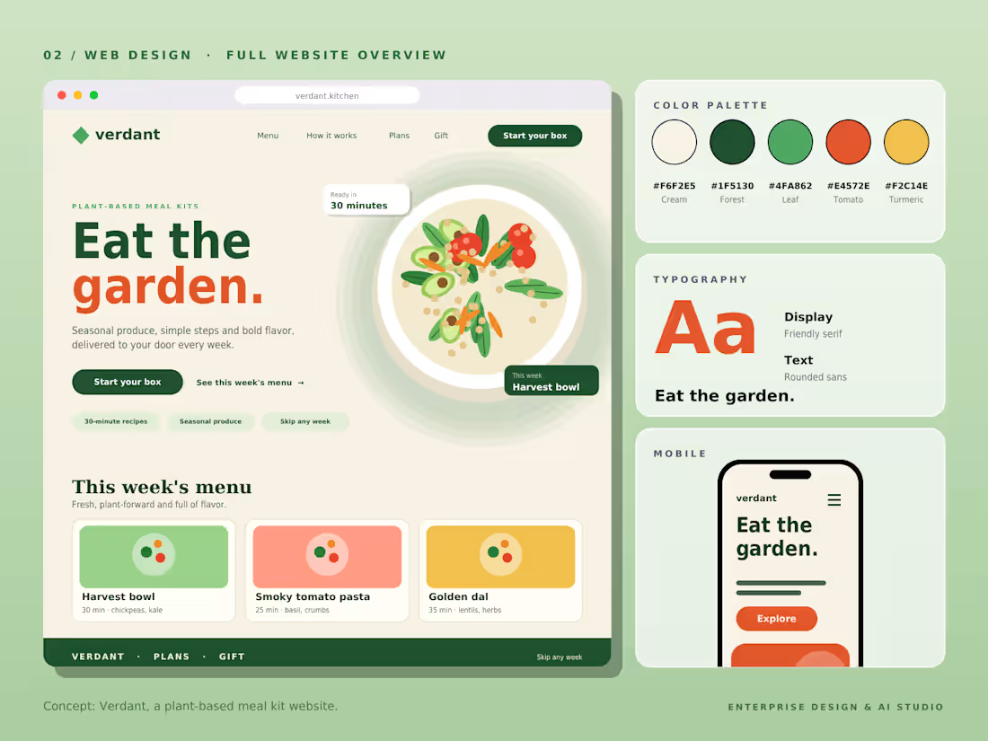
Complete design system and mobile responsive breakdown for Verdant, a plant-based meal kit subscription platform. This full case study showcases the color palette hierarchy, typographic system, desktop landing architecture, and seamless mobile responsiveness.
Design System Details:
🎨 Color Palette: Warm Cream (#F6F2E8), Forest Green (#1F5138), Leaf Green (#4FA062), Tomato (#E4573E), and Turmeric (#F2C14E).
🔤 Typography System: Display serif for friendly warmth and rounded sans for readable body text.
📱 Mobile Ergonomics: Adaptive layout optimized for touch interaction and quick meal customization on mobile viewports
🥗 Weekly Menu Cards: Structured UI elements highlighting "Harvest Bowl", "Smoky Tomato Pasta", and "Golden Dal".
A complete end-to-end UX showcase for modern D2C food and wellness platforms.
Full ecosystem design from design tokens to mobile responsiveness. 🌱✨ What do you think of this visual system? Drop your thoughts below! 👇
#UIUX #DesignSystem #WebDesign #Figma #MobileUX #ColorPalette #D2C #Branding #UXCaseStudy
0
11
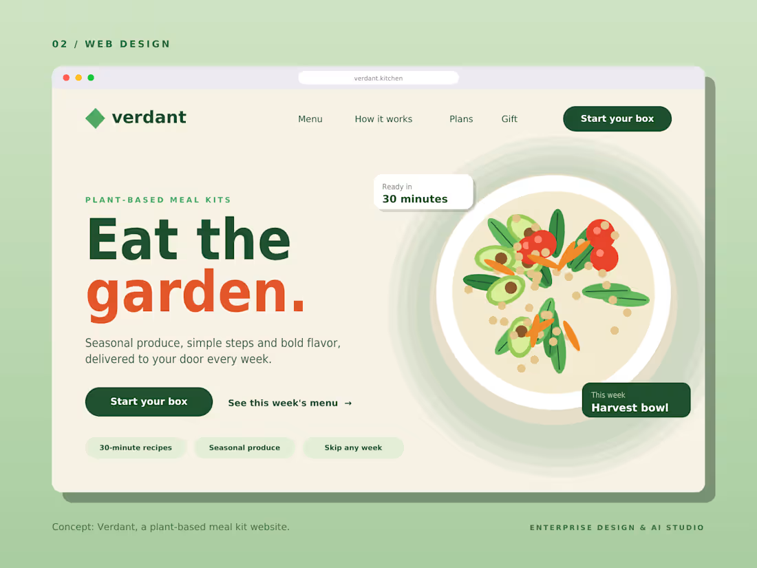
Verdant — Plant-Based Meal Kit Subscription UI/UX 🥗🌱
A vibrant, fresh, and modern landing page concept designed for eco-conscious meal kit delivery platforms. Built around the headline "Eat the garden," it emphasizes organic nutrition, 30-minute quick recipes, and customizable weekly produce boxes.
Key Highlights:
🥑 Organic Aesthetic: Natural green tones, clean typography, and high-appetite food presentation.
📦 Subscription UX: Intuitive CTA flows ("Start your box", "Skip any week") designed for high user retention.
⚡ Value Badges: Quick-view tags highlighting "Ready in 30 minutes", "Seasonal produce", and weekly recipe features.
💻 Conversion-Centric: Clear navigation for weekly menus, subscription plans, and gifting options.
Designed for D2C food brands, organic meal delivery services, and health-tech startups.
Fresh, sustainable, and conversion-focused web design. 🌱✨ What do you think of this green aesthetic? Let me know below! 👇
#WebDesign #UIUX #FoodDesign #D2C #Figma #LandingPage #UXDesign #DesignInspiration #OrganicLiving
0
15