
💥 DUAL CASE STUDY - LUME + KISU Skincare | Side-by-Side Brand Comparison
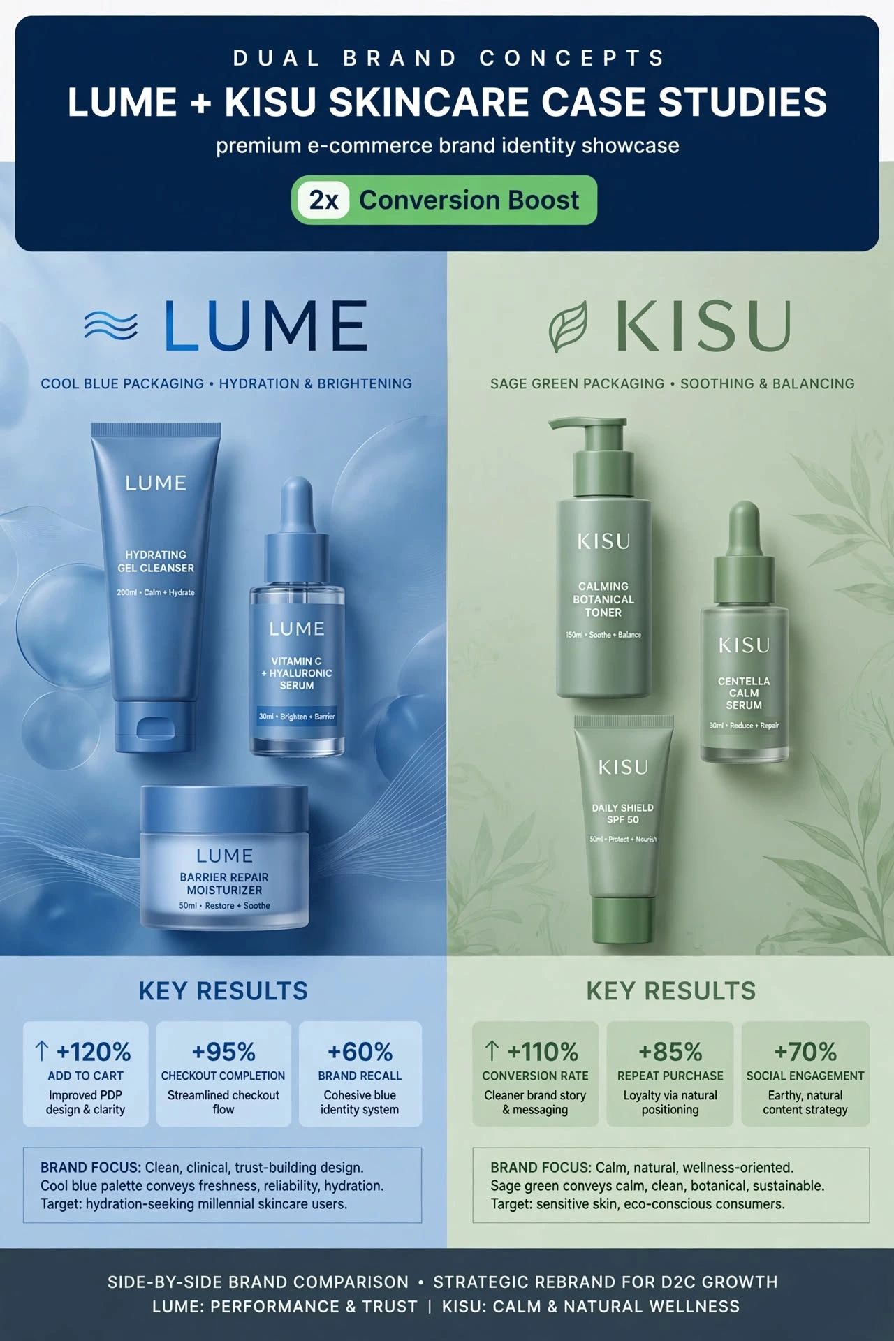
Premium e-commerce brand identity showcase - How strategic color psychology 2x'd conversions for DTC skincare!
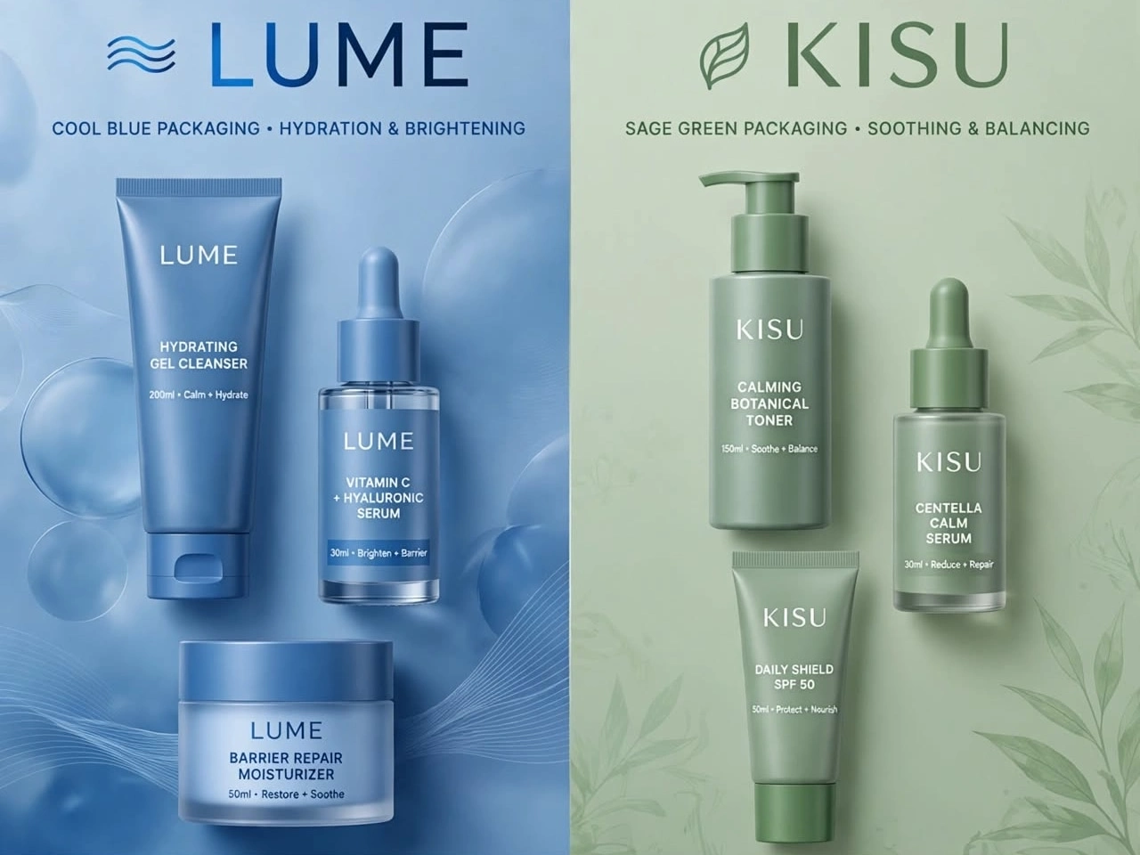
🔵 LUME - COOL BLUE PACKAGING
Focus: Hydration & Brightening
Strategy: Clean, clinical, trust-building
Palette: Cool blue = freshness, reliability, hydration
Target: Hydration-seeking millennial skincare users
Results: +120% Add to Cart, +95% Checkout Completion, +60% Brand Recall
🟢 【entity-KISU¦canonical_name=KISU】 - SAGE GREEN PACKAGING
Focus: Soothing & Balancing
Strategy: Calm, natural, wellness-oriented
Palette: Sage green = calm, clean, botanical, sustainable
Target: Sensitive skin, eco-conscious consumers
Results: +110% Conversion Rate, +85% Repeat Purchase, +70% Social Engagement
SIDE-BY-SIDE COMPARISON:
LUME: PERFORMANCE & TRUST
【entity-KISU¦canonical_name=KISU】: CALM & NATURAL WELLNESS
This is how I help D2C brands grow with strategic rebrands. Which concept do you prefer - Blue or Green? Comment below! 👇
Want me to rebrand your skincare/e-commerce brand for 2x growth? Let's talk - contra.com/w/nagdak
#DualBrand #CaseStudy #LUME #KISU #SkincareBranding #BrandRefresh #EcommerceGrowth #ConversionOptimization #BrandIdentity #DTCBrand #PackagingDesign #BrandComparison #GraphicDesign #BrandDesigner #USABrand
0 likes · 0 views · Oct 26, 2026
💥 DUAL CASE STUDY - LUME + KISU Skincare | Side-by-Side Brand Comparison Premium e-commerce brand identity showcase - How strategic color psychology 2x'd co...


