Freelance Logo Designers in Rajkot
Sign Up
Post a job
Sign Up
Log In
Filters
2
Projects
People
Varun Davera
pro
Rajkot, India
Visual & Brand Designer crafting meaningful identities
$1k+
Earned
12x
Hired
5.0
Rating
42
Followers
Follow
Message
Visual & Brand Designer crafting meaningful identities
0
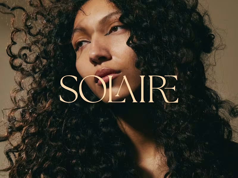
Solaire: Hair Care Brand Identity and Branding As a hair care brand, Solaire believes that every curl deserves to be seen in its best light and treats hair care as a daily ritual rather than a routine. This philosophy forms the core inspiration for the brand's identity and packaging. An elegant serif logotype with interlocking letterforms, a warm sun-washed palette of cream, amber and deep brown, and intimate, light-drenched photography come together to create a feeling of quiet luxury and natural radiance.
0
11
0
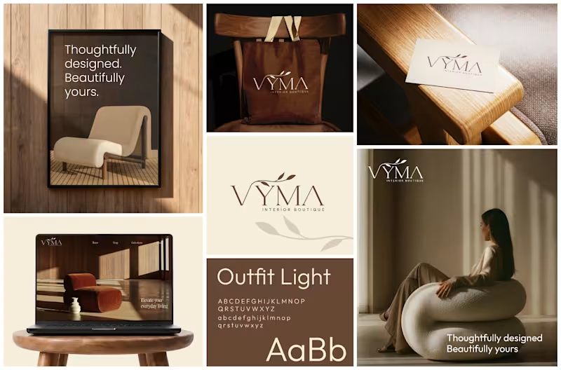
VYMA Interior Boutique — Brand Identity & Logo Design A refined brand identity for VYMA, a contemporary home décor and interior accessories boutique. The visual direction combines minimalism, warm earthy tones, and timeless typography to create a sophisticated yet welcoming aesthetic. The identity was inspired by the story of two interior designers and longtime friends coming together to create a thoughtfully curated space.
0
100
0
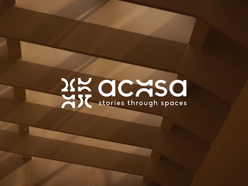
Stories through spaces. 🤎 Introducing Acasa — a refined identity for an interior & architecture studio built around timeless design, thoughtful details, and spaces that feel personal. Clean. Warm. Intentional. Brand Identity | Interior & Architecture
0
208
0
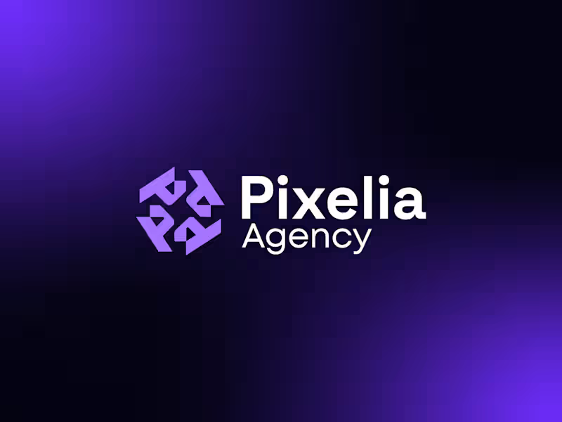
Designed a modern and memorable brand identity for Pixelia Agency, a creative digital agency focused on innovation and impactful design. The goal was to create a logo that communicates creativity, collaboration, and professionalism while maintaining a clean, scalable aesthetic. The icon is built using geometric shapes that form a dynamic, interconnected mark, symbolizing teamwork, growth, and digital transformation. A bold sans-serif wordmark complements the symbol, ensuring strong readability and a contemporary brand presence across both digital and print platforms.
0
218
Logo Designer
(9)
Follow
Message
Comsci Technologies
Rajkot, India
Branding, UX UI, Website, Web App, Mobile App, AI & ML

14
Followers
Follow
Message
Branding, UX UI, Website, Web App, Mobile App, AI & ML
1
EatCoast! 🍔 A comprehensive restaurant management and food delivery platform to streamline operations and enhance the customer experience. https://comsci.tech/projects/eatcoast-food-delivery
1
136
2
Eatcoast - Food Delivery Logo | Branding | Brand Identity
2
12
1
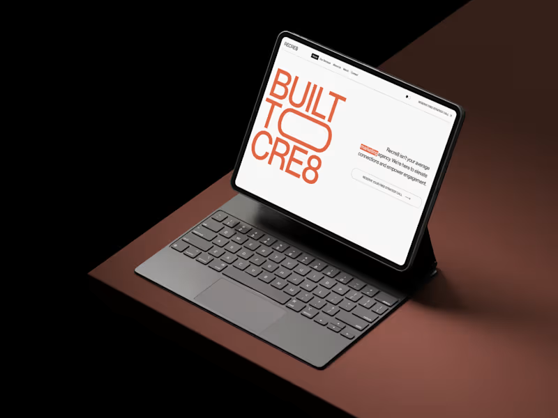
Recre8 - Marketing Website Design
1
9
2
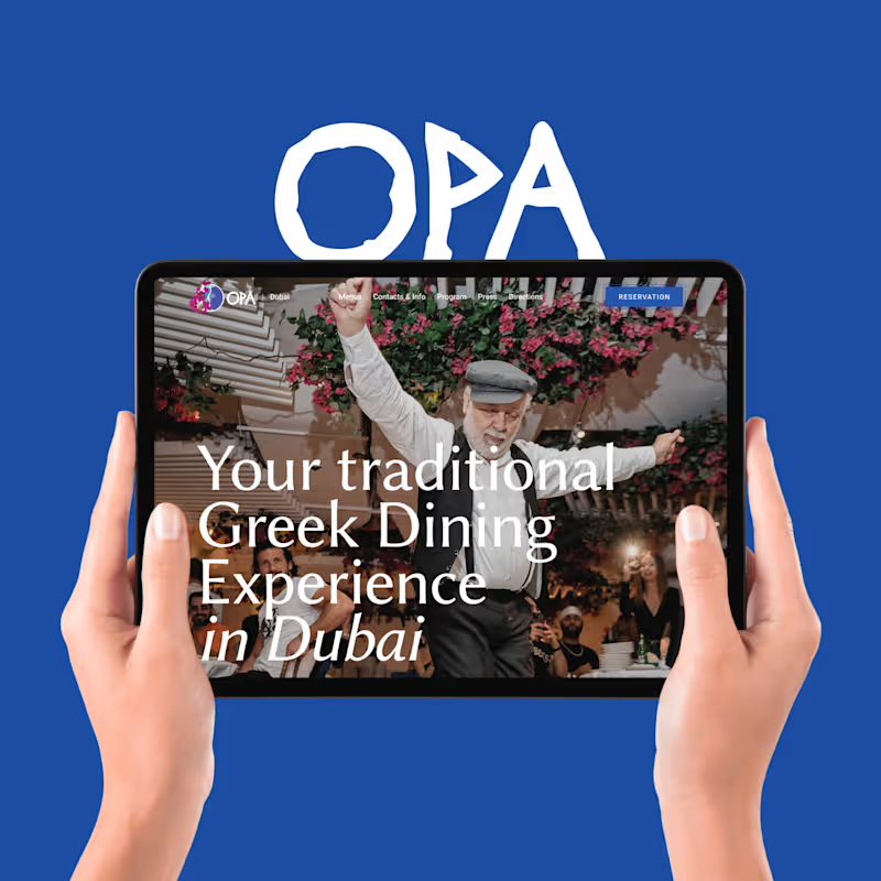
OPA, a luxury Greek restaurant! 🇬🇷 Focused on bringing their stunning locations, from Dubai to St. Tropez, to life online with a seamless user experience. 🌟 Creating a digital experience that mirrors their vibrant and authentic dining atmosphere. Explore the full project: 👇 https://comsci.tech/projects/opa-world-dubai-luxury-greek-restaurant
2
109
Logo Designer
(3)
Follow
Message
Nimit Design
Rajkot, India
Brand Identity & Visual Systems Designer
Follow
Message
Brand Identity & Visual Systems Designer
1
SÓLUM — Mineral Skincare Brand Identity SÓLUM is a premium mineral skincare brand built around a simple belief: some of the most powerful ingredients for skin already exist in the earth. I developed this brand identity around the intersection of earth science and skin science, creating a visual language that feels precise, refined, and deeply connected to natural materials. Instead of following the typical organic skincare aesthetic, the direction takes inspiration from volcanic ash, geological formations, fractured stone, and mineral textures. The SÓLUM logomark is built from a structured square divided by irregular, crack-like forms — a visual reference to fractured volcanic rock and cooling ash. The contrast between the controlled outer structure and organic internal fractures gives the mark a balance of precision and geological permanence. The typography is clean and restrained, allowing the natural textures and imagery to carry the emotional character of the brand. A mineral-inspired visual system, paired with raw geological imagery and refined layouts, creates a sense of quiet luxury without feeling overly decorative. The goal was to position SÓLUM as a skincare brand that feels scientific yet human, natural yet sophisticated, and rigorous without losing its connection to the earth. Services Brand Identity Logo Design Art Direction Typography Visual System Brand Strategy Packaging Direction Tools Adobe Illustrator Adobe Photoshop Adobe InDesign Project Type Branding / Visual Identity FULL PROJECT : https://www.behance.net/gallery/254419423/SOLUM-Brand-Identity
2
1
142
0
SÓLUM — Beauty Brand Identity A visual identity built around the idea of quiet science, natural materials, and everyday care. For SÓLUM, I explored a minimal and grounded visual language that feels premium without becoming overly polished. From the identity and packaging to digital touchpoints and campaign applications, every element was designed to feel calm, tactile, and intentional. The goal was simple: make skincare feel closer to nature, while keeping the science visible. Brand Identity · Packaging · Art Direction · Digital · Campaign
0
85
0
JIVA — Premium Indian Kombucha Brand Identity JIVA was built around a simple thought: Indian kombucha can feel premium, modern, and proudly rooted in where it comes from. The challenge was to move away from the usual clinical or overly craft-market look and create a brand that feels like a global product with an unmistakably Indian soul. The identity takes inspiration from Indian craft, traditional arches, and the natural movement of fermentation. The rounded dome-like symbol gives the mark a sense of warmth and heritage, while the flowing curves represent fermentation as something living, active, and constantly transforming. The visual language keeps things minimal and refined, using earthy tones and a warm off-white to create a balance between tradition and modernity. The result is an identity that feels calm and premium, but still has character. At the heart of JIVA is the idea of “Blend of Culture” — bringing together Indian heritage, natural fermentation, and contemporary design. Alive. Authentic. Artisanal. Indian at heart. Services Brand Identity Logo Design Art Direction Typography Color Palette Visual System Packaging Design Tools Adobe Illustrator Adobe Photoshop Project Type Branding / Visual Identity / Packaging
0
97
0
Natura — Natural Beauty Brand Identity Natura started with a simple idea: natural skincare shouldn’t feel like a luxury that only a few people can afford. I developed this brand identity around the feeling of calm, honesty, and connection with nature. The visual direction uses soft organic forms, flowing leaf-inspired curves, and a gentle color palette to make the brand feel natural without becoming overly rustic or predictable. The logo was shaped around the movement of leaves and natural growth, creating a mark that feels soft, balanced, and easy to recognize. I paired it with warm neutrals, sage greens, deeper botanical tones, and a subtle blossom pink to bring a little warmth and personality into the system. The goal was to create a beauty brand that feels clean, approachable, thoughtful, and trustworthy—something that feels natural without trying too hard to look “natural.” Services Brand Identity Logo Design Art Direction Typography Color Palette Visual System Tools Adobe Illustrator Adobe Photoshop Project Type Branding / Visual Identity Full project: https://www.behance.net/gallery/252237679/Natura-Beauty-brand-branding
0
118
Logo Designer
(4)
Follow
Message
brijesh patel
Gujarat, India
Your brand’s story, told through my creative lens.
Follow
Message
Your brand’s story, told through my creative lens.
0
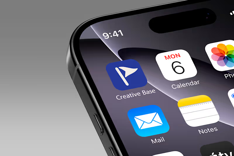
Creative Base - Making business management software feel less like software. Creative Base is a management platform built by creatives, for creatives, primarily photographers - helping them manage their clients, invoices, projects, and the business side of their work. The challenge was that the client didn't want it to feel like another generic business management tool. They wanted something fun, approachable, and genuinely enjoyable to use. So instead of leaning into the usual SaaS aesthetic, I explored a more expressive visual direction, including a custom mascot that could give the product more personality and make the experience feel more human. What started as a branding and visual exploration gradually grew alongside the product itself. New features, screens, and ideas kept being added as Creative Base evolved. And honestly, that's also why I never ended up putting together a proper case study for this project. Every time I thought I had enough to document it, the product had grown a little more. So rather than waiting until it's perfectly finished, I wanted to finally share some of the work from the project here. Creative Base is probably one of my favourite examples of how branding can make even something as functional as business management feel more personal, engaging, and fun.
0
34
0
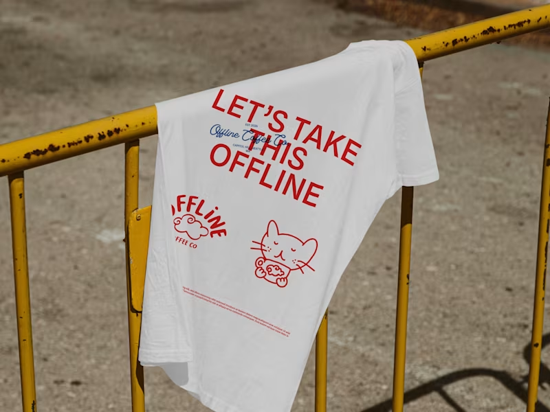
Offline Coffee | A Thoughtful Brand Extension
0
1
0
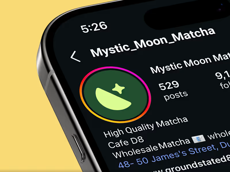
Visual Identity for Mystic Moon Matcha
0
1
0
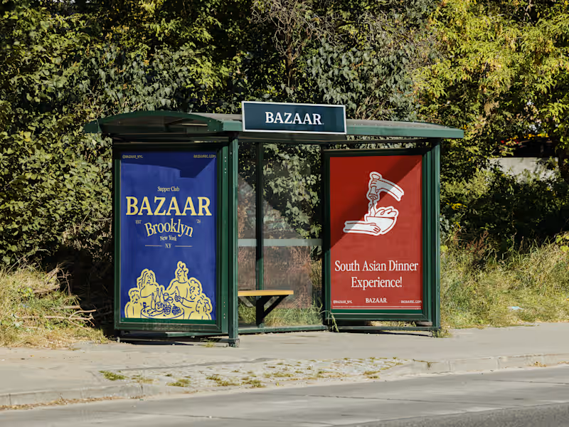
Bazaar Supper Club | Visual Identity
0
1
Logo Designer
(8)
Follow
Message
Sojitra Kevin
Rajkot, India
Innovative Graphic Designer
Follow
Message
Innovative Graphic Designer
0
𝐋𝐨𝐠𝐨 𝐟𝐨𝐫 𝐊 𝐍𝐚𝐢𝐥 𝐒𝐩𝐚𝐜𝐞
0
6
0
𝐋𝐨𝐠𝐨 𝐟𝐨𝐫 𝐒𝐚𝐠𝐚𝐫 𝐒𝐚𝐫𝐛𝐚𝐭𝐰𝐚𝐥𝐚
0
9
0
𝐋𝐨𝐠𝐨 𝐟𝐨𝐫 𝐑𝐨𝐲𝐚𝐥 𝐂𝐞𝐥𝐞𝐛𝐫𝐚𝐭𝐢𝐨𝐧𝐬
0
14
0
:: Logo Design ::
0
8
Logo Designer
(4)
Follow
Message
Mahendra Sindhav
Rajkot, India
Creative brand specialist: inine
Follow
Message
Creative brand specialist: inine
2
The visuals that got rejected — but opened my client’s eyes to what their brand could look like. I recently designed a complete visual direction for a client — clean, modern, and aligned with the personality they wanted to project. And yes… it got rejected. But here’s the interesting part: The rejection wasn’t about the quality of the visuals. It was about the client realizing that their brand vision wasn’t fully defined yet. Sometimes a concept gets rejected not because it's wrong — but because it finally shows the client what they actually want. That’s the power of visual identity. It forces decisions. It creates clarity. It sets a standard. I design visuals that do more than look good — they make brands think, question, and evolve. If you want a visual direction that challenges your brand to grow — let’s talk. #VisualIdentity (https://www.linkedin.com/search/results/all/?keywords=%23visualidentity&origin=HASH_TAG_FROM_FEED) #BrandDesign (https://www.linkedin.com/search/results/all/?keywords=%23branddesign&origin=HASH_TAG_FROM_FEED) #LogoDesigner (https://www.linkedin.com/search/results/all/?keywords=%23logodesigner&origin=HASH_TAG_FROM_FEED) #BrandIdentityDesign (https://www.linkedin.com/search/results/all/?keywords=%23brandidentitydesign&origin=HASH_TAG_FROM_FEED)#GraphicDesign (https://www.linkedin.com/search/results/all/?keywords=%23graphicdesign&origin=HASH_TAG_FROM_FEED) #DesignInspiration (https://www.linkedin.com/search/results/all/?keywords=%23designinspiration&origin=HASH_TAG_FROM_FEED) #CreativeDesign (https://www.linkedin.com/search/results/all/?keywords=%23creativedesign&origin=HASH_TAG_FROM_FEED) #BrandingAgency (https://www.linkedin.com/search/results/all/?keywords=%23brandingagency&origin=HASH_TAG_FROM_FEED)#BrandVisuals (https://www.linkedin.com/search/results/all/?keywords=%23brandvisuals&origin=HASH_TAG_FROM_FEED) #BusinessGrowth (https://www.linkedin.com/search/results/all/?keywords=%23businessgrowth&origin=HASH_TAG_FROM_FEED) #StartupBranding (https://www.linkedin.com/search/results/all/?keywords=%23startupbranding&origin=HASH_TAG_FROM_FEED) #BrandRefresh (https://www.linkedin.com/search/results/all/?keywords=%23brandrefresh&origin=HASH_TAG_FROM_FEED)#BrandConsistency (https://www.linkedin.com/search/results/all/?keywords=%23brandconsistency&origin=HASH_TAG_FROM_FEED) #BrandConsultant (https://www.linkedin.com/search/results/all/?keywords=%23brandconsultant&origin=HASH_TAG_FROM_FEED) #SmallBusinessBranding (https://www.linkedin.com/search/results/all/?keywords=%23smallbusinessbranding&origin=HASH_TAG_FROM_FEED)#DesignerLife (https://www.linkedin.com/search/results/all/?keywords=%23designerlife&origin=HASH_TAG_FROM_FEED) #Branding (https://www.linkedin.com/search/results/all/?keywords=%23branding&origin=HASH_TAG_FROM_FEED) #DesignCommunity (https://www.linkedin.com/search/results/all/?keywords=%23designcommunity&origin=HASH_TAG_FROM_FEED) #Behance (https://www.linkedin.com/search/results/all/?keywords=%23behance&origin=HASH_TAG_FROM_FEED) #BusinessIdentity (https://www.linkedin.com/search/results/all/?keywords=%23businessidentity&origin=HASH_TAG_FROM_FEED)
2
2
280
1
Bran Ix _ Brand Identity design
1
11
1
Mirevo - M monogram logo design
1
6
1
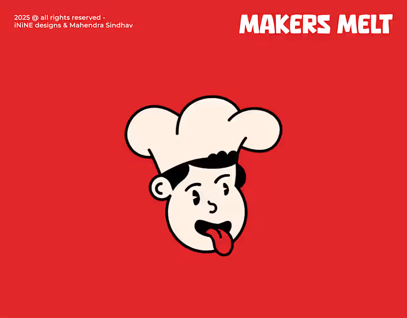
Makers melt logo design-mascoat character brand logo
1
6
Logo Designer
(6)
Follow
Message
Jay Vagadiya
Rajkot, India
Your <embedded> Design Partner ©
16
Followers
expert
Partner
+1
Follow
Message
Your <embedded> Design Partner ©
1
Logo design - Brand styleguide
1
10
1
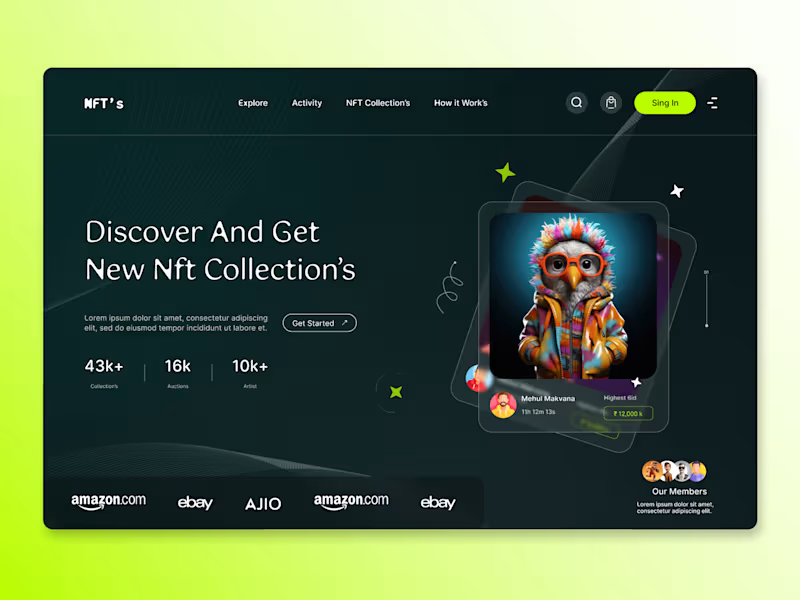
NFT Platform Landing Page Design
1
20
1
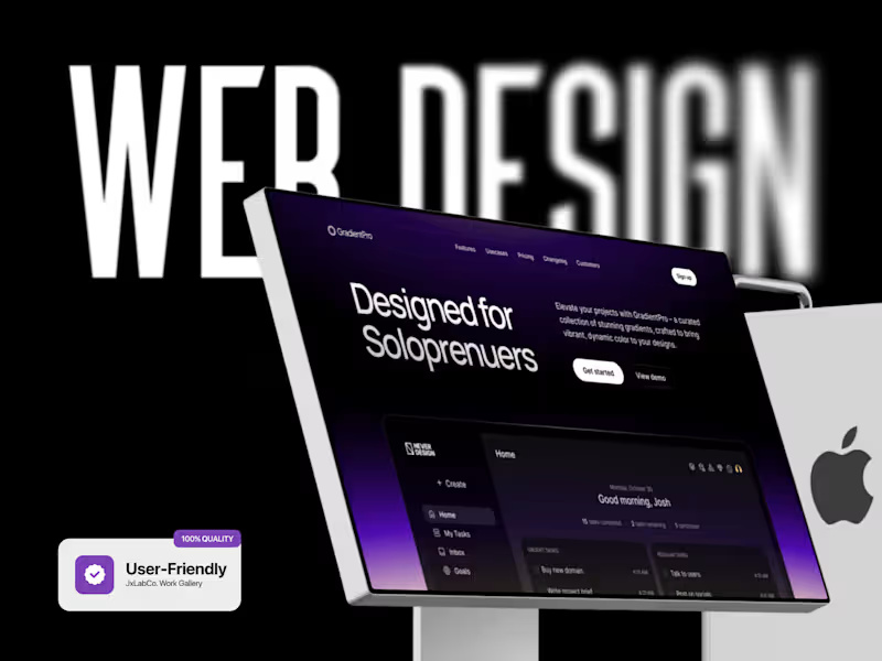
GradientPro Landing Page Design
1
17
1
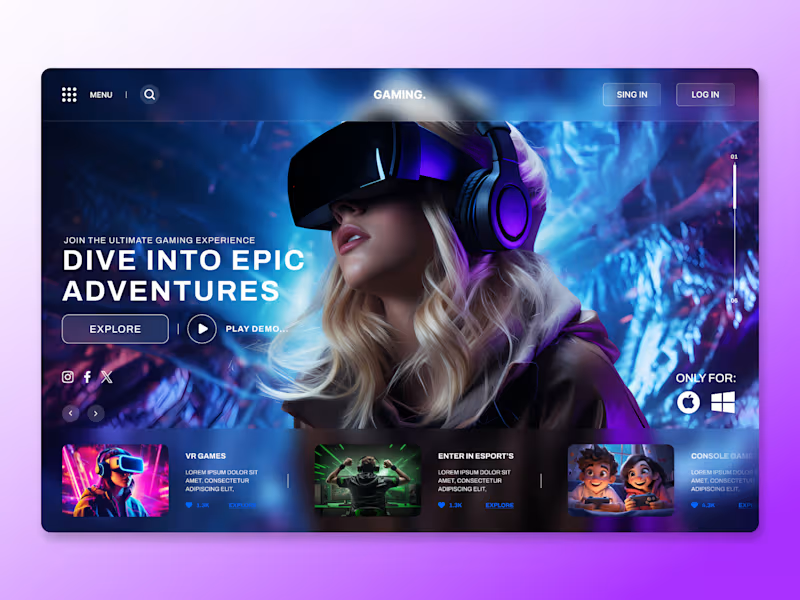
Immersive Gaming Landing Page Design
1
16
Logo Designer
(1)
Follow
Message
Nishant More
Gujarat, India
Web developer ,UI/UX and logo designer!!!!

New to Contra
Follow
Message
Web developer ,UI/UX and logo designer!!!!
0
ORBIT is a modern fintech brand built to make money management feel smarter, simpler, and more connected. Its orbit-inspired identity represents movement, growth, and the continuous flow of money, bringing a futuristic and trustworthy feel to digital finance.
0
93
0
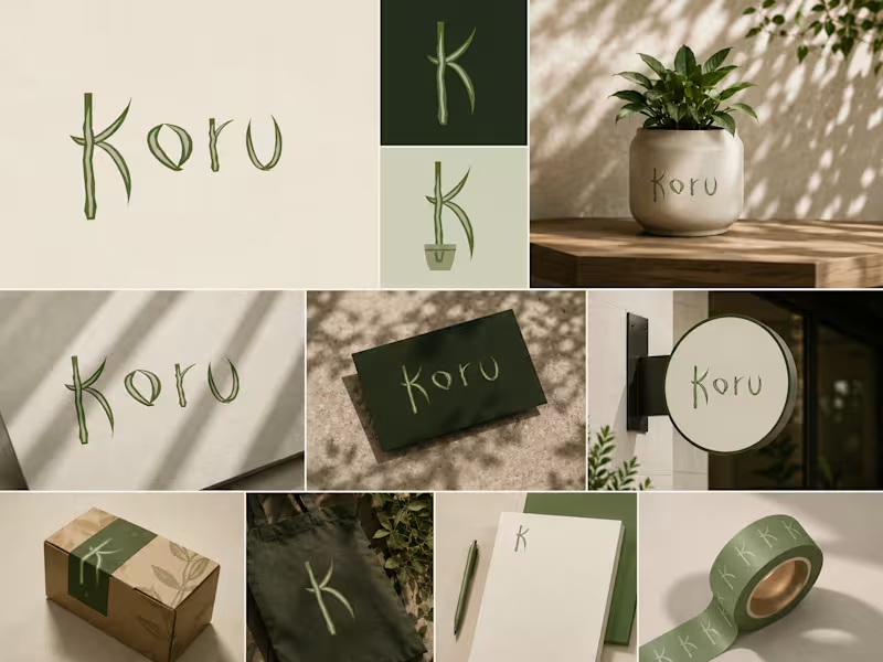
KORU KORU is a modern, nature-inspired lifestyle brand built around simplicity, calm, and conscious living. Its visual identity combines organic forms, botanical influences, and earthy tones to create a clean yet distinctive aesthetic. The hand-drawn logo gives the brand a natural, human character while keeping the overall identity minimal and contemporary. KORU is designed to feel peaceful, authentic, sustainable, and effortlessly premium—a brand that brings a touch of nature into everyday living.
0
140
1
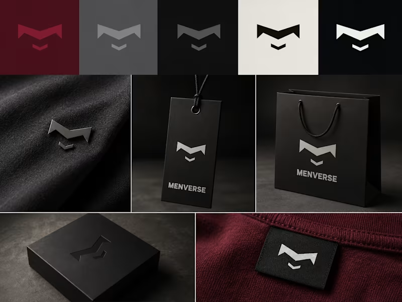
MENVERSE MENVERSE is a modern men’s clothing brand built around confidence, strength, and individuality. Its bold geometric symbol and strong typography create a minimal, masculine, and premium identity. The brand combines streetwear attitude with refined contemporary fashion, using a dark, sophisticated visual language that feels powerful, versatile, and timeless.
1
196
1
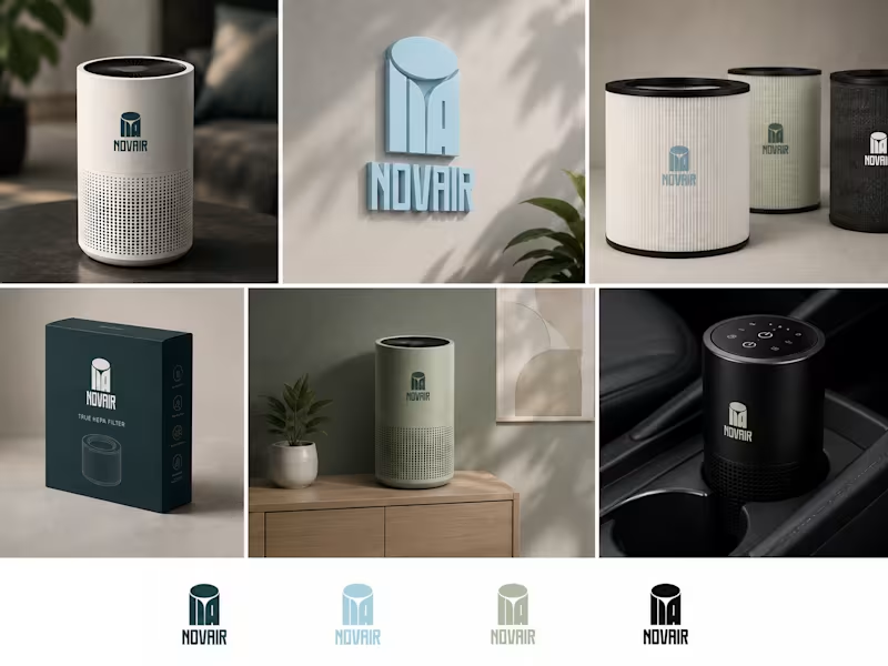
NOVAIR is a modern air-purification brand focused on creating cleaner, healthier, and more breathable spaces through smart, minimalist products. Its visual identity combines clean geometry, calm colors, and a bold symbolic logo to communicate fresh air, technology, and modern living.
1
157
Logo Designer
(7)
Follow
Message
Explore people