The network for creativity
Join 1.25M professional creatives like you
Connect with clients, get discovered, and run your business 100% commission-free
Creatives on Contra have earned over $150M and we are just getting started
Back to feedPost


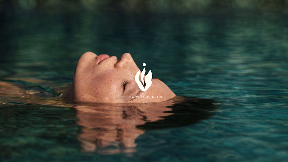
Natura — Natural Beauty Brand Identity
Natura started with a simple idea: natural skincare shouldn’t feel like a luxury that only a few people can afford.
I developed this brand identity around the feeling of calm, honesty, and connection with nature. The visual direction uses soft organic forms, flowing leaf-inspired curves, and a gentle color palette to make the brand feel natural without becoming overly rustic or predictable.
The logo was shaped around the movement of leaves and natural growth, creating a mark that feels soft, balanced, and easy to recognize. I paired it with warm neutrals, sage greens, deeper botanical tones, and a subtle blossom pink to bring a little warmth and personality into the system.
The goal was to create a beauty brand that feels clean, approachable, thoughtful, and trustworthy—something that feels natural without trying too hard to look “natural.”
Services
Brand Identity
Logo Design
Art Direction
Typography
Color Palette
Visual System
Tools
Adobe Illustrator
Adobe Photoshop
Project Type
Branding / Visual Identity


The network for creativity
Join 1.25M professional creatives like you
Connect with clients, get discovered, and run your business 100% commission-free
Creatives on Contra have earned over $150M and we are just getting started







Related posts

Meriot personal portfolio Website Homepage showcase
A portfolio website designed to turn personal expertise into a strong digital presence.
The goal was to create a website that communicates experience, personality, expertise, and credibility within the first few seconds.
I focused on:
Clear positioning and personal branding
Strong visual hierarchy
Editorial-style typography
Project-focused storytelling
UX/Product Design service presentation
Testimonials and social proof
Clear CTA for potential clients
Responsive, conversion-focused layouts
The visual direction combines minimal typography, bold imagery, dark/light sections, and subtle interactions to give the portfolio a distinctive personality without making it difficult to navigate.


Top notch execution

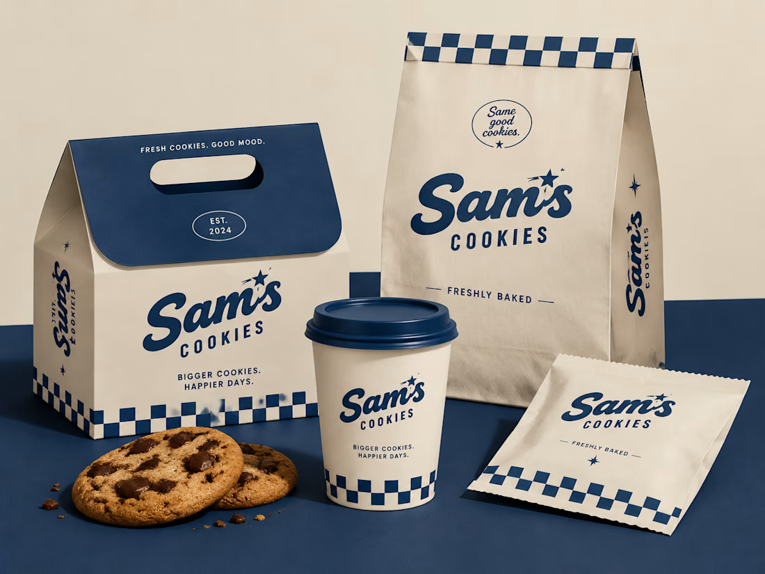
Turning a simple cookie into a memorable brand experience.
A packaging concept created to combine strategy, nostalgia, and a timeless American feel.
#BrandIdentity #PackagingDesign #FoodBranding #CreativeDirection

Beautiful design 😍

Design Direction Poll!
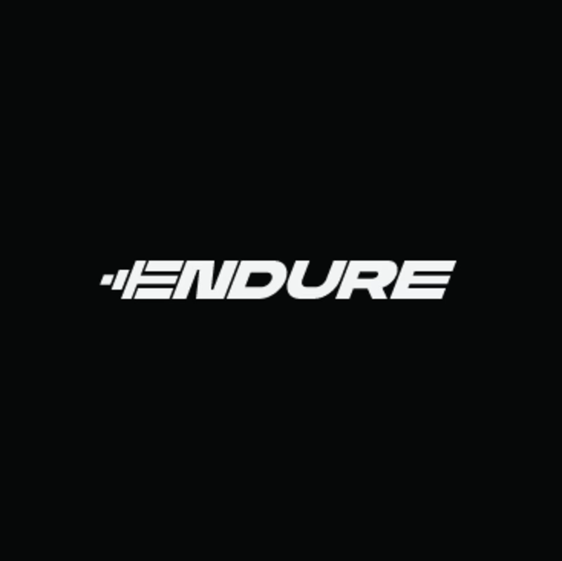
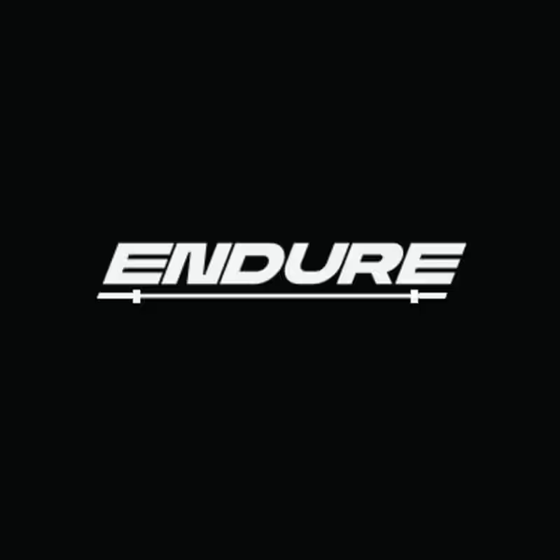
Two versions of the same Endure logo concept; same aggressive italic letterforms, same racing DNA. One detail changes the entire read.
Which version hits harder? 👇
14 voted
78%
4 voted
22%
18 votes
Closed
