
Shopify Website Design | DTC Stores & CRO | UGC Ads
- $10k+
- Earned
- 44
- Followers
Shopify Website Design | DTC Stores & CRO | UGC Ads
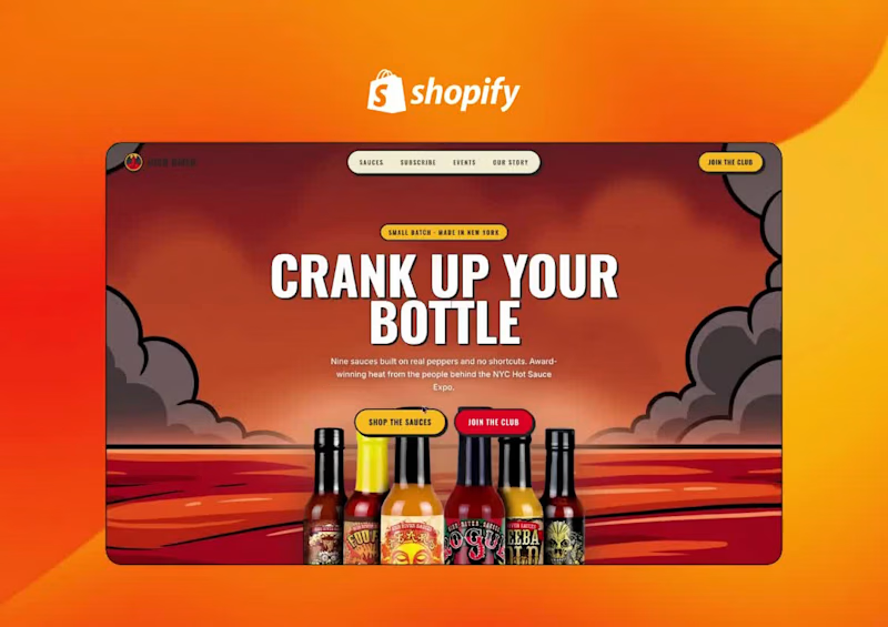
High River makes small-batch hot sauce in New York with no extracts and no fillers. It’s also the team behind the NYC Hot Sauce Expo. The brand has plenty of personality, with loud bottle art, award wins and a real festival community, so we wanted a store that feels as fiery as the product. This is a self-initiated concept, built to show how the brand could look and sell on Shopify.
The challenge
Hot sauce is an impulse buy, and it’s a crowded shelf. The site had to do four things:
Make nine different sauces easy to compare and choose between
Turn one-time buyers into repeat customers
Bring the Expo and festival side of the brand into the store
Earn trust quickly through awards, origin story and real reviews
The design direction
We went with a retro, comic-book look: heavy condensed headlines, thick black outlines, offset card shadows and a palette of chilli red, mustard yellow, cream and deep navy. Sauce-drip dividers run between sections, sunburst backgrounds frame the products, and scrolling ticker bars carry the brand promises: Small Batch · No Fillers · Award Winning · Made in NY.
Key sections
“Crank Up Your Bottle” hero: the full lineup sits in a smoky, fiery illustrated scene, with clear calls to action to shop the sauces or join the club.
“Pick Your Poison” flavour finder: a carousel of sauce cards. Each card shows a heat meter, a flavour profile and a tasting note, with a one-tap “Grab a bottle” button. Picking a sauce feels more like a game than a scroll through a catalogue.
Create-a-Case: customers build their own 12-bottle mix.
“Heat On Repeat” subscription builder: choose 3, 6 or 12 bottles, then one-time or subscribe and save. The price updates live, so the value of subscribing is clear right away.
“Come Taste It In Person”: the NYC Hot Sauce Expo gets a ticket-style feature with dates and a buy-tickets button, plus a “find us on the road” festival schedule.
Brand in numbers: 9 sauces, first bottle in 2011, 13 expos, 0 extracts or fillers.
“What The Burned Say”: reviews on tilted, highlighted cards, styled like notes pinned to a board.
“Built On Real Peppers”: a short origin timeline (2011 → 2013 → today) on a navy section.
“Judged Blind, Won Anyway”: an award wall with year-by-year wins tied to specific sauces.
“Fresh Out The Kitchen”: a news and drops feed with filter tabs for Expo, product and awards.
Footer: a giant scrolling HIGH RIVER marquee over a field of illustrated peppers.
Interaction and motion
Every section has its own motion: the hero bottles rise in, the tickers scroll, the flavour cards change with a radial burst, sauce drips mark the section breaks, and buttons respond with playful hover states. The motion has a job, too. It slows people down on the parts that sell, like the flavour cards, the subscription builder and the reviews.
Outcome
The result is a store that matches the attitude of a small-batch sauce brand and is built around what drives revenue for one: easy flavour discovery, bundles, subscriptions and community. It shows High River as more than a product page, as a brand people want to taste, collect and come back to.
2
1
43
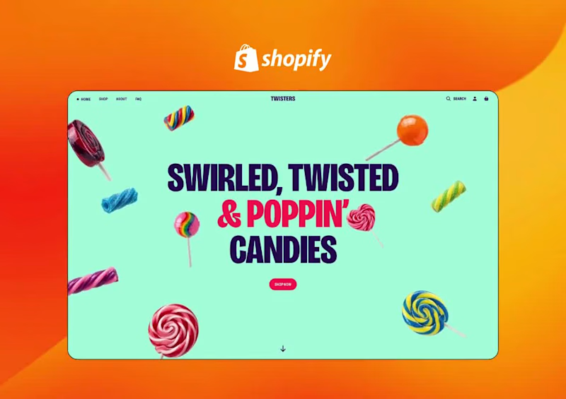
Twisters Pops — Candy Brand Storefront Concept
Self-initiated · Shopify · Confectionery / CPG · Conversion-focused
The problem with candy online
Candy sells on impulse at the till. Online it has none of that — no checkout aisle, no pocket change, no kid pulling at a sleeve. A $9.99 bag has to survive shipping costs and a deliberate buying decision, which means the site has to replace the impulse rather than just list the SKUs. We built the whole page as a sugar rush: colour-blocked, loud, fast, with the products never more than one scroll away.
What we built
A hero made of product. Oversized condensed display type — “Swirled, Twisted & Poppin’ Candies” — on mint, with real lollipops and twists scattered across the whole viewport in a loose float. The product is the background. One CTA, “Shop Now”, and a scroll cue. No hero image to art-direct, no stock photography — the candy does the work.
A staggered product grid, not a tidy one. Six bags laid out on an intentionally offset rhythm, each tilted a few degrees, each with its flavour tag (Cherry, Rainbow, Grape, Blue Razz, Sour, Spicy), weight, price and a one-tap cart button on the card itself. The “POPULAR” headline runs behind them at full bleed with a counter badge. The staggering is deliberate — a clean grid reads as a catalogue, an offset one reads as a sweet shop, and it keeps the eye travelling down the page.
Flavour marquees as navigation. Three scrolling rows — Cherry, Sour, Blue Razz — each in its own flavour colour, with product bags sliding through the type. It converts a boring category nav into the fastest-reading section on the page, and it gives someone who already knows what they want a one-click route in.
Why Twisters: hover-to-explore circles. A colour-blocked orange section where benefit claims — real fruit flavour, two-tone twist — sit inside overlapping circular photo masks that reveal on hover. Product claims that would die as a bullet list become something you want to poke at.
The ingredient flex. “100% real fruit flavours” set in rotated display type over a field of 3D fruit icons — cherry, apple, mango, grape, watermelon, chili. It’s the trust claim doing double duty as decoration, which is the only way a claim survives in a page this loud.
A stacked-card product carousel. Six cards that stack and advance with a 1/6 counter, each pairing the bag with its flavour name and detail — a second route to the same products for the visitor who scrolled past the grid.
The process story. “Here’s how the swirly, poppin’ candy gets twisted” — step cards as stacked colour circles, each a full colour change: cook the sugar, pull & twist, shape & pop. Craft storytelling is what justifies the price gap against supermarket candy, so it earns the real estate.
A footer that returns you to the hero. The page closes on the same mint field and headline it opened on, with email capture and social. Nobody reaches the bottom and finds a dead end.
Art direction
One heavy condensed grotesque, used at every size, carrying the whole page. Six-colour palette pulled off the packaging — mint, pink, orange, blue, yellow, deep purple — applied as full-bleed colour blocks so each section feels like a different flavour. Rounded section edges and shaped dividers so the page reads as stacked candy wrappers rather than stacked rectangles. Motion is constant but cheap: floating product, marquees, hover reveals, stacked-card transitions — all of it decorative, none of it blocking a click.
Build
Shopify custom theme sections — floating hero, staggered product grid with quick-add, flavour marquees, hover-reveal benefits, ingredient block, stacked carousel, process steps, newsletter footer. Merchant-editable throughout: flavours, prices, colours, copy and imagery all swap from the theme editor without touching code.
How we’d measure it
No performance data — this was never deployed. If it were, we’d test it against the live store and watch quick-add rate from the grid (the single highest-leverage metric on an impulse product), scroll depth past the hero, and average order value, since candy lives or dies on multi-bag carts.
What we can point to: these are the same patterns we build into live client stores, where we’ve measured conversion increases of up to 9-12%.
0
52
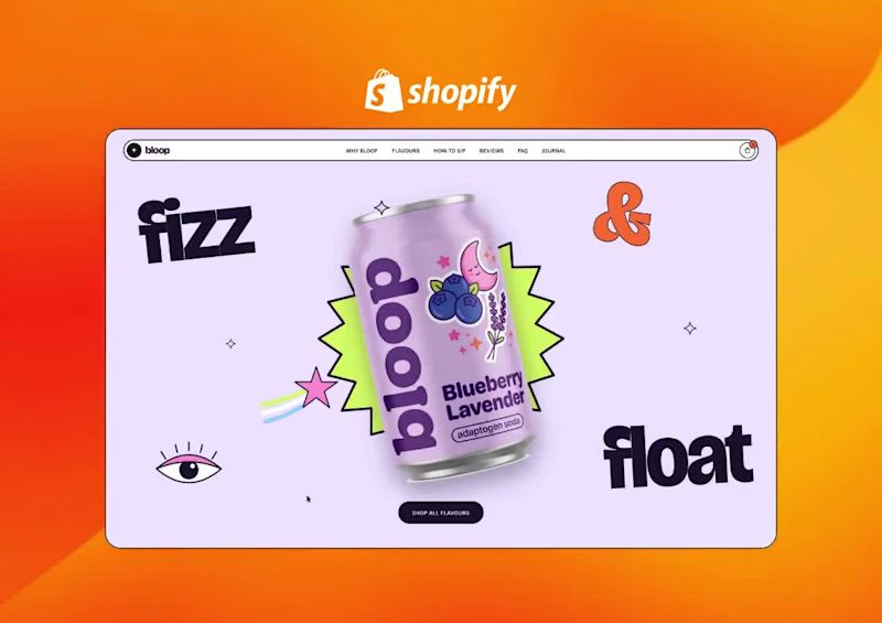
Bloop — Storefront Redesign Concept
Self-initiated · Shopify · Beverage / CPG · Conversion-focused.
Why we picked this one
We track DTC storefronts continuously and rebuild the patterns that work into our clients’ stores. bloop caught our attention because the product is genuinely strong — real doses, five flavours, serious shelf appeal — while the site was doing the standard beverage thing: [one line on what the live site does — e.g. “a flavour grid with no tasting notes or dosage”].
In functional beverage the site has a harder job than the shelf. No fridge door, no sampling, no comparison — just a visitor who has never tasted the thing deciding whether to spend $39 on a case. So we rebuilt the page around that single decision.
What we changed, and why
Hero: packaging, not product shot. The can sits centre on a lavender field, framed by kinetic type — “fizz”, “&”, “float” — plus stickers and a starburst lifted from the can’s own art. One CTA. The site and the packaging read as one object instead of two.
→ The hypothesis: brand recall carries from shelf to screen, which matters most for the visitor arriving from a paid social ad.
Benefits as stickers, not bullets. Four tilted pills — helps you unwind, supports focus, zero added sugar, gut-friendly prebiotics — over lifestyle imagery. Scannable in under two seconds, which is all a cold visitor gives you.
→ Target: reduce hero bounce.
Flavours: grid → carousel. The page flips light-to-plum so the cans become the only light source. Each flavour carries serving size, active dose (150mg L-theanine, 300mg ashwagandha) and a sensory description — the information a first-time buyer needs and a grid has nowhere to put. Neighbouring cans peek in from both edges, and the buy button travels with the carousel so price stays visible at every step.
→ Target: add-to-cart rate, and flavour-page depth per session.
New section: occasion merchandising. “How to sip” maps the product to four moments — ice cold, over ice, as a mocktail, after a workout. This answers when would I drink this, which is the real objection in this category, not price.
→ Target: first-time purchase rate.
Objections, in sequence. Reviews → FAQ covering shipping, payment and subscription pause/cancel → Journal for SEO and education → newsletter capture. Cleared in the order a buyer actually raises them.
→ Target: checkout drop-off, and email capture from non-buyers.
Nav that tracks you. A sticky pill nav highlights the active section on scroll, so a long scroll-led page never loses the visitor’s sense of place.
Art direction
Oversized geometric sans, set tight and bold, used at display scale as a graphic element rather than as headings. Palette pulled off the can and held to four colours — lavender, lime, orange, plum. Motion is restrained: scroll reveals, carousel transitions, hover states. Nothing that delays a buy decision.
Build
Shopify custom theme sections — hero, benefits, scrolling trust marquee, flavour carousel, occasion grid, reviews, FAQ accordion, blog feed, newsletter. Every section is merchant-editable: flavours, doses, copy, imagery and FAQ entries swap from the theme editor without touching code. Subscription-ready.
How we’d measure it
We have no performance data on this build — it was never deployed. If it were, we’d run it as a themed A/B test against the current storefront and watch add-to-cart rate, scroll depth to the flavour carousel, and first-time purchase rate, in that order.
What we can point to: these are the same patterns we’ve implemented in live client stores, where we’ve measured conversion rate increases of up to 7–8%.
0
52
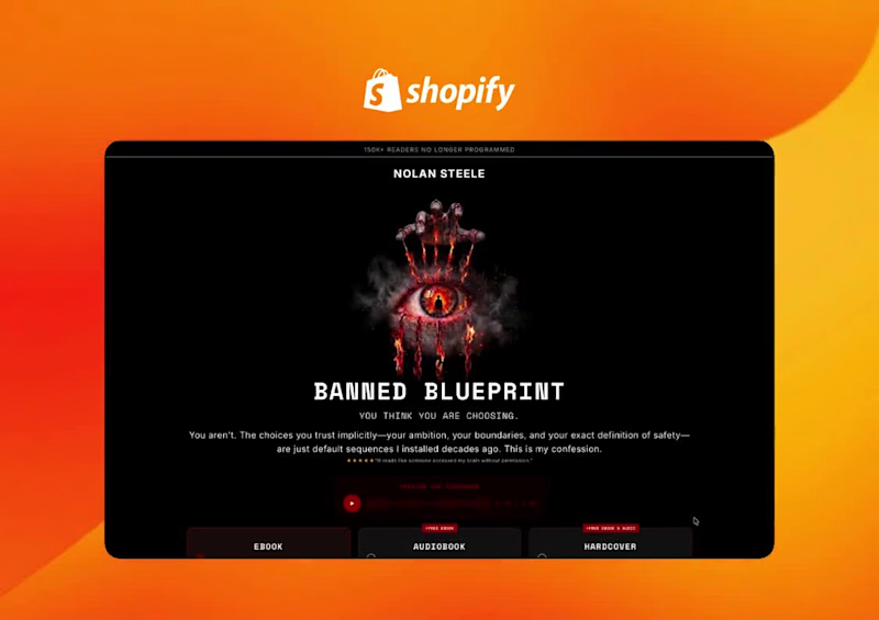
Banned Blueprint isn’t a typical self-help book. It’s narrated in the first person by “The Programmer,” the voice behind the reader’s patterns, with no warmth and no coaching tone. It sells only through its own store, not on Amazon, at premium prices. The page had to make a cold reader feel the book before they ever opened it, then turn that feeling into a purchase.
The challenge
Selling a $97–$197 book to people who’ve already bought and abandoned plenty of self-help titles
Setting it apart from that whole category without looking like another guru funnel
Explaining three formats and their bonuses clearly
Handling a provocative tone responsibly, with clear warnings and a real guarantee
Keeping a very long page easy to buy from at any point
Design direction
The page is dark and cinematic: black, deep burgundy and signal red, set against clean off-white reading sections. Headlines use a typewriter-style monospaced font, so they read like a confession or a classified file. The visuals are surreal, sculptural images of things breaking apart, such as a burning film reel, a hamster wheel on fire, cracked glasses, a melting padlock and a knotted rope. Each one stands in for a pattern the book takes apart. Chains run through the page as a recurring motif, from the book cover through to the closing sections.
Key sections
Hero: the book’s cover art (an eye wrapped in burning chains) leads into the hook, “You think you are choosing.” A format picker sits right above the fold:
Ebook: $97
Audiobook: $147, with a free ebook
Hardcover: $197, with a free ebook and audiobook
The CTA reads
“Refuse to stay programmed”
and sits next to a 90-day guarantee and a “Not available on Amazon” badge.
Quick-scan accordions: What it’s for, Who it’s for, Who it’s not for, Why this, why now, How it works, and Table of contents. Skimmers get the facts fast, and readers who want the long version keep scrolling.
“I call myself the Programmer”: a burgundy card that introduces the narrator and sets the book apart from every therapist- or coach-led title.
Long-form narrative: centred editorial copy, with key phrases in red to pull the eye through the argument.
Clinical disclaimer: a full-width warning panel that tells readers in crisis to step away or read only with professional support. It’s responsible, and it also makes the book feel serious.
“Four parts. One dismantling.”: image cards for each part: Installation, Deprogramming, Weapons and Running.
Interactive loop diagram: Trigger → Default fires → Window → Exit, looping back through “Story.” When you click “Window,” the loop breaks into a “New output” node, which shows the book’s core idea in a single interaction.
Who it’s for vs. who it’s not for: side-by-side persona lists with check marks and crosses.
“What every other book left running”: a comparison table of Banned Blueprint against other self-help books.
“Your Programmer is watching you read this”: a dark interrupt section that speaks directly to the urge to close the tab.
“The ones who refused the exit”: a carousel of verified-reader reviews.
“The guarantee I’d rather not offer”: a 90-day guarantee that pays out only if the reader completes and documents every chapter’s requirement. The terms read like a challenge rather than a safety net.
Final offer and FAQ: the format picker repeats with a delivery-slot timer, followed by an FAQ that answers objections like “Isn’t this just another self-help book?” and “Is this manipulative?”
Conversion details
A sticky add-to-cart bar stays on screen through the whole page, with the format selector built in, so readers can buy from any section.
Bundle-first pricing: each higher tier includes the formats below it, which makes the hardcover the obvious best value.
Scarcity and exclusivity cues: reserved delivery slots, “Not on Amazon,” and direct-only availability.
Objections handled throughout: the comparison table, the who-it’s-not-for list, the disclaimer, the guarantee and the FAQ each take on a different reason not to buy.
Outcome
The finished page sells the book’s voice as much as the book. Every section is written as the Programmer speaking to the reader, which makes the page feel like the first chapter rather than an ad. Buying stays one tap away the whole time, and the premium prices are backed by clear format value, trust signals and a guarantee with real conditions.
1
38

🎥 Dynamic Motion & Custom Brand Design ✨
Freshly shipped for dsgnrai.com (https://dsgnrai.com)⚡
A 60-second launch video for a node-based AI platform built for architects and interior designers.
The challenge was showcasing a powerful workflow system without overwhelming the viewer. Focused on fast-paced editing, clean UI animation, and a modern tech aesthetic to keep everything clear, engaging, and easy to follow.
1
587

This one took a few wrong turns before it made sense.🧠
At first, I was just trying to make it look “good” polished visuals, smooth animation but it felt empty. Like it could be for any product. That’s when I realized I was missing the point.
I shifted my focus to the idea behind it: taking something complex and making it feel simple. Once that clicked, the direction became clear.
I started stripping things back. Cleaner frames, tighter motion, more intention behind every transition. Nothing extra, nothing just for decoration. Then I approached the sound design the same way less noise, more purpose. Small, precise sounds that follow the motion and give it rhythm.
It slowly came together, piece by piece, until everything felt connected.
3
699


SaaS Motion Designer | Product Demo Videos • Explainers
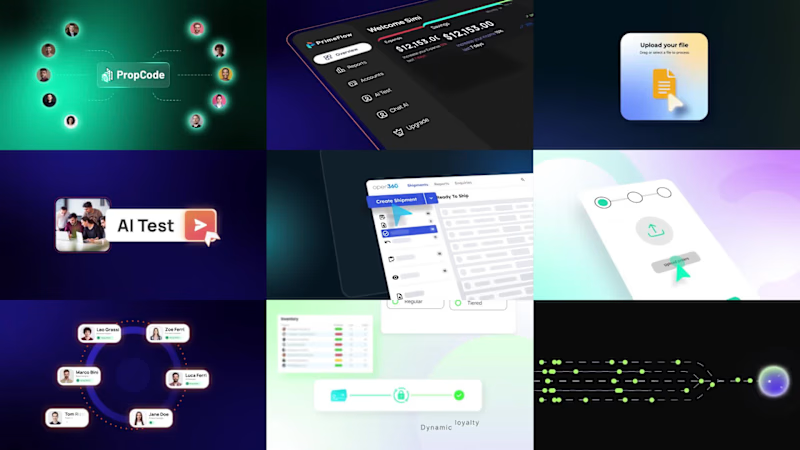
2D motion design built for clarity and conversions.
View portfolio & book projects: umarfarooq.work
(http://umarfarooq.work)#SaaS #ProductExplainer #UIMotion
2
2
118

One of the first SaaS videos I created, SaasyPOS.
Looking back, I can see how much my style and approach have evolved since then.
But this project was an important part of the journey.
Always good to look back and see the progress.
0
160
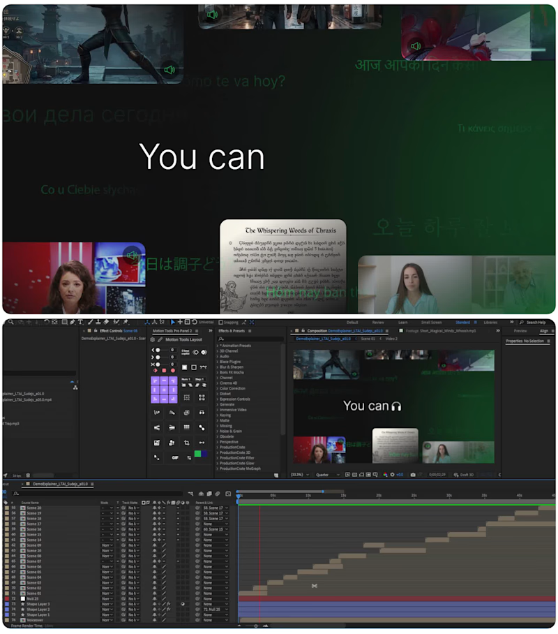
What a SaaS motion project looks like behind the scenes.
The final video might look simple.
But behind a few seconds of animation, there can be a lot happening:
→ Designing the UI
→ Building the scene in After Effects
→ Setting up layers and timing
→ Animating interactions
→ Refining transitions and movement
→ Making sure every element supports the story
This was from a recent product video I created for LTAI.
The goal wasn't to make the UI move just for the sake of movement.
It was to make the product experience clear, engaging, and easy to follow.
That's the part of motion design I enjoy most:
Making complex software feel simple.
2
2
263
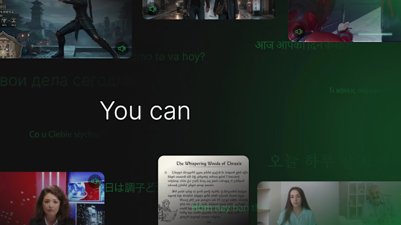
How do you make a complex AI product easier to understand?
That was the challenge behind a recent product video I created for LTAI.
The goal was simple: show what the product does clearly, without overwhelming the viewer.
I focused on:
→ Clear product storytelling
→ UI-driven visuals
→ Motion that guides attention
→ A clean, modern SaaS visual language
The result was a launch video designed to introduce the product quickly and make the experience easier to understand.
The client loved the final result.
This is what I enjoy most about SaaS motion design, taking something complex and making it feel simple.
Launching a SaaS or AI product? Let's make it easier to understand.
1
170

Motion Graphic Designer | SaaS, Product & 2D/3D Animation
🪙Free Wing Wallet — "Buy, Trade & Convert" | Crypto Promo Video Ad
Project type: Video Ad / Product Launch Promo Industry: FinTech / Crypto / Digital Wallets Deliverable: 30–45 sec vertical + horizontal promo video
Overview
Designed and scripted a high-energy launch ad for Free Wing Wallet, a free all-in-one crypto app built for people who want to buy, trade, and convert currencies without juggling five different platforms. The goal: communicate speed, security, and simplicity in under 45 seconds — enough to stop the scroll and drive installs.
The Brief
Wing Wallet needed a promo that positioned it as the "last wallet app you'll ever need" — combining crypto trading, currency conversion, and secure transfers into one clean interface. The concept is energy, trust signals, and a strong CTA, without feeling like just another crypto ad.
What I Delivered
Full video script (hook, body, CTA)
Scene-by-scene shot list/storyboard notes
On-screen text + voiceover copy
Caption-ready social cut suggestions
🎯 Need a video like this for your SaaS or product?
I create scroll-stopping promo, explainer, and demo videos for SaaS, fintech, and app-based businesses — from concept and script to storyboard and final cut. If your product needs a video that actually converts (not just looks nice), let's talk.
📩 Hire me for your next SaaS or explainer video — message me here on Contra or check out more of my work in my portfolio below.
#CryptoWallet #FinTech #VideoAdScript #AppPromo #UGCScript
1
484
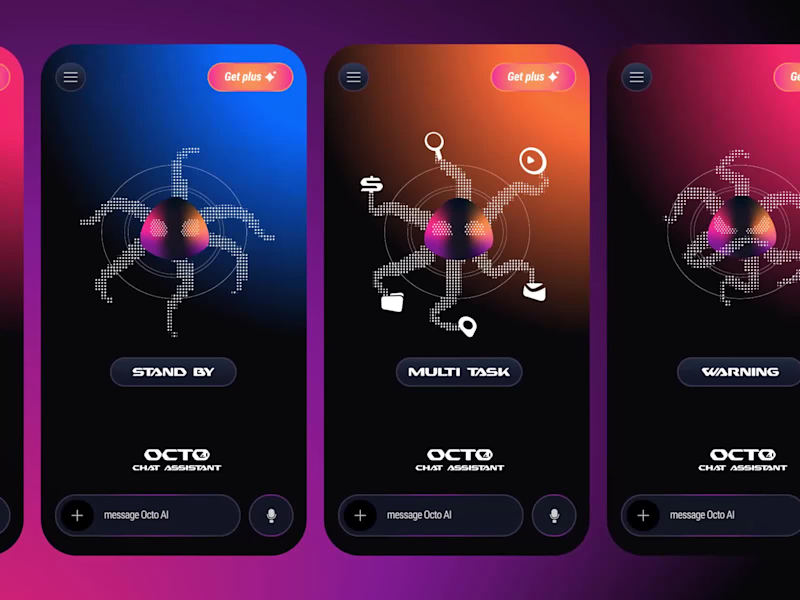
Meet Octo 🐙 — AI Chatbot Mascot Design
the personality-packed AI chatbot mascot with three core behavior states. From chilling on standby to juggling tasks like a pro, and alerting users with charm — Octo turns every interaction into a delightful experience. Designed to solve the cold, robotic feel of traditional chatbot UI. 🐙✨
🐙 Stand By
When idle, Octo AI gently bobs in a looping animation, blinking softly and occasionally curling a tentacle. After a few seconds of inactivity, a small speech bubble appears with a friendly nudge like "I'm here whenever you're ready!" — waiting patiently until the user engages.
⚡ Multitasking
Octo springs to life with all tentacles in motion, juggling task bubbles with wide, focused eyes. This solves user anxiety during loading — instead of a cold spinner, Octo shows "I'm working hard on this for you."
⚠️ Warning
Octo shifts into alert mode — one tentacle raised, eyes sharp, with a warm orange glow. This solves robotic error messages by giving warnings a friendly face that says "Hey, something needs your attention!"
3
15
854
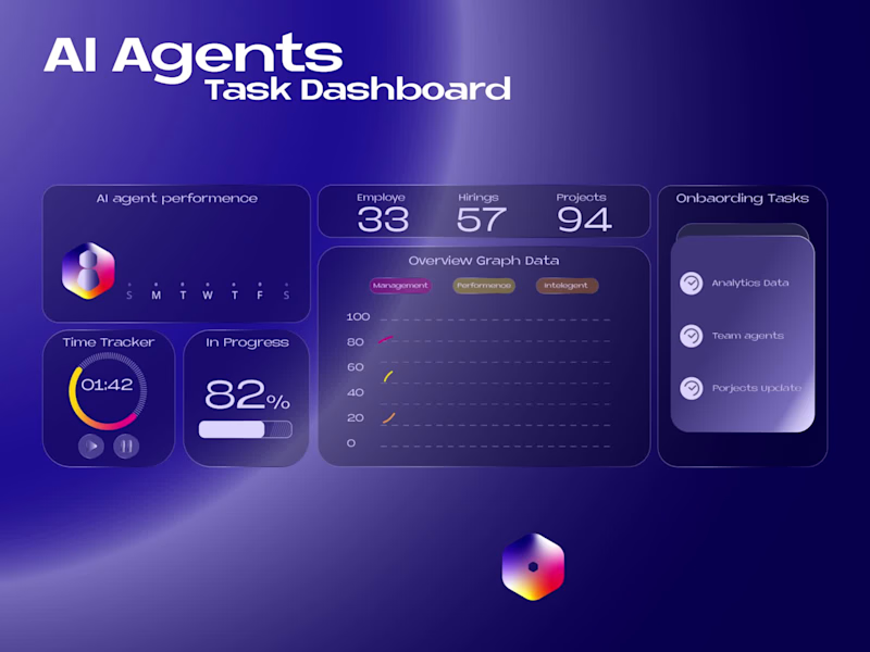
AI Agent Task Manager — Dashboard UI/UX Design
An intelligent dashboard experience designed to help users manage, monitor, and collaborate with AI-powered agents in a single workspace.
This concept focuses on creating a clean, modern, and highly functional interface where users can assign tasks, track agent performance, monitor real-time progress, and gain actionable insights through data visualization.
1
592

Bug Buds — 3D Earbuds Product Animation, App UI Design & Sound Control
🐞 Playful wireless earbuds concept brought to life with studio-grade 3D rendering, a sound-control app UI design, and immersive sound design. 🎧
✨ What's included:
🔹 Full 3D Product Modeling & Rendering
🔹 Custom Case + Earbud Design
🔹 Studio Lighting & Material Shading (matte plastic, soft rubber, glossy accents)
🔹 UI/UX Design for companion Sound Control App
🔹 Brand Identity & Logo Integration
Designed to showcase how strong 3D visualization can elevate a tech product's brand identity before it even hits production.
💬 Let me know your thoughts in the comments — would love your feedback!
📩 DM me for collabs or 3D product Animation projects.
#3DDesign #ProductAnimation #3DRendering #UIUX #UIDesign #AppUI #SoundDesign #SoundControl #ProductVisualization #CGI #TechProduct #Blender3D #HireMe #3DArtist #EarbudsDesign #MotionDesign #ProductShowcase #AdAnimation #DesignPortfolio
2
5
528

Turning SaaS products into engaging videos that sell
Turning SaaS products into engaging videos that sell

2D Animator & Motion Designer


UI/UX Designer | 2+ Years | Figma • Adobe • Canva • AI Tools
New to Contra
UI/UX Designer | 2+ Years | Figma • Adobe • Canva • AI Tools
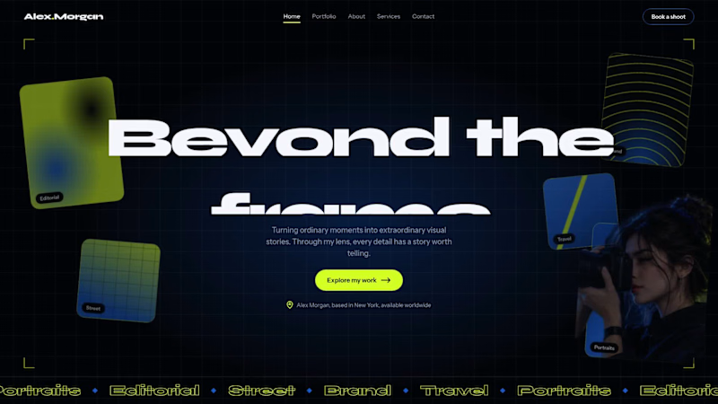
Photographer Portfolio Website: Hero Section Concept
A concept website design for a photographer and visual artist, built around one question: how do you make a portfolio feel like the work itself?
The hero section pairs a dark, high-contrast background with a single lime accent, so photography stays the focus. A subtle animated grid and floating photo tiles (Editorial, Street, Brand, Travel, Portraits) give visitors an instant preview of the photographer’s range, while a bold headline and one clear call to action (“Explore my work”) guide them forward.
Typography uses Syne for headlines and Instrument Sans for body text, keeping the layout modern and easy to read. The navigation includes a “Book a shoot” button to turn visitors into clients.
This is a self-initiated concept project, showing how I approach visual hierarchy, layout, and responsive design
1
22
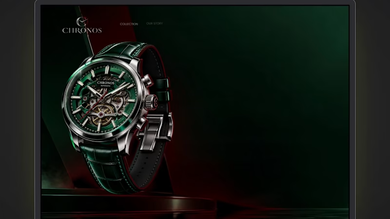
CHRONOS: Dark, Cinematic Landing Page for a Luxury Watch Brand
The brief: A hero section for a luxury watch brand that feels expensive and quiet, and still gives the visitor a clear next step.
What I focused on
Colour: Deep green and black as the base, red used only for the light beam, the first headline word and the button. Limited colour keeps it premium.
Typography: A high-contrast serif for the headline, which gives it a watchmaking feel, and a clean sans-serif for supporting text so it stays easy to read.
Hierarchy: Watch first, headline second, button third. The eye moves in that order, and the animation follows it.
Motion: Slow, controlled movement only: a soft fade-in, a rising headline and a gentle light pulse. No bounce or flashy effects.
Trust: Three short proof points under the button, so the page isn’t only atmosphere.
6
3
156
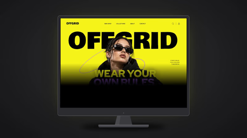
OFFGRID: Bold Landing Page Design for a Streetwear Brand
A hero section for a streetwear label that feels loud, young and confident, and still easy to read.
What I focused on
Typography: A heavy display wordmark for the brand, and a clean sans for the headline and navigation. The contrast gives the page energy without making it messy.
Colour: Yellow, black and purple only. High contrast, so the headline and button are readable at a glance.
Depth: The model overlaps the wordmark, which gives a poster-like layered look.
Motion: Elements load in a clear order (nav, wordmark, model, headline, button), so the eye follows the page naturally.
Tools: Figma
2
3
98

Meriden — Real Estate Website Design
Medrien is a modern real estate website designed to make property discovery feel seamless, intuitive, and premium.
The website features an elegant visual identity with deep forest-green tones, warm neutral backgrounds, refined typography, and high-quality property imagery. From the hero section and property search interface to featured listings, agent profiles, client testimonials, and premium property galleries, every section is designed to create a cohesive and engaging user experience.
I designed the complete website experience with a focus on clear information hierarchy, intuitive navigation, consistent spacing, and a layout that helps users explore properties with ease. The design balances a sophisticated real estate aesthetic with usability, building trust while making property discovery more enjoyable.
Project Highlights
Complete real estate homepage design
Property search and featured listings
Dedicated service and premium property sections
Agent profiles and client testimonials
FAQ section and conversion-focused CTA
Consistent typography, colors, and visual hierarchy
My Role: UI/UX Designer
Tools: Figma
Project Type: Real Estate Website Design
Focus: UI Design, UX Design, Website Layout, Visual Identity, and Responsive Design
The goal was to create a polished digital experience that presents properties beautifully, builds credibility, and helps users take the next step in their property journey.
0
17

Motion Designer & Visual artist making ideas live.
Motion Designer & Visual artist making ideas live.


